




Classical
E-commerce & Offers
Lifestyle
Seasons
Seasons change. Your emails should too. A winter template in July feels out of touch. A summer design in December feels irrelevant. These templates help you match your messaging to what your audience is experiencing right now. Pick a design and customize with Positive User's drag-and-drop editor.
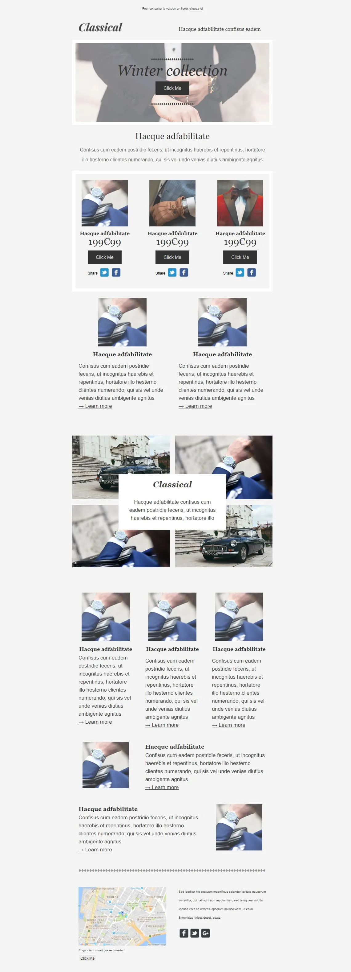
templates galleryComing SoonPremium menswear lives on detail shots — cufflinks, lapels, wristwatches. Classical opens on a tied-bowtie hero ('Winter collection'), drops a 3-product 199€99 grid (watch / glove / bowtie) with individual Share rows, then alternates: two Learn More image blocks, a 4-photo gallery with a floating Classical caption, a 3-card product trio, two image-text rows, and a NYC map closer. Built for tailors, watchmakers, and capsule menswear drops.

Seasonal email templatesSeasons shape moods, habits, and buying decisions. A seasonal design shows your audience you're in sync with their world. Generic templates don't do that.
Icy blues for January. Warm golds for October. The right palette sets expectations and primes the reader before they hit the copy.
Your designs should match. Winter templates highlight indoor comfort. Summer layouts give outdoor gear the energy it deserves.
Even when the seasonal look changes, your core identity holds. Polished and responsive across every device.
seasonal email template
Vibrant and airy for spring and summer. Grounded and warm for autumn and winter. Browse and choose.
Dew-covered leaves for spring. Golden light for autumn. A cozy fireplace for winter. Drop it in. The editor handles the rest.
Swap backgrounds and accent colors. Subtle texture changes make a noticeable difference in seasonal feel.
Confirm the seasonal mood translates to small screens. Schedule when the season peaks.
best practicesCool tones for winter freshness. Warm tones for autumn comfort. These subconscious cues prepare the reader before they process the words.
"Crisp." "Blooming." "Sizzling." "Cozy." Sensory language makes emails immersive. It helps the reader feel the season, not only read about it.
Spring: renewal. Summer: freedom. Autumn: preparation. Winter: comfort. Build your content around these universal themes and the offers feel natural.
A winter tagline in July looks like neglect. Quick seasonal updates to social icons or sign-off lines show attention to detail.

First heatwave. First frost. First spring rain. Sending at the right moment maximizes relevance. Pre-build so you can react fast.
seasonal email contentLight, airy templates for new collections and spring cleaning sales.
Vibrant designs for vacation gear, outdoor events, and seasonal flash sales.
Rich, warm-toned layouts for home decor, cozy fashion, and back-to-basics campaigns.
Crisp, elegant designs for festive greetings, wellness content, and cold-weather essentials.
Optimize your seasonal emailsDoes the typography match the moment?
Light, elegant fonts for spring. Bolder, grounded typefaces for winter. This shift helps the design feel aligned with the season.
Have you tried background textures?
A faint grain for autumn. A soft glow for summer. Small details that add depth without visual clutter.
What's the weather where your subscriber lives?
A beach scene doesn't resonate in the rain. Geographic or climate-based segments make your visuals feel relevant, not random.
Do your CTAs feel timely?
"Start Your Spring Refresh" or "Get Winter Ready" connect the action to a specific moment. That specificity drives clicks.
Are the visuals slowing things down?
Atmospheric images are often heavy files. Compress so the email loads fast on mobile. The moment fades if the email doesn't load.
What's in the subject line?
"New arrivals for fall" or "Summer sale: 30% off outdoor gear." Name the season. Name the offer. Test a few versions.
Richness doesn't mean clutter
Seasonal imagery adds atmosphere. But the layout still needs structure and whitespace. Let the offers land.
Campaigns that move with the calendar. Positive User's seasonal templates and built-in automation.