




Art
Newsletter
Lifestyle
E-commerce i oferty
Myśl o każdym e-mailu jak o witrynie sklepowej. Czy Twoja zachęca, by wejść? Te szablony pomogą Ci wyeksponować produkty, promować oferty i zamieniać subskrybentów w kupujących. Wybierz układ, wrzuć swój katalog i odpal w kilka minut w edytorze drag&drop Positive User.
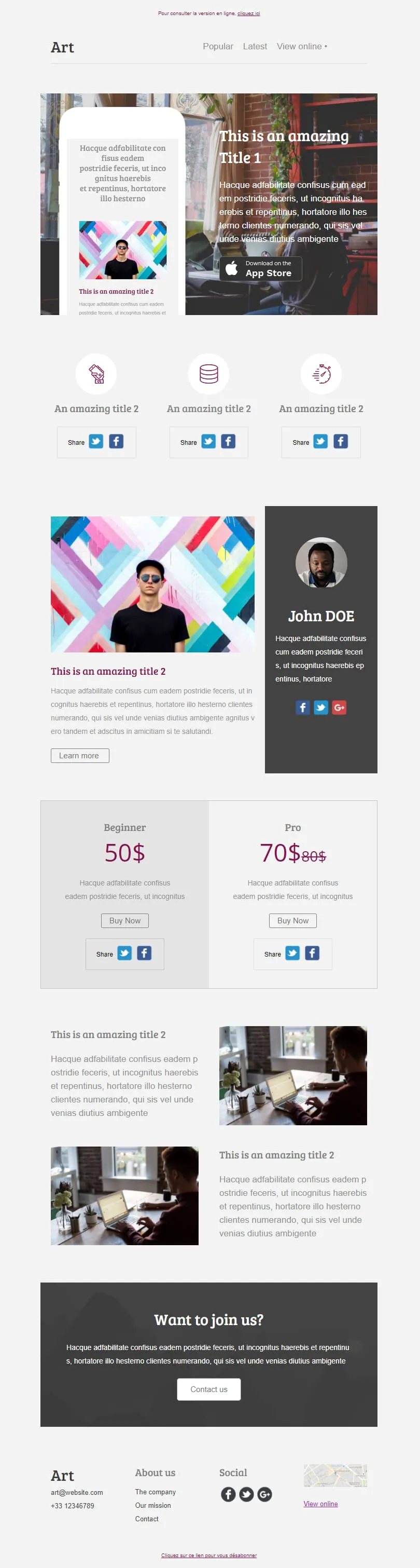
szablonów e-maili e-commerce i promocjiSix modular content blocks stack cleanly into one editorial layout: an App Store hero with phone mockup, a share icon row, an author profile column, a Beginner/Pro pricing tier with crossed-out anchor price, two image feature rows and a join-us call to action. Use the blocks you need and drop the rest.

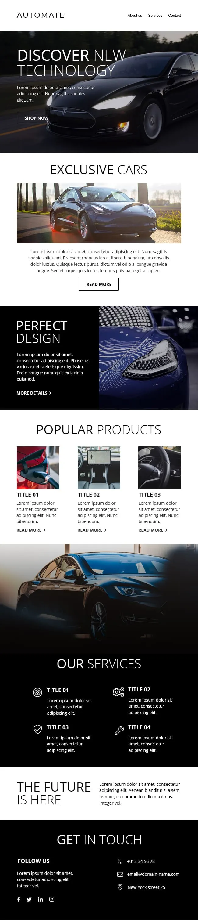
A premium automotive template that leads with a full-bleed black-on-asphalt hero and a soft secondary screen before breaking into three vehicle product cards, a four-icon services row and a sales handoff panel. Designed for dealers and car brands that need presence without clutter.
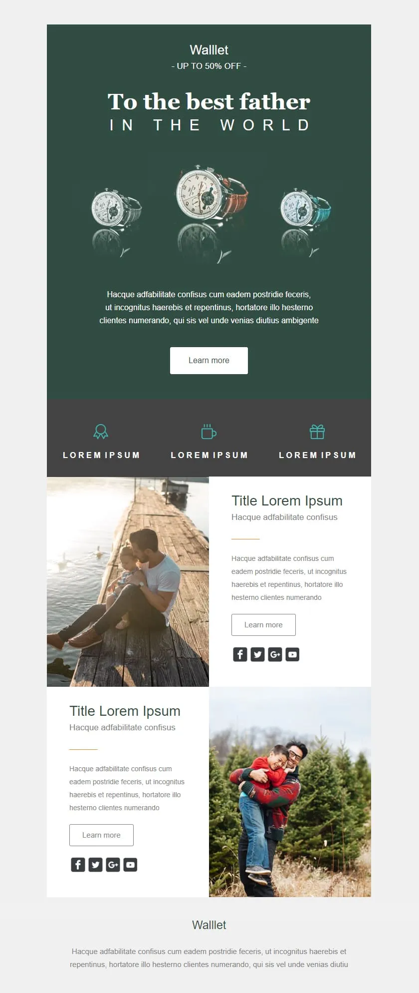
A premium Father's Day retail template in deep editorial green. A watch triptych hero carries a centered headline, a quiet inline discount banner follows, three perk icons sit in a slate strip, and two alternating image-text rows give the products context before the brand signs off.
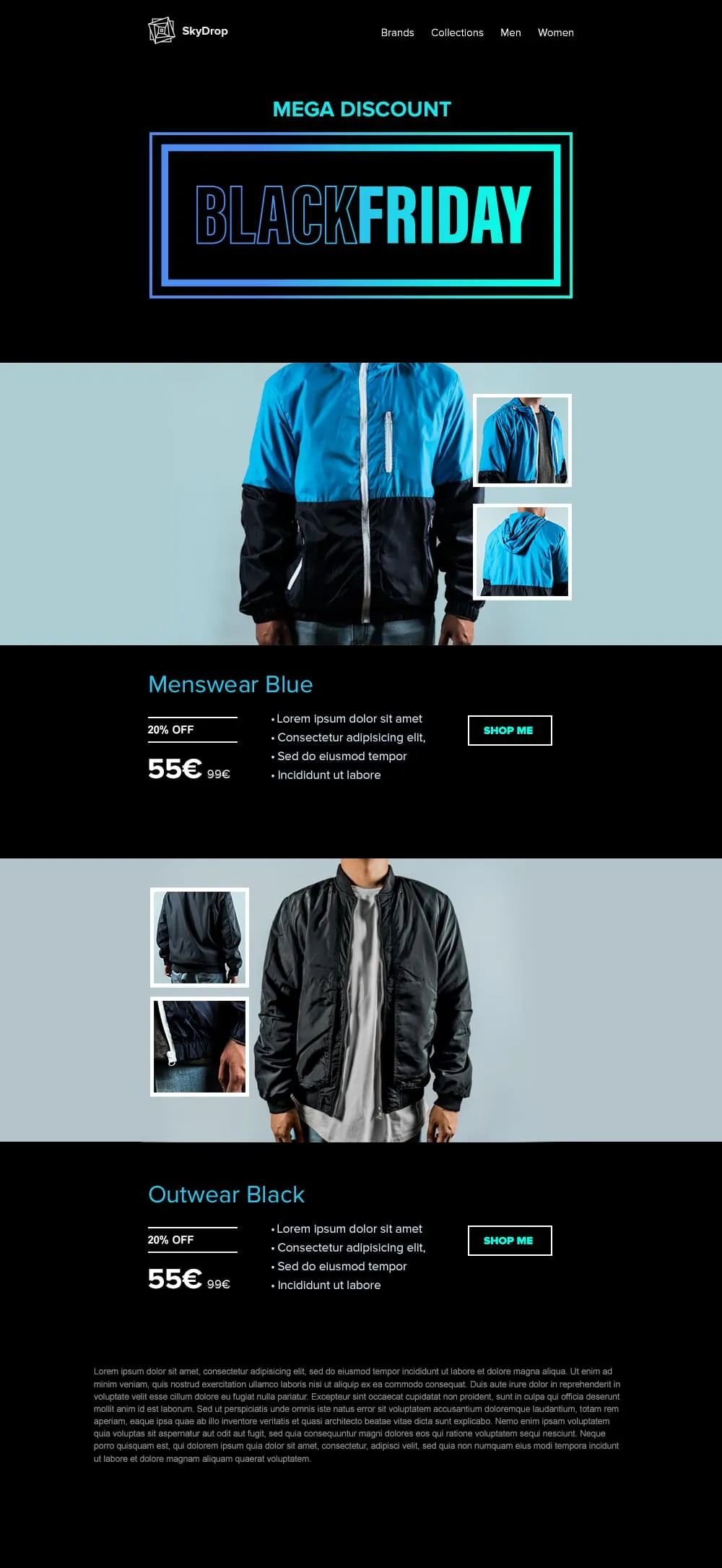
An apparel Black Friday template built around full-body product photography. A neon-framed hero opens the email, then two pairs of jacket showcases with front view and close-up sit on alternating cyan and black backgrounds, each carrying a discount tag, a crossed-out retail price and a direct shop button.
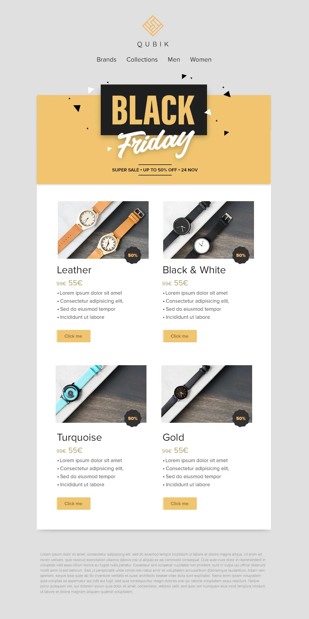
Four product variants, four prices and four buttons on a confetti yellow banner. A 2x2 grid drops Leather, Black and White, Turquoise and Gold colorways into matching cards, each with a 50% badge, a crossed-out anchor price and a soft yellow call to action. Quick to scan, quick to buy.
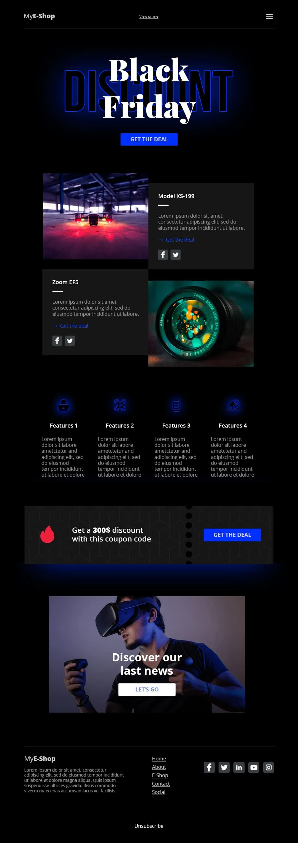
A tech-retail Black Friday template built for spec-driven audiences. Typographic lettering anchors the hero above a shop call to action, two spec product cards follow, a four-feature icon row adds credibility, a coupon code strip closes the deal and a VR product showcase ends the scroll.
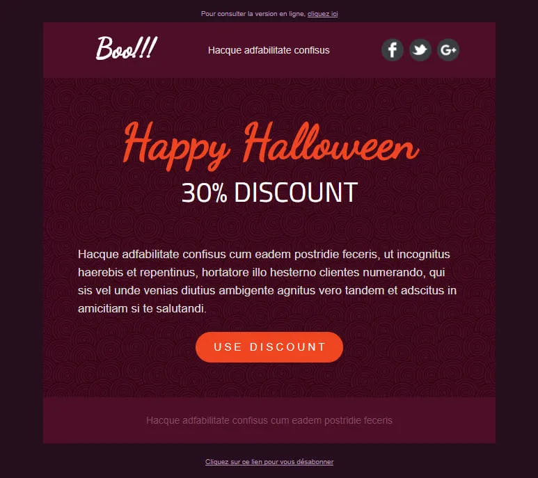
A Halloween template stripped down to a single conversion decision. A dark-plum spiral hero carries the offer, a hand-lettered headline anchors the eye and one orange discount pill is the only action available. No second call to action, no distraction, just the deal.
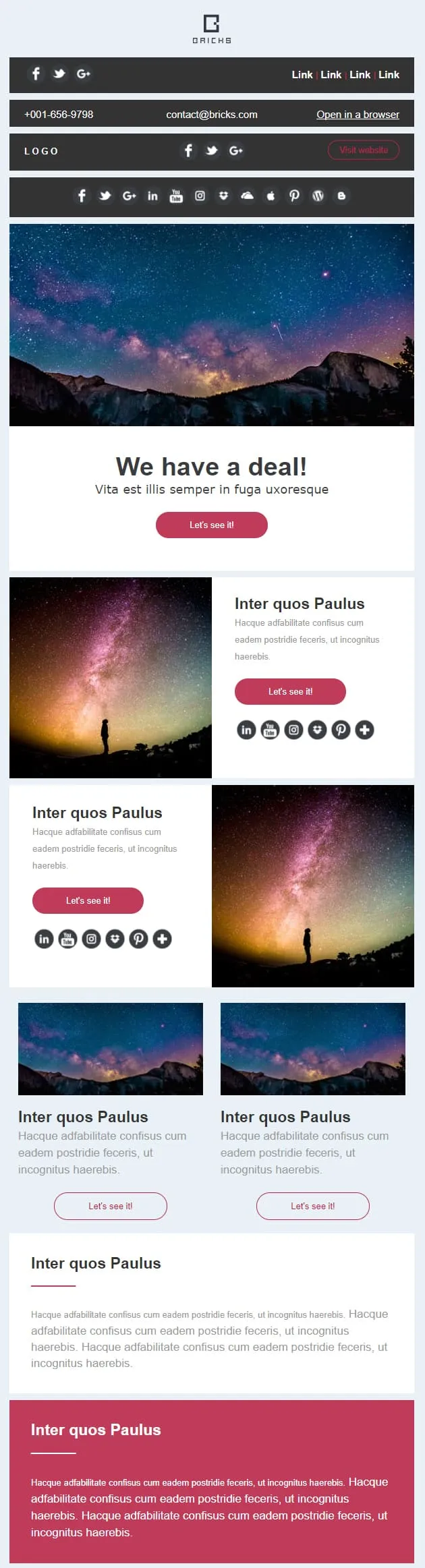
A campaign template made of eight stackable content blocks: a deal banner with a direct call to action, paired left and right image-text rows, two thumbnail sub-cards, a wide highlight strip and a high-contrast closing block. Reorder, drop or duplicate blocks to suit any brief.
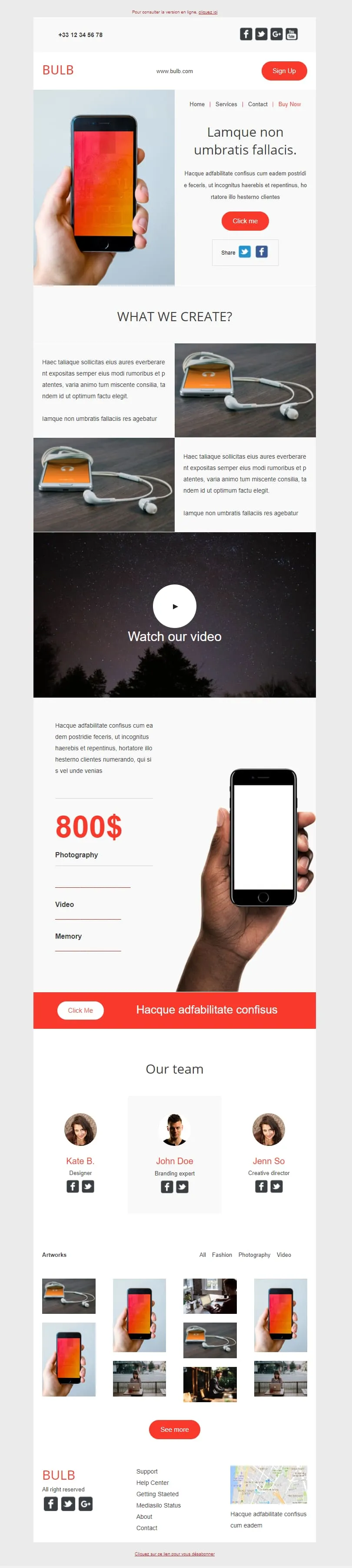
A tech brand template that earns its length. A phone-in-hand hero opens, two image-text rows detail the product, a wide video block follows, a vertical price column tied to a phone close-up, an orange call-to-action bar, a three-portrait team row and a fourteen-thumbnail artwork mosaic close it out.
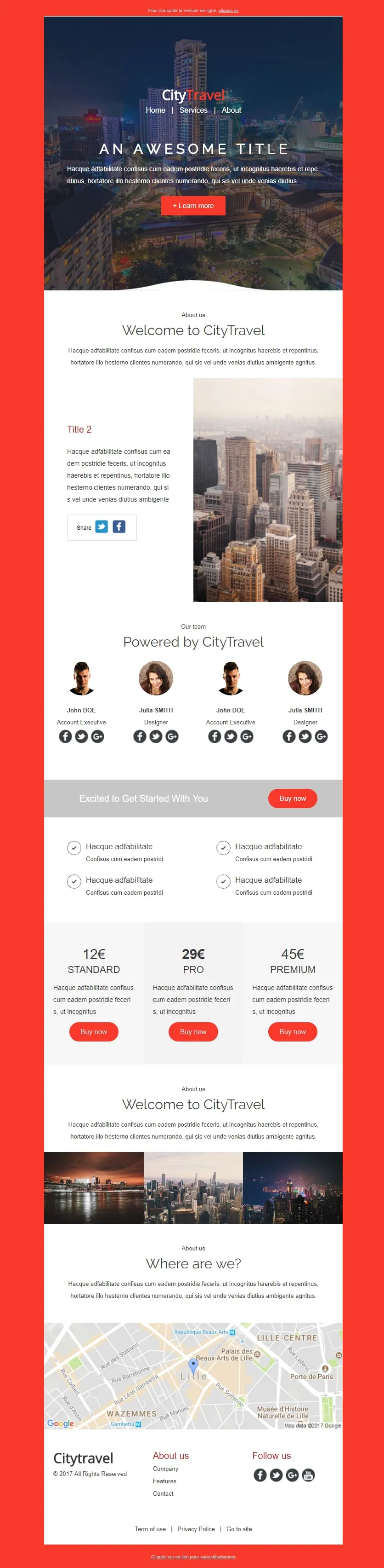
Coming SoonCity breaks need a pricing ladder. CityTravel opens on a red-framed nightscape with a 'Learn More' CTA, runs a Welcome statement next to a metropolis photo, lines up a 4-person team grid ('Powered by'), then drops the offer: a Standard/Pro/Premium tier table (12€/29€/45€) flanked by check-mark features, a 3-thumbnail city mosaic, and a Lille map closer. Built for tour operators selling weekenders.
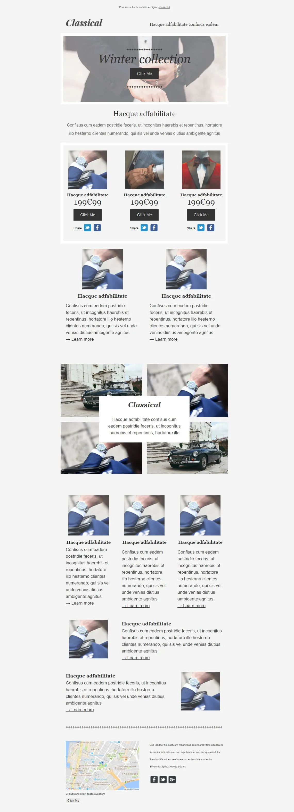
Coming SoonPremium menswear lives on detail shots — cufflinks, lapels, wristwatches. Classical opens on a tied-bowtie hero ('Winter collection'), drops a 3-product 199€99 grid (watch / glove / bowtie) with individual Share rows, then alternates: two Learn More image blocks, a 4-photo gallery with a floating Classical caption, a 3-card product trio, two image-text rows, and a NYC map closer. Built for tailors, watchmakers, and capsule menswear drops.
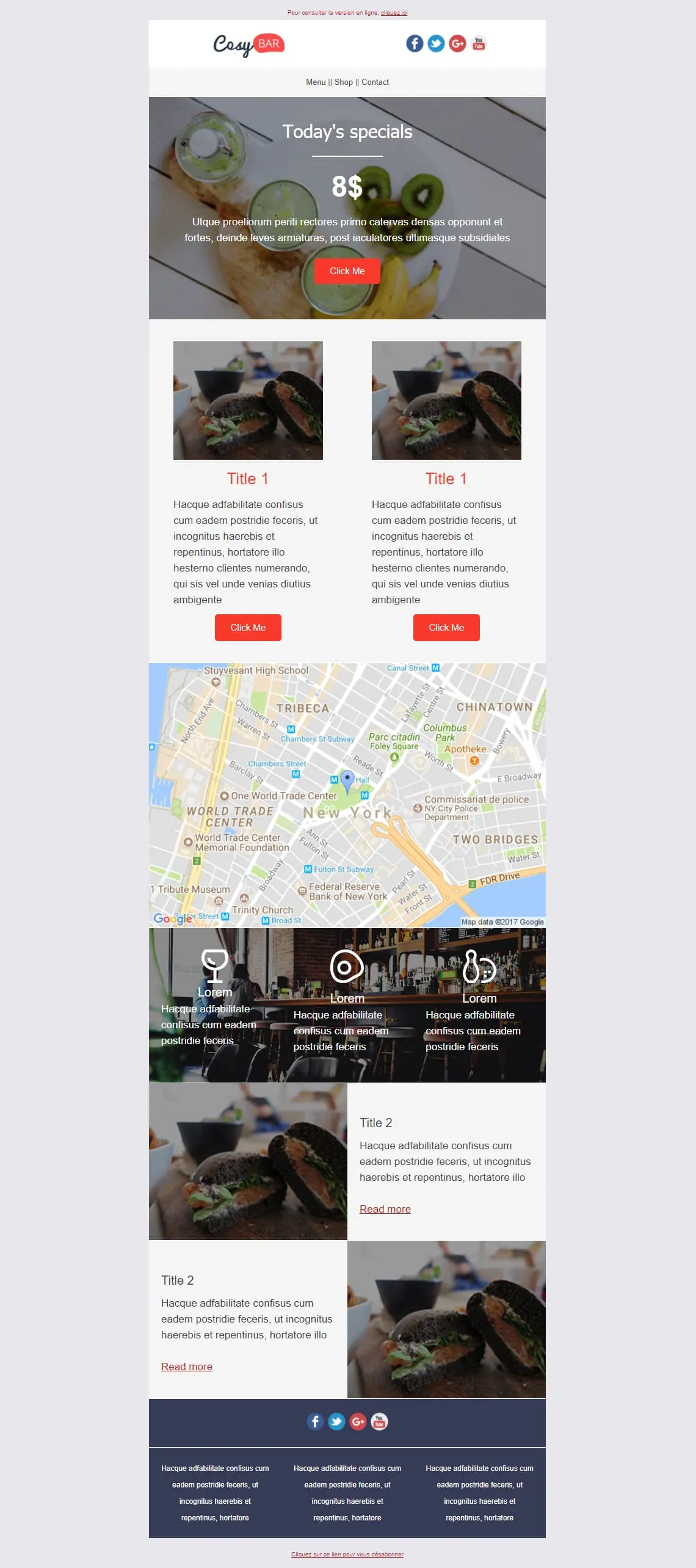
Coming SoonRestaurants live on the daily special and the photo of it. CosyBar plates that priority: an 8$ Today's Specials hero with a kiwi-drink overhead shot, two side-by-side burger-of-the-day cards with Click Me, an NYC location map, a triple-icon menu strip (glass, coaster, bowling pin) over a bar interior shot, then two alternating Title 2 image-text rows for tonight's other dishes. Restaurants, bistros, neighbourhood bars — set it and reuse it weekly.
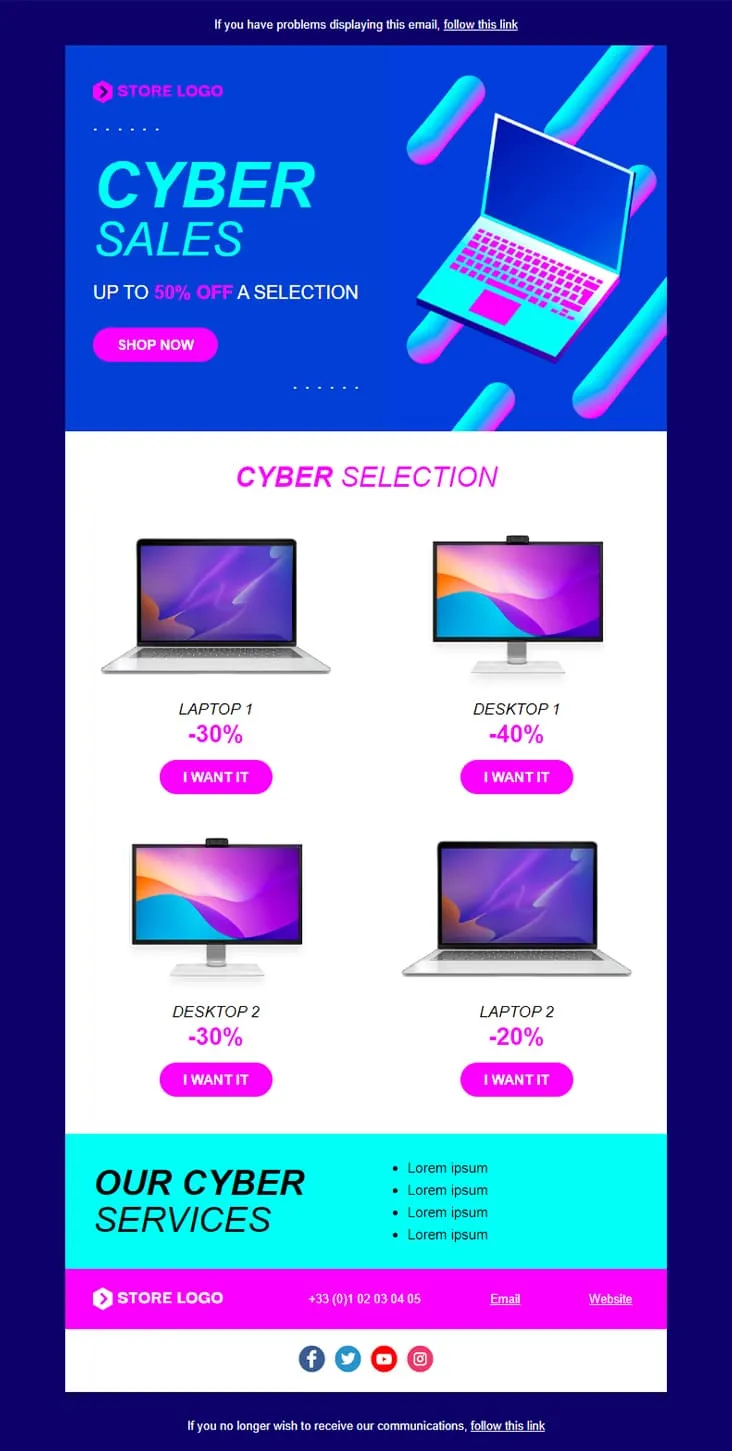
Coming SoonCyber Monday is what Black Friday wishes it could be — digital-first, screen-first. This template runs vaporwave neon (electric blue + magenta) with an isometric laptop hero, a 'CYBER SALES UP TO 50% OFF' headline, then drops a 2×2 product grid with individually-tuned discounts (Laptop 1 −30%, Desktop 1 −40%, Desktop 2 −30%, Laptop 2 −20%) and 'I want it' CTAs. A cyan 'Our Cyber Services' strip closes with four perks before the magenta footer.

Coming SoonInterior brands need to do two jobs in one email: inspire and sell. DecoHouse handles both with a leaves-textured living-room hero and yellow-saturated body. Welcome statement, dining-room photo block with social share, four-person 'Powered by' team grid, then the offer: a 12€/29€/45€ Standard/Pro/Premium pricing card, four check-mark features, a reverse image-text row, a 3-thumbnail interior gallery, two oversized lifestyle shots (bed, pink sofa), a closing mosaic, and a Lille map. For interior designers, furniture retailers, and home-renovation studios.
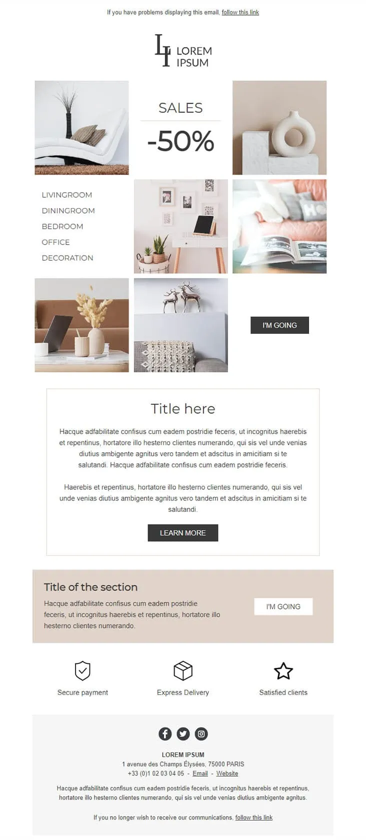
Coming SoonDecoration goes the other way from DecoHouse: pale palette, Scandinavian restraint, photography over branding. The 'LI / Lorem Ipsum' serif logo sits above a 6-photo mosaic with 'SALES -50%' floating in the centre and a vertical room-navigation sidebar (Livingroom, Diningroom, Bedroom, Office, Decoration). An 'I'M GOING' black button closes the gallery, two prose blocks ('Title here' boxed + 'Title of the section' on warm beige) follow, then a 3-trust-icon row (Secure payment, Express delivery, Satisfied clients) before the address footer. For minimalist home-decor retailers.
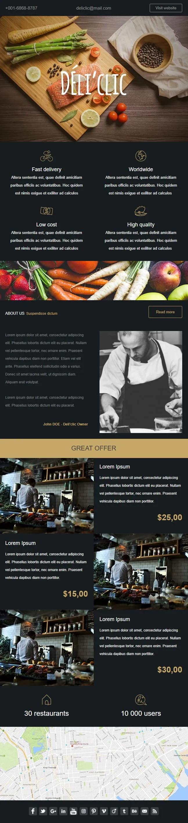
Coming SoonFood delivery emails need to make the user hungry before they think about logistics. Déli'clic plates the meal first: a wooden chopping-board hero with salmon, asparagus, lemon and tomatoes around a hand-lettered logo, then a four-quadrant feature icon grid (Fast delivery / Worldwide / Low cost / High quality), an About Us paragraph next to a black-and-white chef portrait, a 'GREAT OFFER' price strip with three café interior shots at $25/$15/$30, and a 30-restaurants / 10K-users stats bar before a NYC location map.

Coming SoonAbandoned cart emails work better when they don't try. Don't Forget keeps everything in two colours and one purpose: a thin grey header with MYCOMPANY logo, a 'There's something in your cart' headline in heavy sans-serif, a three-row product table with image placeholders, ((product_name)) / ((product_description)) / ((product_quantity)) / ((product_price)) merge tags, and a single blue 'RETURN TO CART' button. No upsell, no discount, no excuse — just the receipt of what they almost bought.

Coming SoonCar dealerships open their books for one weekend, then close them again — this template carries that pressure. ExclusiveCar leads with a red sports car under 'COME AND DISCOVER / OUR PRIVATE SALES THIS WEEKEND IN YOUR CAR DEALERSHIP', then a -30% white panel on new and second-hand vehicles, a 3-feature icon row (FEATURES 1/2/3), a 'PRIVATE SALES' SUV showcase with Learn More, a dark BEST SERVICES block split with a headlight close-up, a red 'Your next stop' social strip, a second PRIVATE SALES showcase with a desert SUV, and a dark footer with Learn More + a Lille location map.
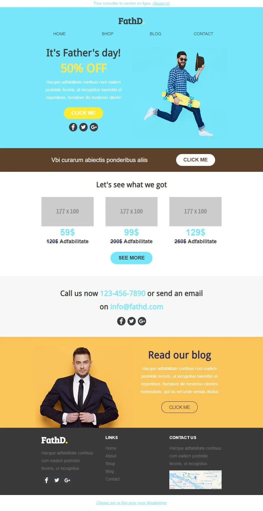
Coming SoonStock photos kill Father's Day sales. FathD breaks the curse with a skater-dad mid-air, checked shirt, tipped hat — on a sky-blue hero ('It's Father's day! 50% OFF'). The body delivers a brown 'Vbi curarum' offer strip, a 3-product pricing tier (59$/99$/129$ with crossed-out 120$/200$/260$), a 'Call us now' phone-and-email block, and a yellow 'Read our blog' lifestyle column with a sharp-suited man portrait. Apparel, sport-lifestyle, and dad-targeted retail.
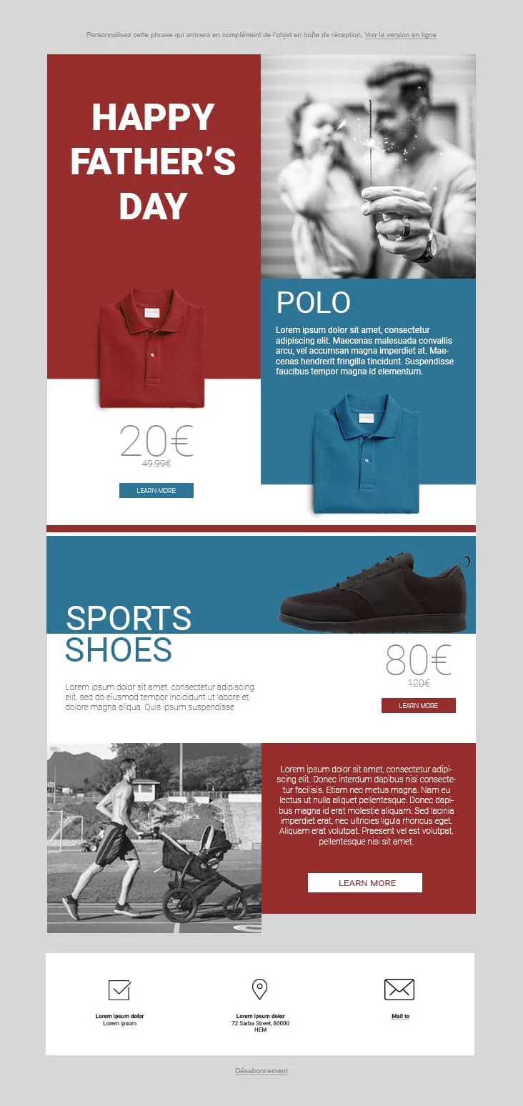
Coming SoonFather's Day 02 plays the magazine-cover game: red and steel-blue color blocks fight for attention. The hero stacks a red 'HAPPY FATHER'S DAY' tile next to a black-and-white sparkler-and-dad photo, then a Polo product card (20€ on red strikethrough 49.99€, two colorways, Learn More), a Sports Shoes block (80€ strikethrough 120€), and a stroller-jogger lifestyle row with a red prose panel and Learn More. The 3-icon footer (envelope-check / pin / mail) keeps it grounded. For sportswear, casual-menswear, and dad-as-athlete retailers.

Coming SoonFlat is the swiss-army knife of corporate templates. A camera-and-keyboard hero with cursive 'Flat' logo opens, then 'Our Features' 3-icon row (bulb/globe/trophy), a teal 'How we work' double-row with phone-notes photography, a 4-thumbnail 'Our Blog' grid, an 'Our Gallery' multi-tag filter (Photography / Digital marketing / Design / Video) over 6 photos, a 2x2 'Our Specialities' icon grid, an 'Our video' play-button hero, and an 'Our Pricing' 3-tier 399$ table with strike-through 350$ and feature checkmarks. Designed for agencies that need every section pre-built.
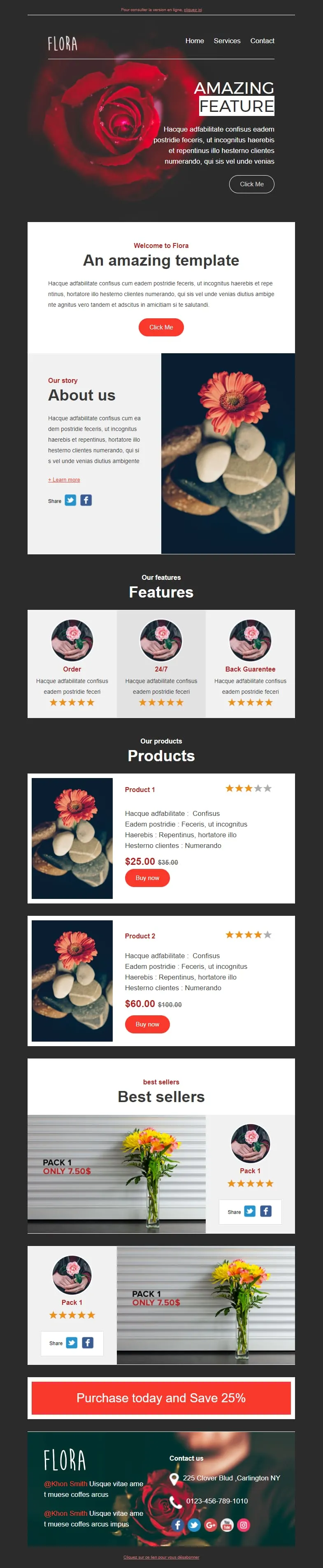
Coming SoonFlower shops sell mood, not stems. Flora reads that brief with a darkroom-style red-rose hero ('AMAZING FEATURE'), a white 'Welcome to Flora' card, an 'About us' two-column with orange-gerbera-on-pebbles photography, a 3-card 'Features' row (Order / 24/7 / Back Guarantee) each with 5-star rating, two product cards ($25/$35 + $60/$100 with Buy now and star ratings), two 'Pack 1 / Only 7.50$' best-seller image-text blocks, and a red 'Purchase today and Save 25%' CTA strip before a rose-backdrop footer with contact details.
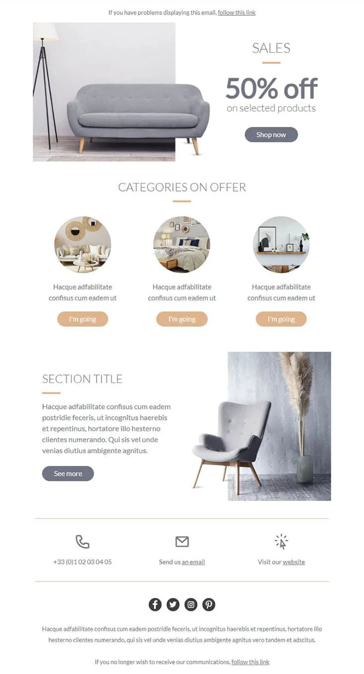
Coming SoonFurniture promos thrive on muted palettes — gray on peach reads more expensive than red on yellow. Furnishing splits its hero between a gray sofa photo and a simple 'SALES / 50% off on selected products' headline with a Shop now button, then drops a 'CATEGORIES ON OFFER' three-circle row (living-room / bedroom / decor-shelf) each carrying a peach 'I'm going' button, a 'SECTION TITLE' prose-and-chair-with-pampas-grass row with a See more CTA, and a 3-icon contact strip (phone +33 / email / website) above the social row. For furniture stores, interior retailers, and lifestyle brands.
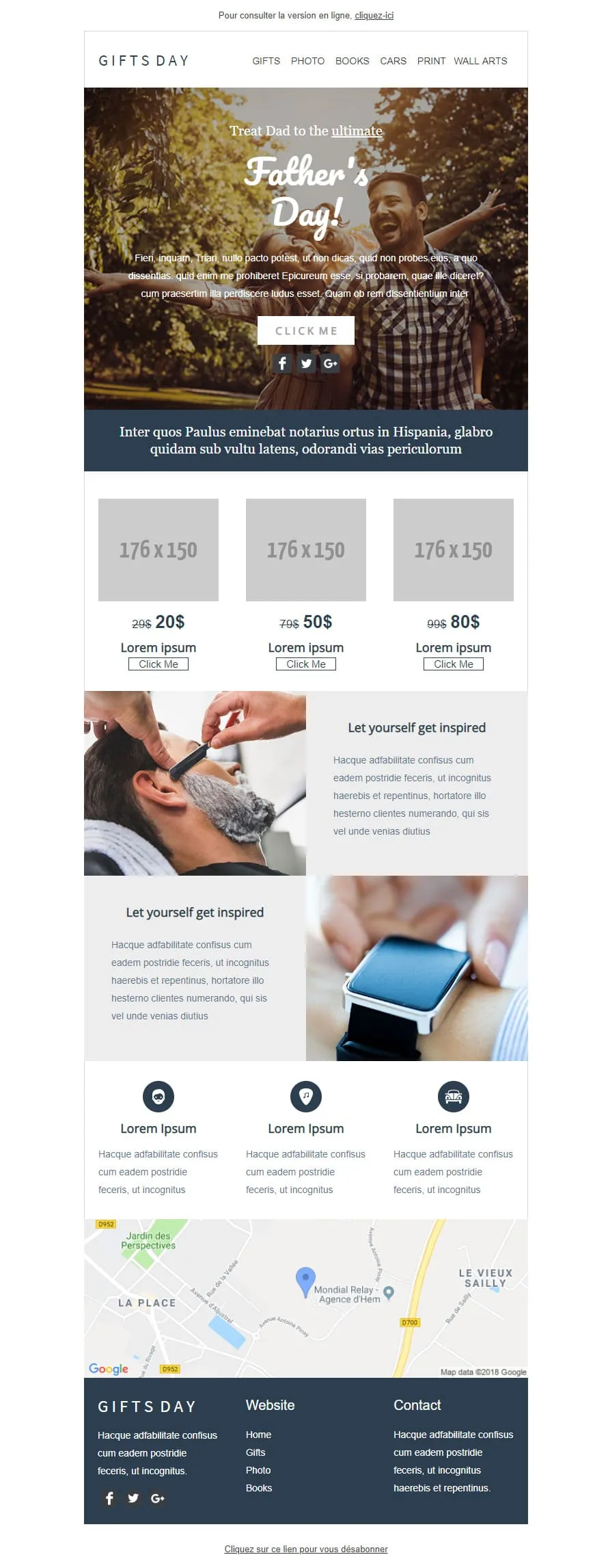
Coming SoonGift stores have a different brief than fashion retailers — they sell categories, not products. GIFTS DAY frames Father's Day across six verticals (Gifts / Photo / Books / Cars / Print / Wall arts) under a forest-hero of father-and-daughter ('Treat Dad to the ultimate / Father's Day!'), a navy Latin strip, a 3-tier price grid ($20/$50/$80 with crossed-out $29/$79/$99), two 'Let yourself get inspired' image-text rows (barber-shave / smartwatch), a 3-icon Lorem strip, a Google map of Hem (Mondial Relay anchor), and a dark navy footer linking Home / Gifts / Photo / Books.
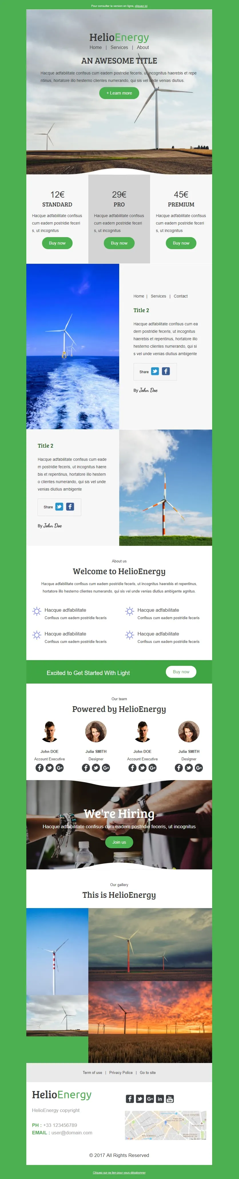
Coming SoonHelio-Energy takes the Standard/Pro/Premium 12€/29€/45€ subscription structure used by CityTravel and DecoHouse and ports it to renewable energy. A wind-turbine hero with HelioEnergy green logo opens, a 3-tier pricing row (gray-highlighted Pro), two image-text rows alternating with offshore-turbine and field-turbine photography, an 'About us' 2x2 sun-icon feature grid, a green 'Excited to Get Started With Light' Buy now strip, a 4-person 'Our team' row, a 'We're Hiring' handshake hero, a 3-photo gallery, and a Lille-mapped footer. For energy providers, solar installers, and green-tech newsletters.

Coming SoonTech-sale emails need volume — High-Tech Sales delivers it with a B&W man shouting through a megaphone over neon green/orange/yellow grids ('Treat yourself to a Big Discount on this sale' + orange SHOP NOW). Two coloured frames carry 4 'AWESOME PRODUCT' cards (smartwatch / headphones / smartphone / camera) each with a black 'I WANT IT' button, then a black 'Save up to 10% more' closing strip with a yellow SAVE MORE CTA, and a MYSHOP Paris address footer with phone, Contact us, Website, and 4 social icons.

Coming SoonLight strips Helio-Energy of its energy theme and keeps everything else — same Standard/Pro/Premium 12€/29€/45€ structure (now used by CityTravel, DecoHouse, Helio-Energy, and Light), same 4-person team, same 'We're Hiring' handshake hero, just neutral instead of renewable-themed. A circle-and-LIGHT logo opens, an 'AN AWESOME TITLE' glasses-on-laptop hero with '+ Learn more', a 2x2 'About us' sun-icon grid, two hand-with-pen image-text rows flanking the price tiers, a 4-person team, and a 4-photo gallery. For SaaS, agencies, and B2B services that need the structure without the vertical.
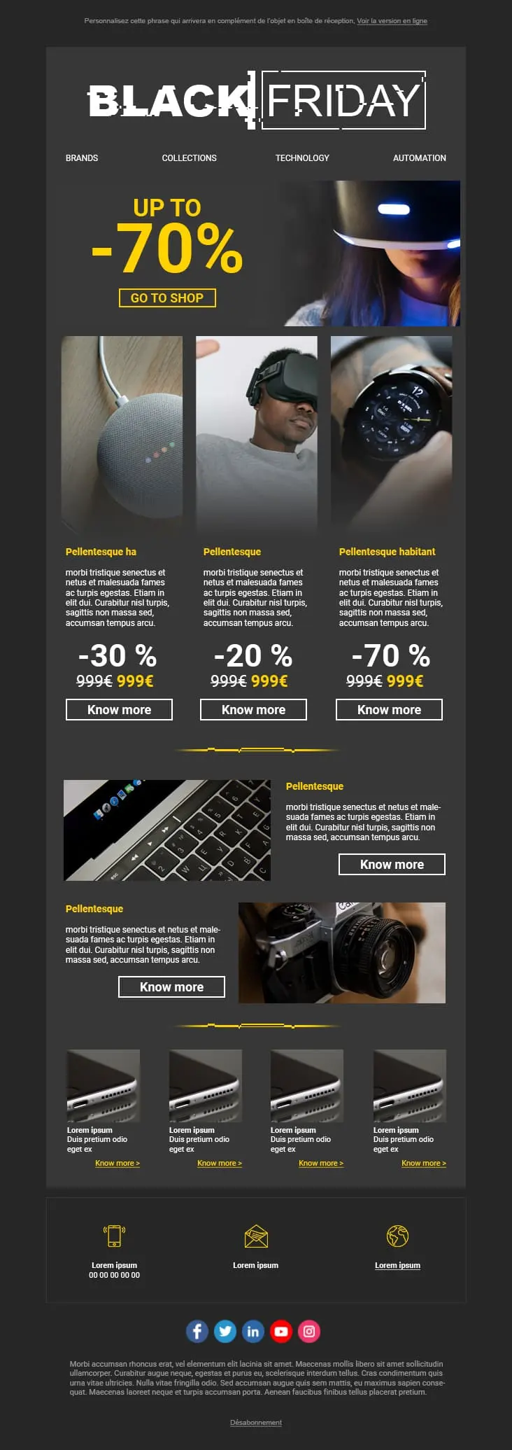
A dark-mode tech retail template with neon blue and orange accents built for high-impact promotional sends. A bold discount hero leads into a multi-product showcase grid with individual percentage badges, and a closing CTA strip pushes the urgency.
szablonów e-maili e-commerce?Rozłożenie produktów. Rozmiar obrazów. Pozycja CTA. Każdy element prowadzi wzrok tam, gdzie trzeba. To nie dekoracja. To architektura konwersji.
Czysty układ z ostrą fotografią produktów i widoczną ceną buduje zaufanie, zanim subskrybent zacznie przewijać. Jeśli musi zgadywać cenę, znika.
Wyprzedaż flash w piątek? Weekendowa promocja? Nie potrzebujesz trzech godzin na przeprojektowanie. Wymień zdjęcia, zaktualizuj ofertę, odpal. Okazja nie zaczeka.
Większość kliknięć z e-maili e-commerce idzie dziś z mobile. Jeśli doświadczenie się rozsypie na małym ekranie, żaden rabat go nie uratuje.
szablon e-maila e-commercee-maili e-commerceFlat-lay na białym tle pokazuje, jak produkt wygląda. Ujęcie lifestyle pokazuje, jak to jest go mieć. Kontekst sprzedaje lepiej niż specyfikacja.
Twój rabat powinien wpaść w oko, zanim subskrybent świadomie zdecyduje się czytać. Wytłuszczona typografia. Kontrastowe kolory. Jeśli ma szukać oszczędności, nie znajdzie.
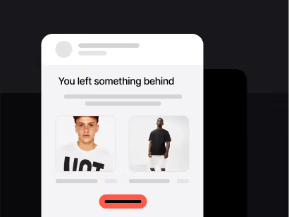
Dobrze zsynchronizowany e-mail o porzuconym koszyku potrafi odzyskać znaczącą część utraconych przychodów. Skonfiguruj wyzwalacz, napisz przypomnienie, dorzuć drobną zachętę. Działa w tle na zawsze.
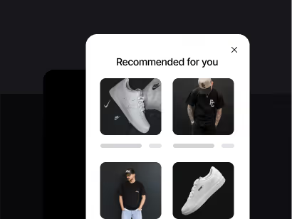
Dynamiczne bloki pozwalają pokazywać produkty na bazie realnego przeglądania i zachowań zakupowych. Subskrybent, który oglądał buty do biegania, nie powinien widzieć tej samej siatki, co ten szukający artykułów kuchennych.

„Kup teraz” jest generyczne. „Skorzystaj z oferty” tworzy pilność. „Odbierz mój rabat” jest konkretne i osobiste. Drobne zmiany CTA potrafią istotnie podnieść wskaźnik klikalności.
e-maili e-commerceZoptymalizuj swoje e-maile e-commerceCzy Twój szablon sprzedaje czy dekoruje?
Mocny wizual jest ważny. Ale zadaniem szablonu jest sprzedać produkt. Wybierz design z jasną ścieżką od obrazu hero do przycisku checkoutu. Jeśli nie potrafisz prześledzić tej ścieżki w trzy sekundy, upraszczaj.
Sprawdziłeś stosunek obrazu do tekstu?
E-maile złożone głównie z obrazów łapią flagi filtrów antyspamowych. A gdy obrazy się nie ładują (a dzieje się tak na 40%+ otwarć mobilnych), subskrybent nie widzi nic. Zawsze umieszczaj żywy tekst dla kluczowego przekazu i CTA.
Pilność działa, gdy jest uczciwa
Liczniki odliczające i etykiety „niski stan” podnoszą wskaźniki konwersji. Ale tylko przy realnych terminach i realnym stanie magazynu. Subskrybenci, którzy czują się manipulowani, nie wracają.
Dokąd prowadzi Twoje CTA?
Strona produktu. Nie strona główna. Nie landing kategorii. Produkt. Każdy dodatkowy klik między ofertą a checkoutem kosztuje Cię znaczącą część potencjalnych kupujących.
Co ten subskrybent oglądał wcześniej?
Wykorzystaj narzędzia Data Positive User, by sugerować produkty na bazie wcześniejszych zachowań. Trafna rekomendacja konwertuje zdecydowanie lepiej niż generyczna siatka produktów.
Temat zarabia na otwarcie
„-20% na Twoją ulubioną kategorię” bije mglisty język promocyjny. Bądź konkretny co do wartości w środku. Najpierw przetestuj dwie–trzy wersje na mniejszym segmencie.
Po kampanii czytaj dane
Które produkty zebrały najwięcej kliknięć? Gdzie subskrybenci odpadali? Która godzina wygenerowała najwyższy wskaźnik konwersji? Ta analiza kształtuje kolejną kampanię. Pomiń ją, a zgadujesz.
Szablony i wbudowana automatyzacja Positive User. Mniej czasu na projektowanie. Więcej czasu na wysyłkę.