





Art
Newsletter
Lifestyle
E-commerce e offerte
Immagina che ogni email sia la vetrina di un negozio. La tua invoglia le persone a entrare? Questi template ti aiutano a mettere in risalto i prodotti, promuovere le offerte e trasformare gli iscritti in acquirenti. Scegli un layout, inserisci il tuo catalogo e pubblica in pochi minuti grazie all'editor drag&drop di Positive User.
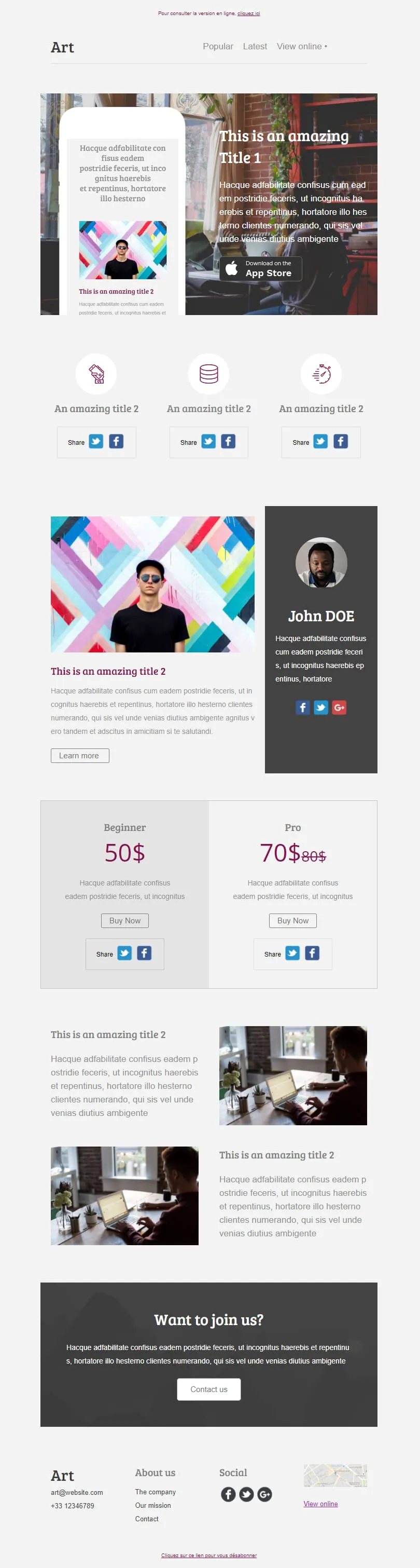
template email per e-commerce e offerteComing SoonSei blocchi di contenuto distinti si combinano in un unico layout editoriale: un elemento di risalto dedicato all’App Store con un mockup di telefono, una riga con tre icone di condivisione, una colonna dedicata all’autore con il suo profilo, un piano tariffario “Principiante/Professionista” con il prezzo di riferimento barrato, due immagini in primo piano e un invito all’azione “Unisciti a noi”. Scegli quelli che ti servono: la struttura si adatta alle tue esigenze.

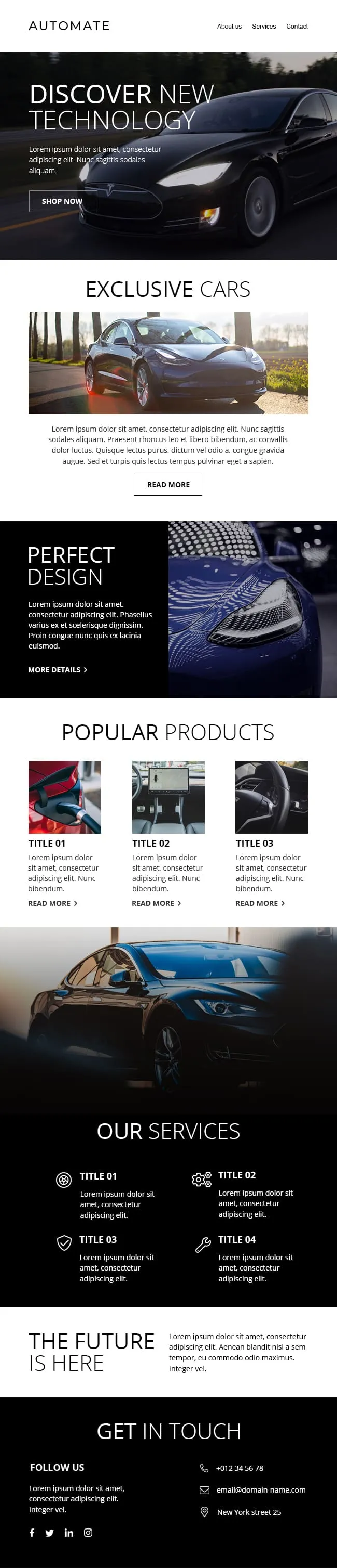
I contenuti premium dedicati al settore automobilistico tendono a passare inosservati nelle caselle di posta elettronica: sono troppo densi o troppo semplici. Questo layout presenta un'immagine principale a tutto campo, con il nero che si staglia sull'asfalto, su uno sfondo tenue con la scritta «Auto esclusive» in secondo piano, per poi suddividersi in tre schede di prodotto, una riga di quattro icone relative ai servizi e un pannello finale «Contattaci» pensato per il passaggio al reparto vendite.
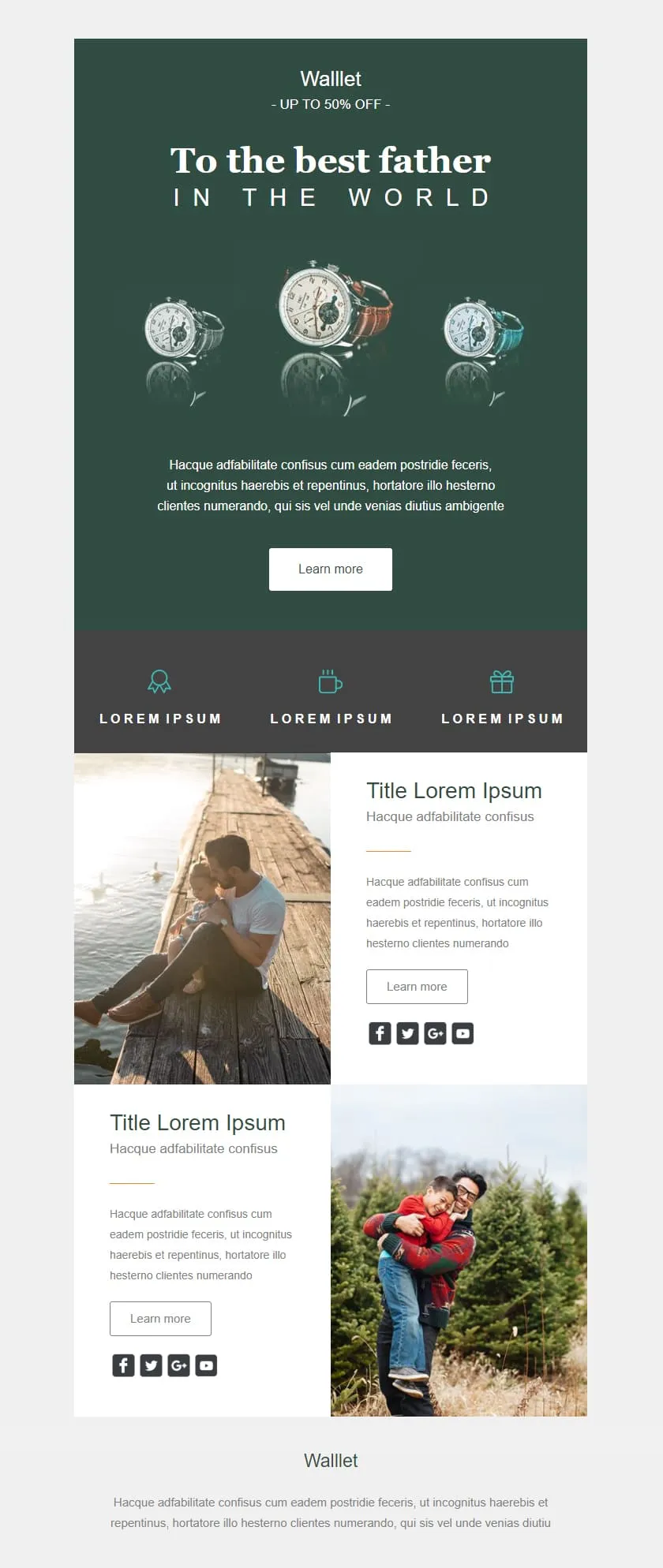
Gli sconti al dettaglio possono dare l’impressione di essere economici; questo invece trasmette un’immagine di alta qualità. Uno sfondo verde intenso fa da cornice al titolo centrato “Al miglior papà” e a un trittico di orologi; un banner con lo sconto del 50% è inserito nel testo come una promessa discreta; tre icone che indicano i vantaggi sono disposte in una striscia color ardesia; infine, due righe di testo e immagini forniscono il contesto del prodotto prima del logo del marchio.
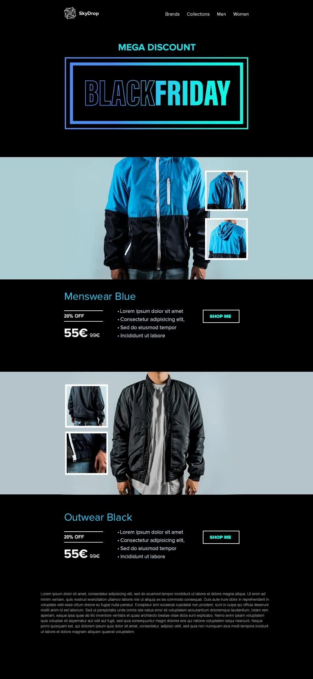
I capi di abbigliamento richiedono cartellini con lo sconto in stile “hangtag” e immagini a figura intera del prodotto; questo template offre entrambe le cose. L’immagine di apertura è dedicata al Black Friday, con una cornice al neon; seguono poi due coppie di foto di giacche (vista frontale + primi piani) su sfondi ciano e nero, ciascuna accompagnata da un cartellino con lo sconto del 20%, un prezzo di listino barrato e un pulsante “Acquista ora” che non lascia spazio a dubbi.
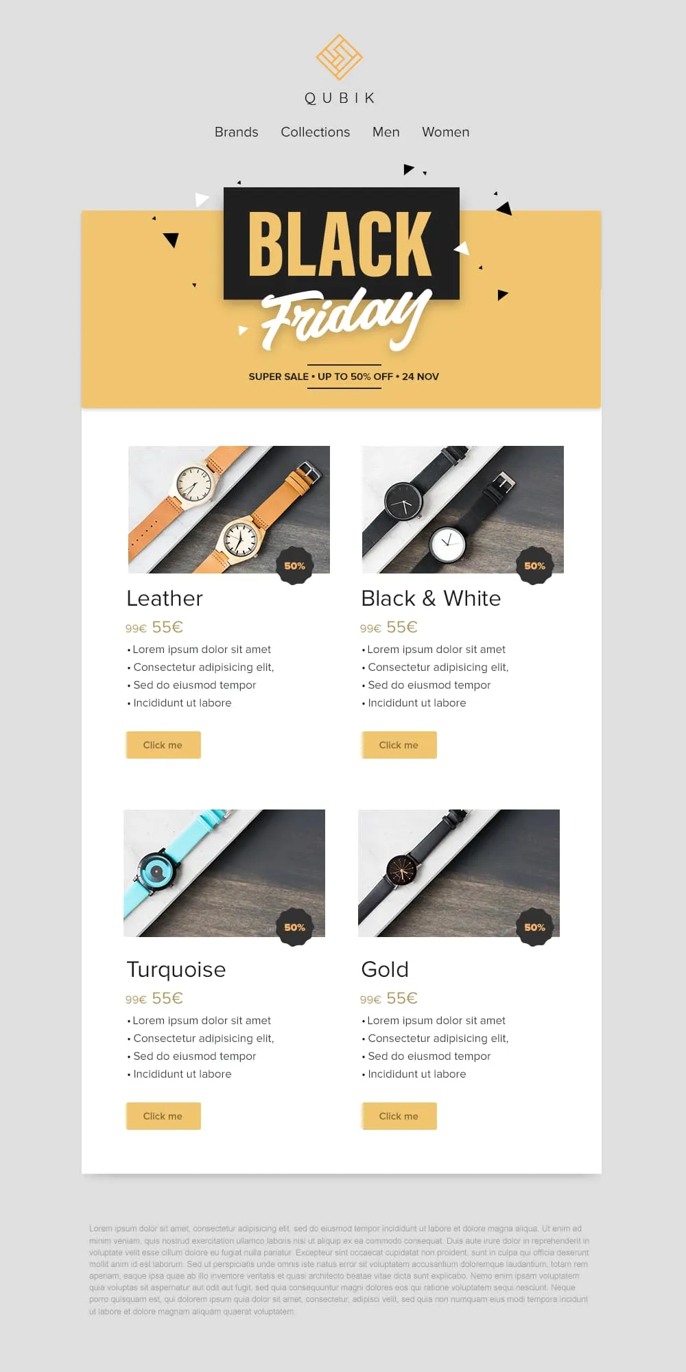
Quattro prodotti, quattro prezzi, quattro pulsanti: il gioco è fatto. Un banner giallo con coriandoli dedicato al Black Friday crea l’atmosfera, poi una griglia 2×2 presenta le varianti Pelle, Bianco e Nero, Turchese e Oro in schede abbinate. Ciascuna presenta un badge con lo sconto del 50%, un prezzo di riferimento barrato e un pulsante “Clicca qui” in giallo tenue.
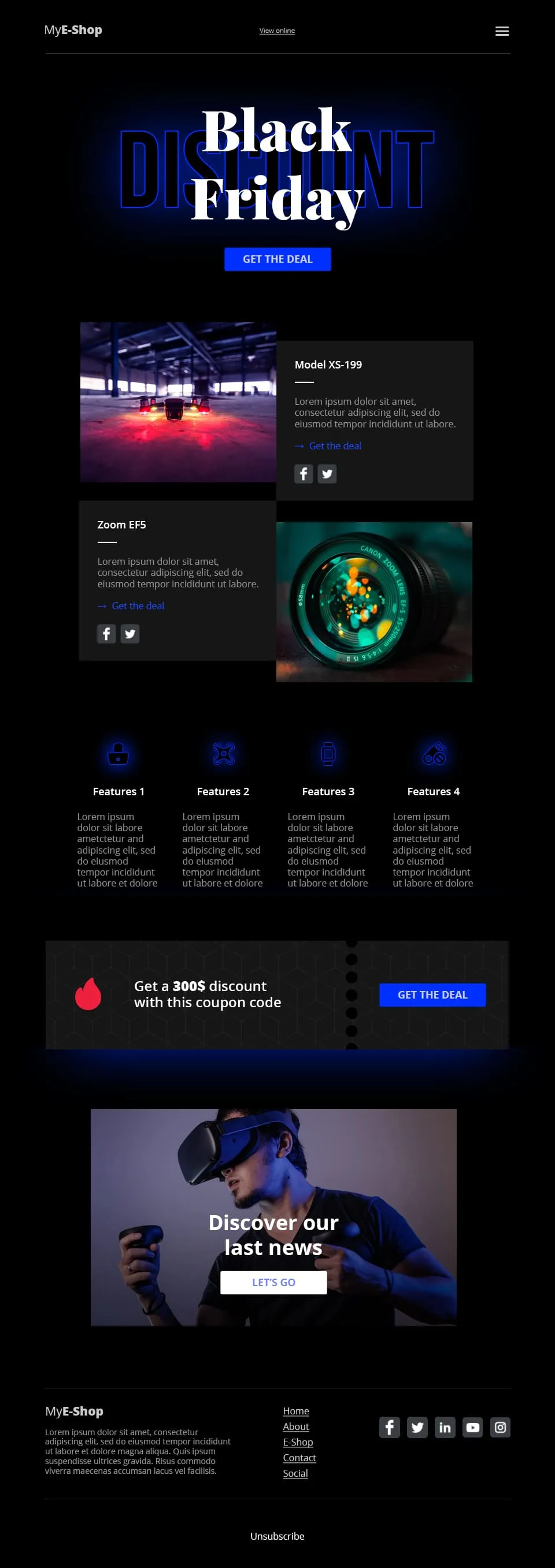
Il settore della vendita al dettaglio di prodotti tecnologici si basa sulla concretezza, non sul romanticismo. Questo template dai toni scuri con riflessi blu abbina il lettering tipografico “Black Friday” a un CTA “Approfitta dell'offerta”, divide la sezione successiva in due schede prodotto (Modello XS-199 + Zoom EF5), presenta una riga di 4 icone con le caratteristiche dei prodotti nella parte inferiore, inserisce una striscia con un codice sconto da 300 $ e conclude con una vetrina di prodotti in realtà virtuale collegata al CTA “Scopri le nostre ultime novità”.
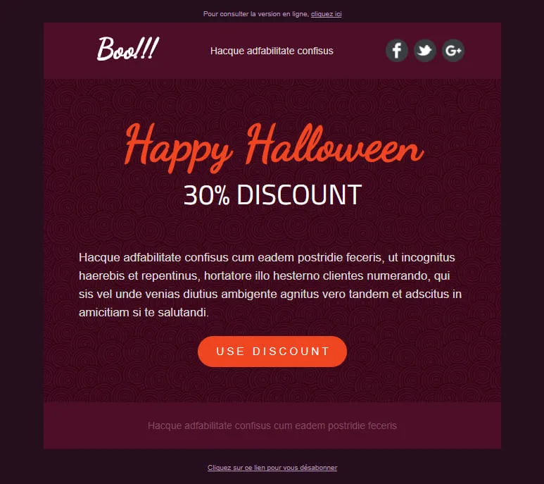
Le conversioni di Halloween dipendono da un'unica decisione: cliccare o no. Questo template elimina tutto il resto. Un elemento principale color prugna scuro con un motivo a spirale mette in risalto l'offerta, il titolo “Happy Halloween” scritto a mano cattura lo sguardo e l'unico pulsante arancione “Usa lo sconto” è l'unica azione da compiere. Nessuna distrazione, nessun secondo CTA, nessuna indecisione.
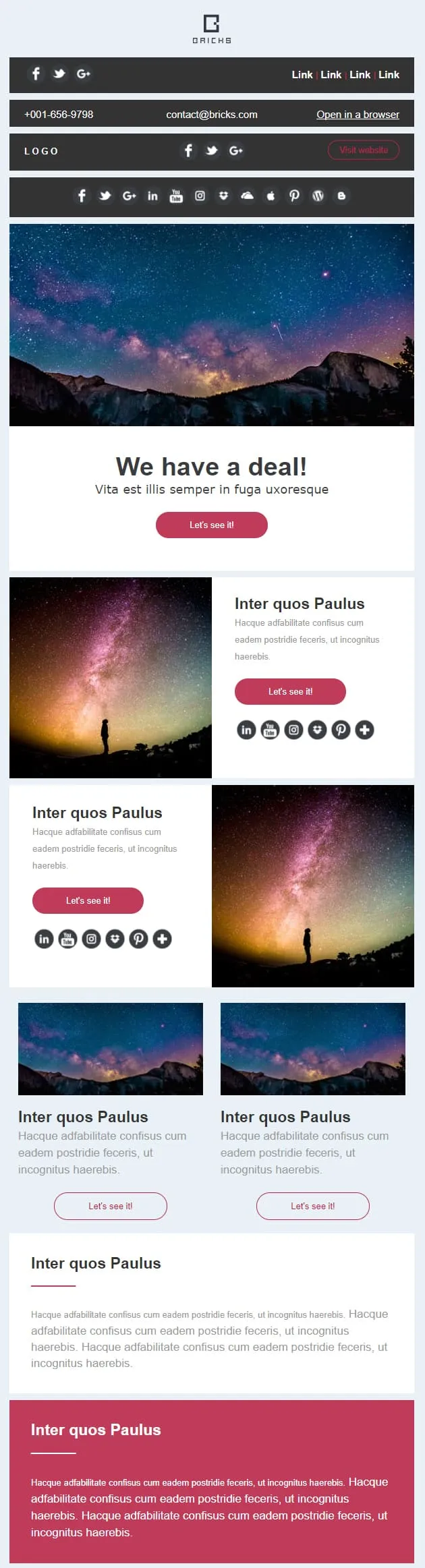
Alcune campagne richiedono un banner, altre una galleria, la maggior parte entrambe le cose. Questo template suddivide l'email in otto blocchi sovrapponibili: un banner promozionale con CTA “Scopriamolo”, coppie di righe con immagine e testo (a sinistra e a destra), due schede secondarie con miniature, una striscia larga in evidenza e una chiusura audace e contrastante. È possibile riordinare, trascinare o duplicare gli elementi: il layout rimane inalterato.
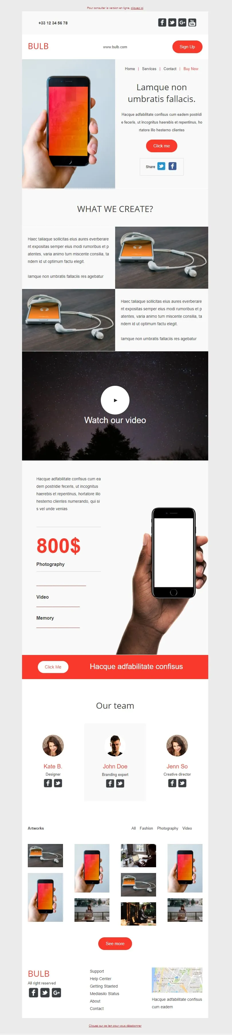
Questo template punta a fare tutto. Hero con smartphone in mano, due sezioni con immagine e testo dedicate al prodotto, un ampio blocco video, una colonna verticale con il prezzo (800 $) abbinata a un dettaglio dello smartphone, una barra arancione "Click Me", una sezione con il team composta da tre ritratti e un mosaico di quattordici miniature dei progetti. Tech brand di giorno, agenzia creativa di notte.
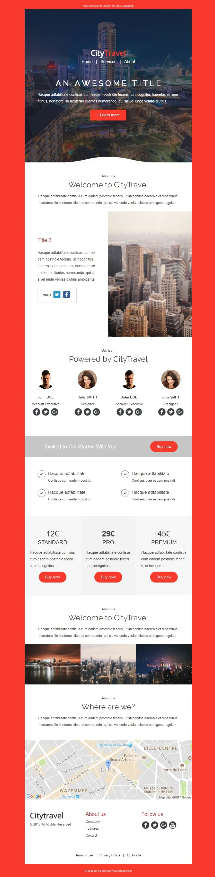
Coming SoonCity breaks need a pricing ladder. CityTravel opens on a red-framed nightscape with a 'Learn More' CTA, runs a Welcome statement next to a metropolis photo, lines up a 4-person team grid ('Powered by'), then drops the offer: a Standard/Pro/Premium tier table (12€/29€/45€) flanked by check-mark features, a 3-thumbnail city mosaic, and a Lille map closer. Built for tour operators selling weekenders.
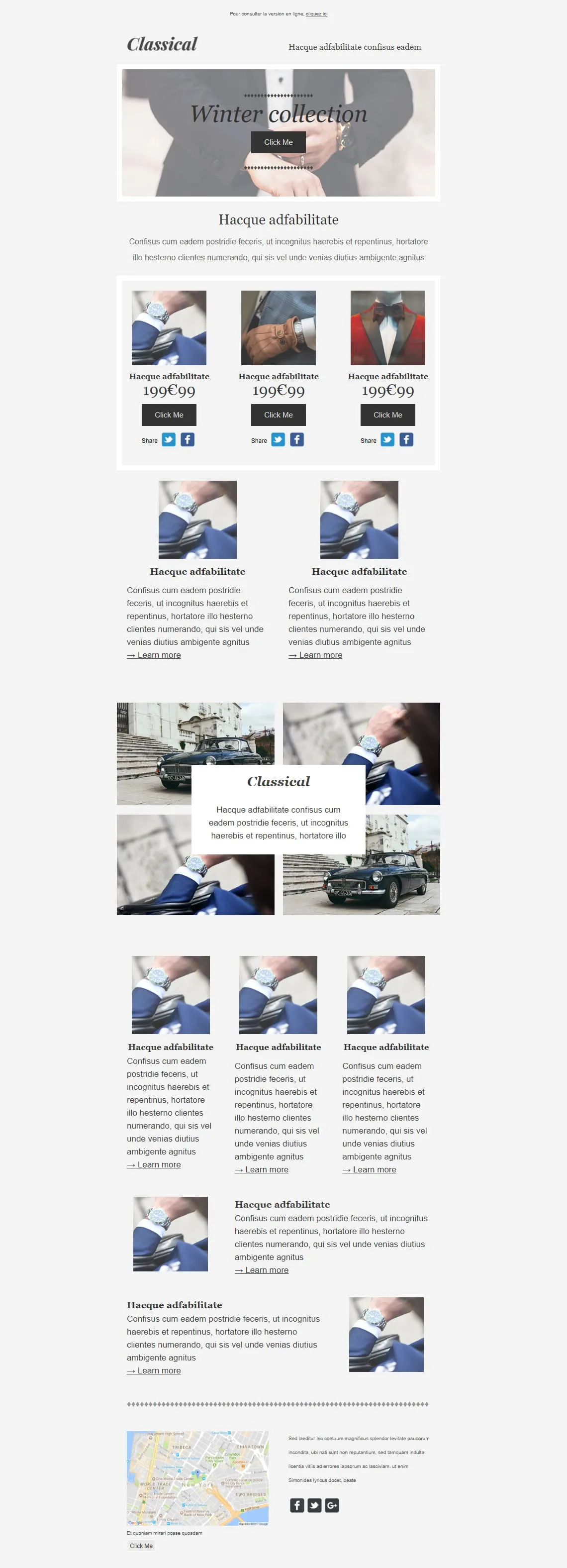
Coming SoonPremium menswear lives on detail shots — cufflinks, lapels, wristwatches. Classical opens on a tied-bowtie hero ('Winter collection'), drops a 3-product 199€99 grid (watch / glove / bowtie) with individual Share rows, then alternates: two Learn More image blocks, a 4-photo gallery with a floating Classical caption, a 3-card product trio, two image-text rows, and a NYC map closer. Built for tailors, watchmakers, and capsule menswear drops.
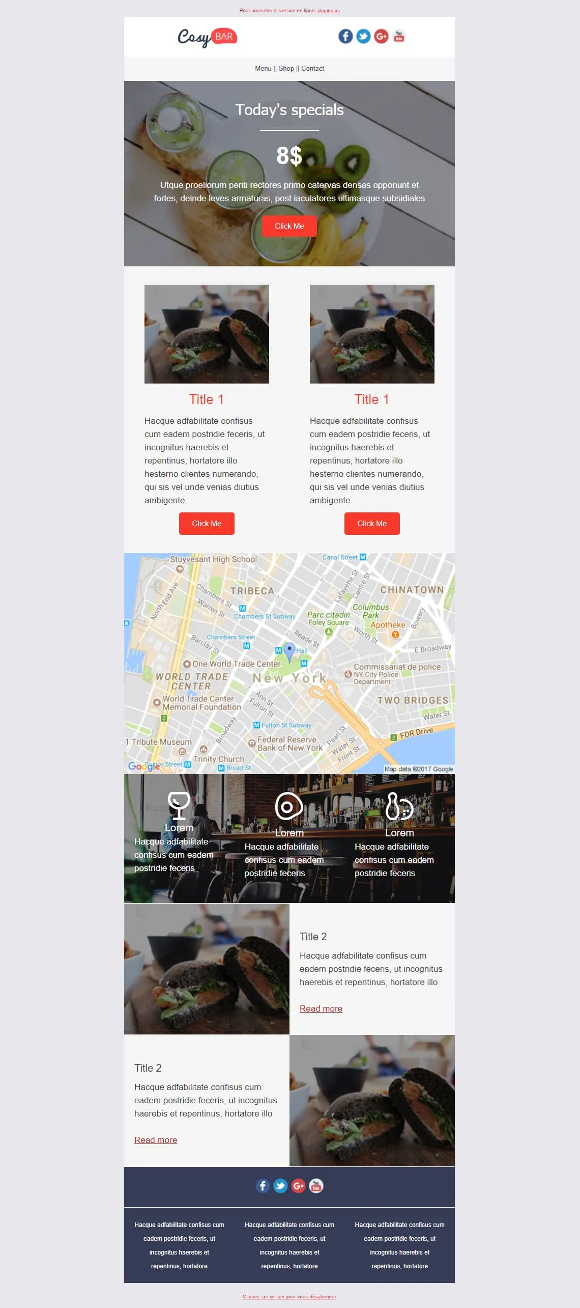
Coming SoonRestaurants live on the daily special and the photo of it. CosyBar plates that priority: an 8$ Today's Specials hero with a kiwi-drink overhead shot, two side-by-side burger-of-the-day cards with Click Me, an NYC location map, a triple-icon menu strip (glass, coaster, bowling pin) over a bar interior shot, then two alternating Title 2 image-text rows for tonight's other dishes. Restaurants, bistros, neighbourhood bars — set it and reuse it weekly.
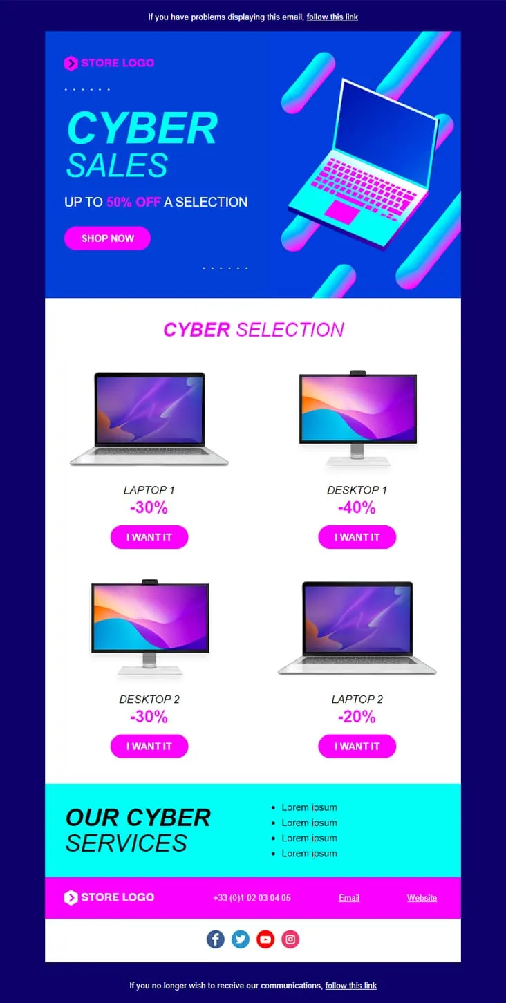
Coming SoonCyber Monday is what Black Friday wishes it could be — digital-first, screen-first. This template runs vaporwave neon (electric blue + magenta) with an isometric laptop hero, a 'CYBER SALES UP TO 50% OFF' headline, then drops a 2×2 product grid with individually-tuned discounts (Laptop 1 −30%, Desktop 1 −40%, Desktop 2 −30%, Laptop 2 −20%) and 'I want it' CTAs. A cyan 'Our Cyber Services' strip closes with four perks before the magenta footer.

Coming SoonInterior brands need to do two jobs in one email: inspire and sell. DecoHouse handles both with a leaves-textured living-room hero and yellow-saturated body. Welcome statement, dining-room photo block with social share, four-person 'Powered by' team grid, then the offer: a 12€/29€/45€ Standard/Pro/Premium pricing card, four check-mark features, a reverse image-text row, a 3-thumbnail interior gallery, two oversized lifestyle shots (bed, pink sofa), a closing mosaic, and a Lille map. For interior designers, furniture retailers, and home-renovation studios.
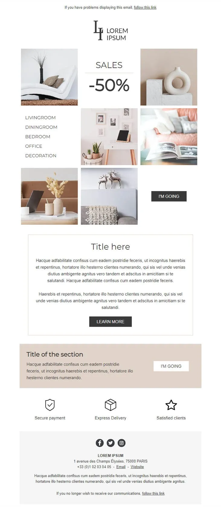
Coming SoonDecoration goes the other way from DecoHouse: pale palette, Scandinavian restraint, photography over branding. The 'LI / Lorem Ipsum' serif logo sits above a 6-photo mosaic with 'SALES -50%' floating in the centre and a vertical room-navigation sidebar (Livingroom, Diningroom, Bedroom, Office, Decoration). An 'I'M GOING' black button closes the gallery, two prose blocks ('Title here' boxed + 'Title of the section' on warm beige) follow, then a 3-trust-icon row (Secure payment, Express delivery, Satisfied clients) before the address footer. For minimalist home-decor retailers.
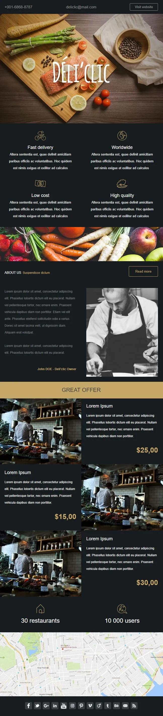
Coming SoonFood delivery emails need to make the user hungry before they think about logistics. Déli'clic plates the meal first: a wooden chopping-board hero with salmon, asparagus, lemon and tomatoes around a hand-lettered logo, then a four-quadrant feature icon grid (Fast delivery / Worldwide / Low cost / High quality), an About Us paragraph next to a black-and-white chef portrait, a 'GREAT OFFER' price strip with three café interior shots at $25/$15/$30, and a 30-restaurants / 10K-users stats bar before a NYC location map.

Coming SoonAbandoned cart emails work better when they don't try. Don't Forget keeps everything in two colours and one purpose: a thin grey header with MYCOMPANY logo, a 'There's something in your cart' headline in heavy sans-serif, a three-row product table with image placeholders, ((product_name)) / ((product_description)) / ((product_quantity)) / ((product_price)) merge tags, and a single blue 'RETURN TO CART' button. No upsell, no discount, no excuse — just the receipt of what they almost bought.

Coming SoonCar dealerships open their books for one weekend, then close them again — this template carries that pressure. ExclusiveCar leads with a red sports car under 'COME AND DISCOVER / OUR PRIVATE SALES THIS WEEKEND IN YOUR CAR DEALERSHIP', then a -30% white panel on new and second-hand vehicles, a 3-feature icon row (FEATURES 1/2/3), a 'PRIVATE SALES' SUV showcase with Learn More, a dark BEST SERVICES block split with a headlight close-up, a red 'Your next stop' social strip, a second PRIVATE SALES showcase with a desert SUV, and a dark footer with Learn More + a Lille location map.
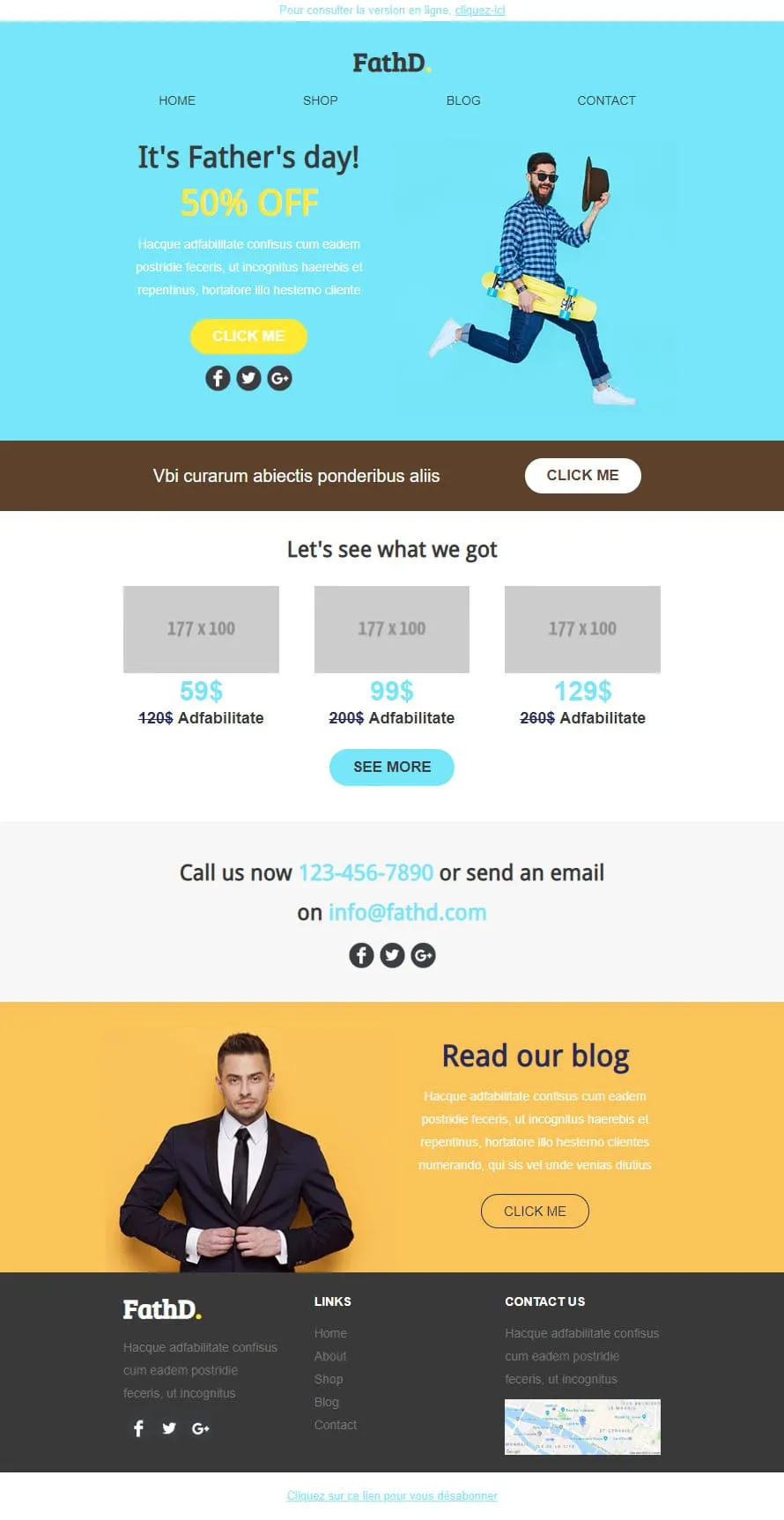
Coming SoonStock photos kill Father's Day sales. FathD breaks the curse with a skater-dad mid-air, checked shirt, tipped hat — on a sky-blue hero ('It's Father's day! 50% OFF'). The body delivers a brown 'Vbi curarum' offer strip, a 3-product pricing tier (59$/99$/129$ with crossed-out 120$/200$/260$), a 'Call us now' phone-and-email block, and a yellow 'Read our blog' lifestyle column with a sharp-suited man portrait. Apparel, sport-lifestyle, and dad-targeted retail.
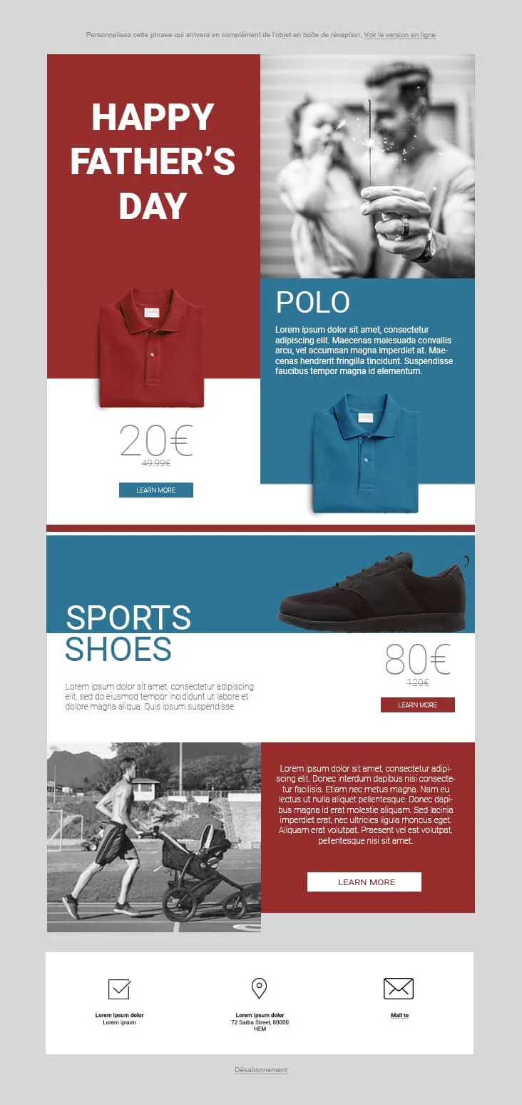
Coming SoonFather's Day 02 plays the magazine-cover game: red and steel-blue color blocks fight for attention. The hero stacks a red 'HAPPY FATHER'S DAY' tile next to a black-and-white sparkler-and-dad photo, then a Polo product card (20€ on red strikethrough 49.99€, two colorways, Learn More), a Sports Shoes block (80€ strikethrough 120€), and a stroller-jogger lifestyle row with a red prose panel and Learn More. The 3-icon footer (envelope-check / pin / mail) keeps it grounded. For sportswear, casual-menswear, and dad-as-athlete retailers.

Coming SoonFlat is the swiss-army knife of corporate templates. A camera-and-keyboard hero with cursive 'Flat' logo opens, then 'Our Features' 3-icon row (bulb/globe/trophy), a teal 'How we work' double-row with phone-notes photography, a 4-thumbnail 'Our Blog' grid, an 'Our Gallery' multi-tag filter (Photography / Digital marketing / Design / Video) over 6 photos, a 2x2 'Our Specialities' icon grid, an 'Our video' play-button hero, and an 'Our Pricing' 3-tier 399$ table with strike-through 350$ and feature checkmarks. Designed for agencies that need every section pre-built.
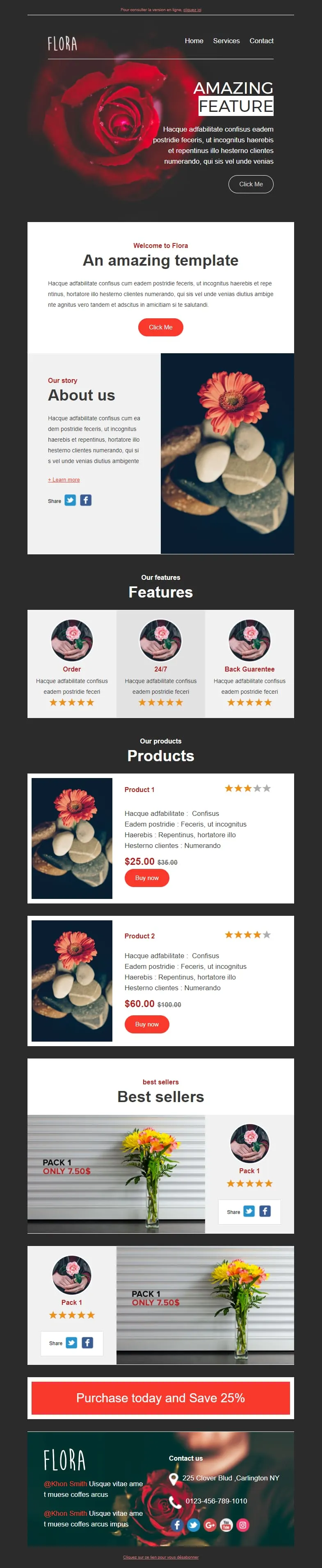
Coming SoonFlower shops sell mood, not stems. Flora reads that brief with a darkroom-style red-rose hero ('AMAZING FEATURE'), a white 'Welcome to Flora' card, an 'About us' two-column with orange-gerbera-on-pebbles photography, a 3-card 'Features' row (Order / 24/7 / Back Guarantee) each with 5-star rating, two product cards ($25/$35 + $60/$100 with Buy now and star ratings), two 'Pack 1 / Only 7.50$' best-seller image-text blocks, and a red 'Purchase today and Save 25%' CTA strip before a rose-backdrop footer with contact details.
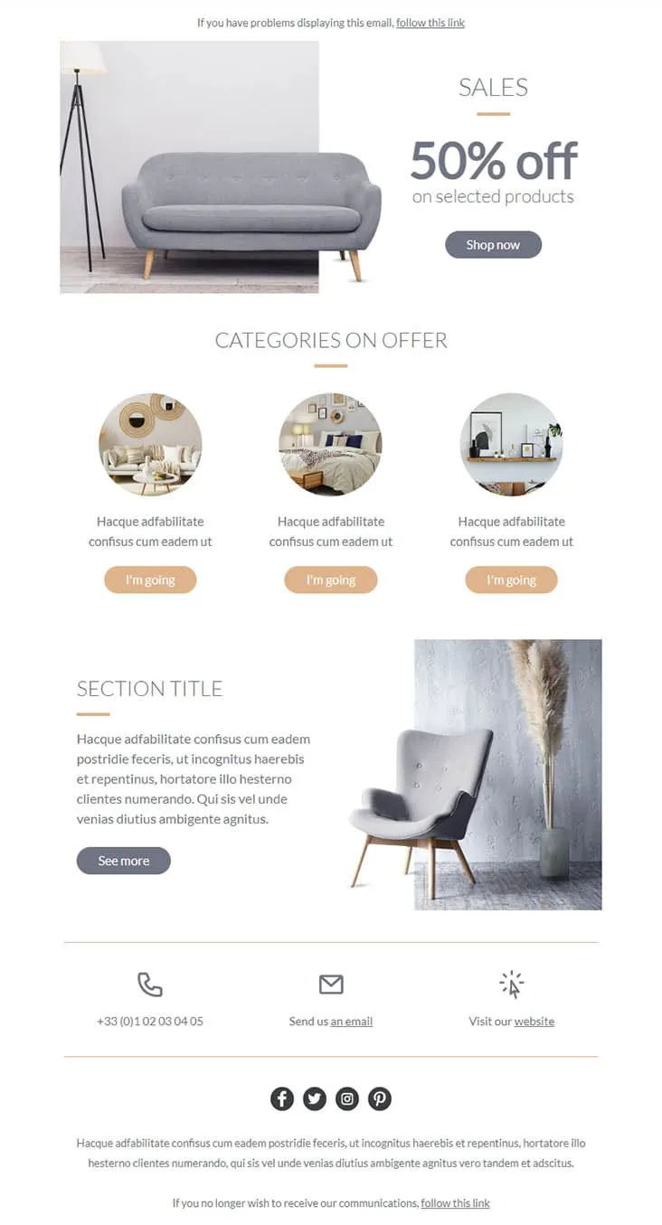
Coming SoonFurniture promos thrive on muted palettes — gray on peach reads more expensive than red on yellow. Furnishing splits its hero between a gray sofa photo and a simple 'SALES / 50% off on selected products' headline with a Shop now button, then drops a 'CATEGORIES ON OFFER' three-circle row (living-room / bedroom / decor-shelf) each carrying a peach 'I'm going' button, a 'SECTION TITLE' prose-and-chair-with-pampas-grass row with a See more CTA, and a 3-icon contact strip (phone +33 / email / website) above the social row. For furniture stores, interior retailers, and lifestyle brands.
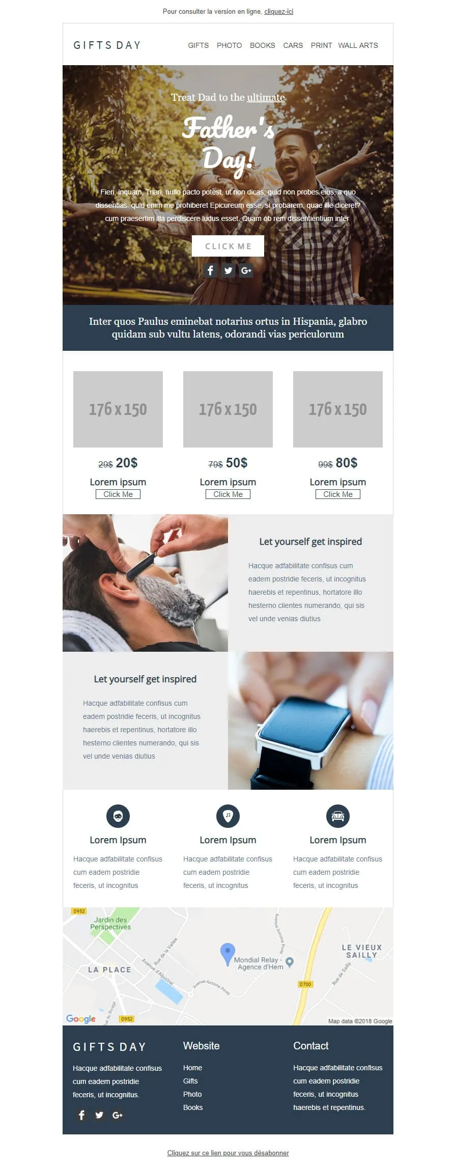
Coming SoonGift stores have a different brief than fashion retailers — they sell categories, not products. GIFTS DAY frames Father's Day across six verticals (Gifts / Photo / Books / Cars / Print / Wall arts) under a forest-hero of father-and-daughter ('Treat Dad to the ultimate / Father's Day!'), a navy Latin strip, a 3-tier price grid ($20/$50/$80 with crossed-out $29/$79/$99), two 'Let yourself get inspired' image-text rows (barber-shave / smartwatch), a 3-icon Lorem strip, a Google map of Hem (Mondial Relay anchor), and a dark navy footer linking Home / Gifts / Photo / Books.
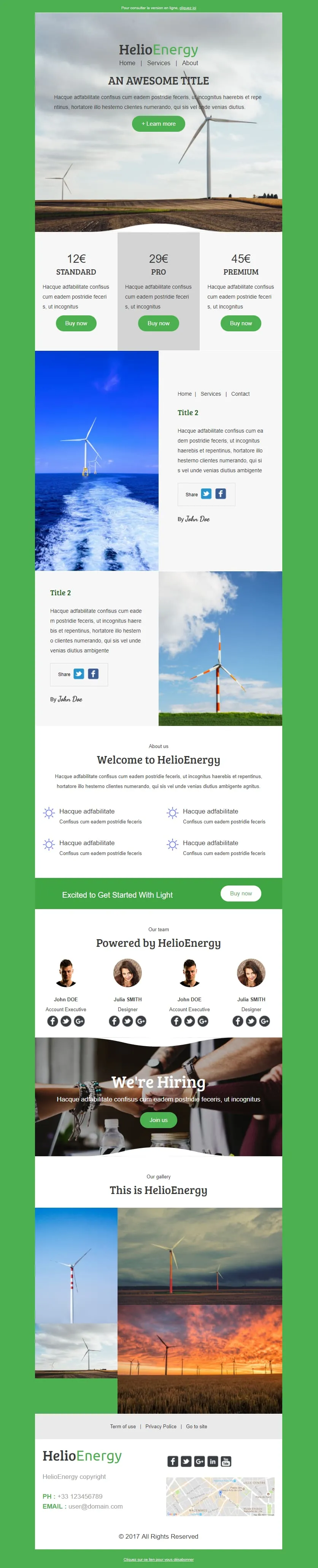
Coming SoonHelio-Energy takes the Standard/Pro/Premium 12€/29€/45€ subscription structure used by CityTravel and DecoHouse and ports it to renewable energy. A wind-turbine hero with HelioEnergy green logo opens, a 3-tier pricing row (gray-highlighted Pro), two image-text rows alternating with offshore-turbine and field-turbine photography, an 'About us' 2x2 sun-icon feature grid, a green 'Excited to Get Started With Light' Buy now strip, a 4-person 'Our team' row, a 'We're Hiring' handshake hero, a 3-photo gallery, and a Lille-mapped footer. For energy providers, solar installers, and green-tech newsletters.

Coming SoonTech-sale emails need volume — High-Tech Sales delivers it with a B&W man shouting through a megaphone over neon green/orange/yellow grids ('Treat yourself to a Big Discount on this sale' + orange SHOP NOW). Two coloured frames carry 4 'AWESOME PRODUCT' cards (smartwatch / headphones / smartphone / camera) each with a black 'I WANT IT' button, then a black 'Save up to 10% more' closing strip with a yellow SAVE MORE CTA, and a MYSHOP Paris address footer with phone, Contact us, Website, and 4 social icons.

Light strips Helio-Energy of its energy theme and keeps everything else — same Standard/Pro/Premium 12€/29€/45€ structure (now used by CityTravel, DecoHouse, Helio-Energy, and Light), same 4-person team, same 'We're Hiring' handshake hero, just neutral instead of renewable-themed. A circle-and-LIGHT logo opens, an 'AN AWESOME TITLE' glasses-on-laptop hero with '+ Learn more', a 2x2 'About us' sun-icon grid, two hand-with-pen image-text rows flanking the price tiers, a 4-person team, and a 4-photo gallery. For SaaS, agencies, and B2B services that need the structure without the vertical.
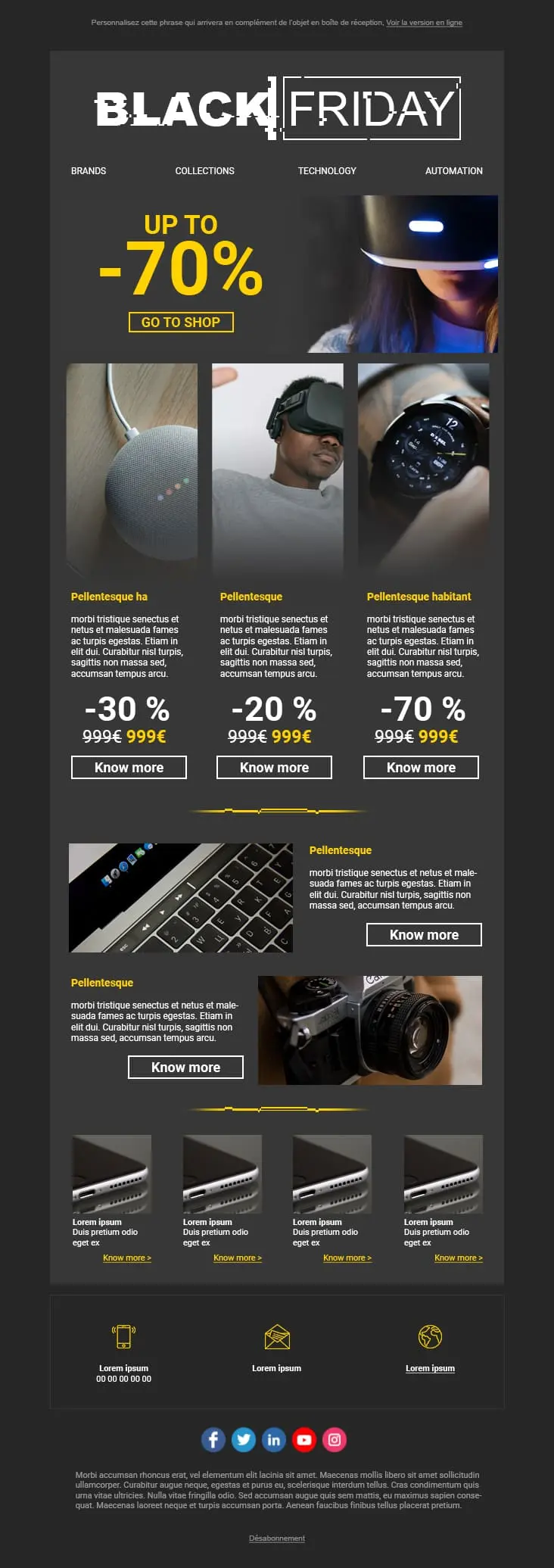
A dark-mode tech retail template with neon blue and orange accents built for high-impact promotional sends. A bold discount hero leads into a multi-product showcase grid with individual percentage badges, and a closing CTA strip pushes the urgency.
template email per l'e-commerce?Posizionamento dei prodotti. Dimensioni delle immagini. Posizionamento della CTA. Ogni elemento guida lo sguardo dove serve. Non si tratta di decorazione. È l’architettura della conversione.
Un layout pulito, con foto dei prodotti nitide e prezzi ben visibili, crea fiducia prima ancora che l'utente inizi a scorrere la pagina. Se devono indovinare il prezzo, se ne andranno.
Vendita flash di venerdì? Speciale weekend? Non ti servono tre ore per riprogettare la pagina. Sostituisci le foto, aggiorna l'offerta e pubblica. L'occasione non aspetta.
La maggior parte dei clic sulle email di e-commerce proviene ormai dai dispositivi mobile. Se l'esperienza utente risulta compromessa su uno schermo piccolo, nessun sconto potrà salvarla.
template email per l'e-commercele email e-commerceUna foto piatta su sfondo bianco mostra l’aspetto del prodotto. Uno scatto di lifestyle trasmette invece l’emozione di possederlo. Il contesto vende meglio delle specifiche tecniche.
Lo sconto deve saltare all’occhio prima che l’iscritto decida consapevolmente di leggere. Caratteri in grassetto. Colori a contrasto. Se devono cercare lo sconto, non lo faranno.
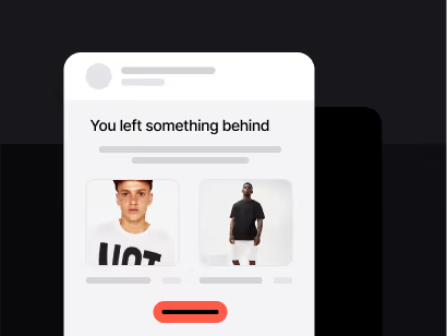
Un’email inviata al momento giusto in caso di carrello abbandonato può recuperare una quota significativa di ricavi persi. Configura il trigger, scrivi il promemoria, aggiungi un piccolo incentivo. Funzionerà in background per sempre.
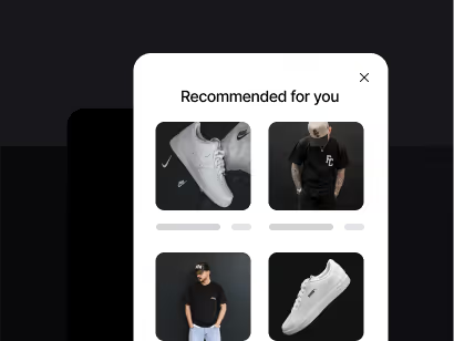
I blocchi dinamici ti consentono di mostrare prodotti in base al comportamento reale di navigazione e di acquisto. Gli iscritti che hanno cercato scarpe da corsa non dovrebbero vedere la stessa griglia di chi sta cercando utensili da cucina.

“Acquista ora” è generico. “Approfitta dell’offerta” crea urgenza. “Richiedi il mio sconto” è specifico e personale. Piccole modifiche alle CTA possono aumentare significativamente il tasso di clic.
le email e-commerceOttimizza le tue email e-commerceIl tuo template serve a vendere o solo a decorare?
Un impatto visivo forte è importante. Ma il compito del template è quello di far vendere il prodotto. Scegli un design con un percorso chiaro dall’immagine principale alla CTA checkout. Se non riesci a seguire quel percorso in tre secondi, semplifica.
Hai controllato il rapporto tra immagini e testo?
Le email composte prevalentemente da immagini vengono segnalate dai filtri antispam. Inoltre, quando le immagini non si caricano (cosa che accade in oltre il 40% delle aperture da dispositivi mobile), l’iscritto non vede nulla. Includi sempre del testo effettivo per il tuo messaggio chiave e la CTA.
L'urgenza funziona quando è onesta
I timer per il conto alla rovescia e le etichette che indicano scorte limitate aumentano i tassi di conversione. Ma solo se si tratta di scadenze reali e scorte effettive. Gli iscritti che si sentono manipolati non tornano più.
Dove porta la CTA?
Alla pagina del prodotto. Non alla homepage. Non alla landing page di una categoria. Al prodotto. Ogni clic in più tra l’offerta e il checkout ti costa una quota significativa di potenziali acquirenti.
Cosa ha guardato in precedenza questo iscritto?
Utilizza gli strumenti di analisi dei dati di Positive User per suggerire prodotti in base al comportamento passato. Un suggerimento pertinente converte in modo significativamente migliore rispetto a una griglia generica di prodotti.
L’oggetto dell’email determina l’apertura
"20% di sconto sulla tua categoria preferita" funziona meglio di un linguaggio promozionale vago. Sii specifico sul valore offerto. Testa prima due o tre versioni su un segmento più ristretto.
Dopo la campagna, analizza i dati
Quali prodotti hanno ottenuto il maggior numero di clic? In quale punto gli iscritti hanno abbandonato? A che ora si è registrato il tasso di conversione più alto? Questa analisi definisce la tua prossima campagna. Se la salti, ti limiterai a tirare a indovinare.
Template di Positive User e automazione integrata. Meno tempo dedicato alla progettazione. Più tempo dedicato alla consegna.