




Best Father
Father's Day
E-commerce & Offers
Sales & Promotions
A sale is only as good as the email that announces it. Bad design, wrong timing, or a buried offer can turn a 40% discount into a 0.3% click rate. These templates help you run flash sales, clearance events, and seasonal promotions with layouts people trust enough to click. Pick one and go live in minutes with Positive User's drag-and-drop editor.
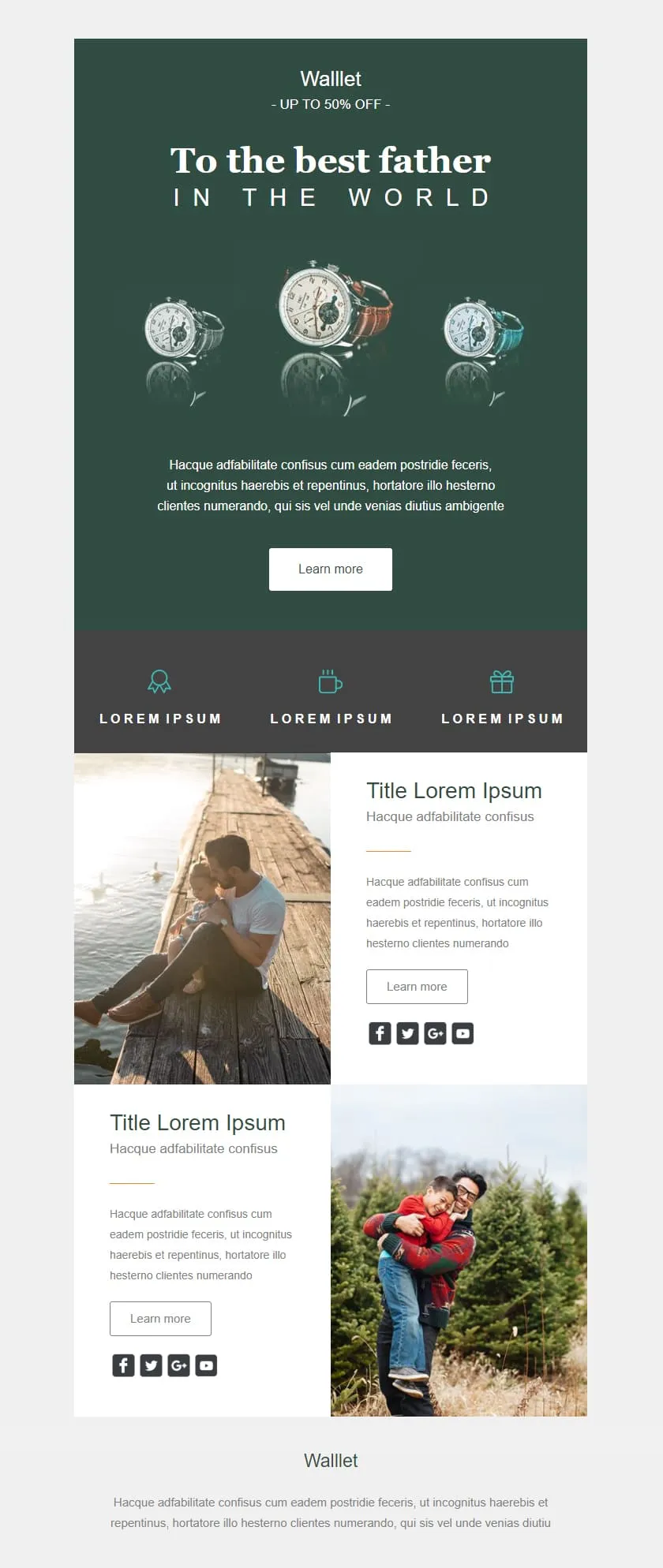
templates galleryA premium Father's Day retail template in deep editorial green. A watch triptych hero carries a centered headline, a quiet inline discount banner follows, three perk icons sit in a slate strip, and two alternating image-text rows give the products context before the brand signs off.

Desktop
Mobile
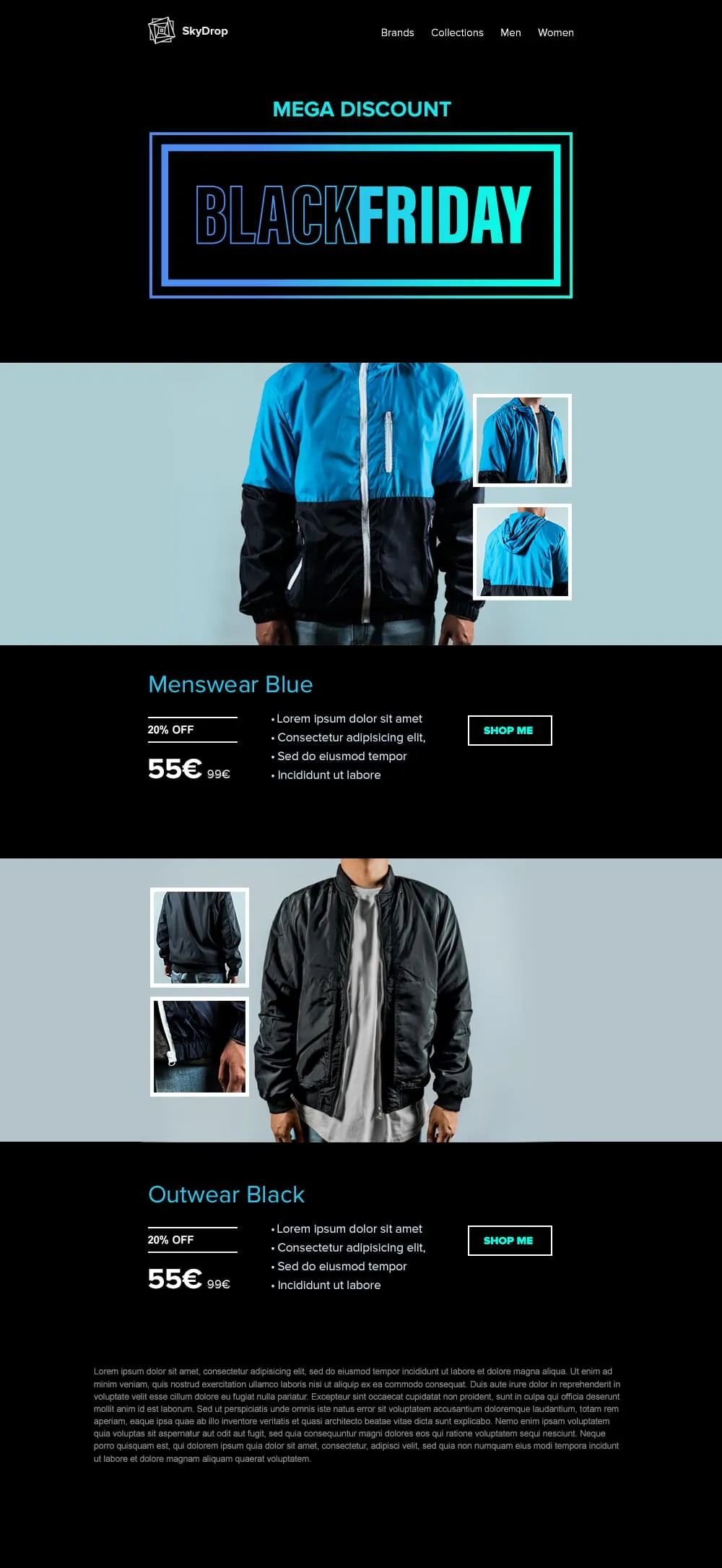
An apparel Black Friday template built around full-body product photography. A neon-framed hero opens the email, then two pairs of jacket showcases with front view and close-up sit on alternating cyan and black backgrounds, each carrying a discount tag, a crossed-out retail price and a direct shop button.
Desktop
Mobile
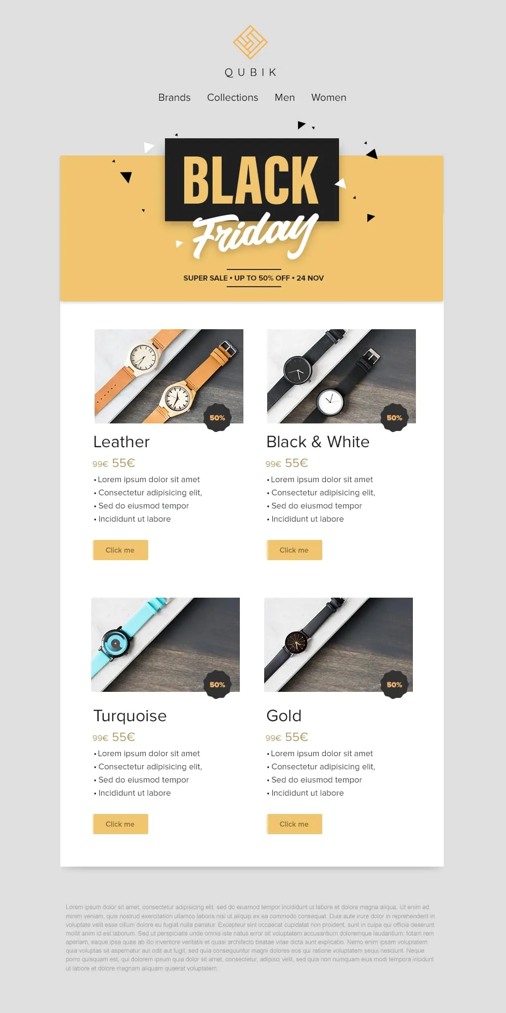
Four product variants, four prices and four buttons on a confetti yellow banner. A 2x2 grid drops Leather, Black and White, Turquoise and Gold colorways into matching cards, each with a 50% badge, a crossed-out anchor price and a soft yellow call to action. Quick to scan, quick to buy.
Desktop
Mobile
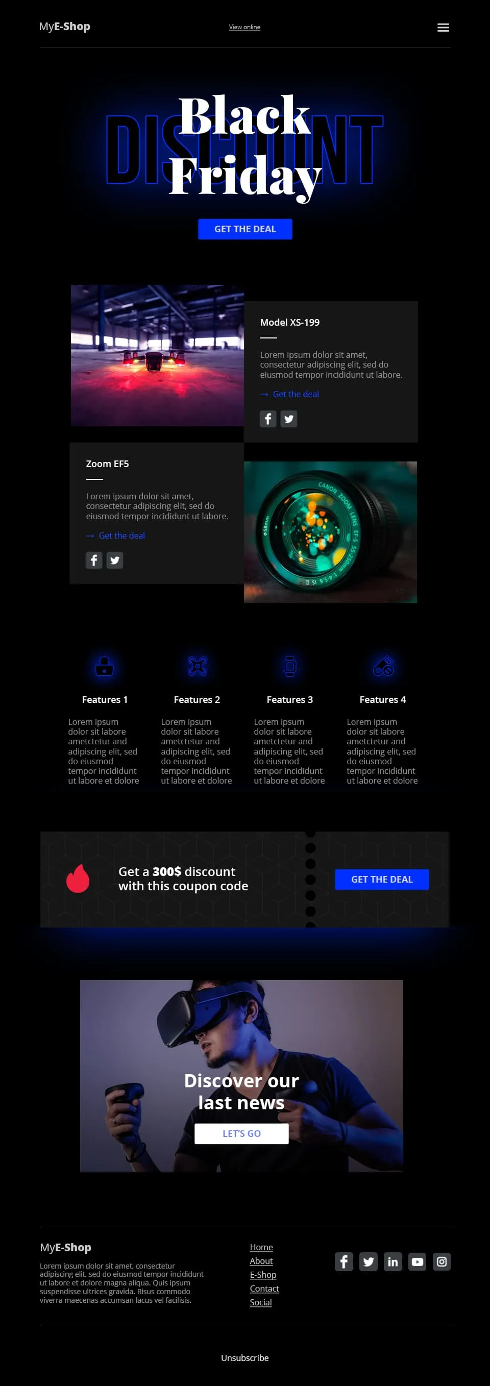
A tech-retail Black Friday template built for spec-driven audiences. Typographic lettering anchors the hero above a shop call to action, two spec product cards follow, a four-feature icon row adds credibility, a coupon code strip closes the deal and a VR product showcase ends the scroll.
Desktop
Mobile
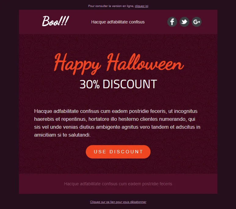
A Halloween template stripped down to a single conversion decision. A dark-plum spiral hero carries the offer, a hand-lettered headline anchors the eye and one orange discount pill is the only action available. No second call to action, no distraction, just the deal.
Desktop
Mobile
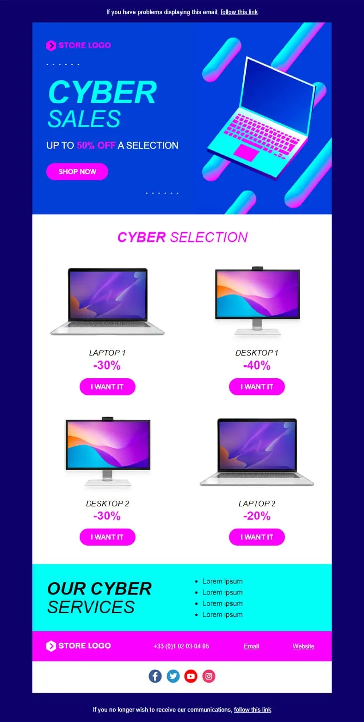
Coming SoonCyber Monday is what Black Friday wishes it could be — digital-first, screen-first. This template runs vaporwave neon (electric blue + magenta) with an isometric laptop hero, a 'CYBER SALES UP TO 50% OFF' headline, then drops a 2×2 product grid with individually-tuned discounts (Laptop 1 −30%, Desktop 1 −40%, Desktop 2 −30%, Laptop 2 −20%) and 'I want it' CTAs. A cyan 'Our Cyber Services' strip closes with four perks before the magenta footer.
Desktop
Mobile
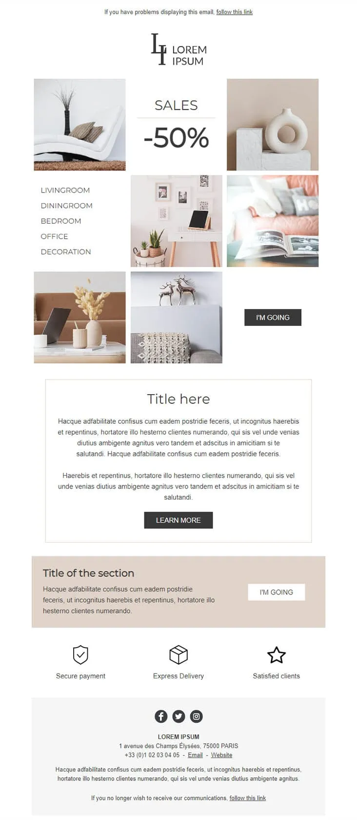
Coming SoonDecoration goes the other way from DecoHouse: pale palette, Scandinavian restraint, photography over branding. The 'LI / Lorem Ipsum' serif logo sits above a 6-photo mosaic with 'SALES -50%' floating in the centre and a vertical room-navigation sidebar (Livingroom, Diningroom, Bedroom, Office, Decoration). An 'I'M GOING' black button closes the gallery, two prose blocks ('Title here' boxed + 'Title of the section' on warm beige) follow, then a 3-trust-icon row (Secure payment, Express delivery, Satisfied clients) before the address footer. For minimalist home-decor retailers.
Desktop
Mobile

Coming SoonCar dealerships open their books for one weekend, then close them again — this template carries that pressure. ExclusiveCar leads with a red sports car under 'COME AND DISCOVER / OUR PRIVATE SALES THIS WEEKEND IN YOUR CAR DEALERSHIP', then a -30% white panel on new and second-hand vehicles, a 3-feature icon row (FEATURES 1/2/3), a 'PRIVATE SALES' SUV showcase with Learn More, a dark BEST SERVICES block split with a headlight close-up, a red 'Your next stop' social strip, a second PRIVATE SALES showcase with a desert SUV, and a dark footer with Learn More + a Lille location map.
Desktop
Mobile
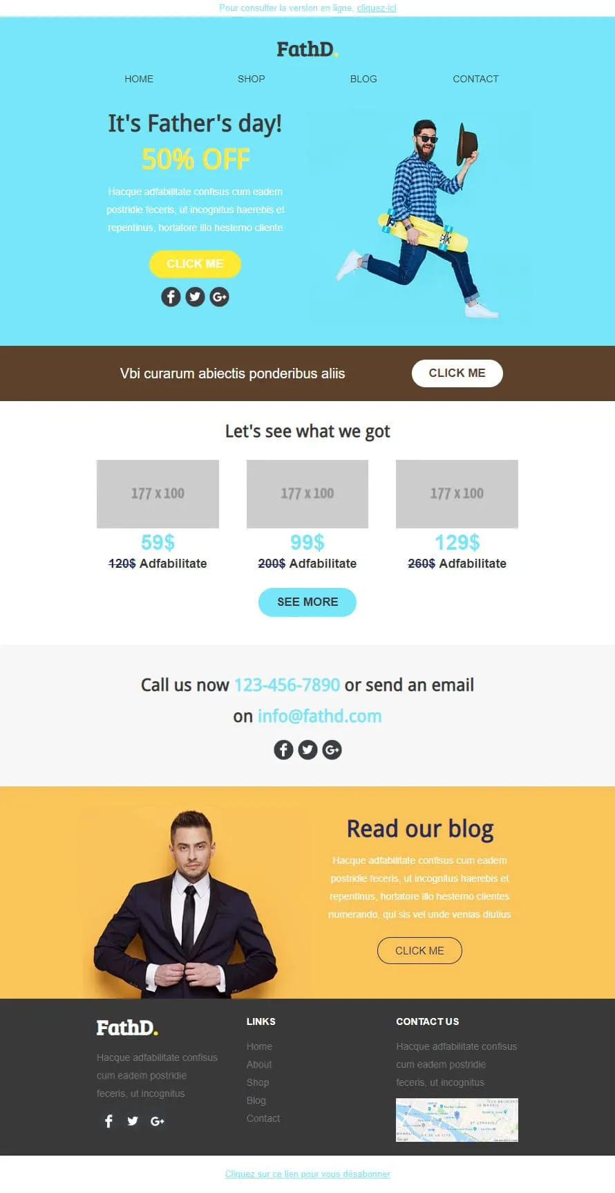
Coming SoonStock photos kill Father's Day sales. FathD breaks the curse with a skater-dad mid-air, checked shirt, tipped hat — on a sky-blue hero ('It's Father's day! 50% OFF'). The body delivers a brown 'Vbi curarum' offer strip, a 3-product pricing tier (59$/99$/129$ with crossed-out 120$/200$/260$), a 'Call us now' phone-and-email block, and a yellow 'Read our blog' lifestyle column with a sharp-suited man portrait. Apparel, sport-lifestyle, and dad-targeted retail.
Desktop
Mobile
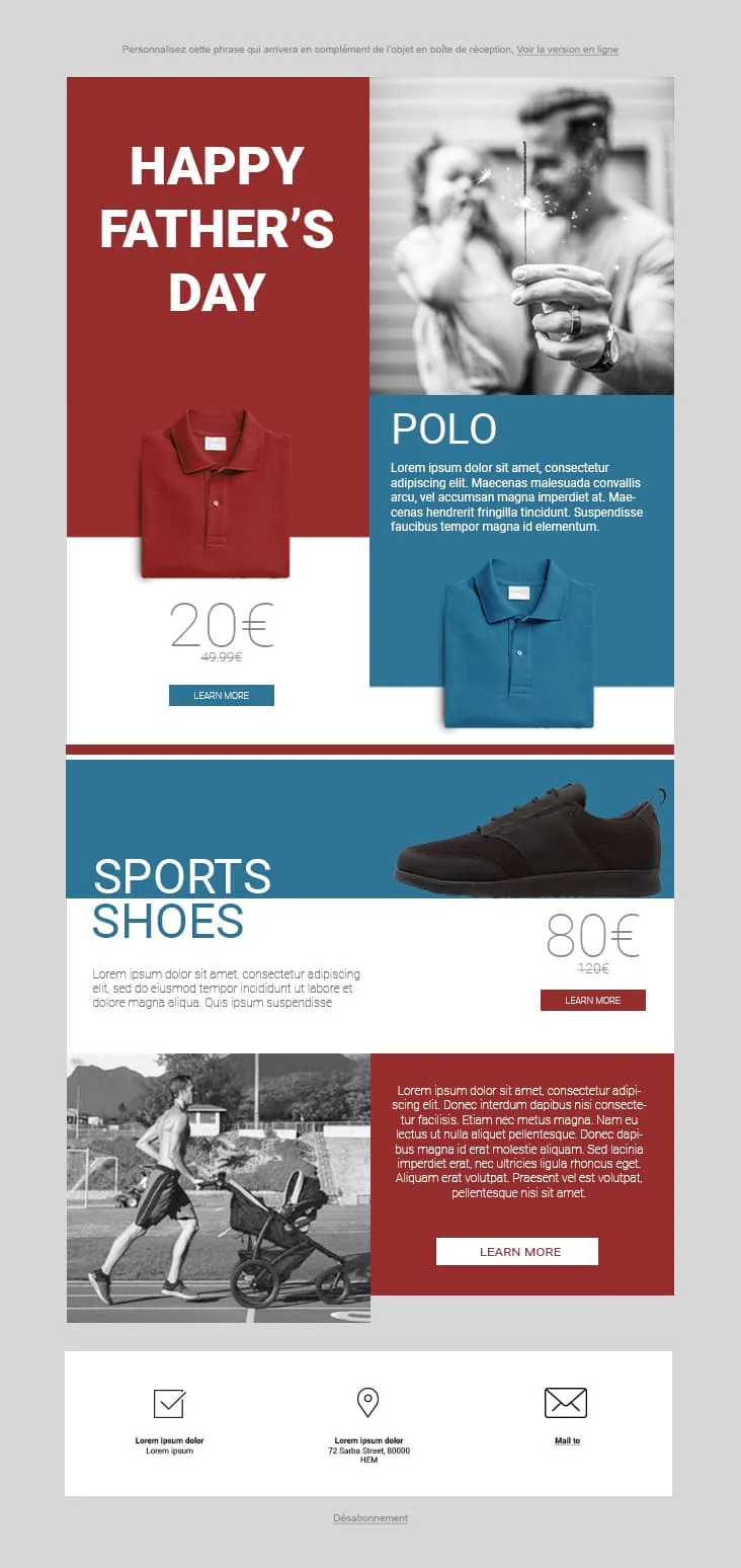
Coming SoonFather's Day 02 plays the magazine-cover game: red and steel-blue color blocks fight for attention. The hero stacks a red 'HAPPY FATHER'S DAY' tile next to a black-and-white sparkler-and-dad photo, then a Polo product card (20€ on red strikethrough 49.99€, two colorways, Learn More), a Sports Shoes block (80€ strikethrough 120€), and a stroller-jogger lifestyle row with a red prose panel and Learn More. The 3-icon footer (envelope-check / pin / mail) keeps it grounded. For sportswear, casual-menswear, and dad-as-athlete retailers.
Desktop
Mobile
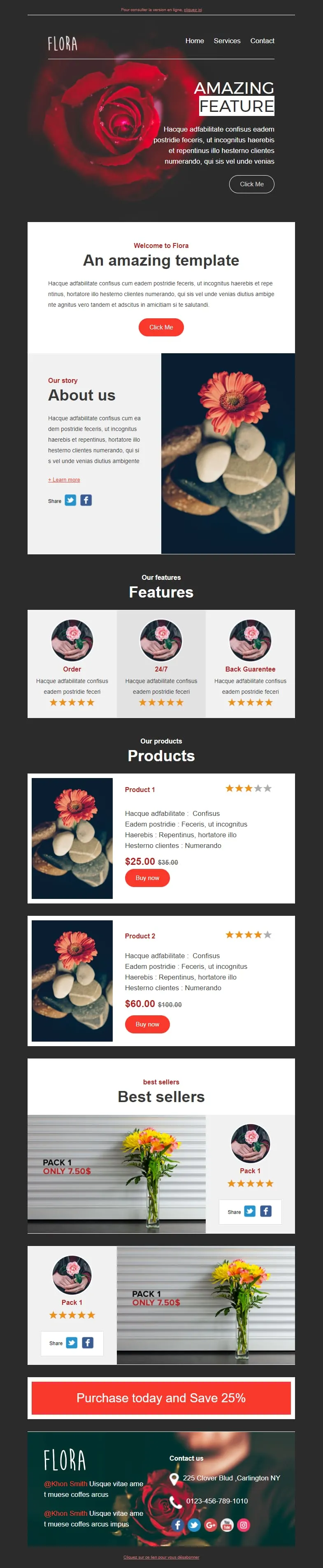
Coming SoonFlower shops sell mood, not stems. Flora reads that brief with a darkroom-style red-rose hero ('AMAZING FEATURE'), a white 'Welcome to Flora' card, an 'About us' two-column with orange-gerbera-on-pebbles photography, a 3-card 'Features' row (Order / 24/7 / Back Guarantee) each with 5-star rating, two product cards ($25/$35 + $60/$100 with Buy now and star ratings), two 'Pack 1 / Only 7.50$' best-seller image-text blocks, and a red 'Purchase today and Save 25%' CTA strip before a rose-backdrop footer with contact details.
Desktop
Mobile
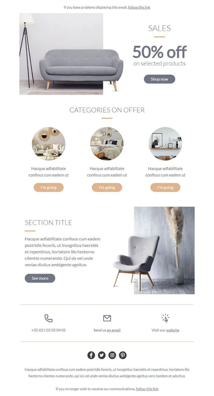
Coming SoonFurniture promos thrive on muted palettes — gray on peach reads more expensive than red on yellow. Furnishing splits its hero between a gray sofa photo and a simple 'SALES / 50% off on selected products' headline with a Shop now button, then drops a 'CATEGORIES ON OFFER' three-circle row (living-room / bedroom / decor-shelf) each carrying a peach 'I'm going' button, a 'SECTION TITLE' prose-and-chair-with-pampas-grass row with a See more CTA, and a 3-icon contact strip (phone +33 / email / website) above the social row. For furniture stores, interior retailers, and lifestyle brands.
Desktop
Mobile
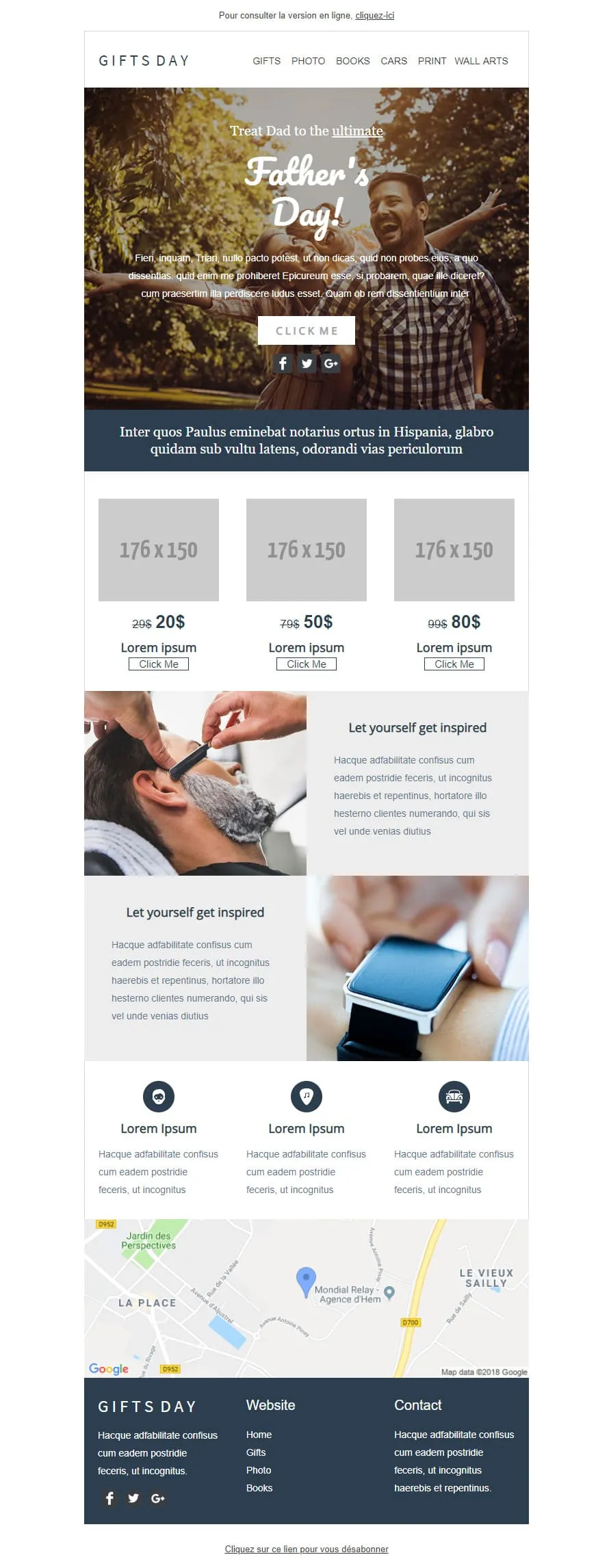
Coming SoonGift stores have a different brief than fashion retailers — they sell categories, not products. GIFTS DAY frames Father's Day across six verticals (Gifts / Photo / Books / Cars / Print / Wall arts) under a forest-hero of father-and-daughter ('Treat Dad to the ultimate / Father's Day!'), a navy Latin strip, a 3-tier price grid ($20/$50/$80 with crossed-out $29/$79/$99), two 'Let yourself get inspired' image-text rows (barber-shave / smartwatch), a 3-icon Lorem strip, a Google map of Hem (Mondial Relay anchor), and a dark navy footer linking Home / Gifts / Photo / Books.
Desktop
Mobile

Coming SoonTech-sale emails need volume — High-Tech Sales delivers it with a B&W man shouting through a megaphone over neon green/orange/yellow grids ('Treat yourself to a Big Discount on this sale' + orange SHOP NOW). Two coloured frames carry 4 'AWESOME PRODUCT' cards (smartwatch / headphones / smartphone / camera) each with a black 'I WANT IT' button, then a black 'Save up to 10% more' closing strip with a yellow SAVE MORE CTA, and a MYSHOP Paris address footer with phone, Contact us, Website, and 4 social icons.
Desktop
Mobile
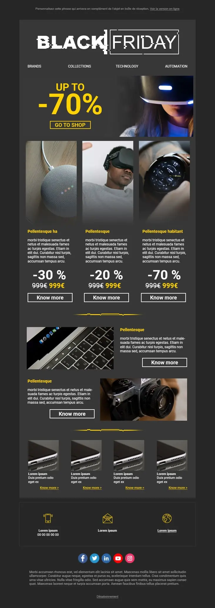
A dark-mode tech retail template with neon blue and orange accents built for high-impact promotional sends. A bold discount hero leads into a multi-product showcase grid with individual percentage badges, and a closing CTA strip pushes the urgency.
Desktop
Mobile
sales & promotion email templates?Every layout puts the discount front and center. Subscribers see the value in the first viewport. That's how fast purchase decisions start on promotional emails.
Sloppy emails with clashing fonts and stretched images erode trust. These templates keep a polished, professional feel during deep markdowns. Your discount shouldn't cost you credibility.
A competitor drops prices. Inventory isn't moving. The weather shifts and summer stock is stuck. You need to react in hours, not days
Most promotional email clicks now come from mobile. Responsive layouts make sure your "Shop Now" button is easy to find and tap. No zooming. No frustration.
sales templatebest practicesCrossed-out original price. Bold sale price right next to it. That visual comparison is the single strongest motivator in any promotional email. Text saying "great savings" doesn't come close.
"Spend $50, save 10%. Spend $100, save 20%." Tiered offers lift average order value naturally. They give shoppers a concrete reason to add one more item to the cart.
"Final 6 hours: 40% off everything" earns more opens than "Don't miss our sale!" Lead with the number. Subscribers decide to open based on specificity, not curiosity.
Send the sale to your best customers before everyone else. Exclusivity drives faster action from the segment that already spends the most. It also reduces your Friday traffic spike.

On mobile, if someone has to scroll to find the deal, you've already lost them. Primary button in the first screen. No exceptions.
sales & promotion email content your sales and promotion emailsHow fast can they find the discount?
Two seconds. That's the window. High-contrast colors on the savings number. If it's not the loudest element on the page, redesign.
Are your stock indicators honest?
"Only 3 left" drives action. But only when it reflects real inventory. Fake scarcity erodes trust faster than it drives clicks. And once trust is gone, it doesn't come back.
Where does the button link?
The product page. Or better yet, a pre-filled cart with the discount applied. Every extra click between offer and checkout loses a meaningful share of potential buyers.
Price-drop alerts run themselves
Use Positive User's automation to notify subscribers when something they've browsed goes on sale. Set it up once. It stays relevant and timely without manual work.
Can urgency and whitespace coexist?
Yes. A promotion can feel urgent without feeling cluttered. Breathing room around your main CTA makes the decision to click feel easy, not overwhelming.
What's in the subject line?
Be specific. "40% off outdoor gear" outperforms "Don't miss this sale!" Name the deal. Test a few versions on a smaller segment before the main blast.
One goal per section
Every block in the email should point toward the same action: buy. If something competes with the offer or distracts from checkout, cut it.
Positive User's templates and built-in automation handle the design. You focus on the offer.