



Best Father
Fête des Pères
E-commerce et offres
Soldes et promotions
Une promotion ne vaut que par l'email qui l'annonce. Un mauvais design, un timing décalé ou une offre noyée dans le contenu peuvent transformer une remise de 40 % en un taux de clic de 0,3 %. Ces templates vous aident à lancer vos ventes flash, vos opérations de déstockage et vos promotions saisonnières avec des mises en page qui inspirent suffisamment confiance pour générer le clic. Choisissez un modèle et lancez votre campagne en quelques minutes avec l'éditeur drag-and-drop de Positive User.
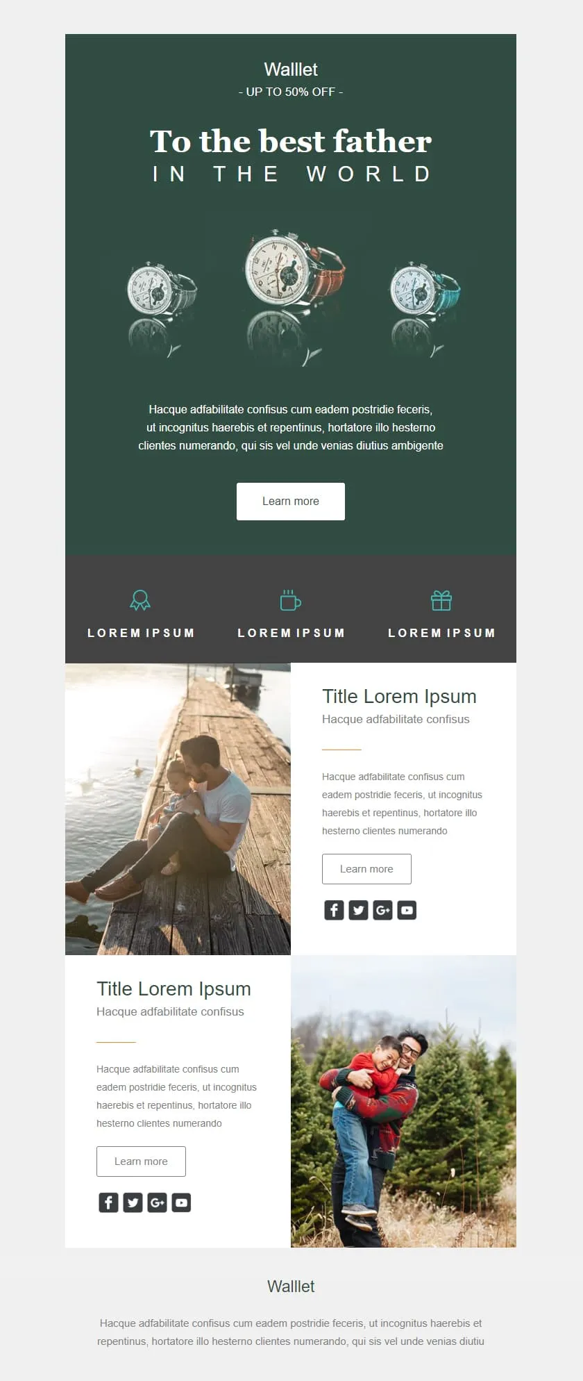
templates emailing soldes et promotionsA premium Father's Day retail template in deep editorial green. A watch triptych hero carries a centered headline, a quiet inline discount banner follows, three perk icons sit in a slate strip, and two alternating image-text rows give the products context before the brand signs off.

Desktop
Mobile
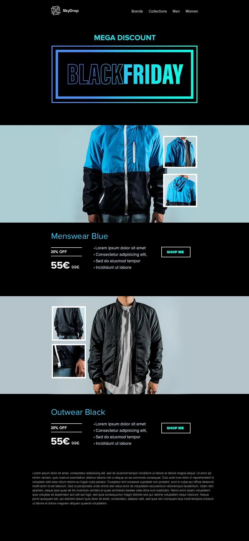
An apparel Black Friday template built around full-body product photography. A neon-framed hero opens the email, then two pairs of jacket showcases with front view and close-up sit on alternating cyan and black backgrounds, each carrying a discount tag, a crossed-out retail price and a direct shop button.
Desktop
Mobile
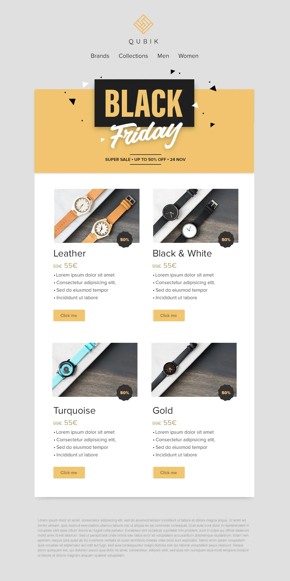
Four product variants, four prices and four buttons on a confetti yellow banner. A 2x2 grid drops Leather, Black and White, Turquoise and Gold colorways into matching cards, each with a 50% badge, a crossed-out anchor price and a soft yellow call to action. Quick to scan, quick to buy.
Desktop
Mobile
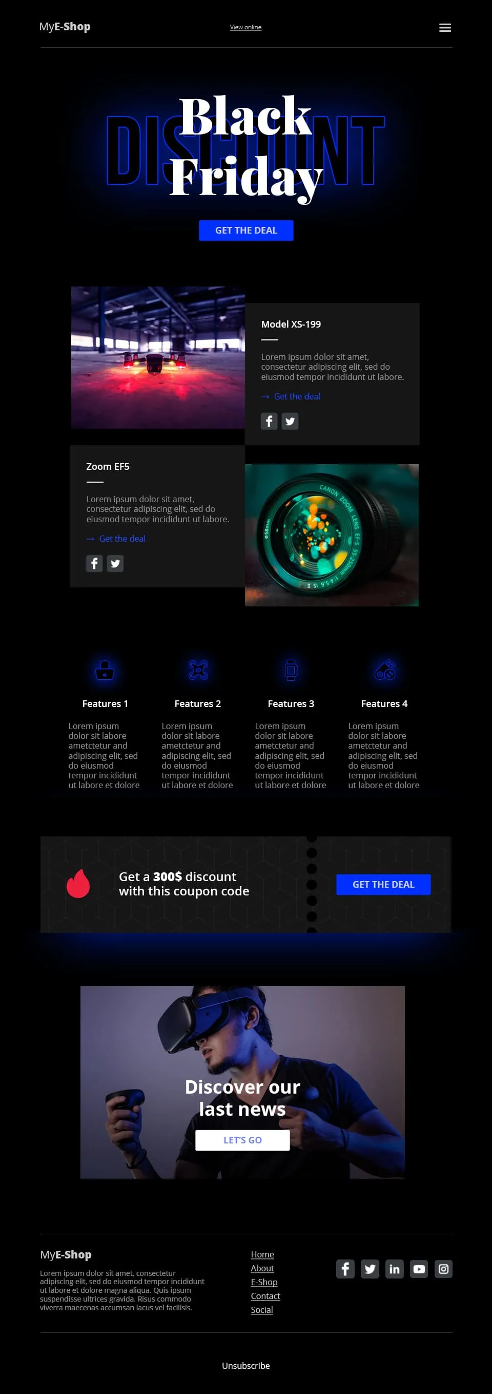
A tech-retail Black Friday template built for spec-driven audiences. Typographic lettering anchors the hero above a shop call to action, two spec product cards follow, a four-feature icon row adds credibility, a coupon code strip closes the deal and a VR product showcase ends the scroll.
Desktop
Mobile
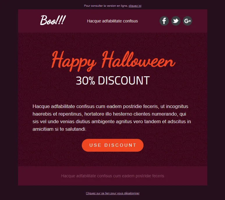
A Halloween template stripped down to a single conversion decision. A dark-plum spiral hero carries the offer, a hand-lettered headline anchors the eye and one orange discount pill is the only action available. No second call to action, no distraction, just the deal.
Desktop
Mobile
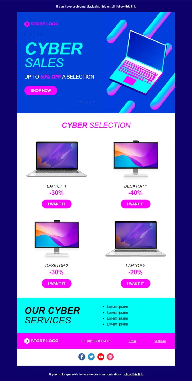
Coming SoonCyber Monday is what Black Friday wishes it could be — digital-first, screen-first. This template runs vaporwave neon (electric blue + magenta) with an isometric laptop hero, a 'CYBER SALES UP TO 50% OFF' headline, then drops a 2×2 product grid with individually-tuned discounts (Laptop 1 −30%, Desktop 1 −40%, Desktop 2 −30%, Laptop 2 −20%) and 'I want it' CTAs. A cyan 'Our Cyber Services' strip closes with four perks before the magenta footer.
Desktop
Mobile
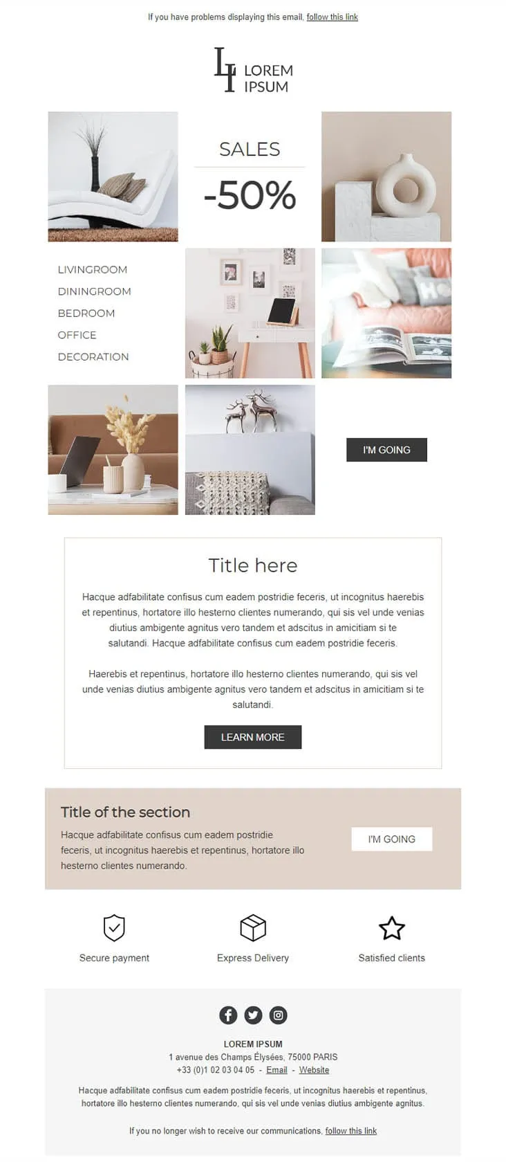
Coming SoonDecoration goes the other way from DecoHouse: pale palette, Scandinavian restraint, photography over branding. The 'LI / Lorem Ipsum' serif logo sits above a 6-photo mosaic with 'SALES -50%' floating in the centre and a vertical room-navigation sidebar (Livingroom, Diningroom, Bedroom, Office, Decoration). An 'I'M GOING' black button closes the gallery, two prose blocks ('Title here' boxed + 'Title of the section' on warm beige) follow, then a 3-trust-icon row (Secure payment, Express delivery, Satisfied clients) before the address footer. For minimalist home-decor retailers.
Desktop
Mobile

Coming SoonCar dealerships open their books for one weekend, then close them again — this template carries that pressure. ExclusiveCar leads with a red sports car under 'COME AND DISCOVER / OUR PRIVATE SALES THIS WEEKEND IN YOUR CAR DEALERSHIP', then a -30% white panel on new and second-hand vehicles, a 3-feature icon row (FEATURES 1/2/3), a 'PRIVATE SALES' SUV showcase with Learn More, a dark BEST SERVICES block split with a headlight close-up, a red 'Your next stop' social strip, a second PRIVATE SALES showcase with a desert SUV, and a dark footer with Learn More + a Lille location map.
Desktop
Mobile
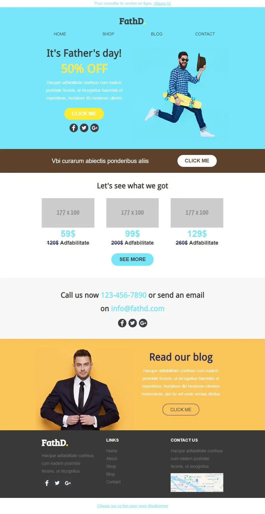
Coming SoonStock photos kill Father's Day sales. FathD breaks the curse with a skater-dad mid-air, checked shirt, tipped hat — on a sky-blue hero ('It's Father's day! 50% OFF'). The body delivers a brown 'Vbi curarum' offer strip, a 3-product pricing tier (59$/99$/129$ with crossed-out 120$/200$/260$), a 'Call us now' phone-and-email block, and a yellow 'Read our blog' lifestyle column with a sharp-suited man portrait. Apparel, sport-lifestyle, and dad-targeted retail.
Desktop
Mobile
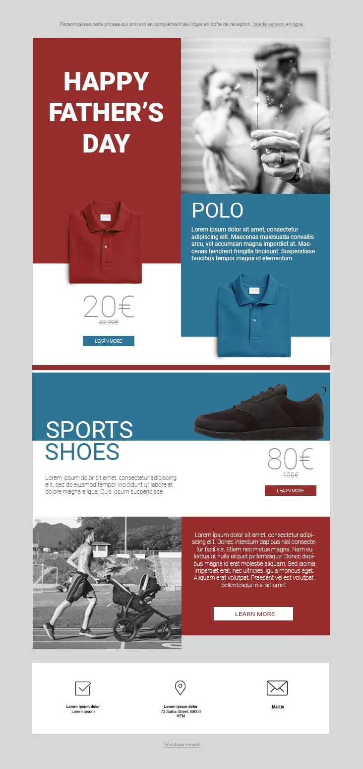
Coming SoonFather's Day 02 plays the magazine-cover game: red and steel-blue color blocks fight for attention. The hero stacks a red 'HAPPY FATHER'S DAY' tile next to a black-and-white sparkler-and-dad photo, then a Polo product card (20€ on red strikethrough 49.99€, two colorways, Learn More), a Sports Shoes block (80€ strikethrough 120€), and a stroller-jogger lifestyle row with a red prose panel and Learn More. The 3-icon footer (envelope-check / pin / mail) keeps it grounded. For sportswear, casual-menswear, and dad-as-athlete retailers.
Desktop
Mobile
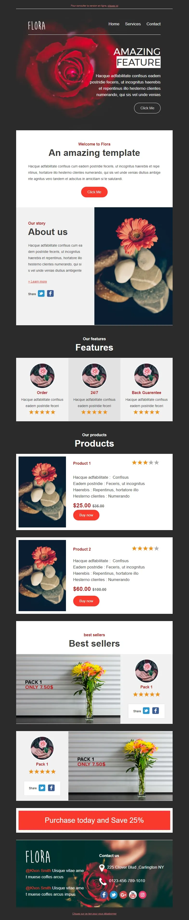
Coming SoonFlower shops sell mood, not stems. Flora reads that brief with a darkroom-style red-rose hero ('AMAZING FEATURE'), a white 'Welcome to Flora' card, an 'About us' two-column with orange-gerbera-on-pebbles photography, a 3-card 'Features' row (Order / 24/7 / Back Guarantee) each with 5-star rating, two product cards ($25/$35 + $60/$100 with Buy now and star ratings), two 'Pack 1 / Only 7.50$' best-seller image-text blocks, and a red 'Purchase today and Save 25%' CTA strip before a rose-backdrop footer with contact details.
Desktop
Mobile
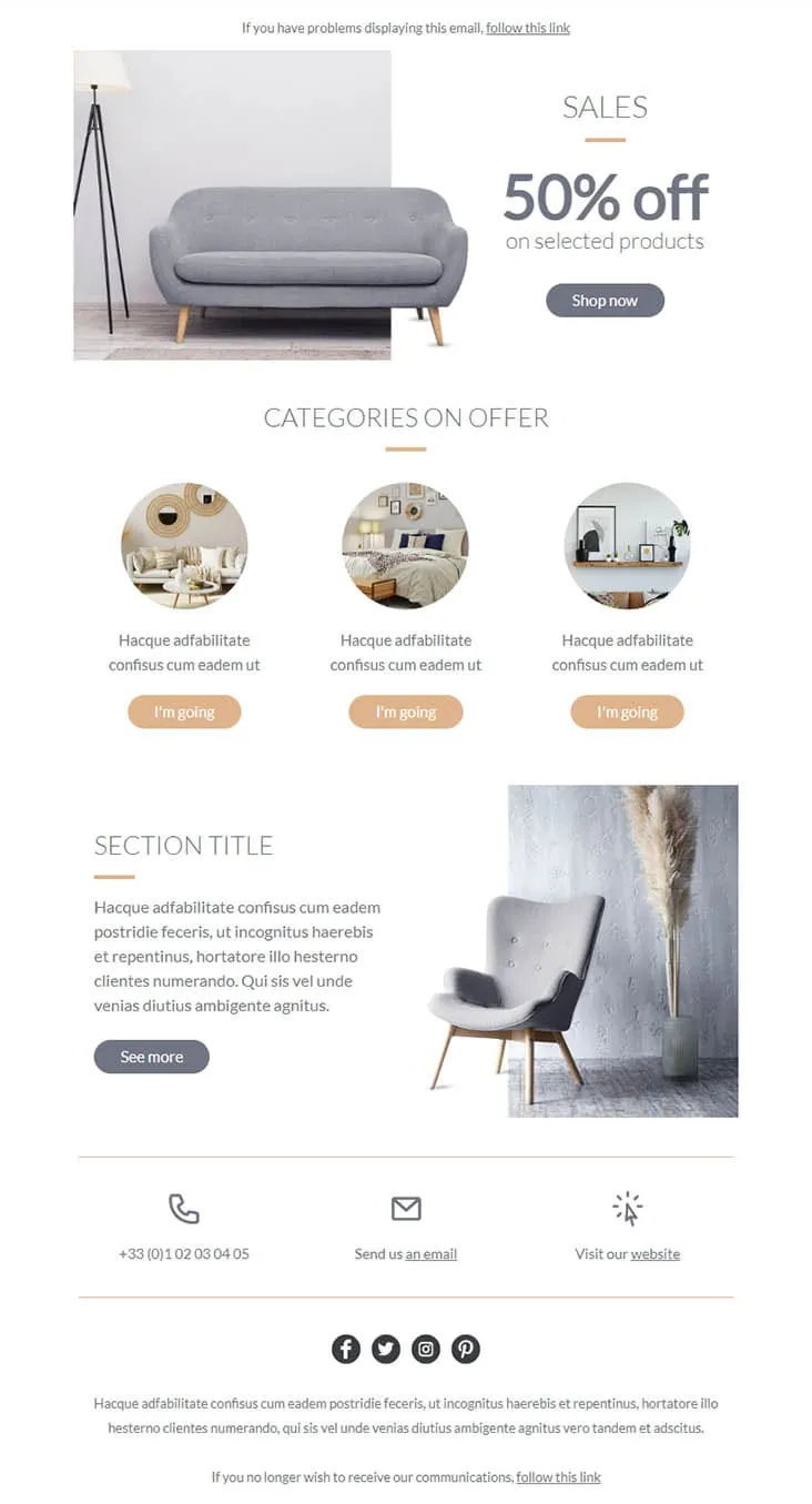
Coming SoonFurniture promos thrive on muted palettes — gray on peach reads more expensive than red on yellow. Furnishing splits its hero between a gray sofa photo and a simple 'SALES / 50% off on selected products' headline with a Shop now button, then drops a 'CATEGORIES ON OFFER' three-circle row (living-room / bedroom / decor-shelf) each carrying a peach 'I'm going' button, a 'SECTION TITLE' prose-and-chair-with-pampas-grass row with a See more CTA, and a 3-icon contact strip (phone +33 / email / website) above the social row. For furniture stores, interior retailers, and lifestyle brands.
Desktop
Mobile
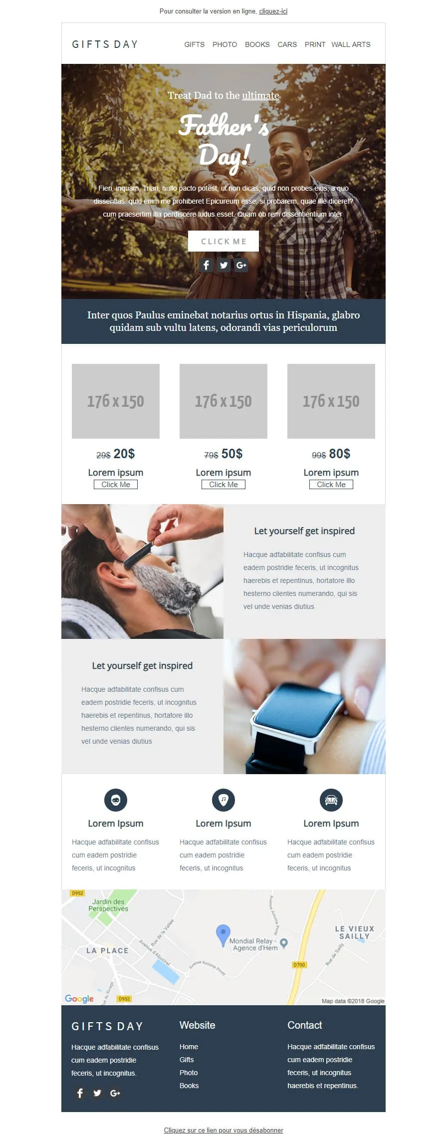
Coming SoonGift stores have a different brief than fashion retailers — they sell categories, not products. GIFTS DAY frames Father's Day across six verticals (Gifts / Photo / Books / Cars / Print / Wall arts) under a forest-hero of father-and-daughter ('Treat Dad to the ultimate / Father's Day!'), a navy Latin strip, a 3-tier price grid ($20/$50/$80 with crossed-out $29/$79/$99), two 'Let yourself get inspired' image-text rows (barber-shave / smartwatch), a 3-icon Lorem strip, a Google map of Hem (Mondial Relay anchor), and a dark navy footer linking Home / Gifts / Photo / Books.
Desktop
Mobile

Coming SoonTech-sale emails need volume — High-Tech Sales delivers it with a B&W man shouting through a megaphone over neon green/orange/yellow grids ('Treat yourself to a Big Discount on this sale' + orange SHOP NOW). Two coloured frames carry 4 'AWESOME PRODUCT' cards (smartwatch / headphones / smartphone / camera) each with a black 'I WANT IT' button, then a black 'Save up to 10% more' closing strip with a yellow SAVE MORE CTA, and a MYSHOP Paris address footer with phone, Contact us, Website, and 4 social icons.
Desktop
Mobile
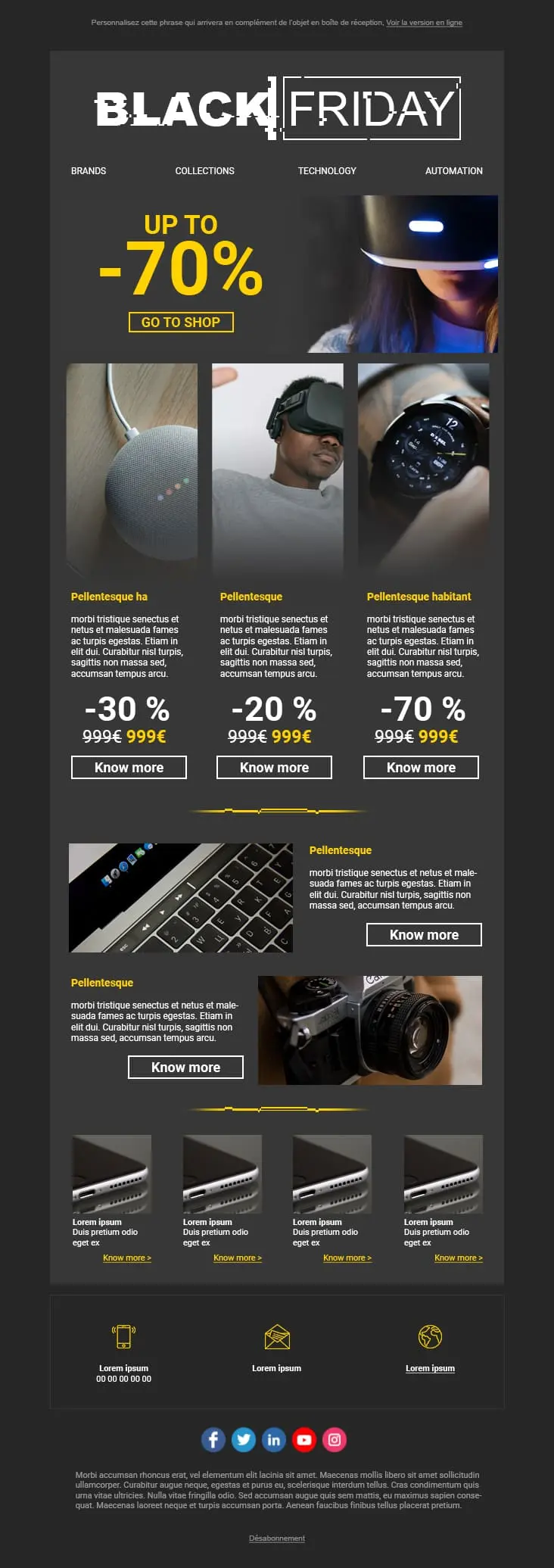
A dark-mode tech retail template with neon blue and orange accents built for high-impact promotional sends. A bold discount hero leads into a multi-product showcase grid with individual percentage badges, and a closing CTA strip pushes the urgency.
Desktop
Mobile
templates emailing soldes et promotions ?Chaque mise en page place la remise au centre de l'attention. Vos abonnés voient la valeur dès le premier écran, et c'est ainsi que démarrent les décisions d'achat rapides sur un email promotionnel.
Des emails négligés, avec des typographies qui jurent et des images étirées, dégradent la confiance. Ces templates conservent un rendu soigné et professionnel, même sur les plus fortes remises. Votre discount ne doit pas vous coûter votre crédibilité.
Un concurrent baisse ses prix. Un produit ne se vend pas. La météo change et vos stocks d'été restent en rayon. Vous devez réagir en quelques heures, pas en quelques jours.
Aujourd'hui, la majorité des clics sur les emails promotionnels viennent du mobile. Des mises en page responsives garantissent que votre bouton « Acheter maintenant » est facile à repérer et à toucher. Sans zoom. Sans frustration.
template emailing soldescampagnes emailing promotionnellesLe prix initial barré. Le prix soldé en gras juste à côté. Cette comparaison visuelle est le déclencheur le plus puissant de tout email promotionnel. Une phrase qui dit « belles économies » n'a pas le même impact.
« 50 € d'achats, 10 % offerts. 100 € d'achats, 20 % offerts. » Les offres par paliers font naturellement grimper le panier moyen. Elles donnent à vos acheteurs une vraie raison d'ajouter un article de plus au panier.
« Plus que 6 heures : 40 % sur tout » génère plus d'ouvertures que « Ne manquez pas notre promo ! ». Mettez le chiffre en premier. Vos abonnés ouvrent par précision, pas par curiosité.
Envoyez votre promotion à vos meilleurs clients avant tout le monde. L'exclusivité accélère le passage à l'achat sur le segment qui dépense déjà le plus. Cela réduit aussi le pic de trafic du vendredi.

Sur mobile, si votre abonné doit scroller pour trouver l'offre, vous l'avez déjà perdu. Bouton principal dans le premier écran. Sans exception.
emails soldes et promotionsOptimisez vos emails soldes et promotionsEn combien de temps repèrent-ils la remise ?
Deux secondes. C'est votre fenêtre. Des couleurs très contrastées sur le chiffre des économies. Si ce n'est pas l'élément le plus visible de votre email, repensez le design.
Vos indicateurs de stock sont-ils honnêtes ?
« Plus que 3 en stock » pousse à l'action. Mais seulement quand ça reflète votre inventaire réel. La fausse rareté détruit la confiance plus vite qu'elle ne génère de clics. Et la confiance perdue ne revient pas.
Où mène votre bouton ?
La page produit. Ou mieux encore, un panier pré-rempli avec la remise déjà appliquée. Chaque clic supplémentaire entre l'offre et le panier vous fait perdre une part significative d'acheteurs potentiels.
Les alertes de baisse de prix tournent toutes seules
Utilisez l'automatisation de Positive User pour prévenir vos abonnés dès qu'un produit consulté passe en promotion. Vous configurez le scénario une seule fois et il reste pertinent et opportun, sans intervention manuelle.
Urgence et respiration peuvent-elles cohabiter ?
Oui. Une promotion peut transmettre l'urgence sans saturer l'œil. De l'espace autour de votre CTA principal rend la décision de cliquer naturelle, jamais oppressante.
Qu'y a-t-il dans votre objet ?
Soyez précis. « 40 % sur l'outdoor » fait mieux que « Ne manquez pas notre promo ! ». Nommez l'offre. Testez deux ou trois versions sur un segment réduit avant l'envoi principal.
Un objectif par section
Chaque bloc de votre email doit converger vers la même action : acheter. Si un élément vient concurrencer l'offre ou détourner du checkout, supprimez-le.
Les templates et l'automatisation intégrée de Positive User s'occupent du design. Vous vous concentrez sur l'offre.