






Best Father
Festa del Papà
E-commerce e offerte
Saldi e promozioni
Il successo di una vendita dipende dall’efficacia dell’email che la annuncia. Un design scadente, un tempismo sbagliato o un’offerta poco visibile possono trasformare uno sconto del 40% in un tasso di clic dello 0,3%. Questi template ti aiutano a organizzare vendite lampo, svendite di fine stagione e promozioni stagionali con layout che ispirano fiducia e invogliano gli utenti a cliccare. Scegline uno e pubblicalo in pochi minuti con l’editor drag&drop di Positive User.
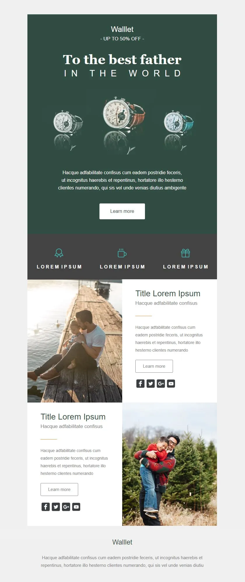
template email per saldi e promozioniGli sconti al dettaglio possono dare l’impressione di essere economici; questo invece trasmette un’immagine di alta qualità. Uno sfondo verde intenso fa da cornice al titolo centrato “Al miglior papà” e a un trittico di orologi; un banner con lo sconto del 50% è inserito nel testo come una promessa discreta; tre icone che indicano i vantaggi sono disposte in una striscia color ardesia; infine, due righe di testo e immagini forniscono il contesto del prodotto prima del logo del marchio.

Desktop
Mobile
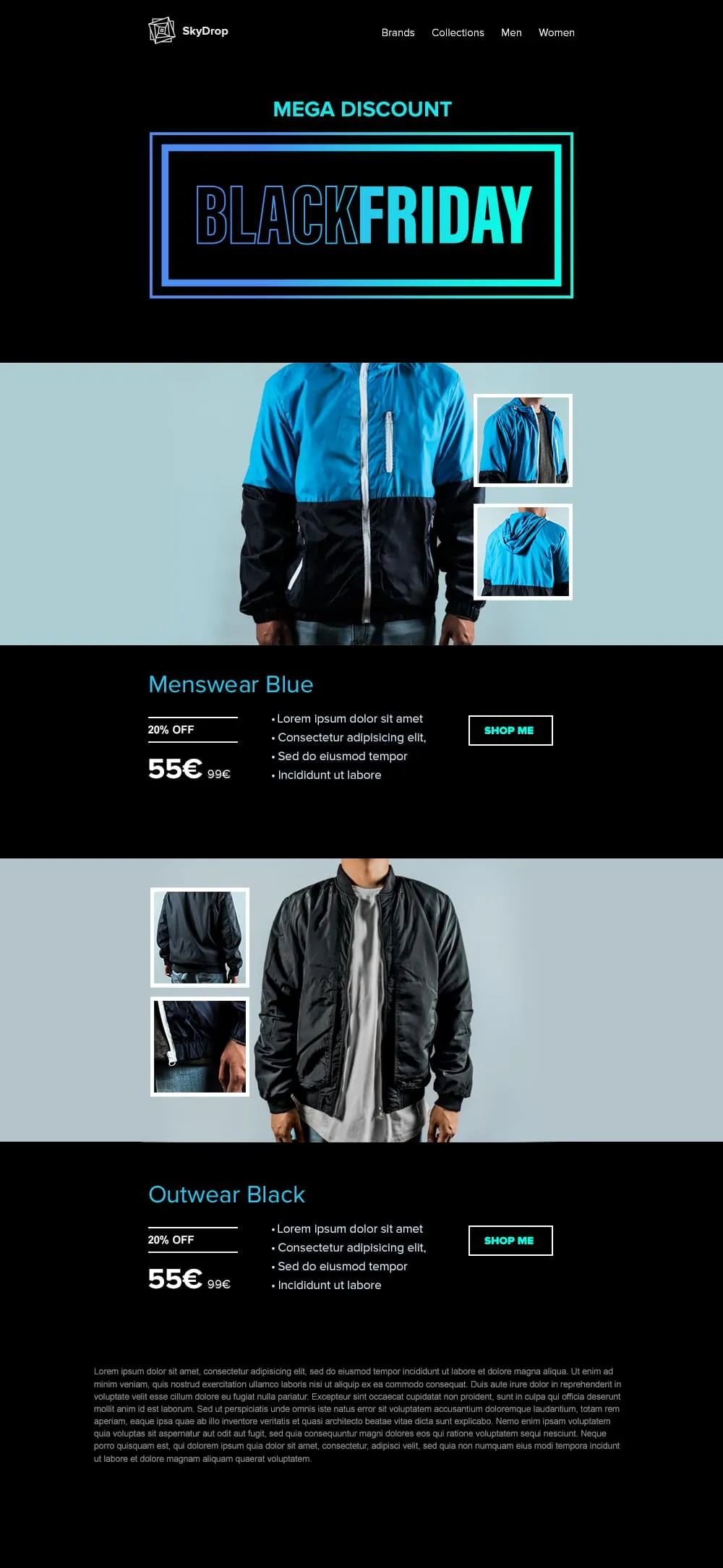
I capi di abbigliamento richiedono cartellini con lo sconto in stile “hangtag” e immagini a figura intera del prodotto; questo template offre entrambe le cose. L’immagine di apertura è dedicata al Black Friday, con una cornice al neon; seguono poi due coppie di foto di giacche (vista frontale + primi piani) su sfondi ciano e nero, ciascuna accompagnata da un cartellino con lo sconto del 20%, un prezzo di listino barrato e un pulsante “Acquista ora” che non lascia spazio a dubbi.
Desktop
Mobile
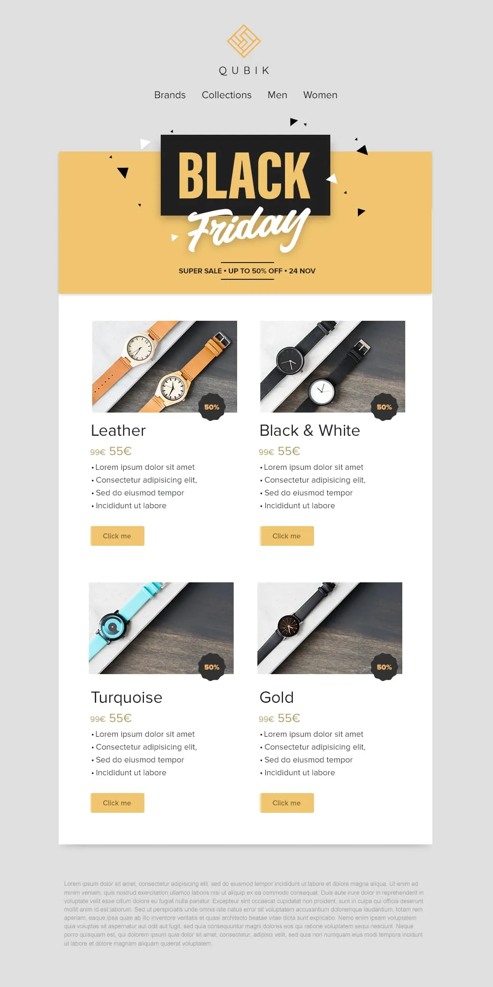
Quattro prodotti, quattro prezzi, quattro pulsanti: il gioco è fatto. Un banner giallo con coriandoli dedicato al Black Friday crea l’atmosfera, poi una griglia 2×2 presenta le varianti Pelle, Bianco e Nero, Turchese e Oro in schede abbinate. Ciascuna presenta un badge con lo sconto del 50%, un prezzo di riferimento barrato e un pulsante “Clicca qui” in giallo tenue.
Desktop
Mobile
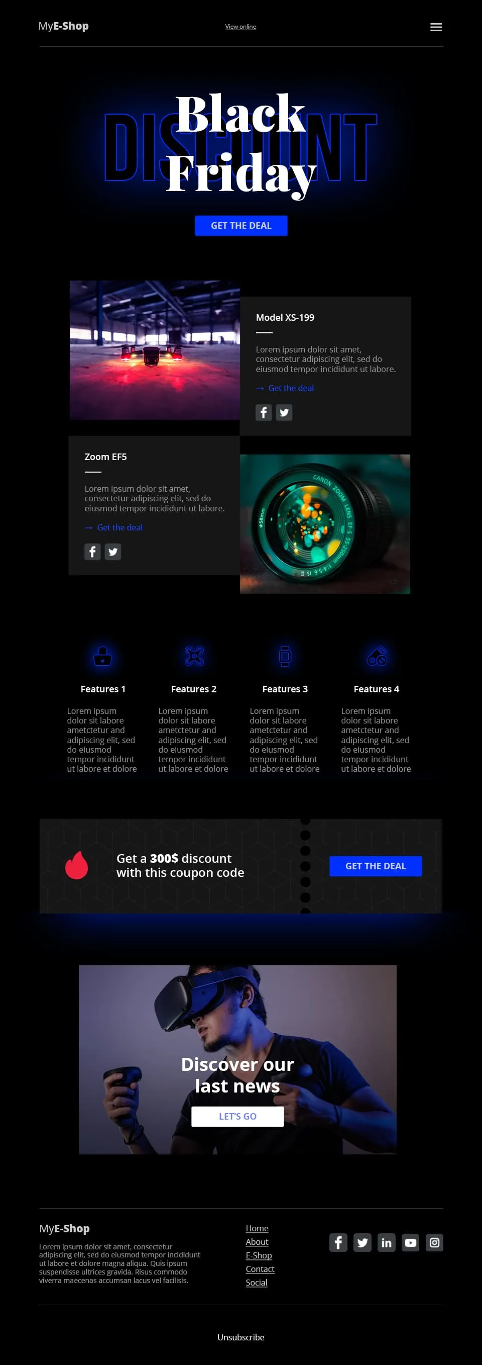
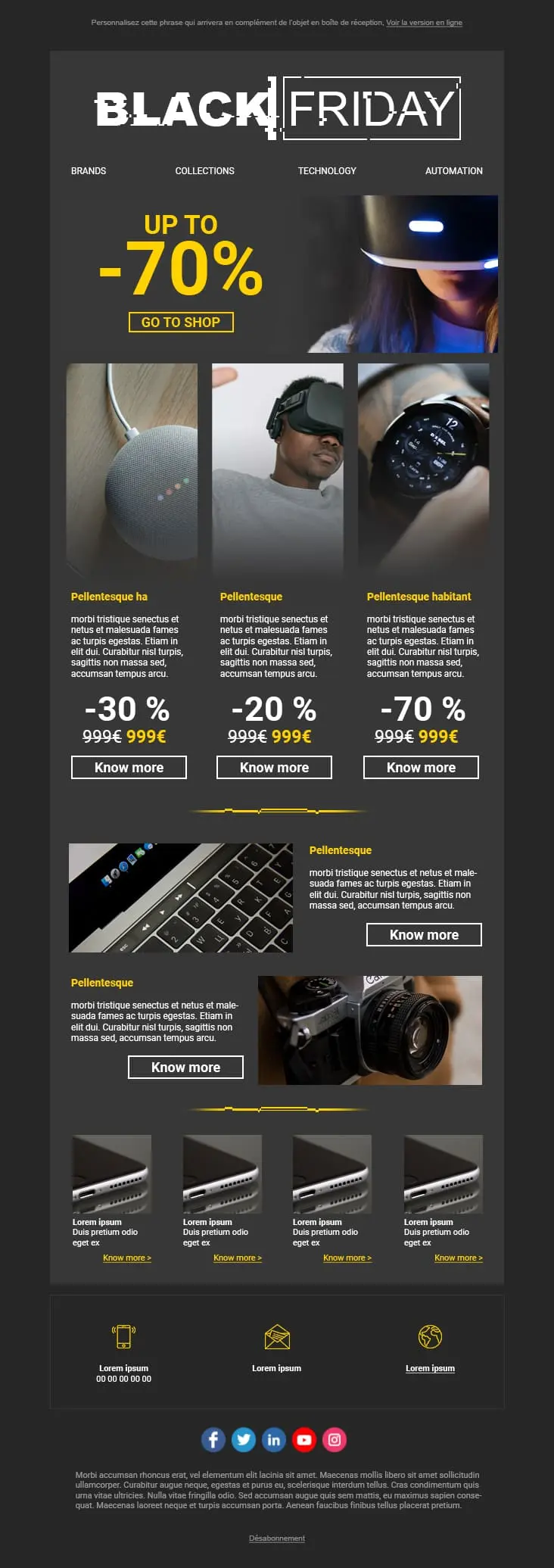
Il settore della vendita al dettaglio di prodotti tecnologici si basa sulla concretezza, non sul romanticismo. Questo template dai toni scuri con riflessi blu abbina il lettering tipografico “Black Friday” a un CTA “Approfitta dell'offerta”, divide la sezione successiva in due schede prodotto (Modello XS-199 + Zoom EF5), presenta una riga di 4 icone con le caratteristiche dei prodotti nella parte inferiore, inserisce una striscia con un codice sconto da 300 $ e conclude con una vetrina di prodotti in realtà virtuale collegata al CTA “Scopri le nostre ultime novità”.
Desktop
Mobile
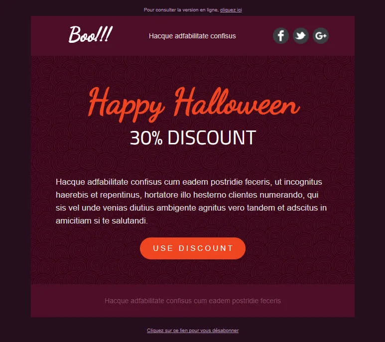
Le conversioni di Halloween dipendono da un'unica decisione: cliccare o no. Questo template elimina tutto il resto. Un elemento principale color prugna scuro con un motivo a spirale mette in risalto l'offerta, il titolo “Happy Halloween” scritto a mano cattura lo sguardo e l'unico pulsante arancione “Usa lo sconto” è l'unica azione da compiere. Nessuna distrazione, nessun secondo CTA, nessuna indecisione.
Desktop
Mobile
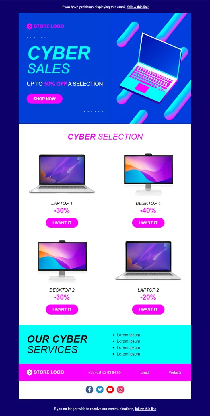
Coming SoonCyber Monday is what Black Friday wishes it could be — digital-first, screen-first. This template runs vaporwave neon (electric blue + magenta) with an isometric laptop hero, a 'CYBER SALES UP TO 50% OFF' headline, then drops a 2×2 product grid with individually-tuned discounts (Laptop 1 −30%, Desktop 1 −40%, Desktop 2 −30%, Laptop 2 −20%) and 'I want it' CTAs. A cyan 'Our Cyber Services' strip closes with four perks before the magenta footer.
Desktop
Mobile
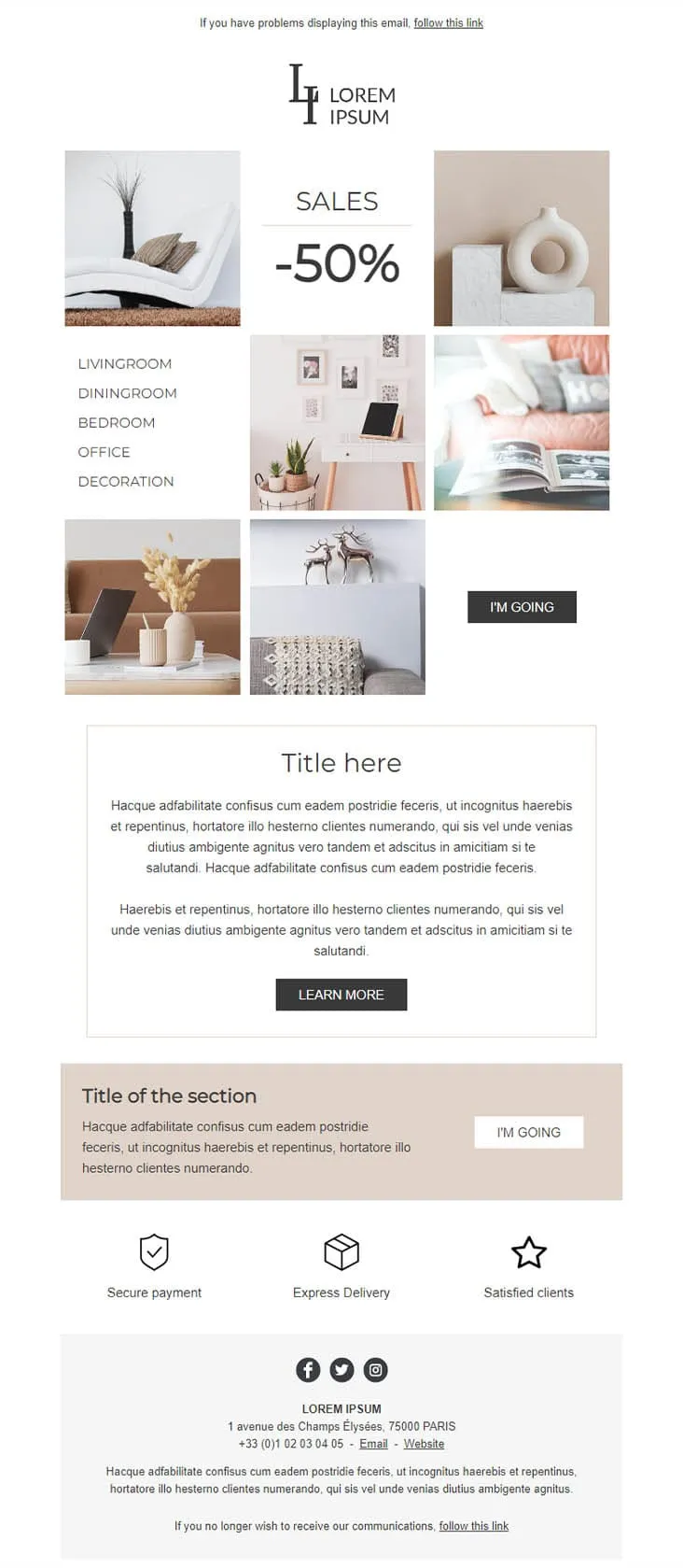
Coming SoonDecoration goes the other way from DecoHouse: pale palette, Scandinavian restraint, photography over branding. The 'LI / Lorem Ipsum' serif logo sits above a 6-photo mosaic with 'SALES -50%' floating in the centre and a vertical room-navigation sidebar (Livingroom, Diningroom, Bedroom, Office, Decoration). An 'I'M GOING' black button closes the gallery, two prose blocks ('Title here' boxed + 'Title of the section' on warm beige) follow, then a 3-trust-icon row (Secure payment, Express delivery, Satisfied clients) before the address footer. For minimalist home-decor retailers.
Desktop
Mobile

Coming SoonCar dealerships open their books for one weekend, then close them again — this template carries that pressure. ExclusiveCar leads with a red sports car under 'COME AND DISCOVER / OUR PRIVATE SALES THIS WEEKEND IN YOUR CAR DEALERSHIP', then a -30% white panel on new and second-hand vehicles, a 3-feature icon row (FEATURES 1/2/3), a 'PRIVATE SALES' SUV showcase with Learn More, a dark BEST SERVICES block split with a headlight close-up, a red 'Your next stop' social strip, a second PRIVATE SALES showcase with a desert SUV, and a dark footer with Learn More + a Lille location map.
Desktop
Mobile
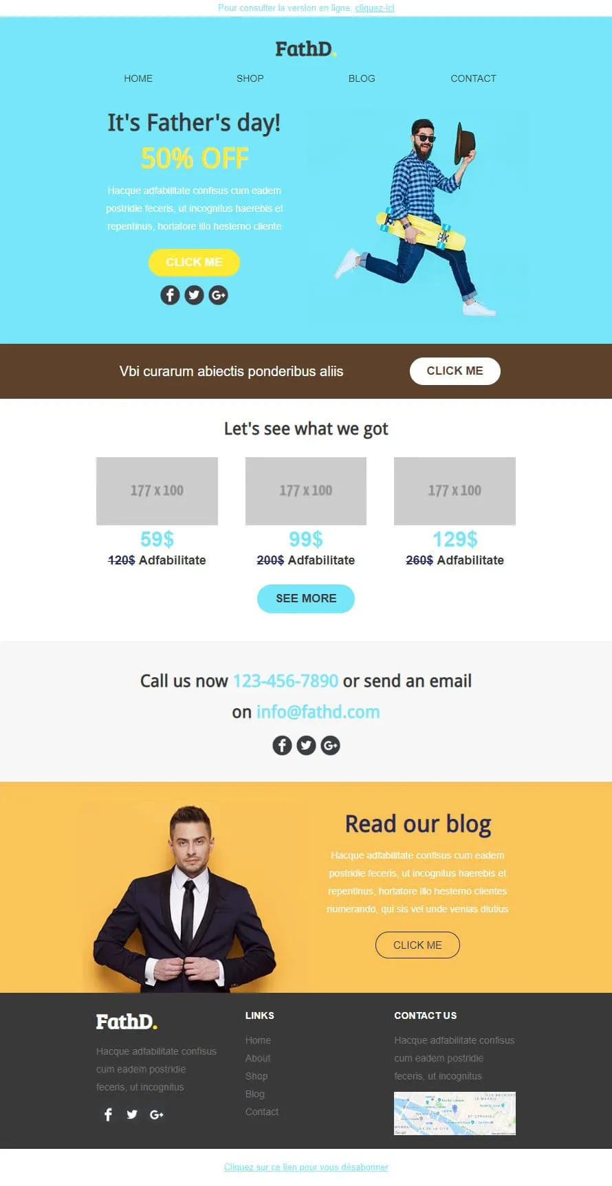
Coming SoonStock photos kill Father's Day sales. FathD breaks the curse with a skater-dad mid-air, checked shirt, tipped hat — on a sky-blue hero ('It's Father's day! 50% OFF'). The body delivers a brown 'Vbi curarum' offer strip, a 3-product pricing tier (59$/99$/129$ with crossed-out 120$/200$/260$), a 'Call us now' phone-and-email block, and a yellow 'Read our blog' lifestyle column with a sharp-suited man portrait. Apparel, sport-lifestyle, and dad-targeted retail.
Desktop
Mobile
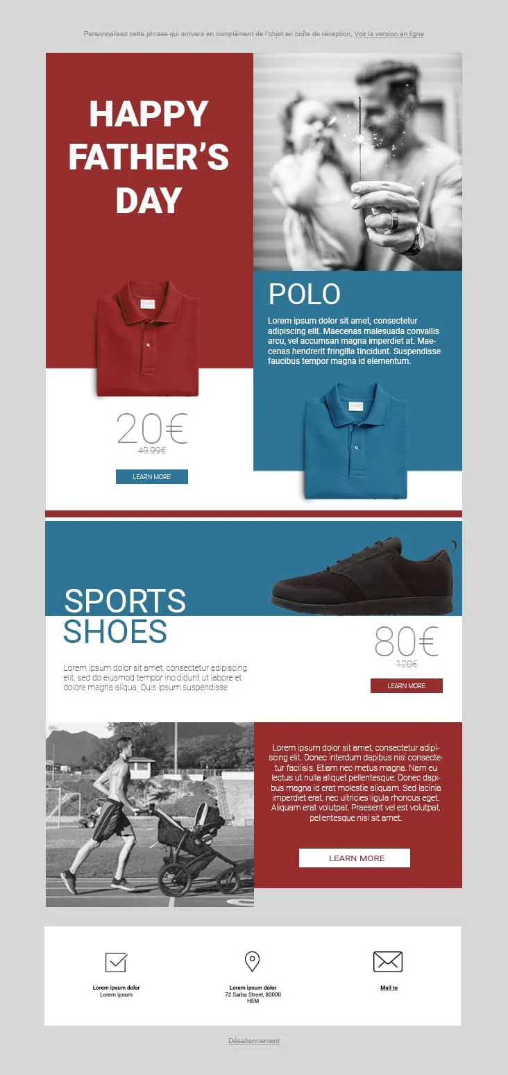
Coming SoonFather's Day 02 plays the magazine-cover game: red and steel-blue color blocks fight for attention. The hero stacks a red 'HAPPY FATHER'S DAY' tile next to a black-and-white sparkler-and-dad photo, then a Polo product card (20€ on red strikethrough 49.99€, two colorways, Learn More), a Sports Shoes block (80€ strikethrough 120€), and a stroller-jogger lifestyle row with a red prose panel and Learn More. The 3-icon footer (envelope-check / pin / mail) keeps it grounded. For sportswear, casual-menswear, and dad-as-athlete retailers.
Desktop
Mobile
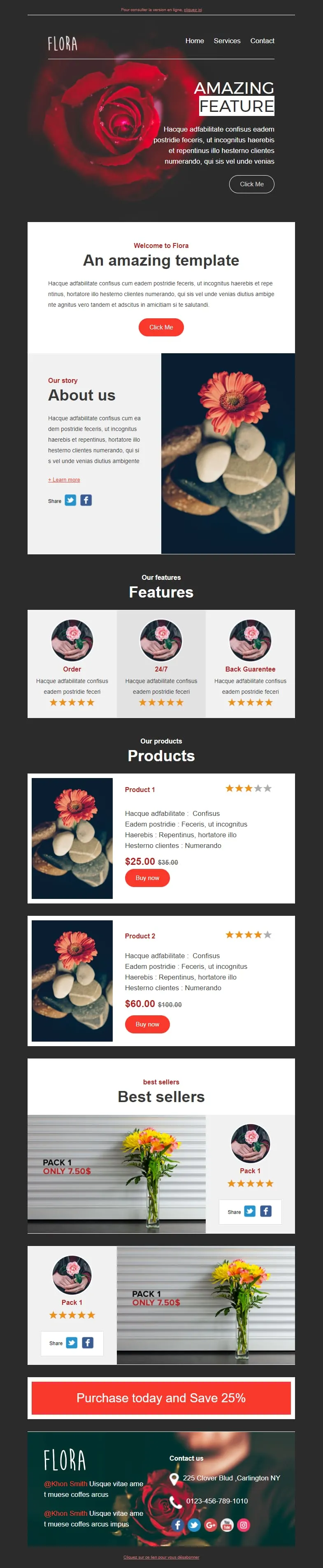
Coming SoonFlower shops sell mood, not stems. Flora reads that brief with a darkroom-style red-rose hero ('AMAZING FEATURE'), a white 'Welcome to Flora' card, an 'About us' two-column with orange-gerbera-on-pebbles photography, a 3-card 'Features' row (Order / 24/7 / Back Guarantee) each with 5-star rating, two product cards ($25/$35 + $60/$100 with Buy now and star ratings), two 'Pack 1 / Only 7.50$' best-seller image-text blocks, and a red 'Purchase today and Save 25%' CTA strip before a rose-backdrop footer with contact details.
Desktop
Mobile
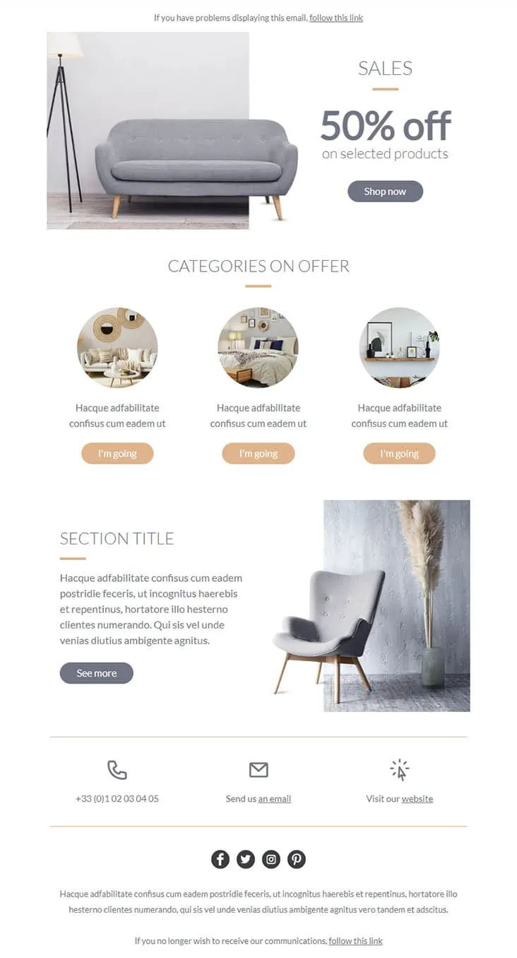
Coming SoonFurniture promos thrive on muted palettes — gray on peach reads more expensive than red on yellow. Furnishing splits its hero between a gray sofa photo and a simple 'SALES / 50% off on selected products' headline with a Shop now button, then drops a 'CATEGORIES ON OFFER' three-circle row (living-room / bedroom / decor-shelf) each carrying a peach 'I'm going' button, a 'SECTION TITLE' prose-and-chair-with-pampas-grass row with a See more CTA, and a 3-icon contact strip (phone +33 / email / website) above the social row. For furniture stores, interior retailers, and lifestyle brands.
Desktop
Mobile
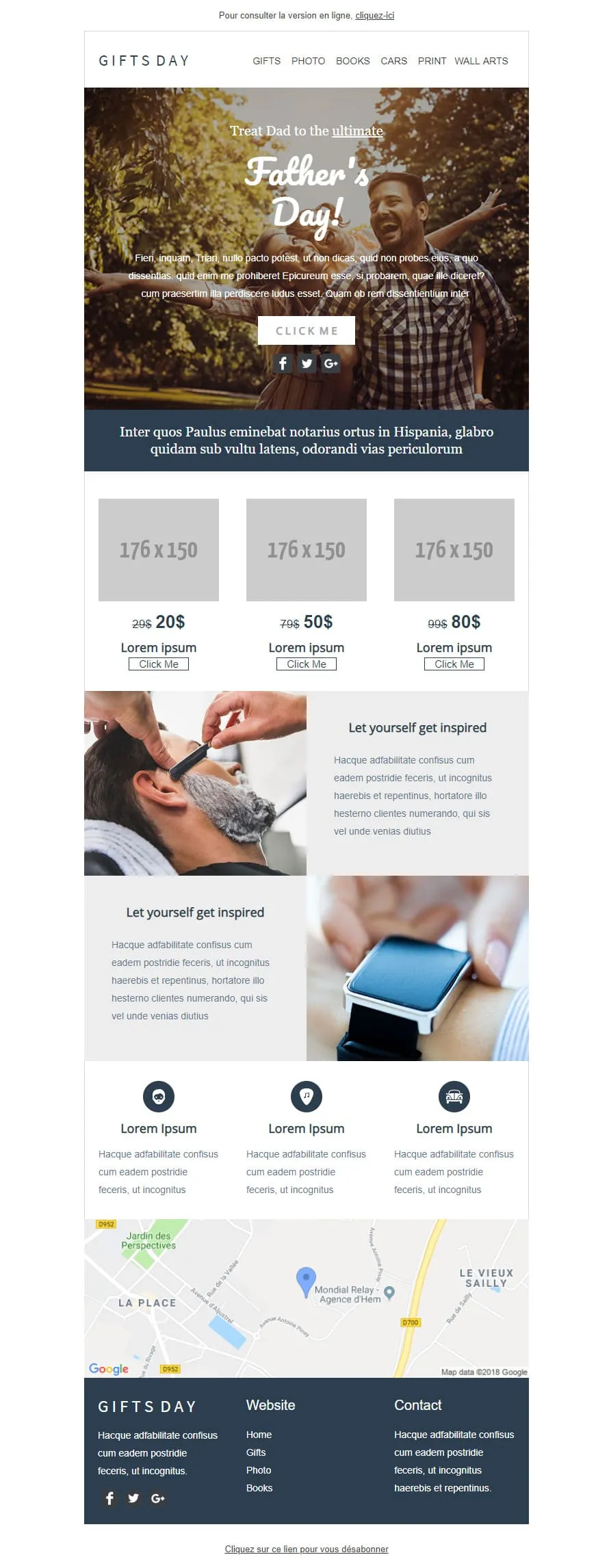
Coming SoonGift stores have a different brief than fashion retailers — they sell categories, not products. GIFTS DAY frames Father's Day across six verticals (Gifts / Photo / Books / Cars / Print / Wall arts) under a forest-hero of father-and-daughter ('Treat Dad to the ultimate / Father's Day!'), a navy Latin strip, a 3-tier price grid ($20/$50/$80 with crossed-out $29/$79/$99), two 'Let yourself get inspired' image-text rows (barber-shave / smartwatch), a 3-icon Lorem strip, a Google map of Hem (Mondial Relay anchor), and a dark navy footer linking Home / Gifts / Photo / Books.
Desktop
Mobile

Coming SoonTech-sale emails need volume — High-Tech Sales delivers it with a B&W man shouting through a megaphone over neon green/orange/yellow grids ('Treat yourself to a Big Discount on this sale' + orange SHOP NOW). Two coloured frames carry 4 'AWESOME PRODUCT' cards (smartwatch / headphones / smartphone / camera) each with a black 'I WANT IT' button, then a black 'Save up to 10% more' closing strip with a yellow SAVE MORE CTA, and a MYSHOP Paris address footer with phone, Contact us, Website, and 4 social icons.
Desktop
Mobile
A dark-mode tech retail template with neon blue and orange accents built for high-impact promotional sends. A bold discount hero leads into a multi-product showcase grid with individual percentage badges, and a closing CTA strip pushes the urgency.
Desktop
Mobile
template email per saldi e promozioni?Ogni layout mette lo sconto in primo piano. Gli iscritti vedono il valore già nella prima schermata. È così che nascono le decisioni di acquisto nelle email promozionali.
Email trascurate, con caratteri in contrasto e immagini deformate, minano la fiducia. Questi template mantengono un aspetto curato e professionale anche durante i saldi più consistenti. Il tuo sconto non deve costarti la credibilità.
Un concorrente abbassa i prezzi. Le scorte non si smuovono. Il tempo cambia e la merce estiva rimane invenduta. Devi reagire in poche ore, non in giorni.
La maggior parte dei clic sulle email promozionali proviene ormai dai dispositivi mobile. I layout responsive assicurano che il tuo pulsante “Acquista ora” sia facile da trovare e da toccare. Niente zoom. Niente frustrazione.
template email per le promozionile campagne email promozionaliQuesto confronto visivo è il fattore motivazionale più potente in qualsiasi email promozionale. Una frase del tipo “grandi risparmi” non regge il confronto.
“Spendi 50 € e risparmia il 10%. Spendi 100 € e risparmia il 20%.” Le offerte a più livelli aumentano naturalmente il valore medio dell’ordine. Offrono agli acquirenti un motivo concreto per aggiungere un altro articolo al carrello.
“Ultime 6 ore: 40% di sconto su tutto” genera più aperture rispetto a “Non perdere i nostri saldi!”. Metti in primo piano la cifra. Gli iscritti decidono di aprire l’email in base alla concretezza, non alla curiosità.
Invia l’offerta ai tuoi migliori clienti prima di chiunque altro. L’esclusività stimola un’azione più rapida da parte del segmento che già spende di più. Inoltre, riduce il picco di traffico del venerdì.

Su dispositivo mobile, se qualcuno deve scorrere per trovare l’offerta, l’hai già perso. Il pulsante principale deve trovarsi nella prima schermata. Senza eccezioni.
saldi e promozioniOttimizza le tue email per saldi e promozioniIn quanto tempo riescono a individuare lo sconto?
Due secondi. Questo è il tempo a disposizione. Colori ad alto contrasto sul numero che indica il risparmio. Se non è l’elemento che salta maggiormente all’occhio sulla pagina, riprogettatela.
I tuoi indicatori di disponibilità sono veritieri?
“Ne restano solo 3” stimola all'azione. Ma solo se riflette le reali disponibilità di magazzino. La falsa scarsità mina la fiducia più rapidamente di quanto generi clic. E una volta persa, la fiducia non torna più.
Dove rimanda il pulsante?
Alla pagina del prodotto. O meglio ancora, a un carrello già compilato con lo sconto applicato. Ogni clic in più tra l'offerta e il checkout fa perdere una quota significativa di potenziali acquirenti.
Gli avvisi di calo di prezzo funzionano in modo automatico
Usa l’automazione di Positive User per avvisare gli iscritti quando un prodotto che hanno visualizzato viene messo in saldo. Configuralo una volta sola. Rimarrà pertinente e tempestivo senza alcun intervento manuale.
L’urgenza e lo spazio bianco possono coesistere?
Sì. Una promozione può trasmettere urgenza senza dare un senso di confusione. Lasciare spazio intorno alla tua CTA principale rende la decisione di cliccare più semplice, non opprimente.
Cosa mettere nell’oggetto?
Sii specifico. “40% di sconto sull’attrezzatura outdoor” funziona meglio di “Non perdere questa offerta!”. Indica chiaramente l’offerta. Testa alcune versioni su un segmento più ristretto prima dell’invio di massa.
Un unico obiettivo per ogni sezione
Ogni blocco dell’email dovrebbe indirizzare verso la stessa azione: l’acquisto. Se qualcosa entra in competizione con l’offerta o distrae dal completamento dell’acquisto, eliminalo.
I template e l'automation integrata di Positive User si occupano del design. Tu ti concentri sull'offerta.