




Best Father
Vatertag
E-Commerce & Angebote
Aktionen & Angebote
Eine Promotion ist nur so gut wie die E-Mail, die sie ankündigt. Schlechtes Design, falscher Zeitpunkt oder ein versteckter Rabatt verwandeln 40 % Nachlass schnell in eine Klickrate von 0,3 %. Diese Vorlagen unterstützen Sie bei Flash-Sales, Räumungsverkäufen und saisonalen Aktionen mit Layouts, denen Ihre Abonnenten genug vertrauen, um zu klicken. Wählen Sie eine Vorlage und gehen Sie in wenigen Minuten mit dem Drag-and-Drop-Editor von Positive User live.
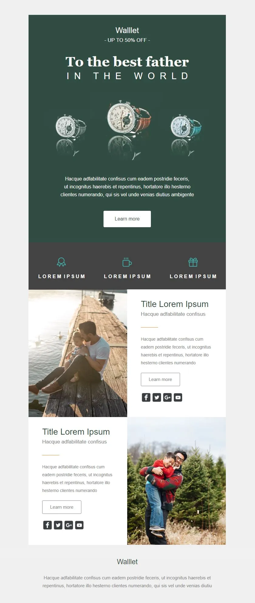
E-Mail-Vorlagen für Sales und PromotionsA premium Father's Day retail template in deep editorial green. A watch triptych hero carries a centered headline, a quiet inline discount banner follows, three perk icons sit in a slate strip, and two alternating image-text rows give the products context before the brand signs off.

Desktop
Mobile
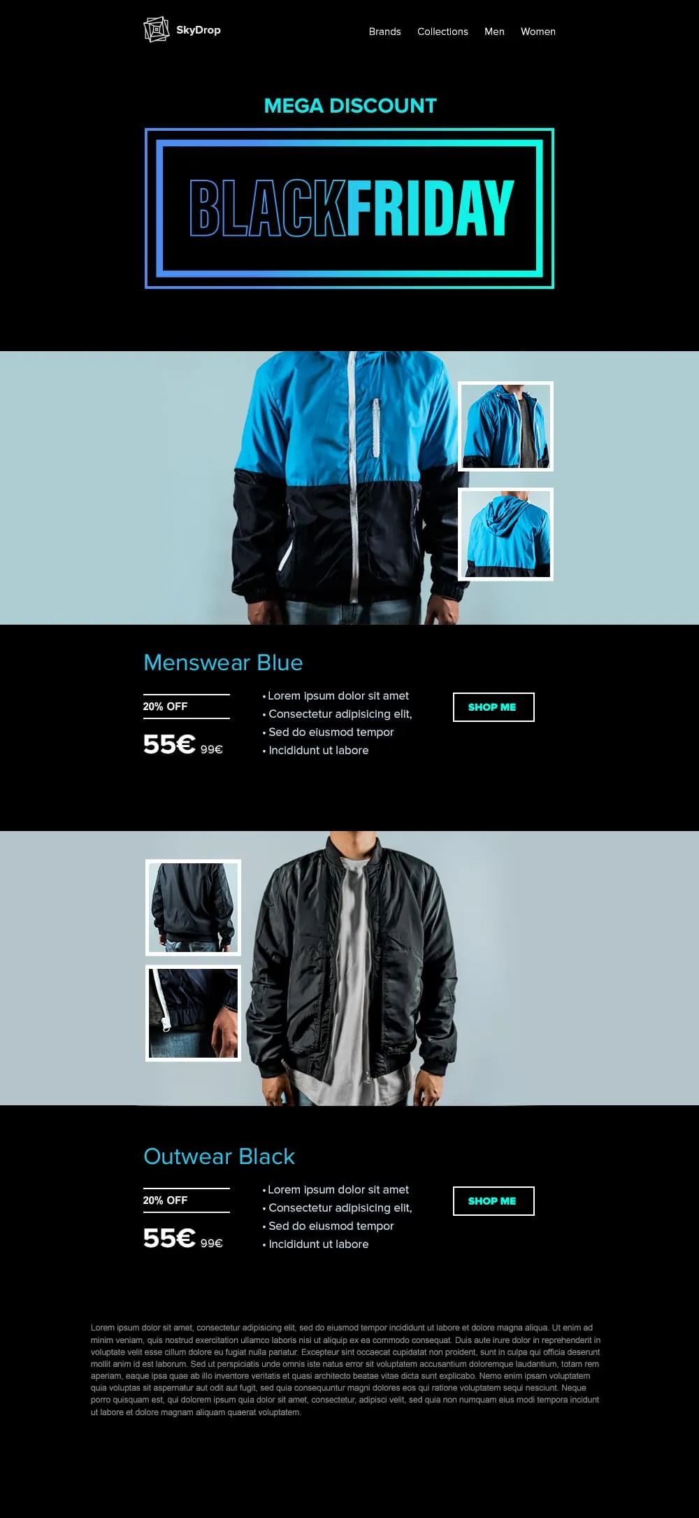
An apparel Black Friday template built around full-body product photography. A neon-framed hero opens the email, then two pairs of jacket showcases with front view and close-up sit on alternating cyan and black backgrounds, each carrying a discount tag, a crossed-out retail price and a direct shop button.
Desktop
Mobile
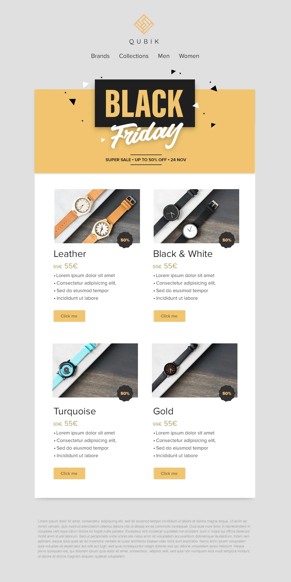
Four product variants, four prices and four buttons on a confetti yellow banner. A 2x2 grid drops Leather, Black and White, Turquoise and Gold colorways into matching cards, each with a 50% badge, a crossed-out anchor price and a soft yellow call to action. Quick to scan, quick to buy.
Desktop
Mobile
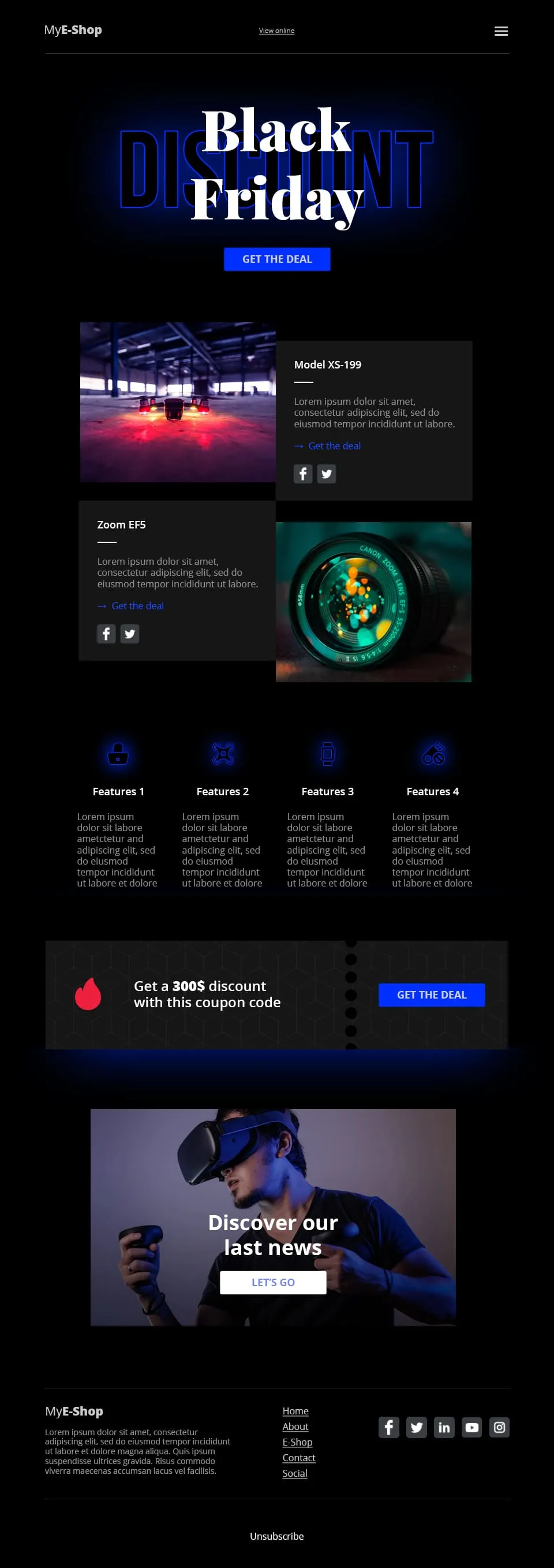
A tech-retail Black Friday template built for spec-driven audiences. Typographic lettering anchors the hero above a shop call to action, two spec product cards follow, a four-feature icon row adds credibility, a coupon code strip closes the deal and a VR product showcase ends the scroll.
Desktop
Mobile
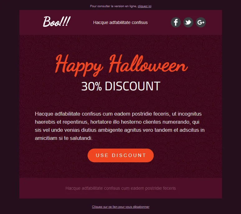
A Halloween template stripped down to a single conversion decision. A dark-plum spiral hero carries the offer, a hand-lettered headline anchors the eye and one orange discount pill is the only action available. No second call to action, no distraction, just the deal.
Desktop
Mobile
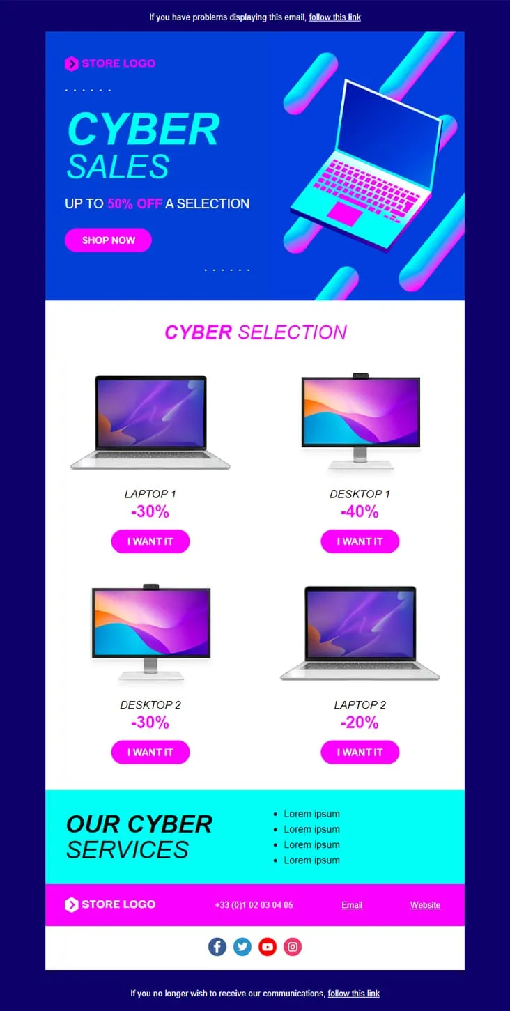
Coming SoonCyber Monday is what Black Friday wishes it could be — digital-first, screen-first. This template runs vaporwave neon (electric blue + magenta) with an isometric laptop hero, a 'CYBER SALES UP TO 50% OFF' headline, then drops a 2×2 product grid with individually-tuned discounts (Laptop 1 −30%, Desktop 1 −40%, Desktop 2 −30%, Laptop 2 −20%) and 'I want it' CTAs. A cyan 'Our Cyber Services' strip closes with four perks before the magenta footer.
Desktop
Mobile
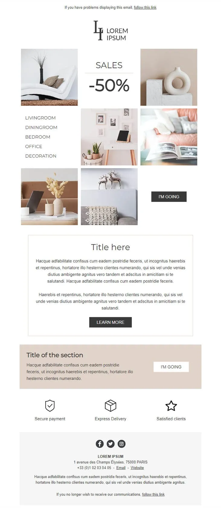
Coming SoonDecoration goes the other way from DecoHouse: pale palette, Scandinavian restraint, photography over branding. The 'LI / Lorem Ipsum' serif logo sits above a 6-photo mosaic with 'SALES -50%' floating in the centre and a vertical room-navigation sidebar (Livingroom, Diningroom, Bedroom, Office, Decoration). An 'I'M GOING' black button closes the gallery, two prose blocks ('Title here' boxed + 'Title of the section' on warm beige) follow, then a 3-trust-icon row (Secure payment, Express delivery, Satisfied clients) before the address footer. For minimalist home-decor retailers.
Desktop
Mobile

Coming SoonCar dealerships open their books for one weekend, then close them again — this template carries that pressure. ExclusiveCar leads with a red sports car under 'COME AND DISCOVER / OUR PRIVATE SALES THIS WEEKEND IN YOUR CAR DEALERSHIP', then a -30% white panel on new and second-hand vehicles, a 3-feature icon row (FEATURES 1/2/3), a 'PRIVATE SALES' SUV showcase with Learn More, a dark BEST SERVICES block split with a headlight close-up, a red 'Your next stop' social strip, a second PRIVATE SALES showcase with a desert SUV, and a dark footer with Learn More + a Lille location map.
Desktop
Mobile
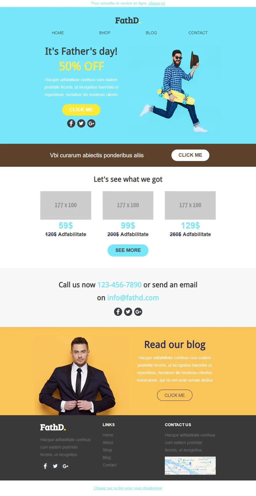
Coming SoonStock photos kill Father's Day sales. FathD breaks the curse with a skater-dad mid-air, checked shirt, tipped hat — on a sky-blue hero ('It's Father's day! 50% OFF'). The body delivers a brown 'Vbi curarum' offer strip, a 3-product pricing tier (59$/99$/129$ with crossed-out 120$/200$/260$), a 'Call us now' phone-and-email block, and a yellow 'Read our blog' lifestyle column with a sharp-suited man portrait. Apparel, sport-lifestyle, and dad-targeted retail.
Desktop
Mobile
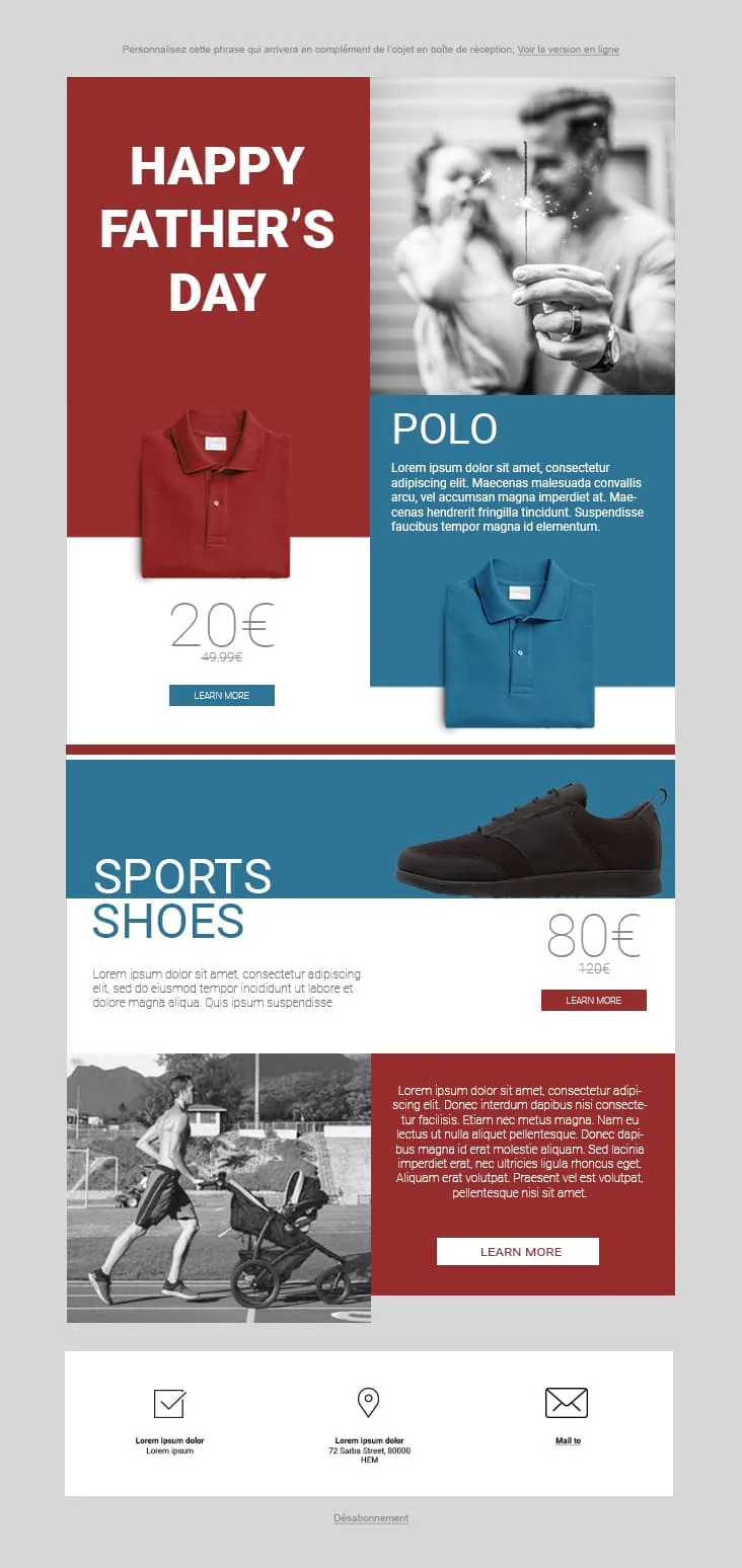
Coming SoonFather's Day 02 plays the magazine-cover game: red and steel-blue color blocks fight for attention. The hero stacks a red 'HAPPY FATHER'S DAY' tile next to a black-and-white sparkler-and-dad photo, then a Polo product card (20€ on red strikethrough 49.99€, two colorways, Learn More), a Sports Shoes block (80€ strikethrough 120€), and a stroller-jogger lifestyle row with a red prose panel and Learn More. The 3-icon footer (envelope-check / pin / mail) keeps it grounded. For sportswear, casual-menswear, and dad-as-athlete retailers.
Desktop
Mobile
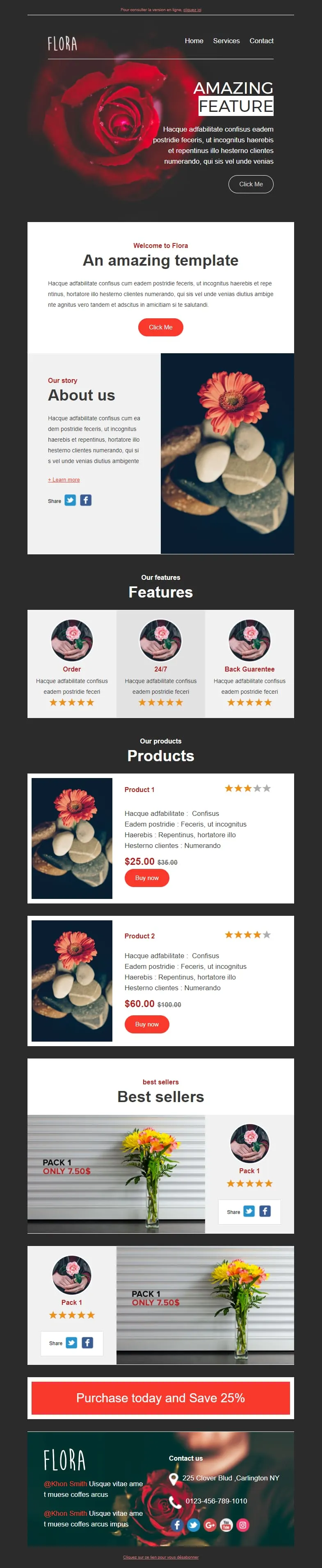
Coming SoonFlower shops sell mood, not stems. Flora reads that brief with a darkroom-style red-rose hero ('AMAZING FEATURE'), a white 'Welcome to Flora' card, an 'About us' two-column with orange-gerbera-on-pebbles photography, a 3-card 'Features' row (Order / 24/7 / Back Guarantee) each with 5-star rating, two product cards ($25/$35 + $60/$100 with Buy now and star ratings), two 'Pack 1 / Only 7.50$' best-seller image-text blocks, and a red 'Purchase today and Save 25%' CTA strip before a rose-backdrop footer with contact details.
Desktop
Mobile
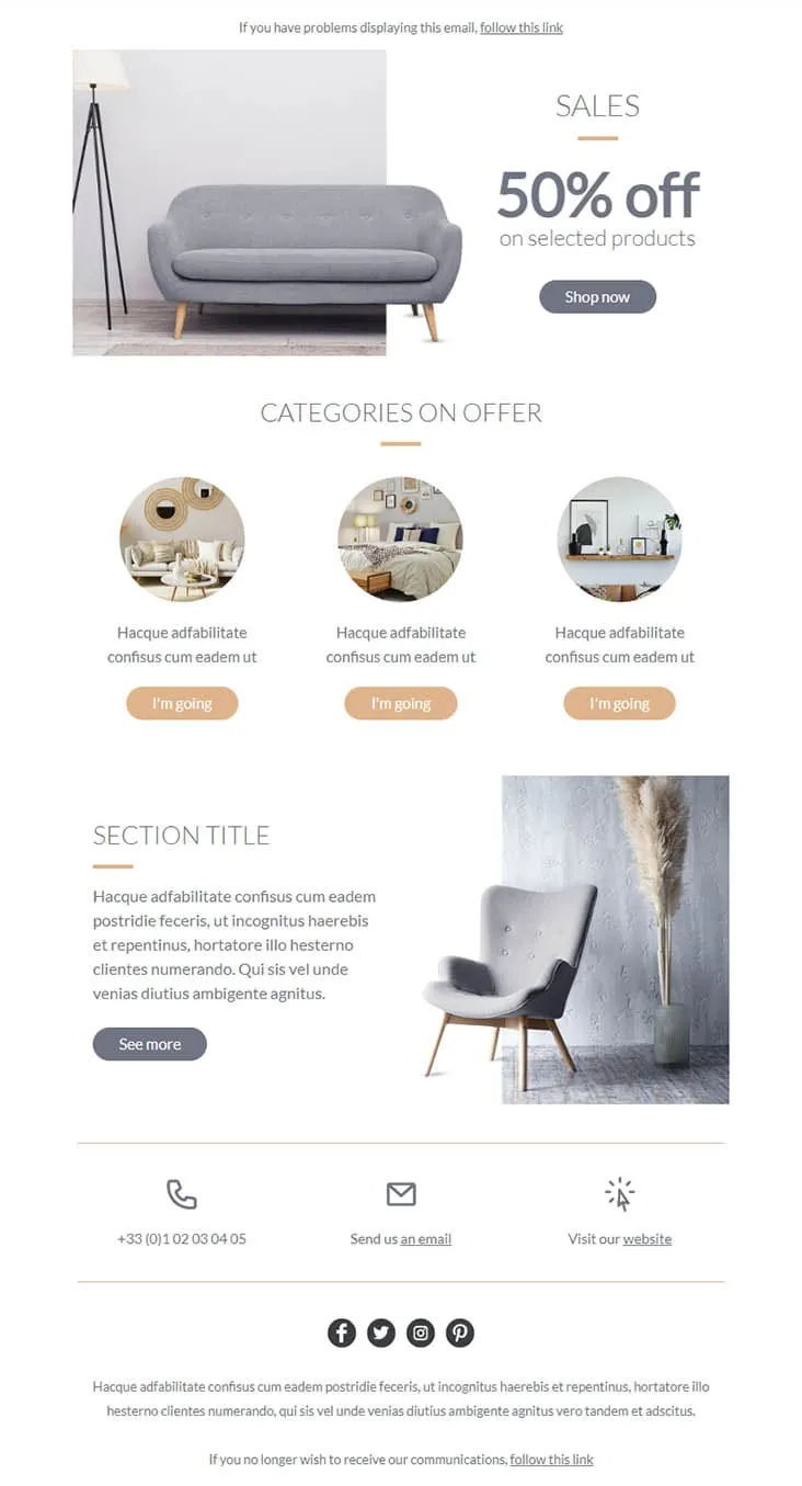
Coming SoonFurniture promos thrive on muted palettes — gray on peach reads more expensive than red on yellow. Furnishing splits its hero between a gray sofa photo and a simple 'SALES / 50% off on selected products' headline with a Shop now button, then drops a 'CATEGORIES ON OFFER' three-circle row (living-room / bedroom / decor-shelf) each carrying a peach 'I'm going' button, a 'SECTION TITLE' prose-and-chair-with-pampas-grass row with a See more CTA, and a 3-icon contact strip (phone +33 / email / website) above the social row. For furniture stores, interior retailers, and lifestyle brands.
Desktop
Mobile
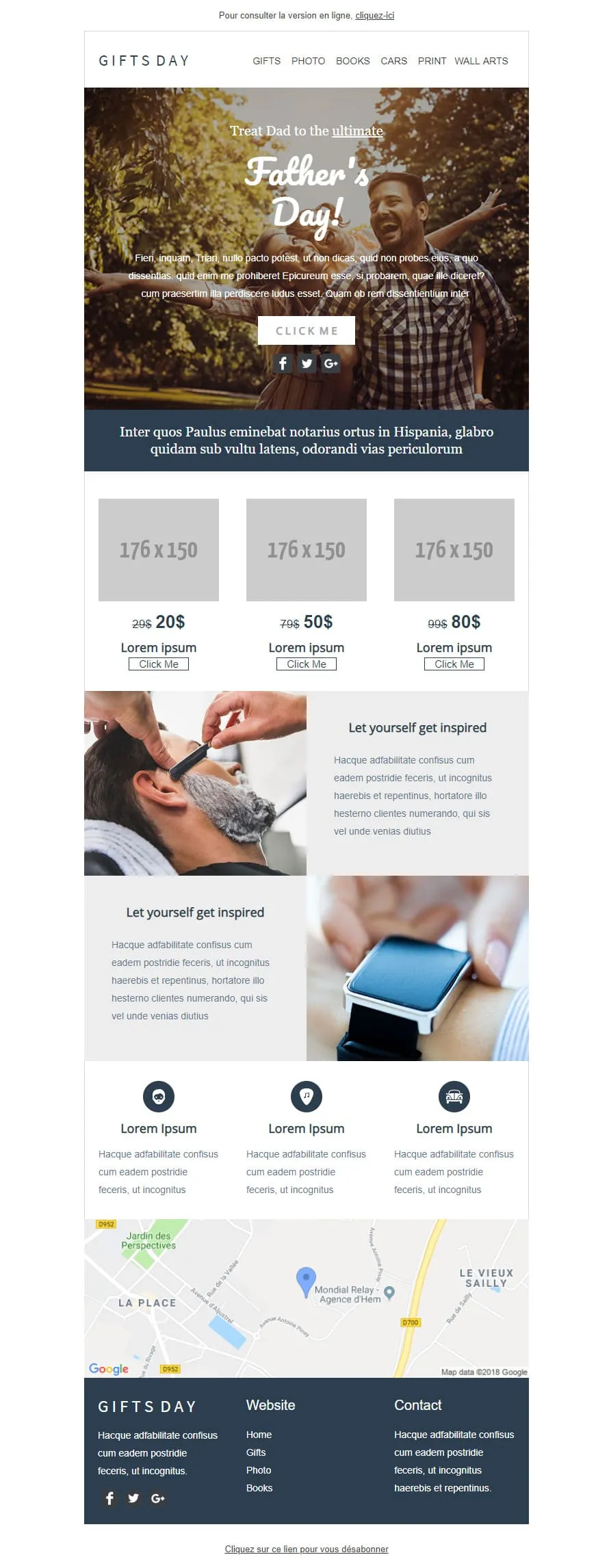
Coming SoonGift stores have a different brief than fashion retailers — they sell categories, not products. GIFTS DAY frames Father's Day across six verticals (Gifts / Photo / Books / Cars / Print / Wall arts) under a forest-hero of father-and-daughter ('Treat Dad to the ultimate / Father's Day!'), a navy Latin strip, a 3-tier price grid ($20/$50/$80 with crossed-out $29/$79/$99), two 'Let yourself get inspired' image-text rows (barber-shave / smartwatch), a 3-icon Lorem strip, a Google map of Hem (Mondial Relay anchor), and a dark navy footer linking Home / Gifts / Photo / Books.
Desktop
Mobile

Coming SoonTech-sale emails need volume — High-Tech Sales delivers it with a B&W man shouting through a megaphone over neon green/orange/yellow grids ('Treat yourself to a Big Discount on this sale' + orange SHOP NOW). Two coloured frames carry 4 'AWESOME PRODUCT' cards (smartwatch / headphones / smartphone / camera) each with a black 'I WANT IT' button, then a black 'Save up to 10% more' closing strip with a yellow SAVE MORE CTA, and a MYSHOP Paris address footer with phone, Contact us, Website, and 4 social icons.
Desktop
Mobile
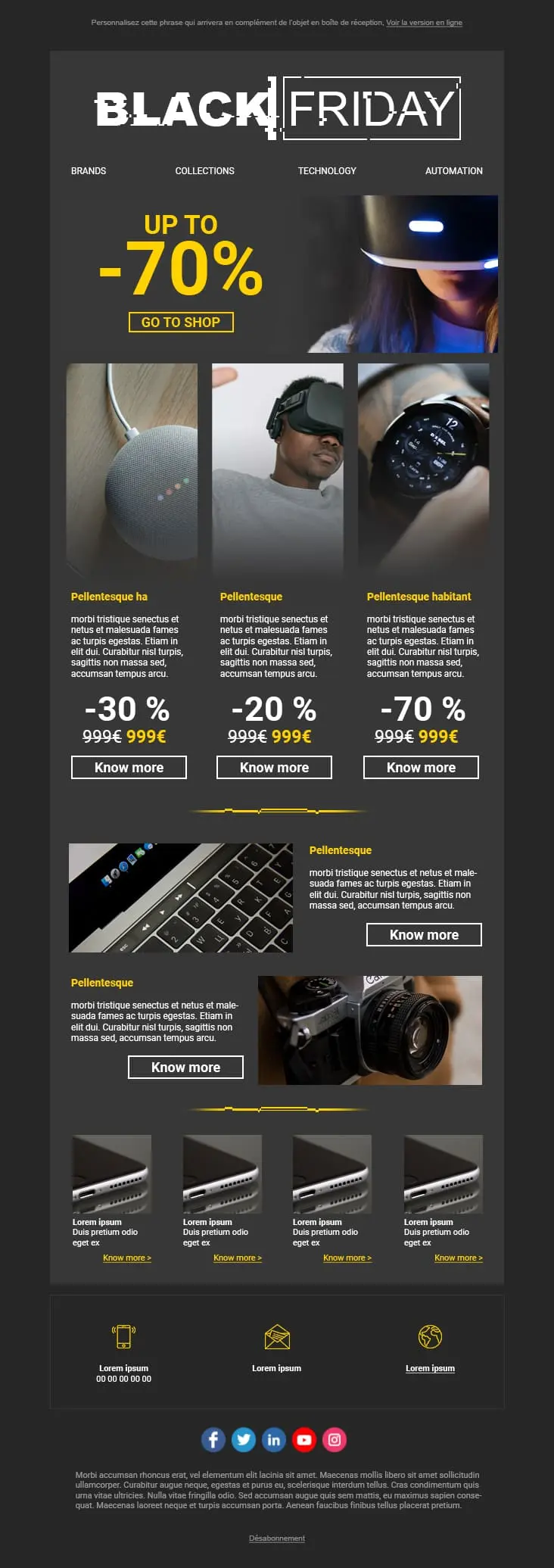
A dark-mode tech retail template with neon blue and orange accents built for high-impact promotional sends. A bold discount hero leads into a multi-product showcase grid with individual percentage badges, and a closing CTA strip pushes the urgency.
Desktop
Mobile
E-Mail-Vorlagen für Sales und Promotions verwenden?Jedes Layout stellt den Rabatt in den Mittelpunkt. Ihre Abonnenten sehen den Wert direkt im ersten Viewport. So beginnen schnelle Kaufentscheidungen bei Promo-E-Mails.
Schlampige E-Mails mit kollidierenden Schriften und verzerrten Bildern untergraben das Vertrauen. Diese Vorlagen wirken auch bei starken Rabatten gepflegt und professionell. Ihr Rabatt sollte Sie nicht die Glaubwürdigkeit kosten.
Ein Wettbewerber senkt die Preise. Der Bestand bewegt sich nicht. Das Wetter ändert sich und die Sommerware bleibt liegen. Sie müssen in Stunden reagieren, nicht in Tagen.
Die meisten Klicks auf Promo-E-Mails kommen heute vom Smartphone. Responsive Layouts sorgen dafür, dass Ihr „Jetzt kaufen“-Button leicht zu finden und zu tippen ist. Kein Zoomen. Kein Frust.
Sales-Vorlage anSales-E-Mail-KampagnenDurchgestrichener Originalpreis. Direkt daneben der fette Aktionspreis. Dieser visuelle Vergleich ist der stärkste Trigger in jeder Promo-E-Mail. Ein Text wie „tolle Ersparnisse“ kommt da nicht heran.
„50 € ausgeben, 10 % sparen. 100 € ausgeben, 20 % sparen.“ Gestaffelte Angebote heben den durchschnittlichen Warenkorbwert auf natürliche Weise an. Sie geben Käufern einen konkreten Grund, einen weiteren Artikel in den Warenkorb zu legen.
„Letzte 6 Stunden: 40 % auf alles“ erzielt mehr Öffnungen als „Verpassen Sie nicht unsere Aktion!“. Beginnen Sie mit der Zahl. Abonnenten öffnen aufgrund von Konkretheit, nicht aus Neugier.
Schicken Sie Ihre Aktion zuerst an Ihre besten Kunden. Exklusivität beschleunigt den Kaufabschluss bei dem Segment, das ohnehin am meisten ausgibt. Außerdem entzerrt es den Freitags-Traffic-Peak.

Wenn jemand am Smartphone scrollen muss, um das Angebot zu finden, ist er bereits verloren. Hauptbutton im ersten Bildschirm. Ohne Ausnahme.
Sales- und Promo-E-MailsOptimieren Sie Ihre Sales- und Promo-E-MailsWie schnell finden sie den Rabatt?
Zwei Sekunden. Mehr Zeit haben Sie nicht. Hochkontrastreiche Farben auf der Ersparnis-Zahl. Wenn das nicht das auffälligste Element ist, gestalten Sie neu.
Sind Ihre Bestandsanzeigen ehrlich?
„Nur noch 3 verfügbar“ treibt zum Handeln. Aber nur, wenn es den tatsächlichen Bestand widerspiegelt. Künstliche Knappheit zerstört Vertrauen schneller, als sie Klicks erzeugt. Und einmal verlorenes Vertrauen kommt nicht zurück.
Wohin führt Ihr Button?
Auf die Produktseite. Oder besser noch: auf einen vorbefüllten Warenkorb mit bereits angewendetem Rabatt. Jeder zusätzliche Klick zwischen Angebot und Checkout kostet einen relevanten Anteil potenzieller Käufer.
Preisalarm-Mails laufen von selbst
Nutzen Sie die Automatisierung von Positive User, um Abonnenten zu benachrichtigen, sobald ein Produkt, das sie sich angesehen haben, im Angebot ist. Einmal eingerichtet, bleibt sie relevant und pünktlich, ohne manuelle Pflege.
Können Dringlichkeit und Weißraum koexistieren?
Ja. Eine Aktion kann dringlich wirken, ohne überladen zu sein. Luft rund um Ihren Haupt-CTA macht die Klickentscheidung leicht statt erdrückend.
Was steht in der Betreffzeile?
Werden Sie konkret. „40 % auf Outdoor-Ausrüstung“ schlägt „Verpassen Sie unsere Aktion nicht!“. Benennen Sie das Angebot. Testen Sie zwei oder drei Versionen auf einem kleineren Segment vor dem Hauptversand.
Ein Ziel pro Abschnitt
Jeder Block in der E-Mail sollte auf dieselbe Aktion abzielen: kaufen. Was mit dem Angebot konkurriert oder vom Checkout ablenkt, fliegt raus.
Die Vorlagen und die integrierte Automatisierung von Positive User kümmern sich um das Design. Sie konzentrieren sich auf das Angebot.