




Best Father
Día del Padre
E-commerce y ofertas
Rebajas y promociones
Una promoción solo vale lo que vale el email que la anuncia. Un mal diseño, un mal momento o una oferta enterrada en el contenido pueden convertir un 40% de descuento en un 0,3% de clics. Estas plantillas te ayudan a lanzar ventas flash, liquidaciones y promociones estacionales con diseños que inspiran la confianza necesaria para hacer clic. Elige una plantilla y lanza tu campaña en minutos con el editor drag & drop de Positive User.
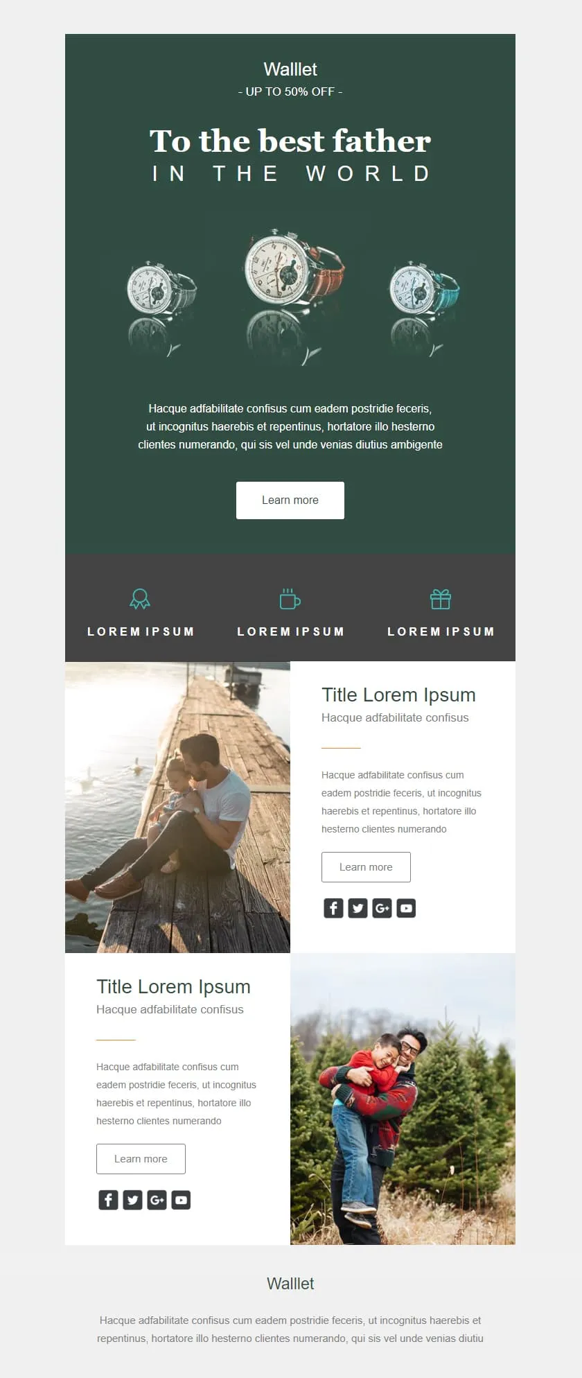
plantillas de email para promociones y rebajasA premium Father's Day retail template in deep editorial green. A watch triptych hero carries a centered headline, a quiet inline discount banner follows, three perk icons sit in a slate strip, and two alternating image-text rows give the products context before the brand signs off.

Desktop
Mobile
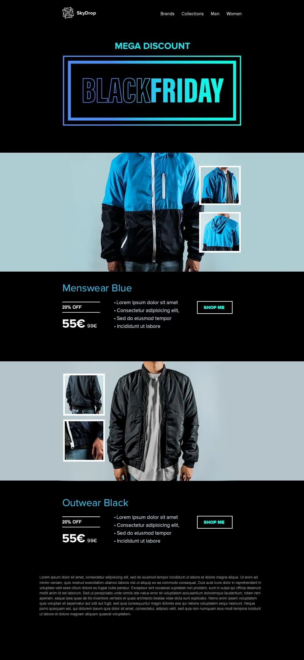
An apparel Black Friday template built around full-body product photography. A neon-framed hero opens the email, then two pairs of jacket showcases with front view and close-up sit on alternating cyan and black backgrounds, each carrying a discount tag, a crossed-out retail price and a direct shop button.
Desktop
Mobile
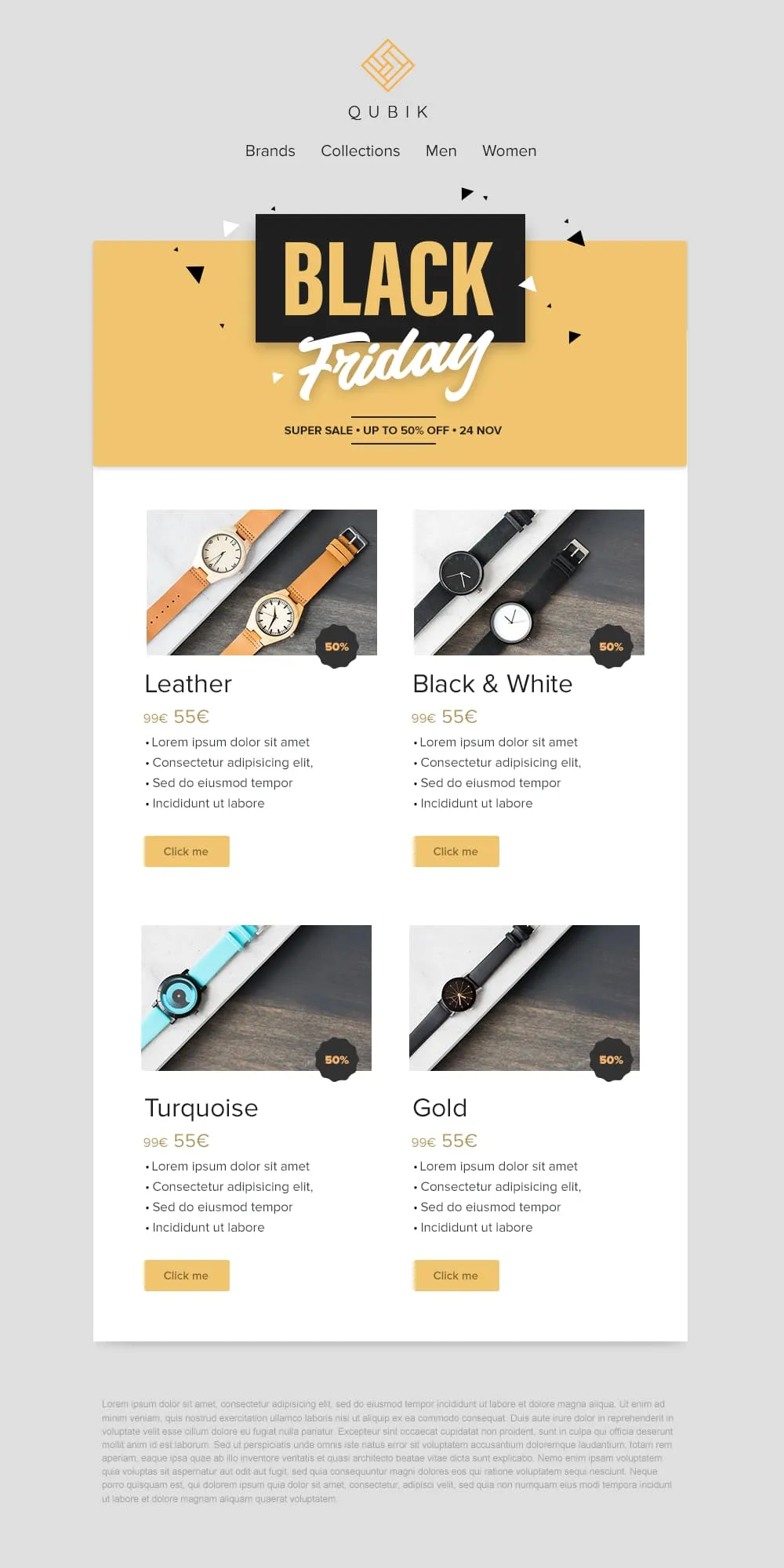
Four product variants, four prices and four buttons on a confetti yellow banner. A 2x2 grid drops Leather, Black and White, Turquoise and Gold colorways into matching cards, each with a 50% badge, a crossed-out anchor price and a soft yellow call to action. Quick to scan, quick to buy.
Desktop
Mobile
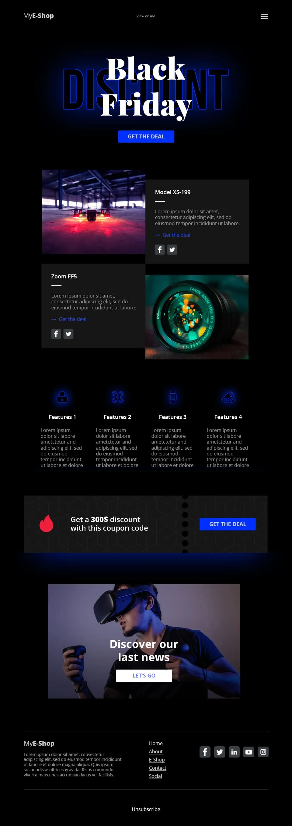
A tech-retail Black Friday template built for spec-driven audiences. Typographic lettering anchors the hero above a shop call to action, two spec product cards follow, a four-feature icon row adds credibility, a coupon code strip closes the deal and a VR product showcase ends the scroll.
Desktop
Mobile
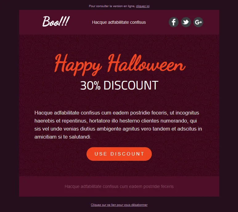
A Halloween template stripped down to a single conversion decision. A dark-plum spiral hero carries the offer, a hand-lettered headline anchors the eye and one orange discount pill is the only action available. No second call to action, no distraction, just the deal.
Desktop
Mobile
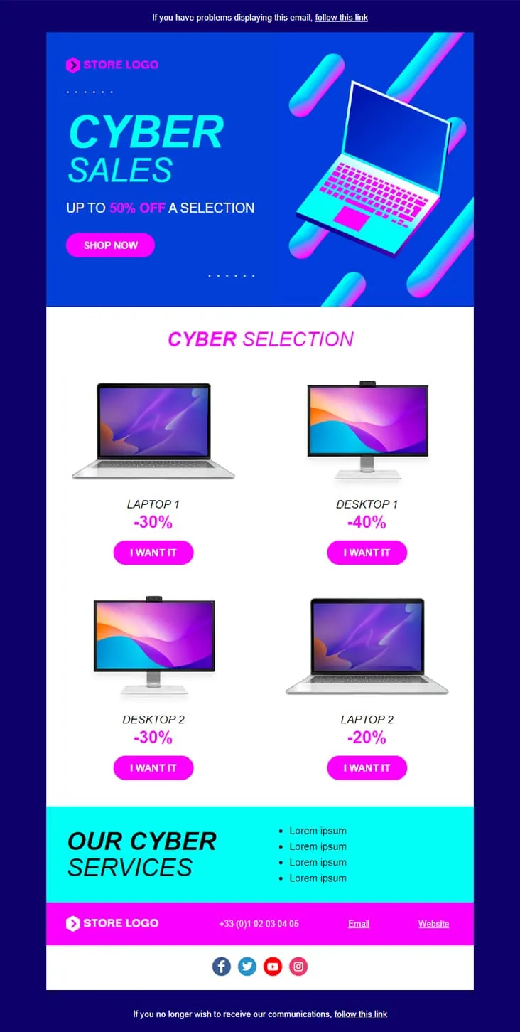
Coming SoonCyber Monday is what Black Friday wishes it could be — digital-first, screen-first. This template runs vaporwave neon (electric blue + magenta) with an isometric laptop hero, a 'CYBER SALES UP TO 50% OFF' headline, then drops a 2×2 product grid with individually-tuned discounts (Laptop 1 −30%, Desktop 1 −40%, Desktop 2 −30%, Laptop 2 −20%) and 'I want it' CTAs. A cyan 'Our Cyber Services' strip closes with four perks before the magenta footer.
Desktop
Mobile
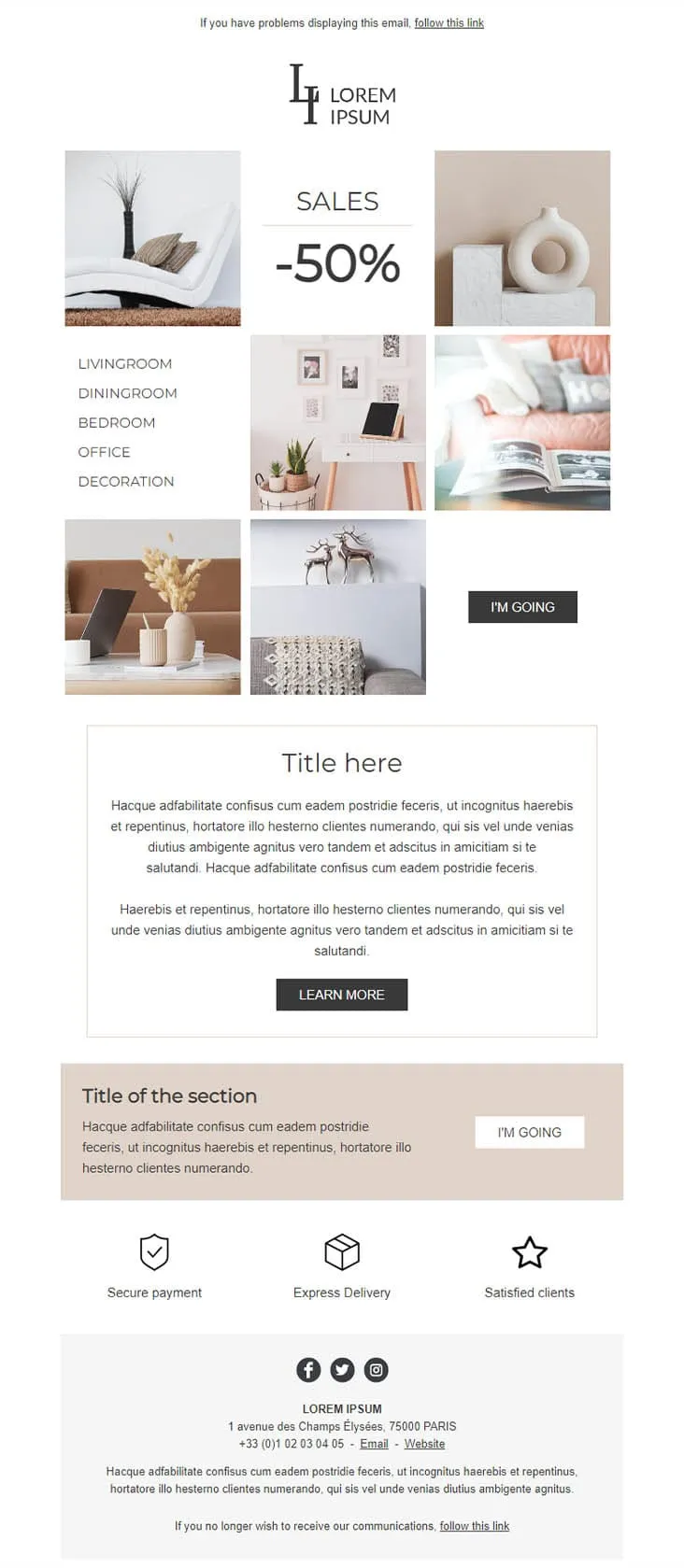
Coming SoonDecoration goes the other way from DecoHouse: pale palette, Scandinavian restraint, photography over branding. The 'LI / Lorem Ipsum' serif logo sits above a 6-photo mosaic with 'SALES -50%' floating in the centre and a vertical room-navigation sidebar (Livingroom, Diningroom, Bedroom, Office, Decoration). An 'I'M GOING' black button closes the gallery, two prose blocks ('Title here' boxed + 'Title of the section' on warm beige) follow, then a 3-trust-icon row (Secure payment, Express delivery, Satisfied clients) before the address footer. For minimalist home-decor retailers.
Desktop
Mobile

Coming SoonCar dealerships open their books for one weekend, then close them again — this template carries that pressure. ExclusiveCar leads with a red sports car under 'COME AND DISCOVER / OUR PRIVATE SALES THIS WEEKEND IN YOUR CAR DEALERSHIP', then a -30% white panel on new and second-hand vehicles, a 3-feature icon row (FEATURES 1/2/3), a 'PRIVATE SALES' SUV showcase with Learn More, a dark BEST SERVICES block split with a headlight close-up, a red 'Your next stop' social strip, a second PRIVATE SALES showcase with a desert SUV, and a dark footer with Learn More + a Lille location map.
Desktop
Mobile
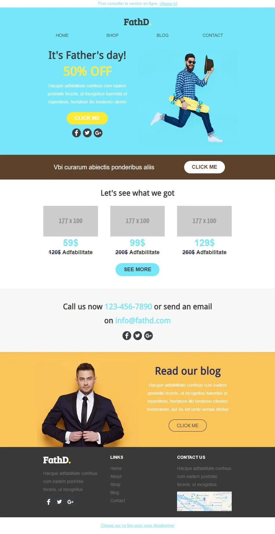
Coming SoonStock photos kill Father's Day sales. FathD breaks the curse with a skater-dad mid-air, checked shirt, tipped hat — on a sky-blue hero ('It's Father's day! 50% OFF'). The body delivers a brown 'Vbi curarum' offer strip, a 3-product pricing tier (59$/99$/129$ with crossed-out 120$/200$/260$), a 'Call us now' phone-and-email block, and a yellow 'Read our blog' lifestyle column with a sharp-suited man portrait. Apparel, sport-lifestyle, and dad-targeted retail.
Desktop
Mobile
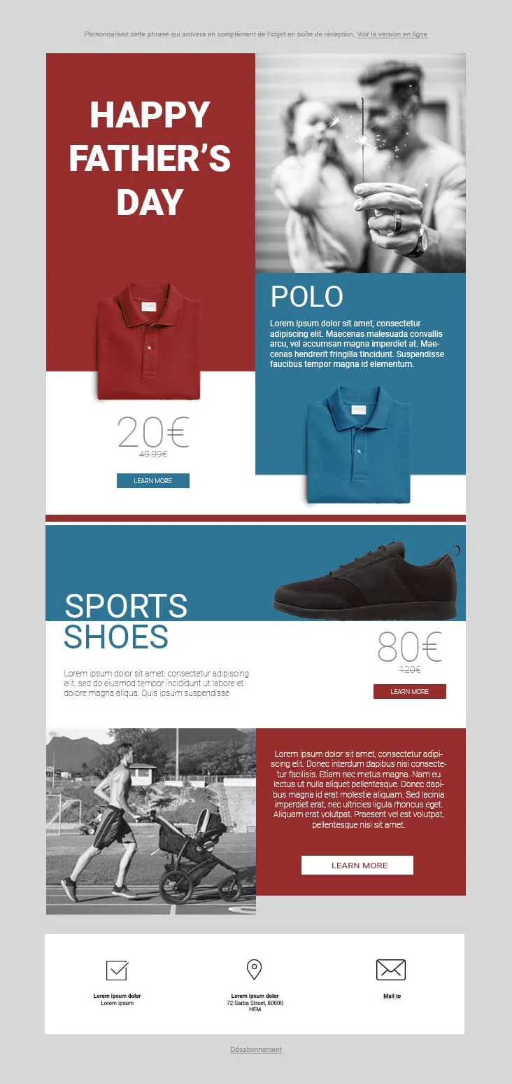
Coming SoonFather's Day 02 plays the magazine-cover game: red and steel-blue color blocks fight for attention. The hero stacks a red 'HAPPY FATHER'S DAY' tile next to a black-and-white sparkler-and-dad photo, then a Polo product card (20€ on red strikethrough 49.99€, two colorways, Learn More), a Sports Shoes block (80€ strikethrough 120€), and a stroller-jogger lifestyle row with a red prose panel and Learn More. The 3-icon footer (envelope-check / pin / mail) keeps it grounded. For sportswear, casual-menswear, and dad-as-athlete retailers.
Desktop
Mobile
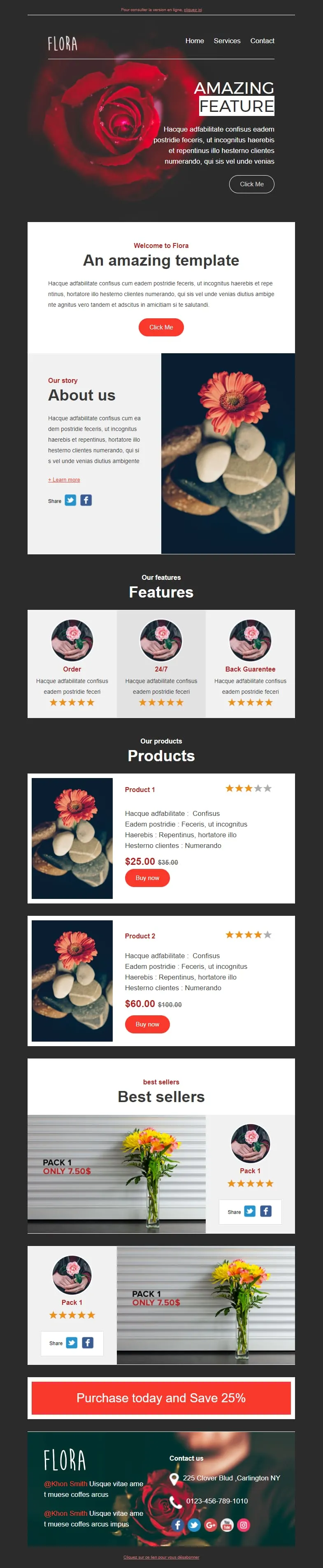
Coming SoonFlower shops sell mood, not stems. Flora reads that brief with a darkroom-style red-rose hero ('AMAZING FEATURE'), a white 'Welcome to Flora' card, an 'About us' two-column with orange-gerbera-on-pebbles photography, a 3-card 'Features' row (Order / 24/7 / Back Guarantee) each with 5-star rating, two product cards ($25/$35 + $60/$100 with Buy now and star ratings), two 'Pack 1 / Only 7.50$' best-seller image-text blocks, and a red 'Purchase today and Save 25%' CTA strip before a rose-backdrop footer with contact details.
Desktop
Mobile
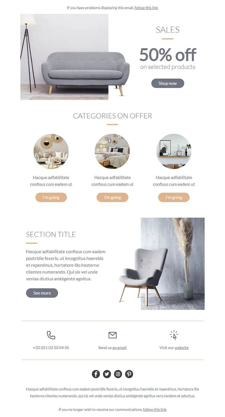
Coming SoonFurniture promos thrive on muted palettes — gray on peach reads more expensive than red on yellow. Furnishing splits its hero between a gray sofa photo and a simple 'SALES / 50% off on selected products' headline with a Shop now button, then drops a 'CATEGORIES ON OFFER' three-circle row (living-room / bedroom / decor-shelf) each carrying a peach 'I'm going' button, a 'SECTION TITLE' prose-and-chair-with-pampas-grass row with a See more CTA, and a 3-icon contact strip (phone +33 / email / website) above the social row. For furniture stores, interior retailers, and lifestyle brands.
Desktop
Mobile
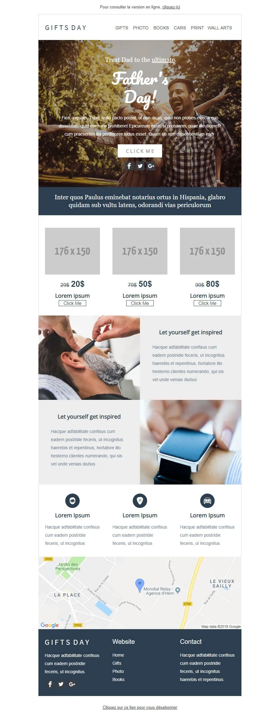
Coming SoonGift stores have a different brief than fashion retailers — they sell categories, not products. GIFTS DAY frames Father's Day across six verticals (Gifts / Photo / Books / Cars / Print / Wall arts) under a forest-hero of father-and-daughter ('Treat Dad to the ultimate / Father's Day!'), a navy Latin strip, a 3-tier price grid ($20/$50/$80 with crossed-out $29/$79/$99), two 'Let yourself get inspired' image-text rows (barber-shave / smartwatch), a 3-icon Lorem strip, a Google map of Hem (Mondial Relay anchor), and a dark navy footer linking Home / Gifts / Photo / Books.
Desktop
Mobile

Coming SoonTech-sale emails need volume — High-Tech Sales delivers it with a B&W man shouting through a megaphone over neon green/orange/yellow grids ('Treat yourself to a Big Discount on this sale' + orange SHOP NOW). Two coloured frames carry 4 'AWESOME PRODUCT' cards (smartwatch / headphones / smartphone / camera) each with a black 'I WANT IT' button, then a black 'Save up to 10% more' closing strip with a yellow SAVE MORE CTA, and a MYSHOP Paris address footer with phone, Contact us, Website, and 4 social icons.
Desktop
Mobile
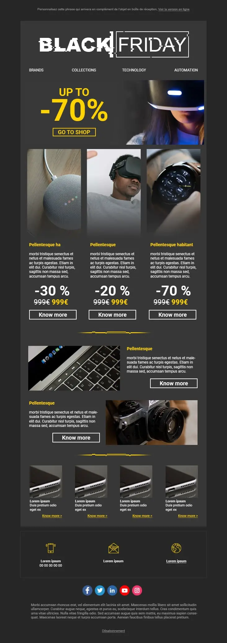
A dark-mode tech retail template with neon blue and orange accents built for high-impact promotional sends. A bold discount hero leads into a multi-product showcase grid with individual percentage badges, and a closing CTA strip pushes the urgency.
Desktop
Mobile
plantillas de email para promociones y rebajas?Cada diseño coloca el descuento en el centro. Tus suscriptores ven el valor desde la primera pantalla. Así arrancan las decisiones de compra rápidas en los emails promocionales.
Los emails descuidados, con tipografías que chocan e imágenes deformadas, erosionan la confianza. Estas plantillas mantienen un acabado cuidado y profesional incluso con grandes rebajas. Tu descuento no debería costarte credibilidad.
Un competidor baja precios. El stock no se mueve. Cambia el tiempo y la colección de verano se queda parada. Tienes que reaccionar en horas, no en días.
La mayoría de los clics en emails promocionales vienen ya del móvil. Los diseños responsive garantizan que tu botón «Comprar ahora» sea fácil de encontrar y de pulsar. Sin zoom. Sin frustración.
plantilla de email de promocióncampañas de email promocionalesEl precio original tachado. El precio rebajado en negrita justo al lado. Esa comparación visual es el motivador más fuerte en cualquier email promocional. Un texto que dice «grandes ahorros» no se acerca.
«Gasta 50 €, ahorra un 10%. Gasta 100 €, ahorra un 20%.» Las ofertas por tramos elevan de forma natural el valor medio del pedido. Le dan al comprador una razón concreta para añadir un artículo más al carrito.
«Últimas 6 horas: 40% en todo» consigue más aperturas que «¡No te pierdas nuestra promo!». Lidera con el número. Tus suscriptores abren por concreción, no por curiosidad.
Envía la promoción a tus mejores clientes antes que al resto. La exclusividad acelera la compra en el segmento que ya gasta más. Además, reduce el pico de tráfico del viernes.

En móvil, si alguien tiene que hacer scroll para encontrar la oferta, ya lo has perdido. Botón principal en la primera pantalla. Sin excepciones.
email para promociones y rebajasOptimiza tus emails de promociones y rebajas¿Cuánto tarda en encontrar el descuento?
Dos segundos. Esa es la ventana. Colores de alto contraste en la cifra de ahorro. Si no es el elemento más llamativo de la página, rediseña.
¿Tus indicadores de stock son honestos?
«Solo quedan 3» impulsa la acción. Pero solo cuando refleja el stock real. La escasez falsa destruye la confianza más rápido de lo que genera clics. Y una vez perdida, no vuelve.
¿Adónde lleva tu botón?
A la página del producto. O mejor aún, a un carrito ya cargado con el descuento aplicado. Cada clic adicional entre la oferta y el checkout te hace perder una parte significativa de compradores potenciales.
Las alertas de bajada de precio funcionan solas
Usa la automatización de Positive User para avisar a tus suscriptores cuando un producto que han mirado entra en promoción. Lo configuras una vez y se mantiene relevante y oportuno sin trabajo manual.
¿Pueden convivir la urgencia y el espacio en blanco?
Sí. Una promoción puede transmitir urgencia sin saturar. El espacio en blanco alrededor del CTA principal hace que la decisión de hacer clic resulte fácil, no abrumadora.
¿Qué dice tu asunto?
Sé concreto. «40% en outdoor» funciona mejor que «¡No te pierdas esta promo!». Nombra la oferta. Prueba un par de versiones en un segmento más pequeño antes del envío principal.
Un objetivo por sección
Cada bloque del email debe apuntar a la misma acción: comprar. Si algo compite con la oferta o distrae del checkout, elimínalo.
Las plantillas y la automatización integrada de Positive User se ocupan del diseño. Tú te concentras en la oferta.