




Around the World
Natura e viaggi
Lifestyle
Non sai da dove cominciare? È proprio questo lo scopo di una library. Sequenze automatizzate, lanci di prodotti, newsletter settimanali, conferme delle transazioni. Qualunque sia la campagna, c'è un template adatto a te. Scegli un layout, personalizzalo con il nostro editor drag&drop e invialo senza scrivere una sola riga di codice.
template emailLe agenzie di viaggio e i tour operator puntano sull’ispirazione. Questo template include mappe incorporate, una griglia con quattro destinazioni, schede sulle città abbinate e un pannello video: spazio sufficiente per vendere tre viaggi per ogni invio, mantenendo intatto il desiderio di viaggiare.

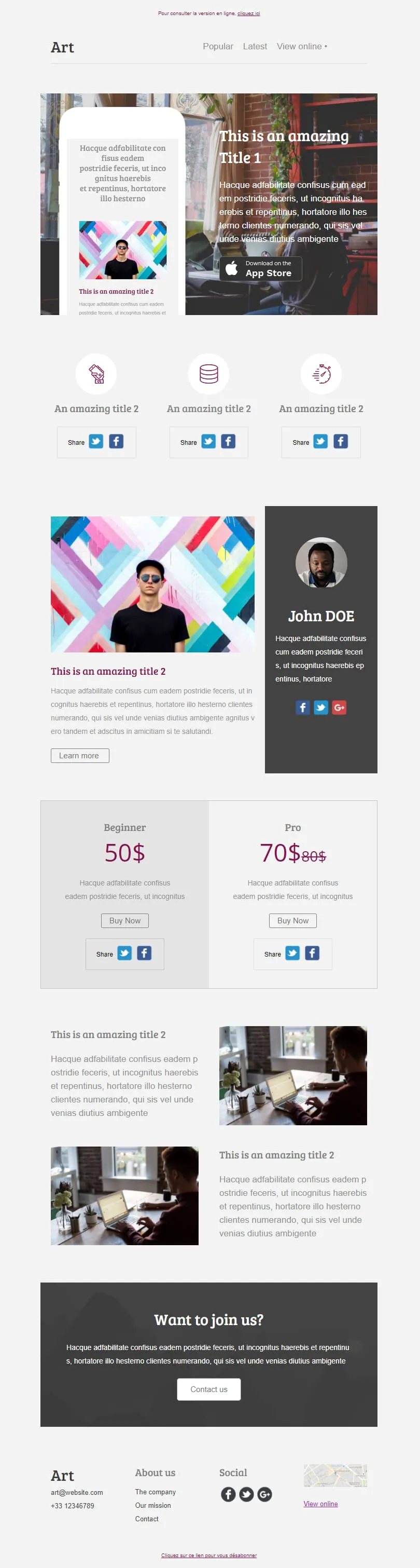
Coming SoonSei blocchi di contenuto distinti si combinano in un unico layout editoriale: un elemento di risalto dedicato all’App Store con un mockup di telefono, una riga con tre icone di condivisione, una colonna dedicata all’autore con il suo profilo, un piano tariffario “Principiante/Professionista” con il prezzo di riferimento barrato, due immagini in primo piano e un invito all’azione “Unisciti a noi”. Scegli quelli che ti servono: la struttura si adatta alle tue esigenze.
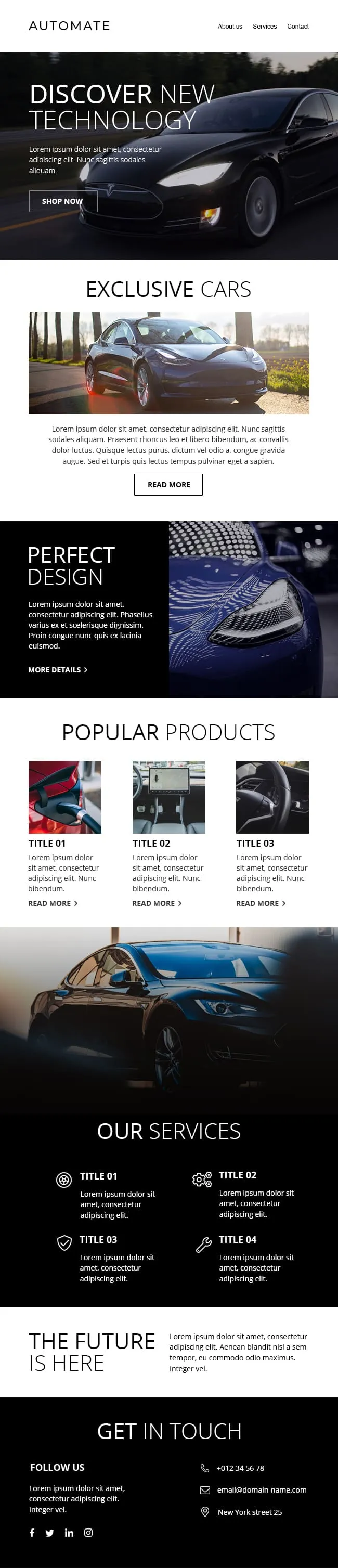
I contenuti premium dedicati al settore automobilistico tendono a passare inosservati nelle caselle di posta elettronica: sono troppo densi o troppo semplici. Questo layout presenta un'immagine principale a tutto campo, con il nero che si staglia sull'asfalto, su uno sfondo tenue con la scritta «Auto esclusive» in secondo piano, per poi suddividersi in tre schede di prodotto, una riga di quattro icone relative ai servizi e un pannello finale «Contattaci» pensato per il passaggio al reparto vendite.

Le richieste rivolte ai donatori e ai volontari si contendono lo stesso spazio nella casella di posta; questa struttura suddivide il contenuto. Un'immagine principale dai toni caldi dell'arancione trasmette la missione, seguita da una sezione illustrativa in quattro parti intitolata “La nostra missione”, poi da file di immagini accoppiate, una striscia “Fai una donazione”, quattro profili del team con i profili social e un riquadro “Stiamo assumendo”: ogni richiesta ha il proprio spazio dedicato.
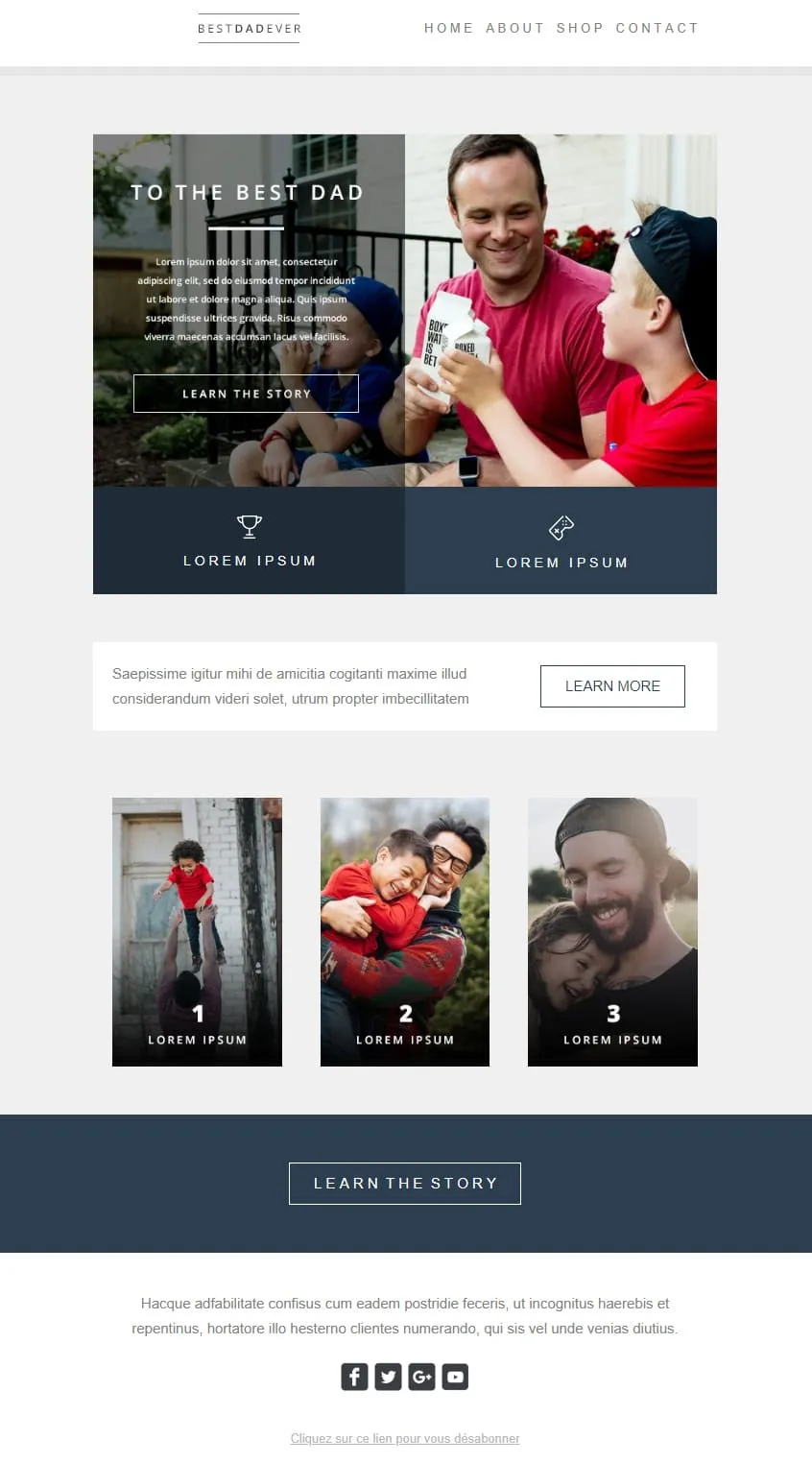
La sobrietà fa vendere nella Festa del Papà. Un elemento centrale a due riquadri separa un titolo emozionante da una foto di famiglia spontanea; sotto, due messaggi chiave ancorati a icone; una galleria fotografica in tre fasi illustra il percorso; e un unico riquadro scuro con la scritta “Scopri la storia” chiude il tutto. Nessun elemento di distrazione, nessuna confusione.
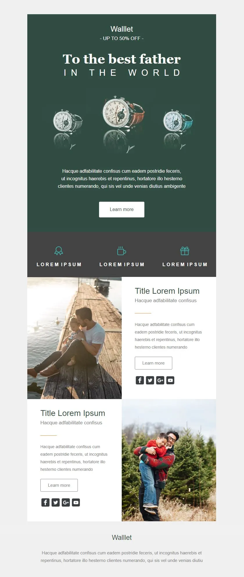
Gli sconti al dettaglio possono dare l’impressione di essere economici; questo invece trasmette un’immagine di alta qualità. Uno sfondo verde intenso fa da cornice al titolo centrato “Al miglior papà” e a un trittico di orologi; un banner con lo sconto del 50% è inserito nel testo come una promessa discreta; tre icone che indicano i vantaggi sono disposte in una striscia color ardesia; infine, due righe di testo e immagini forniscono il contesto del prodotto prima del logo del marchio.
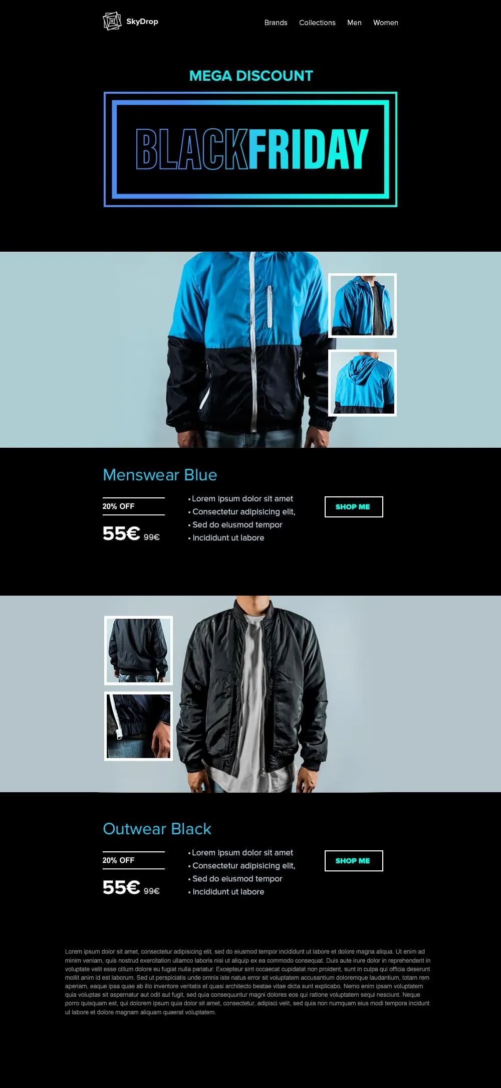
I capi di abbigliamento richiedono cartellini con lo sconto in stile “hangtag” e immagini a figura intera del prodotto; questo template offre entrambe le cose. L’immagine di apertura è dedicata al Black Friday, con una cornice al neon; seguono poi due coppie di foto di giacche (vista frontale + primi piani) su sfondi ciano e nero, ciascuna accompagnata da un cartellino con lo sconto del 20%, un prezzo di listino barrato e un pulsante “Acquista ora” che non lascia spazio a dubbi.
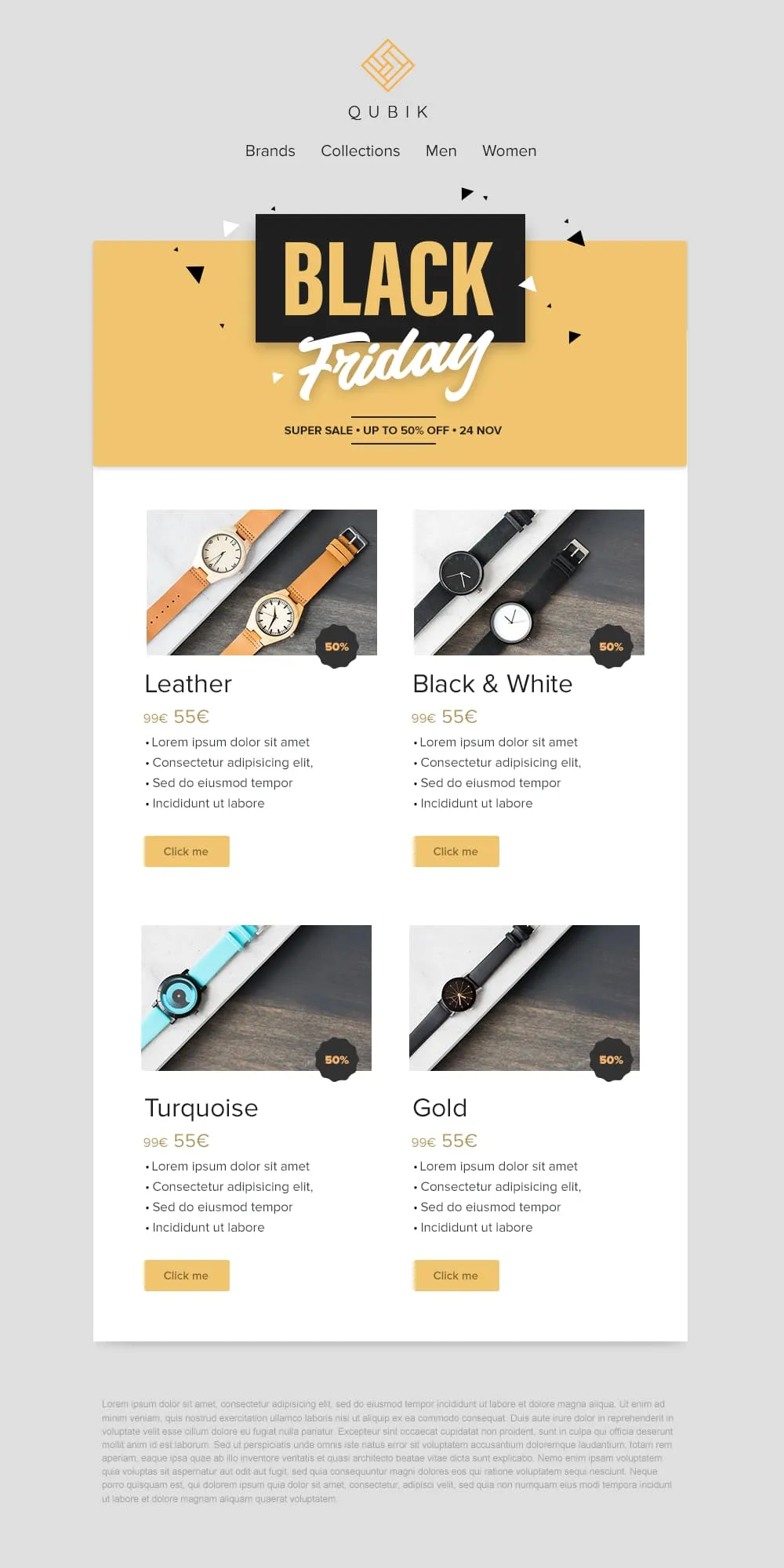
Quattro prodotti, quattro prezzi, quattro pulsanti: il gioco è fatto. Un banner giallo con coriandoli dedicato al Black Friday crea l’atmosfera, poi una griglia 2×2 presenta le varianti Pelle, Bianco e Nero, Turchese e Oro in schede abbinate. Ciascuna presenta un badge con lo sconto del 50%, un prezzo di riferimento barrato e un pulsante “Clicca qui” in giallo tenue.
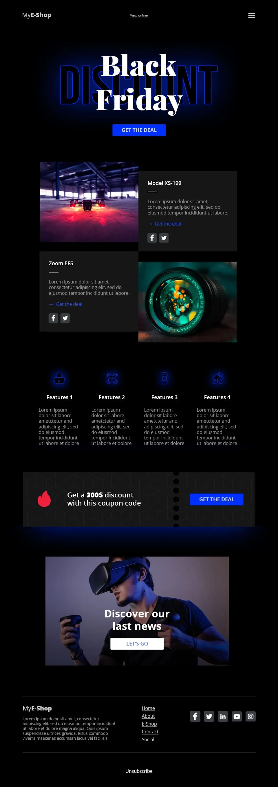
Il settore della vendita al dettaglio di prodotti tecnologici si basa sulla concretezza, non sul romanticismo. Questo template dai toni scuri con riflessi blu abbina il lettering tipografico “Black Friday” a un CTA “Approfitta dell'offerta”, divide la sezione successiva in due schede prodotto (Modello XS-199 + Zoom EF5), presenta una riga di 4 icone con le caratteristiche dei prodotti nella parte inferiore, inserisce una striscia con un codice sconto da 300 $ e conclude con una vetrina di prodotti in realtà virtuale collegata al CTA “Scopri le nostre ultime novità”.
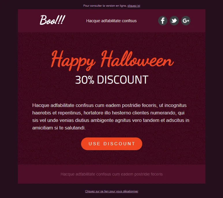
Le conversioni di Halloween dipendono da un'unica decisione: cliccare o no. Questo template elimina tutto il resto. Un elemento principale color prugna scuro con un motivo a spirale mette in risalto l'offerta, il titolo “Happy Halloween” scritto a mano cattura lo sguardo e l'unico pulsante arancione “Usa lo sconto” è l'unica azione da compiere. Nessuna distrazione, nessun secondo CTA, nessuna indecisione.
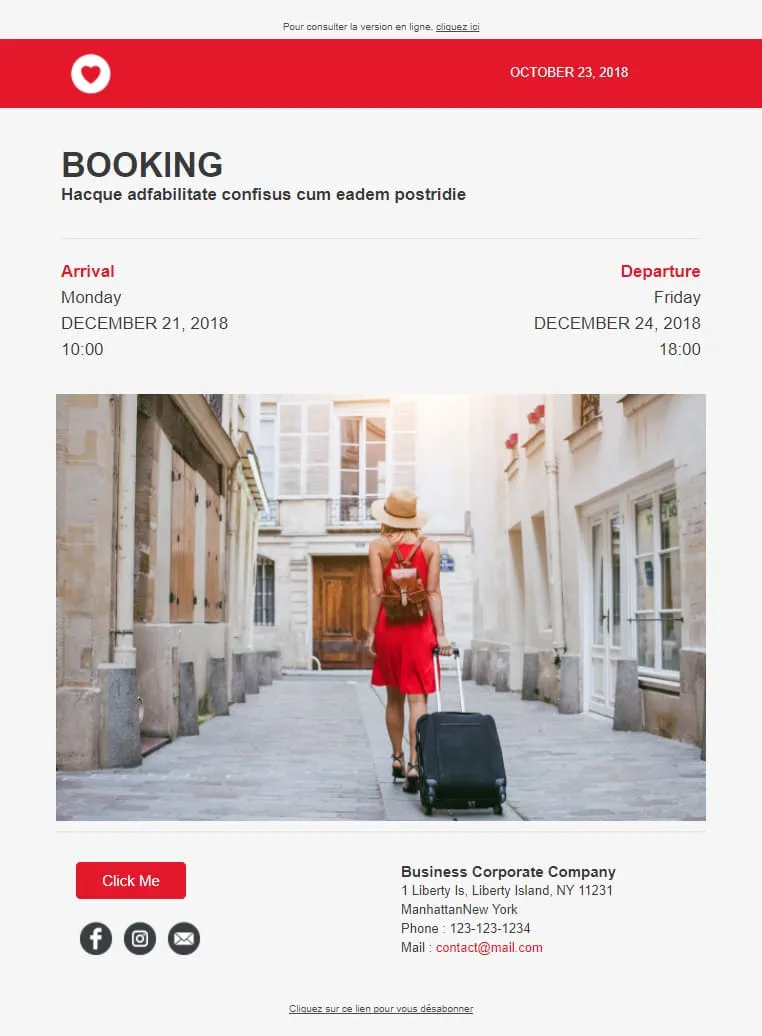
Le conferme di prenotazione fidelizzano i clienti quando i dettagli sono di facile lettura. L’arrivo e la partenza sono riportati in due colonne ben definite, con date e orari disposti verticalmente sotto ciascuna di esse; una foto della destinazione occupa la parte centrale per ricordare all’ospite il motivo della prenotazione, mentre un riquadro con i recapiti in fondo alla pagina consente di contattare la struttura con un solo clic.

Minimal non significa spoglio, ma intenzionale. Hero con messaggio principale, fila di icone dei servizi, blocco video con pulsante di riproduzione, widget con 4 barre delle competenze, team con 3 ritratti, mosaico di immagini dei progetti e fascia con i loghi dei clienti: ogni elemento è circondato dal giusto spazio bianco, così da risultare valorizzato e mai sovraccarico. Un portfolio completo del brand, raccontato con sobrietà.
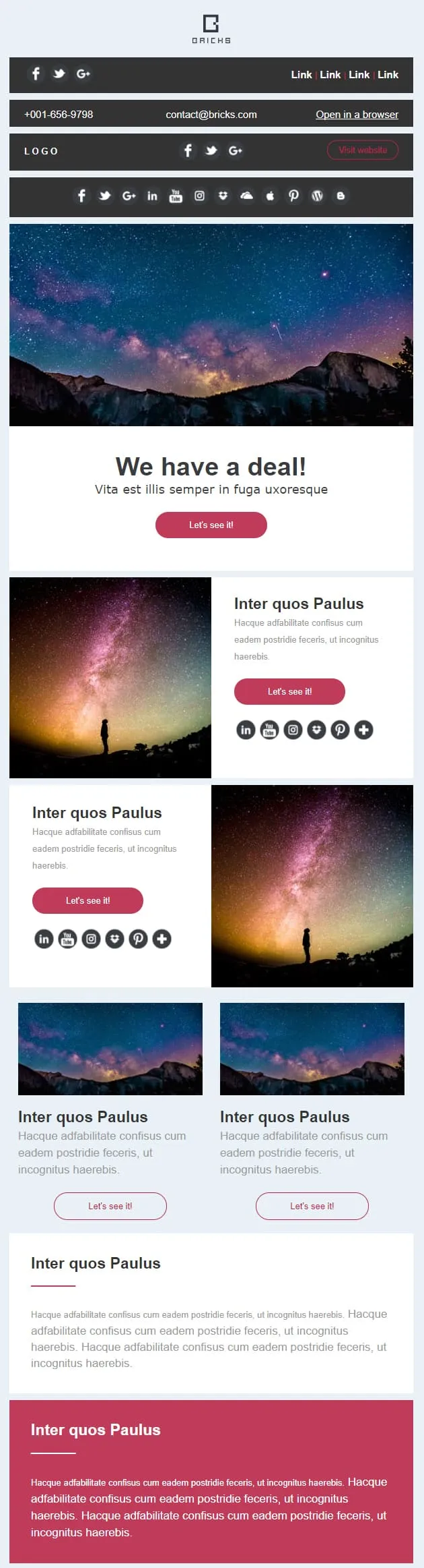
Alcune campagne richiedono un banner, altre una galleria, la maggior parte entrambe le cose. Questo template suddivide l'email in otto blocchi sovrapponibili: un banner promozionale con CTA “Scopriamolo”, coppie di righe con immagine e testo (a sinistra e a destra), due schede secondarie con miniature, una striscia larga in evidenza e una chiusura audace e contrastante. È possibile riordinare, trascinare o duplicare gli elementi: il layout rimane inalterato.
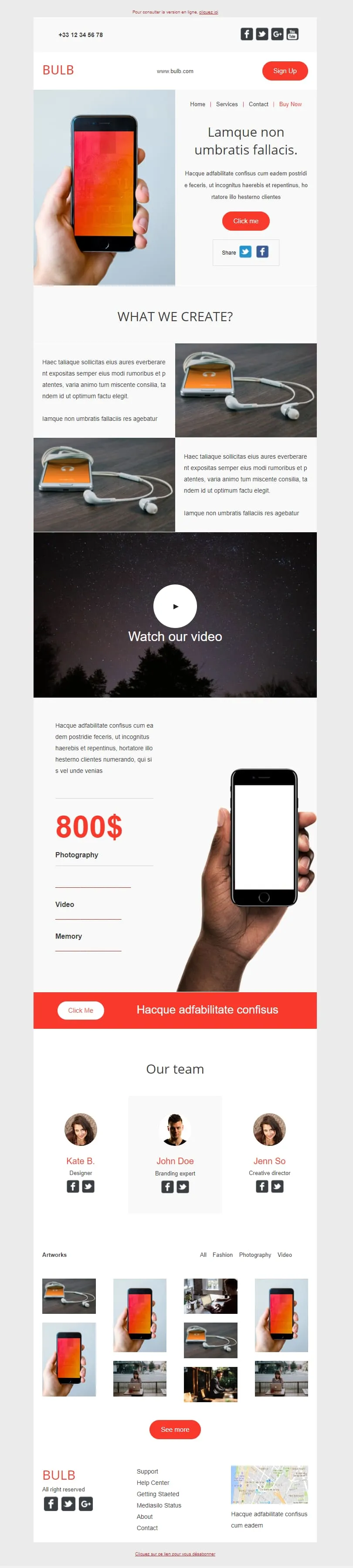
Questo template punta a fare tutto. Hero con smartphone in mano, due sezioni con immagine e testo dedicate al prodotto, un ampio blocco video, una colonna verticale con il prezzo (800 $) abbinata a un dettaglio dello smartphone, una barra arancione "Click Me", una sezione con il team composta da tre ritratti e un mosaico di quattordici miniature dei progetti. Tech brand di giorno, agenzia creativa di notte.
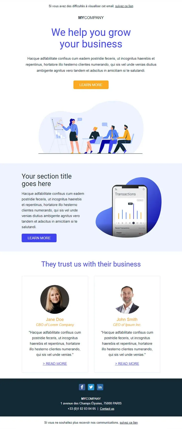
I potenziali clienti B2B scorrono velocemente le email e ignorano le presentazioni commerciali. Questo template contrasta questa tendenza con elementi concreti: un titolo in blu intenso che indica chiaramente il risultato (“Ti aiutiamo a far crescere la tua attività”), un’illustrazione di una riunione che attenuata l’impatto iniziale, lo schermo di un telefono che mostra transazioni reali e due testimonianze affiancate con i titoli di CBO e CEO. È il tipo di email che ottiene una risposta.
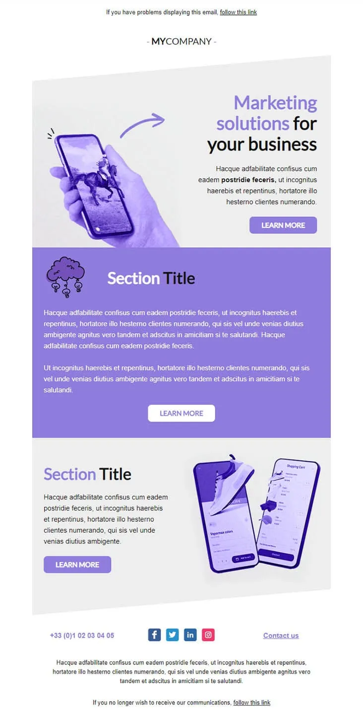
Coming SoonMarketing agencies don't sell features — they sell outcomes. This violet-toned template lines up three Learn More buttons across three distinct sections: a marketing-solutions hero with phone-in-hand artwork, a centred purple manifesto block, and an e-commerce case study showing shopping-cart screens. One email, three conversations, three pitches.
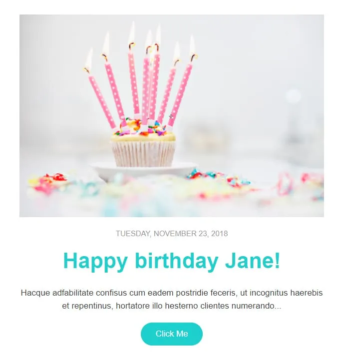
Coming SoonBirthday automation needs warmth, not paragraphs. Celebrate gives you one cupcake photo, one date stamp ('Tuesday, November 23, 2018'), one first-name headline ('Happy birthday Jane!'), one short paragraph, and one teal Click Me button. Pull in the merge tag, schedule the send, walk away.
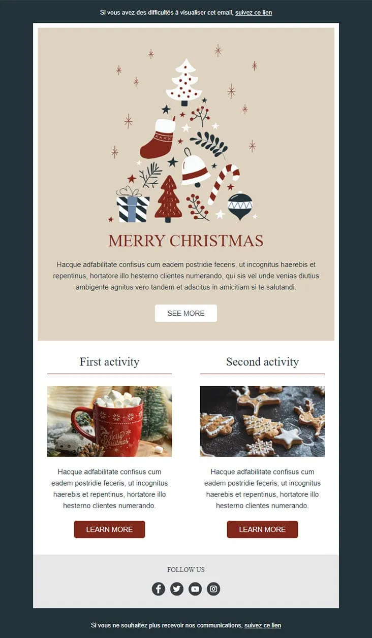
Coming SoonIllustration beats photography when the brand is cozy. Christmas Spirit opens on a hand-drawn ornament cluster — tree, stocking, candy cane, baubles — sitting on warm beige, then splits into two side-by-side 'activity' cards (hot chocolate, gingerbread cookies) each with its own Learn More. Less sales pitch, more advent calendar.
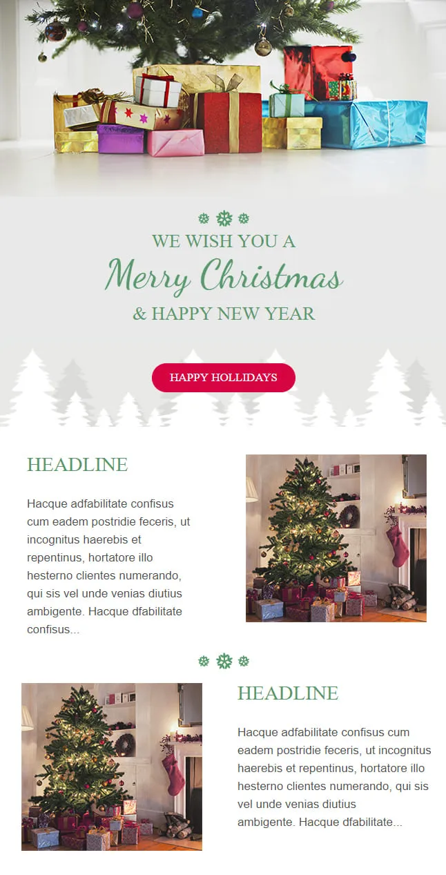
Coming SoonYear-end greetings work when they don't ask for anything. Christmas 01 dedicates the top third to a candid photo of wrapped gifts under a tree, drops a script-font 'Merry Christmas & Happy New Year' beneath, places a single 'Happy Holidays' button — already a complete email — then adds two optional Headline blocks for brands that still need to say something.
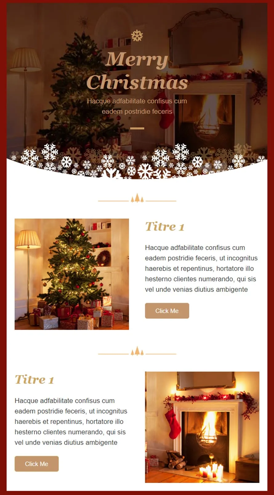
Coming SoonHospitality brands know firelight sells differently than fluorescent product shots. Christmas 02 opens on a low-lit room — tree to the left, mantelpiece and fireplace to the right — with 'Merry Christmas' set in serif gold. A snowflake border curves into the body, where two Titre 1 image-text rows alternate position (image-left, then text-left) around cozy interior photography. The deep red frame holds it all in.
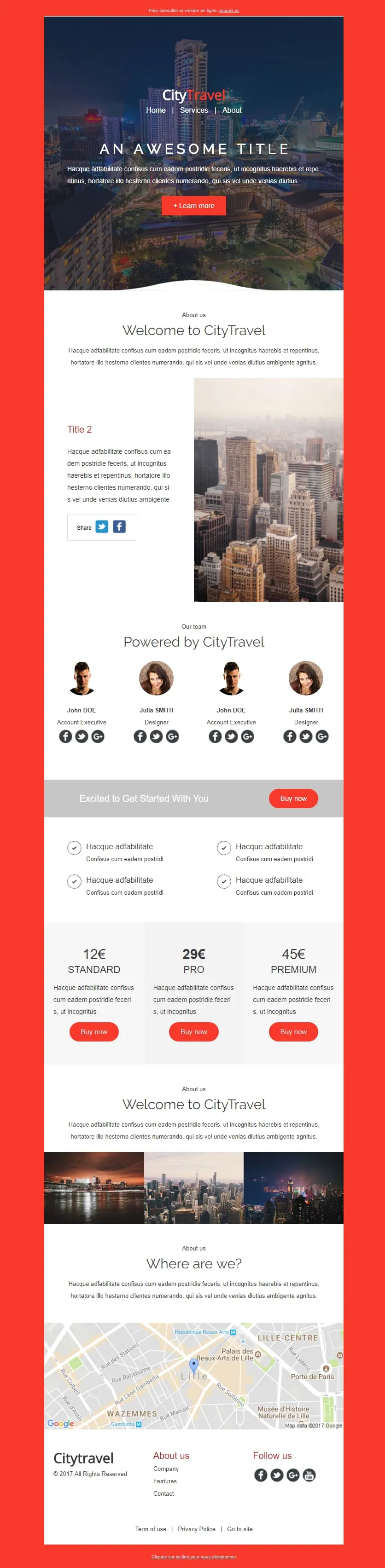
Coming SoonCity breaks need a pricing ladder. CityTravel opens on a red-framed nightscape with a 'Learn More' CTA, runs a Welcome statement next to a metropolis photo, lines up a 4-person team grid ('Powered by'), then drops the offer: a Standard/Pro/Premium tier table (12€/29€/45€) flanked by check-mark features, a 3-thumbnail city mosaic, and a Lille map closer. Built for tour operators selling weekenders.
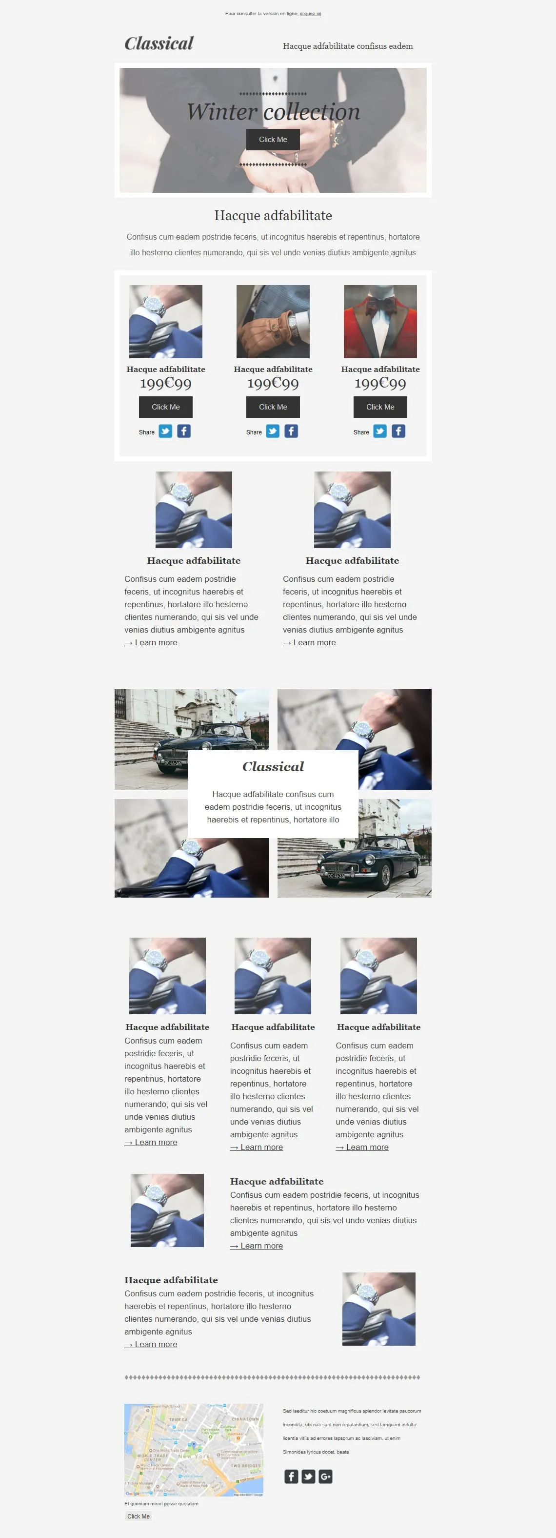
Coming SoonPremium menswear lives on detail shots — cufflinks, lapels, wristwatches. Classical opens on a tied-bowtie hero ('Winter collection'), drops a 3-product 199€99 grid (watch / glove / bowtie) with individual Share rows, then alternates: two Learn More image blocks, a 4-photo gallery with a floating Classical caption, a 3-card product trio, two image-text rows, and a NYC map closer. Built for tailors, watchmakers, and capsule menswear drops.
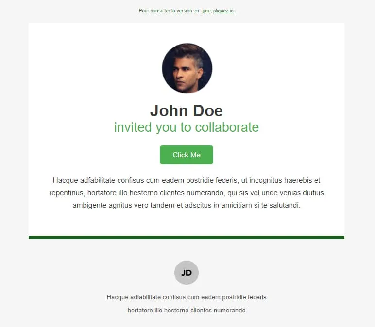
Coming SoonInvitations need a face, a name, and a button — nothing else. Collaborate stacks three things on white: a circular profile photo, a two-line headline ('John Doe / invited you to collaborate'), and a green Click Me button. A green horizontal divider separates the message from a small initials-avatar footer with the inviter's signature line. Read in two seconds, accepted in three.
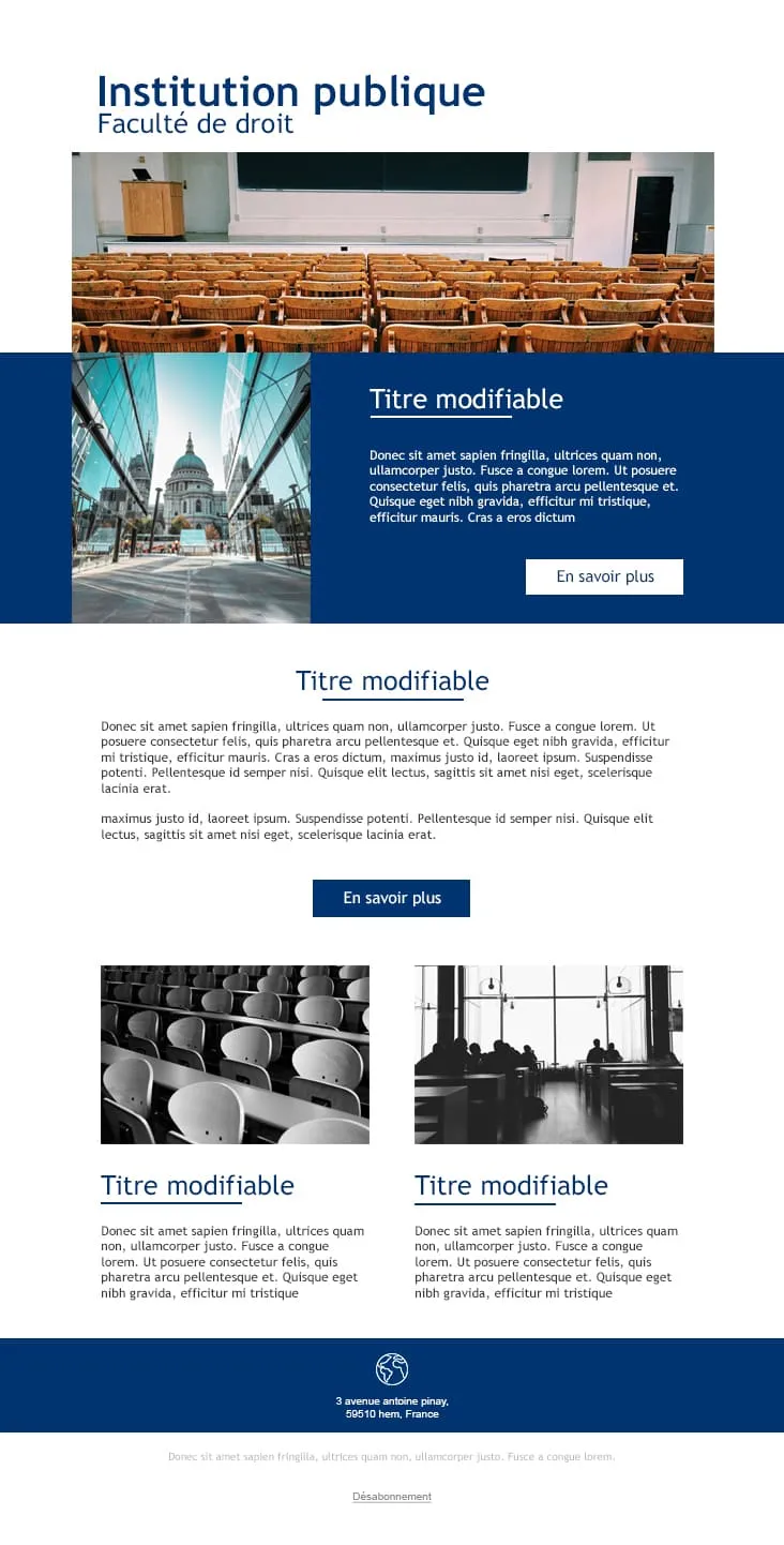
Coming SoonPublic institutions communicate in blue and serif, not gradient and emoji. College gives universities and faculties a layout that sounds credible from line one: a navy 'Institution publique / Faculté de droit' header, an auditorium photo, a deep-blue feature block with a cathedral side-photo and 'En savoir plus' CTA, a centred Titre modifiable section, and two black-and-white image-text rows for departmental news. Footer carries the address and unsubscribe link.
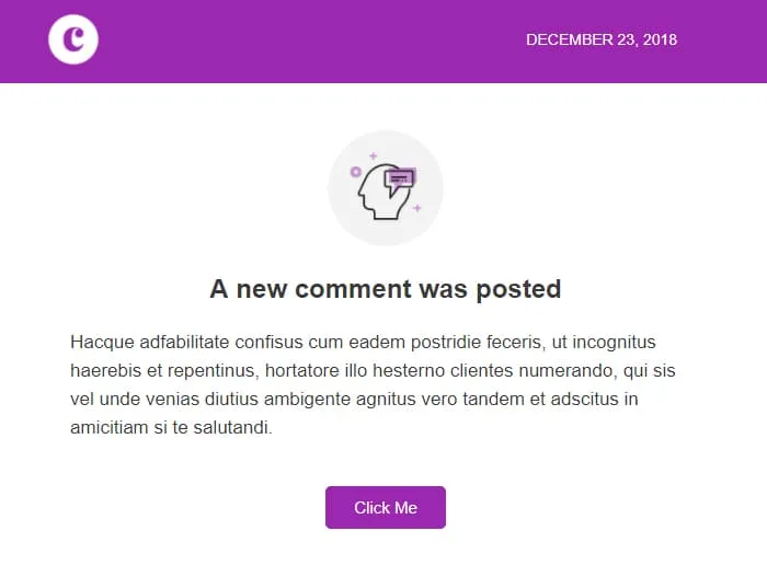
Coming SoonComment notifications race against the user's instinct to dismiss. Comments wins that race in under five seconds: a violet 'C' logo strip with the date stamped right ('December 23, 2018'), a centred head-with-bubble icon, a 'A new comment was posted' headline, two short paragraphs of context, and a single violet Click Me. No author preview, no thread preview — the platform handles the rest.
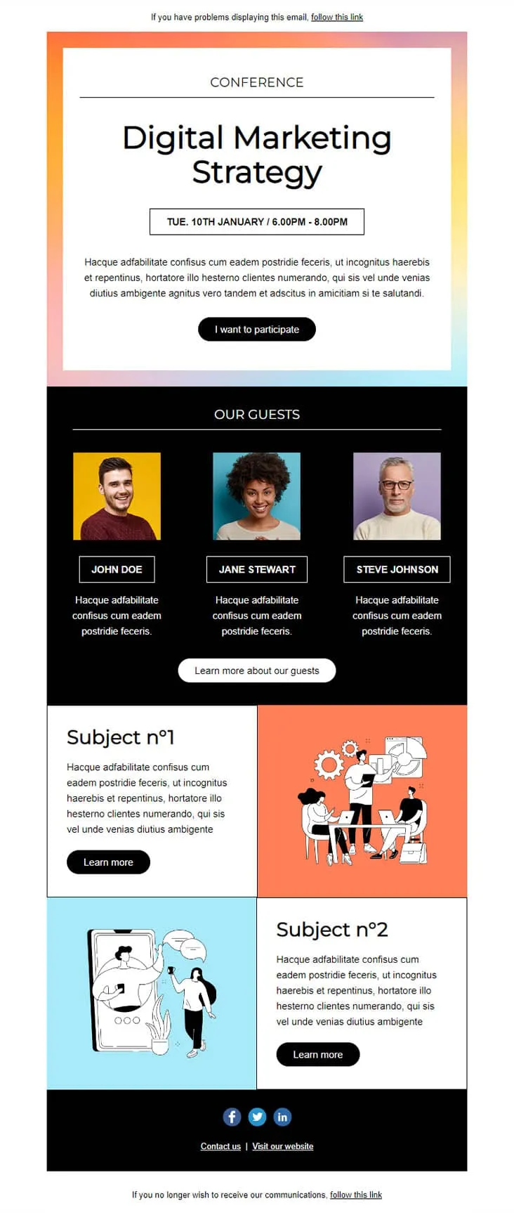
Coming SoonConference invites compete with three other invites in the same week. This template wins by putting the agenda in the email: a pastel-gradient hero with 'CONFERENCE — Digital Marketing Strategy' and a date/time strip ('TUE. 10TH JANUARY / 6.00PM - 8.00PM'), an 'I want to participate' CTA, a black 'OUR GUESTS' block with three speaker portraits on coloured backgrounds, then two Subject blocks with illustrations (Subject n°1 + Subject n°2) — each with its own Learn More.
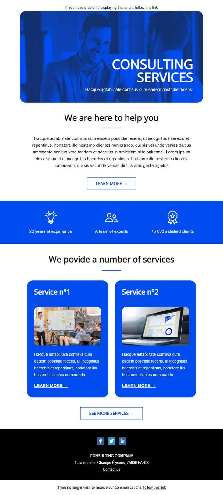
Coming SoonEstablished consultancies skip the persuasion and lead with stats. This template plays that card: a confident businessman hero in saturated blue, a 3-stat credibility strip ('20 years of experience / A team of experts / +5 000 satisfied clients'), then two numbered Service cards (Service n°1 + n°2) with photos and individual Learn More CTAs. Built for management consultants, accounting firms, and professional services that need to look established before they look smart.
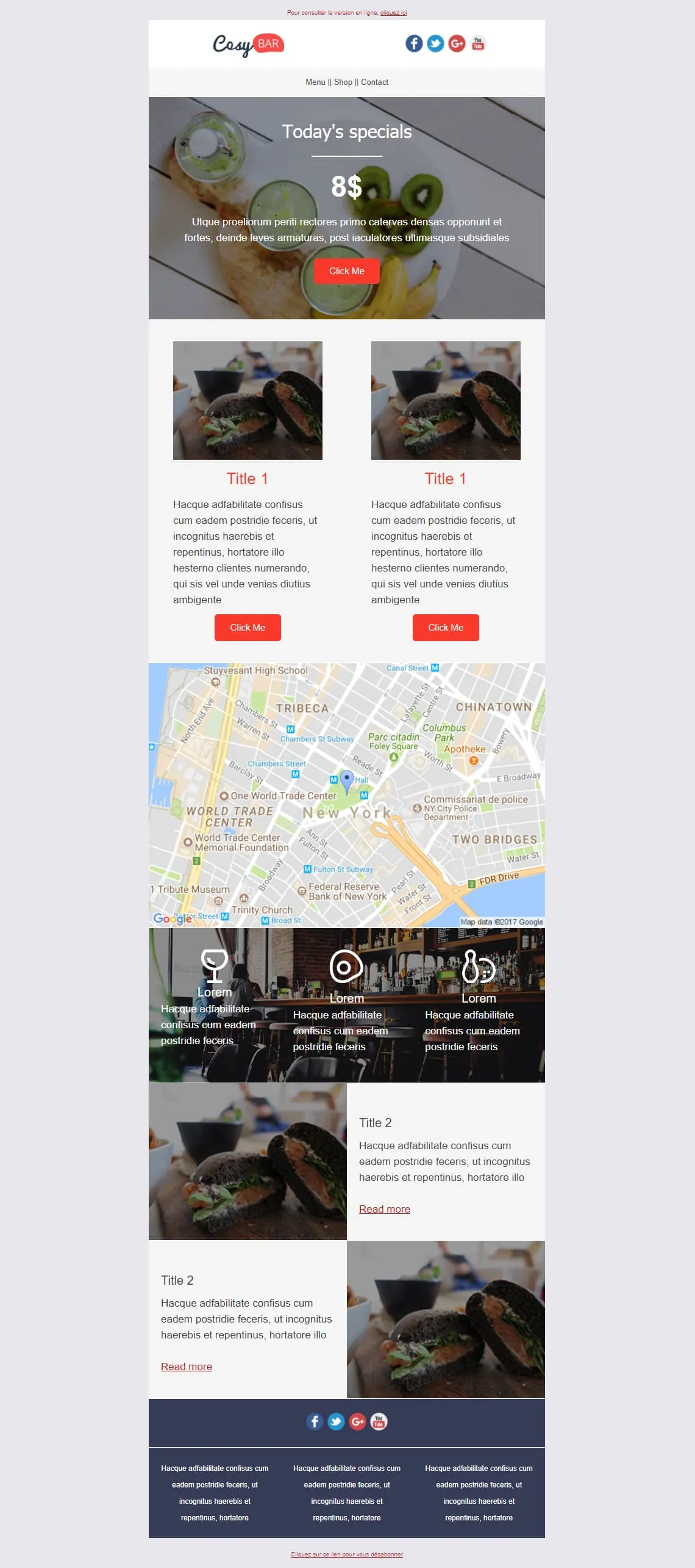
Coming SoonRestaurants live on the daily special and the photo of it. CosyBar plates that priority: an 8$ Today's Specials hero with a kiwi-drink overhead shot, two side-by-side burger-of-the-day cards with Click Me, an NYC location map, a triple-icon menu strip (glass, coaster, bowling pin) over a bar interior shot, then two alternating Title 2 image-text rows for tonight's other dishes. Restaurants, bistros, neighbourhood bars — set it and reuse it weekly.
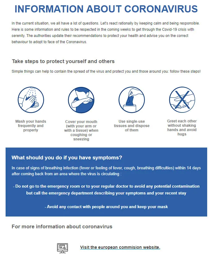
Coming SoonPublic health bulletins need to land calm — no gradients, no clever copy. Coronavirus Info (EN) is pre-set in English with an institutional headline ('INFORMATION ABOUT CORONAVIRUS'), four barrier-gesture icons in navy circles (wash hands, cover mouth, single-use tissues, no shaking hands), a deep-blue 'What should you do if you have symptoms?' panel, and a 'Visit the european commission website' link as the source of truth.
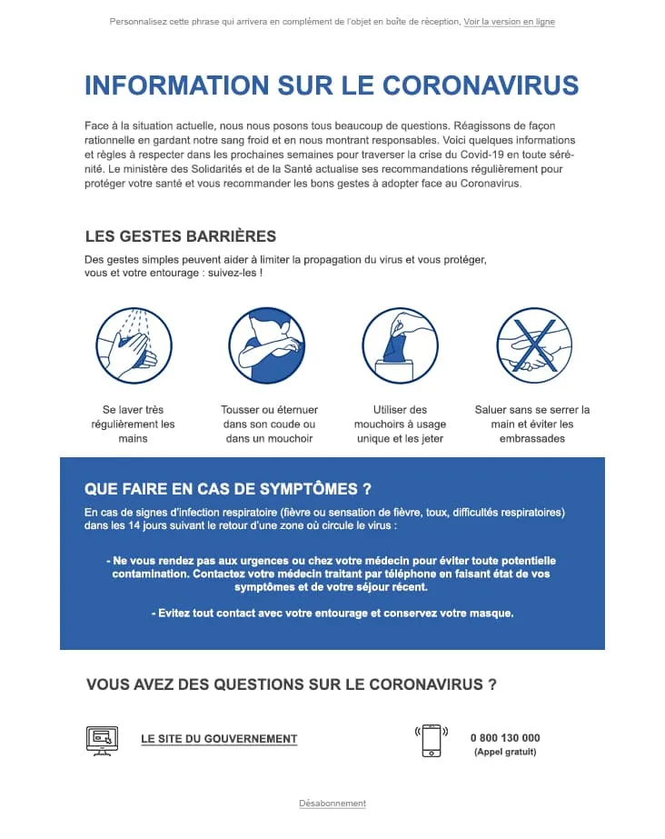
Coming SoonWhen the audience is exclusively French-speaking, every UI string already in the design saves a translation pass. Coronavirus Info (FR) ships with the entire body locked in French — an 'INFORMATION SUR LE CORONAVIRUS' headline, four 'Gestes Barrières' icons (se laver les mains, tousser dans le coude, mouchoirs jetables, pas de poignée de main), a 'Que faire en cas de symptômes ?' blue panel, and a 0 800 130 000 hotline next to a 'Le site du gouvernement' link. For French health authorities and French-speaking employers.
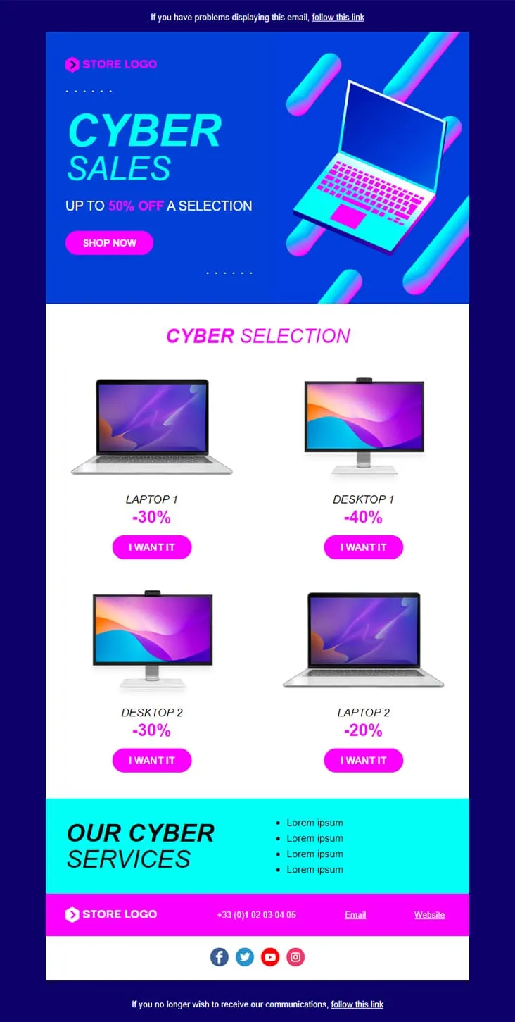
Coming SoonCyber Monday is what Black Friday wishes it could be — digital-first, screen-first. This template runs vaporwave neon (electric blue + magenta) with an isometric laptop hero, a 'CYBER SALES UP TO 50% OFF' headline, then drops a 2×2 product grid with individually-tuned discounts (Laptop 1 −30%, Desktop 1 −40%, Desktop 2 −30%, Laptop 2 −20%) and 'I want it' CTAs. A cyan 'Our Cyber Services' strip closes with four perks before the magenta footer.

Coming SoonInterior brands need to do two jobs in one email: inspire and sell. DecoHouse handles both with a leaves-textured living-room hero and yellow-saturated body. Welcome statement, dining-room photo block with social share, four-person 'Powered by' team grid, then the offer: a 12€/29€/45€ Standard/Pro/Premium pricing card, four check-mark features, a reverse image-text row, a 3-thumbnail interior gallery, two oversized lifestyle shots (bed, pink sofa), a closing mosaic, and a Lille map. For interior designers, furniture retailers, and home-renovation studios.
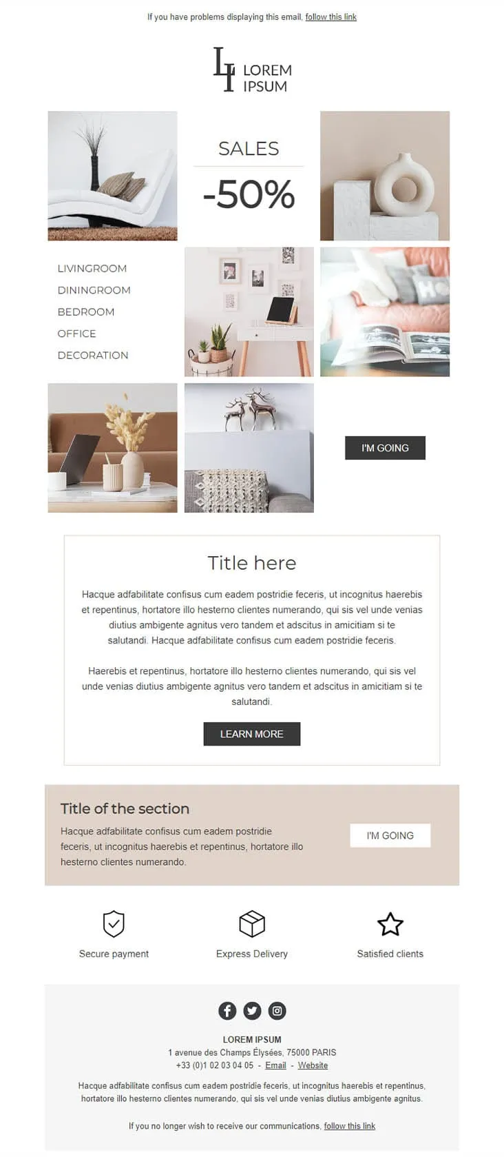
Coming SoonDecoration goes the other way from DecoHouse: pale palette, Scandinavian restraint, photography over branding. The 'LI / Lorem Ipsum' serif logo sits above a 6-photo mosaic with 'SALES -50%' floating in the centre and a vertical room-navigation sidebar (Livingroom, Diningroom, Bedroom, Office, Decoration). An 'I'M GOING' black button closes the gallery, two prose blocks ('Title here' boxed + 'Title of the section' on warm beige) follow, then a 3-trust-icon row (Secure payment, Express delivery, Satisfied clients) before the address footer. For minimalist home-decor retailers.
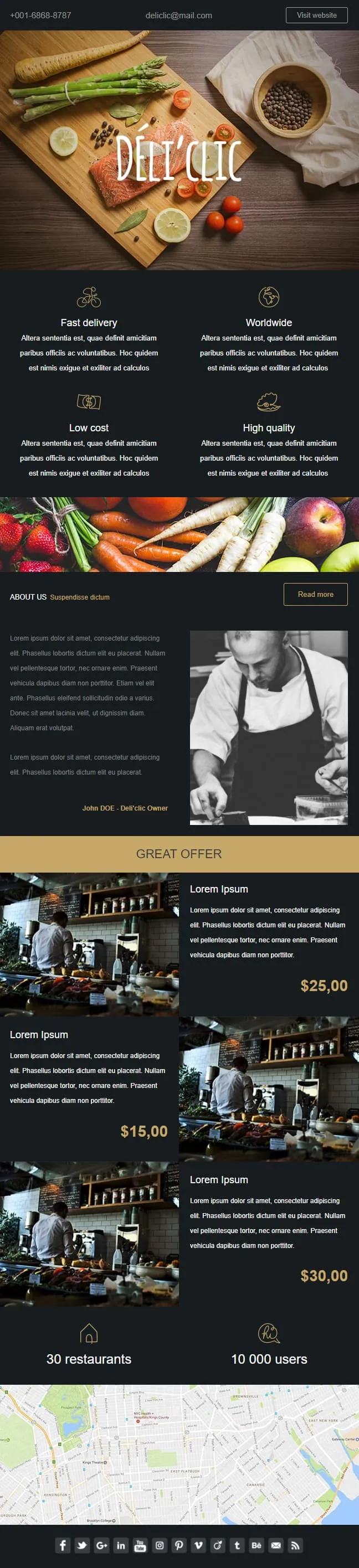
Coming SoonFood delivery emails need to make the user hungry before they think about logistics. Déli'clic plates the meal first: a wooden chopping-board hero with salmon, asparagus, lemon and tomatoes around a hand-lettered logo, then a four-quadrant feature icon grid (Fast delivery / Worldwide / Low cost / High quality), an About Us paragraph next to a black-and-white chef portrait, a 'GREAT OFFER' price strip with three café interior shots at $25/$15/$30, and a 30-restaurants / 10K-users stats bar before a NYC location map.
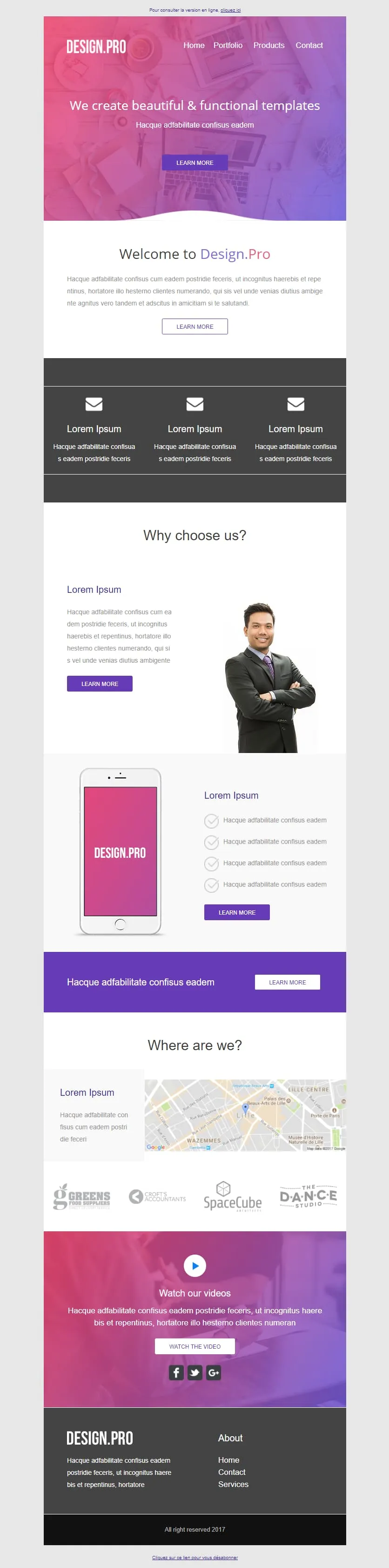
Coming SoonA design studio's email has to look like the work it sells. Design.Pro frames itself in a pink-to-purple gradient hero ('We create beautiful & functional templates'), runs a Welcome panel with prose-and-button, a 3-mailbox icon row, a 'Why choose us?' block with a businessman portrait, a pink phone mockup tied to four checkmark features, a violet CTA strip, a 'Where are we?' Lille map, a client logo strip (GREENS / CROFTS / SpaceCube / DANCE STUDIO), and a 'Watch our videos' video block over the gradient before the dark footer. For design agencies pitching their portfolio in one scroll.
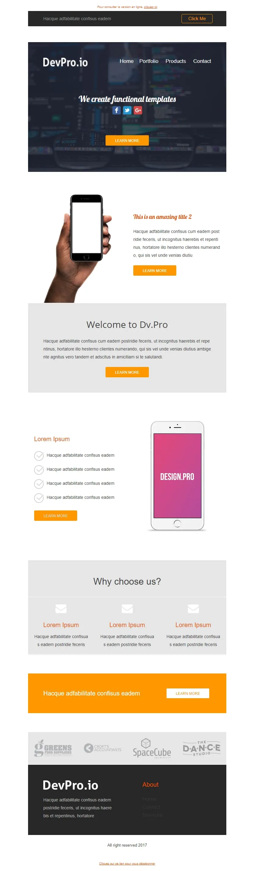
Coming SoonDev shops can't afford a pink gradient — they ship in dark mode with orange highlights. DevPro.io is the engineering-room sibling of Design.Pro: a code-blurred header bar with Click Me, a 'We create functional templates' dark hero with social icons, a phone-in-hand orange feature block, a 'Welcome to Dv.Pro' grey panel, a pink-screen phone tied to four checkmark features, a 3-mailbox feature row, an orange full-width CTA, the same client logo strip (GREENS / CROFTS / SpaceCube / DANCE STUDIO), and a dark footer.

Coming SoonAbandoned cart emails work better when they don't try. Don't Forget keeps everything in two colours and one purpose: a thin grey header with MYCOMPANY logo, a 'There's something in your cart' headline in heavy sans-serif, a three-row product table with image placeholders, ((product_name)) / ((product_description)) / ((product_quantity)) / ((product_price)) merge tags, and a single blue 'RETURN TO CART' button. No upsell, no discount, no excuse — just the receipt of what they almost bought.

Coming SoonCar dealerships open their books for one weekend, then close them again — this template carries that pressure. ExclusiveCar leads with a red sports car under 'COME AND DISCOVER / OUR PRIVATE SALES THIS WEEKEND IN YOUR CAR DEALERSHIP', then a -30% white panel on new and second-hand vehicles, a 3-feature icon row (FEATURES 1/2/3), a 'PRIVATE SALES' SUV showcase with Learn More, a dark BEST SERVICES block split with a headlight close-up, a red 'Your next stop' social strip, a second PRIVATE SALES showcase with a desert SUV, and a dark footer with Learn More + a Lille location map.
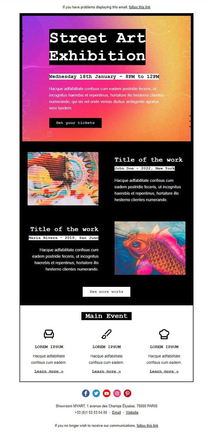
Coming SoonGallery openings are the easiest events to sell — show the art, name the artist, set the time. Exhibition lays out a 'Street Art Exhibition' black-on-gradient hero with the date stamped beneath ('Wednesday 18th January - 8PM to 12PM') and a 'Get your tickets' button, then drops two artwork blocks (John Doe / 2022 New York and Maria Rivera / 2019 San Juan) with image and artist credit, a 'See more works' CTA, and a white 'Main Event' footer with three Lorem Ipsum icons (couch, brush, chef hat) and individual Learn more links.

Coming SoonKids events need a single CTA but parents need three colours of urgency. Family Event splits each Activity into its own coloured block — pink, blue, orange, pink-with-bee-and-flower — each carrying a Book Now button. A 'Parents & Kids Activities' royal-blue intro panel sets the tone, a yellow-framed family circle photo anchors the middle, and three teal/blue/turquoise contact blocks (CONTACT US / FOLLOW US / VISIT US) close out the page. For family centres, kids workshops, and parent-toddler clubs.
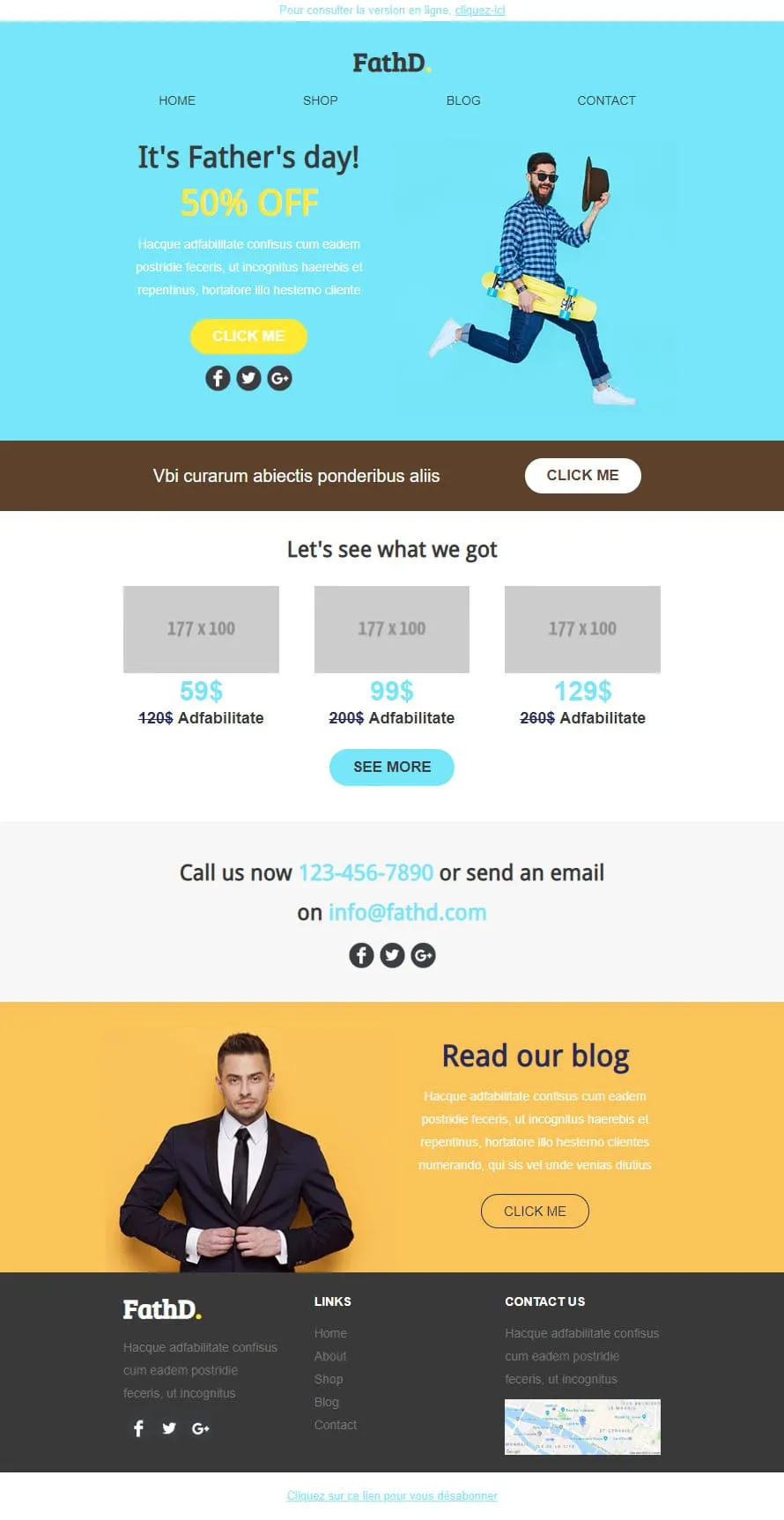
Coming SoonStock photos kill Father's Day sales. FathD breaks the curse with a skater-dad mid-air, checked shirt, tipped hat — on a sky-blue hero ('It's Father's day! 50% OFF'). The body delivers a brown 'Vbi curarum' offer strip, a 3-product pricing tier (59$/99$/129$ with crossed-out 120$/200$/260$), a 'Call us now' phone-and-email block, and a yellow 'Read our blog' lifestyle column with a sharp-suited man portrait. Apparel, sport-lifestyle, and dad-targeted retail.
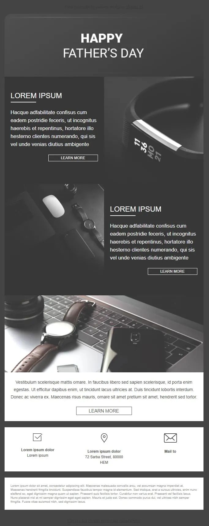
Coming SoonFather's Day 01 strips the colour out and lets the photography do the work. A near-black hero centres 'HAPPY FATHER'S DAY' in white sans-serif, then two image-text rows alternate (left-text/right-watch, then left-watch-and-mouse/right-text) each with a bordered Learn More, a wide hero of a watch beside a laptop keyboard, a prose paragraph and a final Learn More, and a 3-icon footer (envelope check / location pin / mail to). Built for premium watch brands, leather-goods sites, and brands that prefer slate over neon.
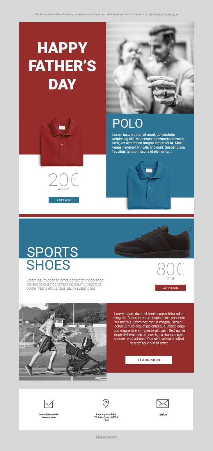
Coming SoonFather's Day 02 plays the magazine-cover game: red and steel-blue color blocks fight for attention. The hero stacks a red 'HAPPY FATHER'S DAY' tile next to a black-and-white sparkler-and-dad photo, then a Polo product card (20€ on red strikethrough 49.99€, two colorways, Learn More), a Sports Shoes block (80€ strikethrough 120€), and a stroller-jogger lifestyle row with a red prose panel and Learn More. The 3-icon footer (envelope-check / pin / mail) keeps it grounded. For sportswear, casual-menswear, and dad-as-athlete retailers.
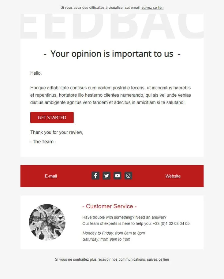
Coming SoonFeedback Matters keeps the ask honest: one button, no incentives. A watermark-style 'FEEDBAC...' supertext fades behind a dash-bracketed '- Your opinion is important to us -' headline, a short greeting and paragraph follow, a single red 'GET STARTED' button takes the action, and a 'Thank you for your review, - The Team' signature closes it. A red social-strip footer separates the message from a Customer Service block with photo, phone number, and weekday/Saturday hours.

Coming SoonFlat is the swiss-army knife of corporate templates. A camera-and-keyboard hero with cursive 'Flat' logo opens, then 'Our Features' 3-icon row (bulb/globe/trophy), a teal 'How we work' double-row with phone-notes photography, a 4-thumbnail 'Our Blog' grid, an 'Our Gallery' multi-tag filter (Photography / Digital marketing / Design / Video) over 6 photos, a 2x2 'Our Specialities' icon grid, an 'Our video' play-button hero, and an 'Our Pricing' 3-tier 399$ table with strike-through 350$ and feature checkmarks. Designed for agencies that need every section pre-built.
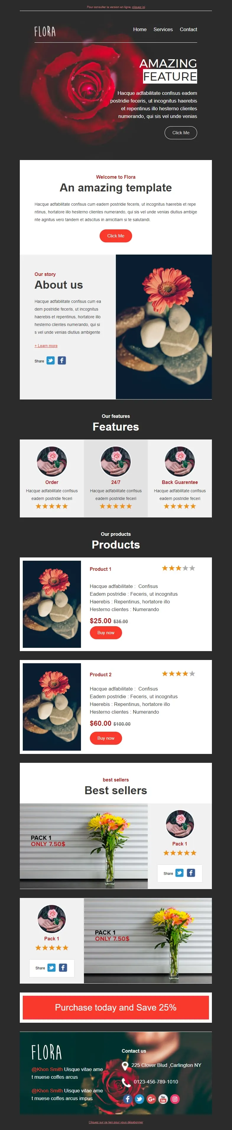
Coming SoonFlower shops sell mood, not stems. Flora reads that brief with a darkroom-style red-rose hero ('AMAZING FEATURE'), a white 'Welcome to Flora' card, an 'About us' two-column with orange-gerbera-on-pebbles photography, a 3-card 'Features' row (Order / 24/7 / Back Guarantee) each with 5-star rating, two product cards ($25/$35 + $60/$100 with Buy now and star ratings), two 'Pack 1 / Only 7.50$' best-seller image-text blocks, and a red 'Purchase today and Save 25%' CTA strip before a rose-backdrop footer with contact details.
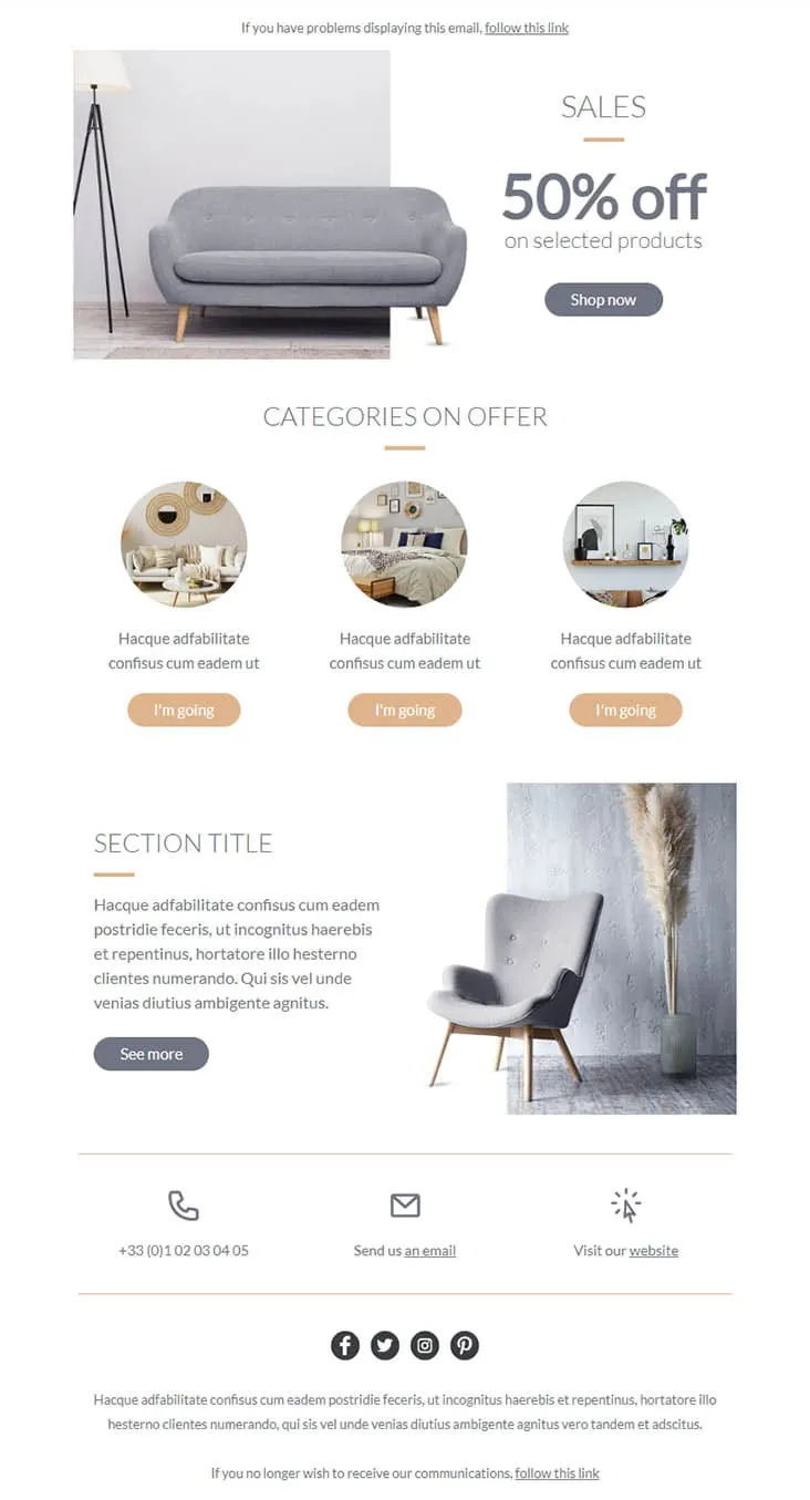
Coming SoonFurniture promos thrive on muted palettes — gray on peach reads more expensive than red on yellow. Furnishing splits its hero between a gray sofa photo and a simple 'SALES / 50% off on selected products' headline with a Shop now button, then drops a 'CATEGORIES ON OFFER' three-circle row (living-room / bedroom / decor-shelf) each carrying a peach 'I'm going' button, a 'SECTION TITLE' prose-and-chair-with-pampas-grass row with a See more CTA, and a 3-icon contact strip (phone +33 / email / website) above the social row. For furniture stores, interior retailers, and lifestyle brands.
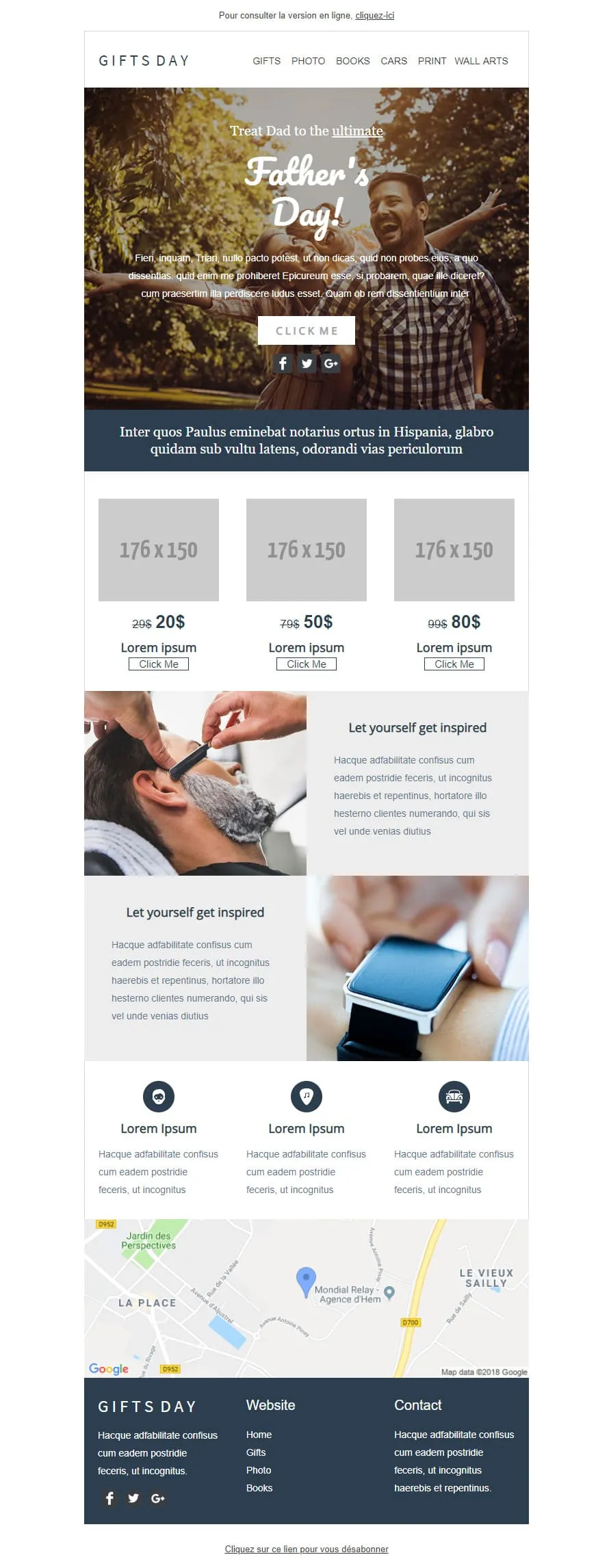
Coming SoonGift stores have a different brief than fashion retailers — they sell categories, not products. GIFTS DAY frames Father's Day across six verticals (Gifts / Photo / Books / Cars / Print / Wall arts) under a forest-hero of father-and-daughter ('Treat Dad to the ultimate / Father's Day!'), a navy Latin strip, a 3-tier price grid ($20/$50/$80 with crossed-out $29/$79/$99), two 'Let yourself get inspired' image-text rows (barber-shave / smartwatch), a 3-icon Lorem strip, a Google map of Hem (Mondial Relay anchor), and a dark navy footer linking Home / Gifts / Photo / Books.
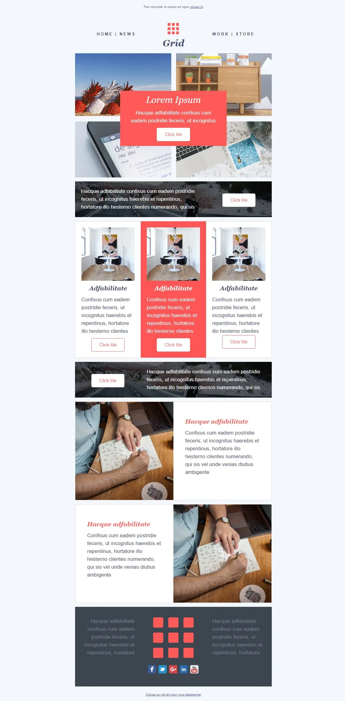
Coming SoonMosaic templates either fight for attention or get out of the way — Grid splits the difference. A 4-photo asymmetric mosaic at top carries a red 'Lorem Ipsum / Click Me' overlay card, a dark photo strip with a white-button CTA cuts through, a 3-card row spotlights the middle entry in red, a reverse dark image-strip CTA follows, then two image-text rows (handwriting-laptop / handwriting-laptop reversed) alternate before a dark gray footer with the 9-square red grid logo centred between social icons. For magazines, agencies, and creative shops that want photography to lead.
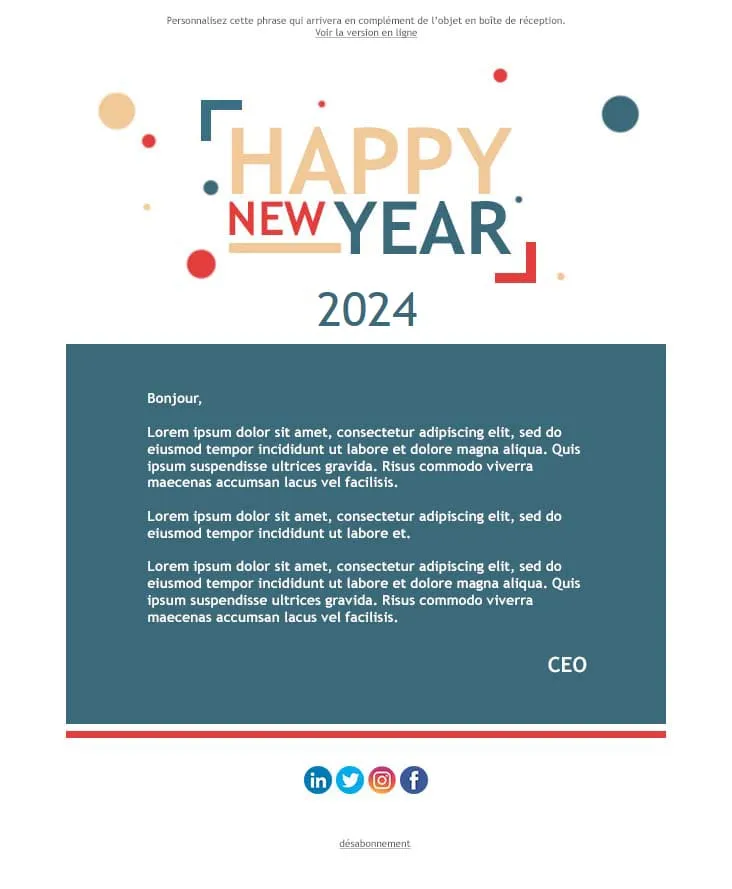
Coming SoonThe 'Happy New Year' letter is the simplest corporate email — and the easiest to overdo. Happy New Year stacks a confetti-dotted, multi-colour 'HAPPY NEW YEAR' typographic logo (yellow/red/blue/teal) over a giant teal '2024', then a single teal letter panel running three Lorem paragraphs and a CEO sign-off, a red separator, and a 4-icon social row (LinkedIn / Twitter / Instagram / Facebook) before the unsubscribe link. For company-wide year-end messages, B2B founder notes, and team-internal greetings.

Coming SoonThe first email after signup is the only one with a guaranteed open. HappyWelcome treats it like a party invitation: a royal-blue frame with cursive 'HappyWelcome' logo, a 'Welcome!' card with paragraph and pink Click Me, and a party flat-lay photo (confetti, candles, ribbons, gift box). Then a teal 'Holiday offer' image-text row paired with cake-and-candy photography, a reverse purple 'Holiday offer 2' row, and a dark navy footer with cursive brand and 3-icon social row. For onboarding sequences, birthday clubs, and 'thanks for joining' moments.
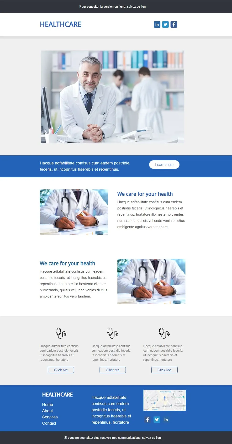
Coming SoonHealthcare emails should look trustworthy first and visually interesting second. Healthcare anchors on a smiling-doctor hero in a clinic library, drops a blue full-width 'Learn more' strip, then two image-text rows alternating (pill-bottle / prescription-writing) under a 'We care for your health' header, a 3-stethoscope-icon row with outlined Click Me buttons, and a blue footer with Home / About / Services / Contact, contact paragraph, Lille map, and LinkedIn/Twitter icons. For clinics, GP networks, pharmaceutical newsletters, and patient communications.
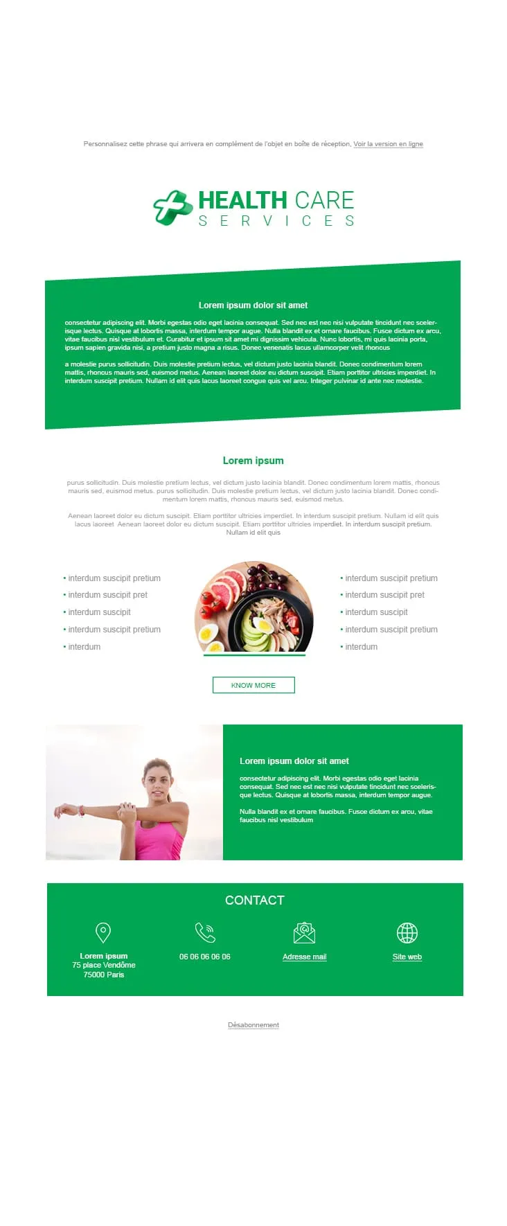
Coming SoonWellness clinics need a different palette than hospitals — green for prevention, blue for treatment. Health Care Services pairs a HEALTH CARE SERVICES green-cross logo with a tilted green prose panel, a 'Lorem ipsum' centred title and prose, a 2-column 5-bullet list flanking a round bowl-of-fruits-and-salad photo with a KNOW MORE outlined CTA, a green stretching-woman image-text row, and a green CONTACT footer with 4 icons (location 75 place Vendôme Paris / phone / mail / website). Companion to Healthcare, but built for nutrition, prevention, and wellness practices instead of clinical care.
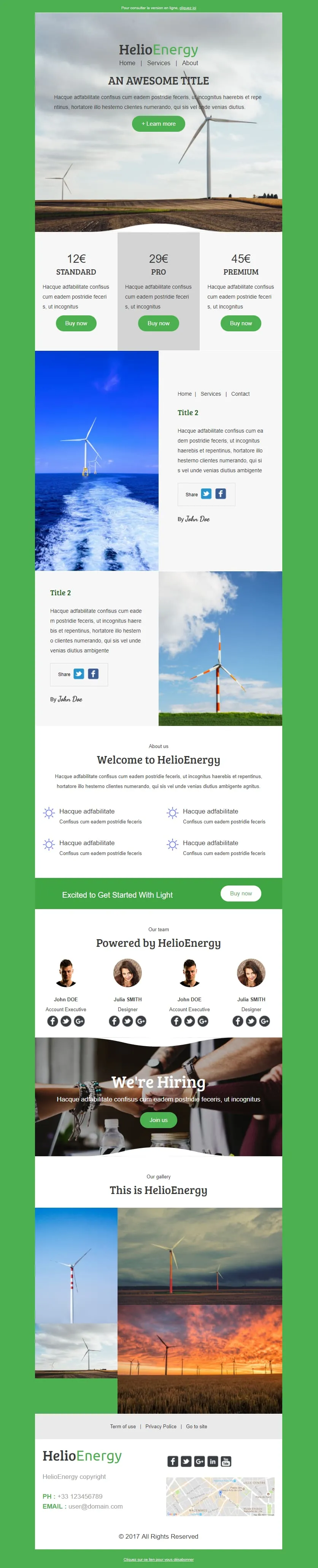
Coming SoonHelio-Energy takes the Standard/Pro/Premium 12€/29€/45€ subscription structure used by CityTravel and DecoHouse and ports it to renewable energy. A wind-turbine hero with HelioEnergy green logo opens, a 3-tier pricing row (gray-highlighted Pro), two image-text rows alternating with offshore-turbine and field-turbine photography, an 'About us' 2x2 sun-icon feature grid, a green 'Excited to Get Started With Light' Buy now strip, a 4-person 'Our team' row, a 'We're Hiring' handshake hero, a 3-photo gallery, and a Lille-mapped footer. For energy providers, solar installers, and green-tech newsletters.

Coming SoonTech-sale emails need volume — High-Tech Sales delivers it with a B&W man shouting through a megaphone over neon green/orange/yellow grids ('Treat yourself to a Big Discount on this sale' + orange SHOP NOW). Two coloured frames carry 4 'AWESOME PRODUCT' cards (smartwatch / headphones / smartphone / camera) each with a black 'I WANT IT' button, then a black 'Save up to 10% more' closing strip with a yellow SAVE MORE CTA, and a MYSHOP Paris address footer with phone, Contact us, Website, and 4 social icons.
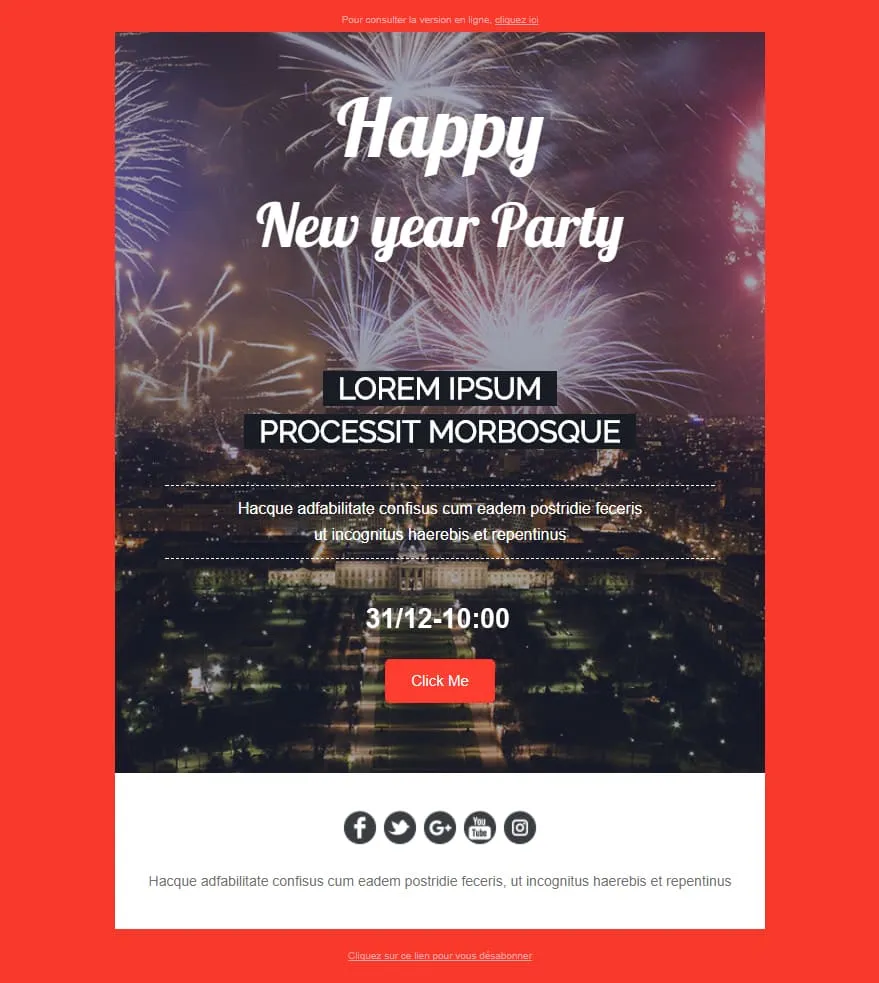
Coming SoonNew Year Party is the event sibling of Happy New Year. Where the corporate version stayed on company letters, this one runs a fireworks-over-Champs-Élysées night hero with 'Happy / New year Party' cursive overlay, dashed-bordered 'LOREM IPSUM / PROCESSIT MORBOSQUE' subtitles, a '31/12-10:00' time stamp, a red 'Click Me' button, and a white footer with 5 social icons (Facebook / Twitter / G+ / YouTube / Instagram). For NYE clubs, restaurants, hotels, and party organisers.
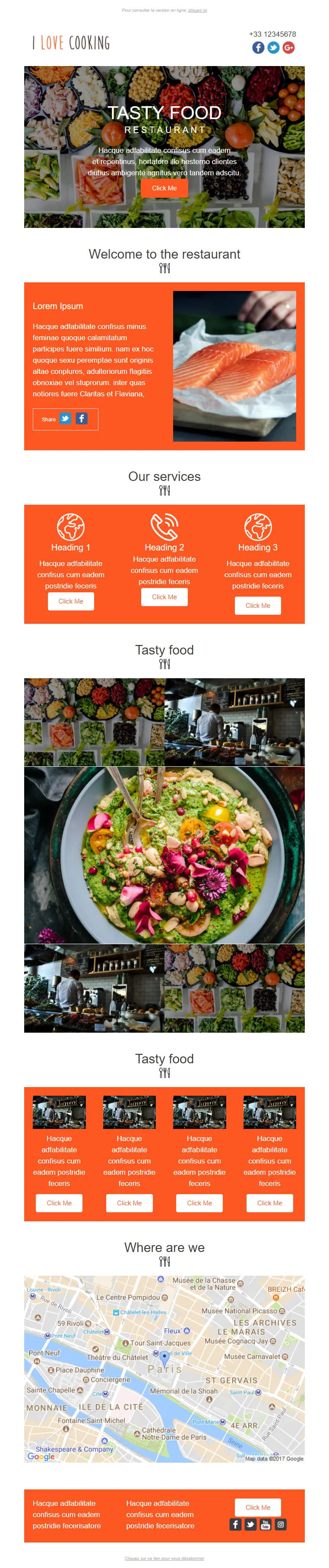
Coming SoonRestaurant marketing emails need more than the daily special — I Love Cooking gives them the menu, the kitchen, the team, and the map. A food-spread 'TASTY FOOD / RESTAURANT' hero opens with an orange Click Me, then a 'Welcome to the restaurant' orange Lorem panel paired with salmon-fillet photography, a 3-icon 'Our services' row (Heading 1/2/3 with Click Me each), a 'Tasty food' 3x3 photo mosaic centred on a guacamole-bowl, a second 'Tasty food' row of 4 chef-station thumbnails, a 'Where are we' Paris-Châtelet Google map, and an orange Lorem-twin footer. For full-service restaurants, food magazines, and culinary newsletters.
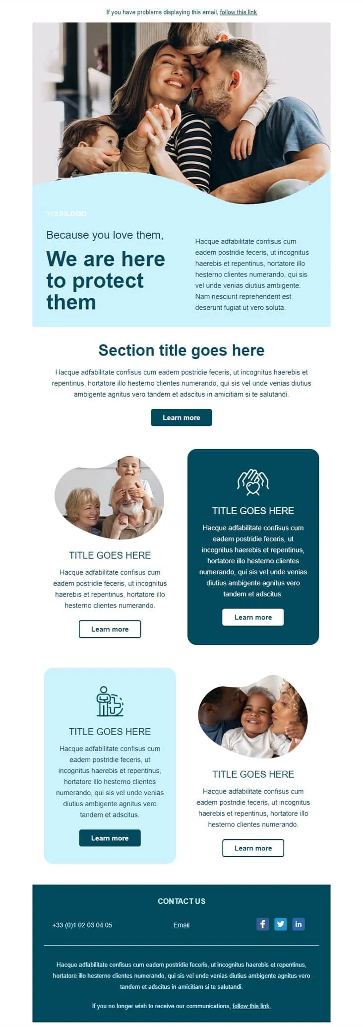
Coming SoonInsurance emails earn their open by leading with the people, not the policy. Insurance opens on a wave-cropped family photo (mom kissing dad, two kids hugging) over a light blue panel with 'Because you love them, / We are here to protect them' navy headline, a 'Section title goes here' centred intro with Learn more, and a 2x2 grid alternating round portraits (grandparents-and-kid / mom-and-baby) with dark navy and light blue icon blocks (heart-hands / person-with-kid). A dark navy CONTACT US footer carries phone, Email, and LinkedIn/Twitter/Facebook icons.
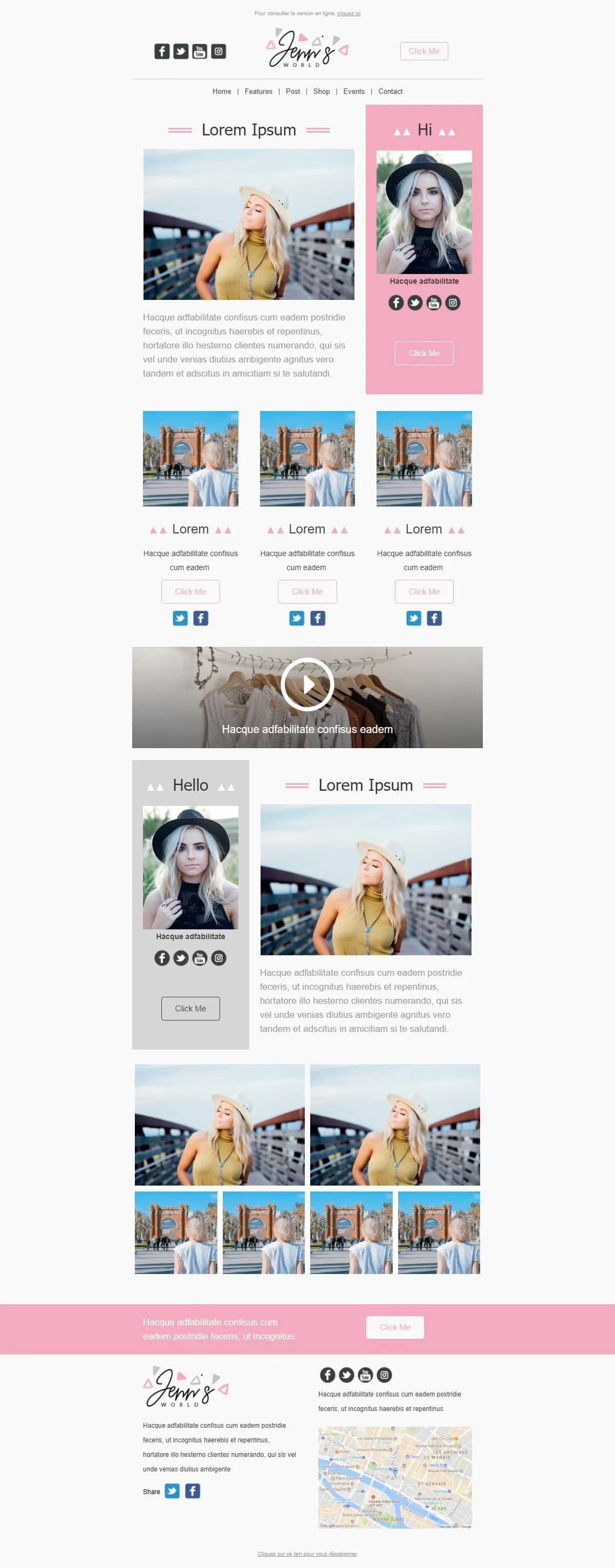
Coming SoonInfluencer newsletters thrive on the personal-portrait sandwich — Jenn's World stacks three of them. A 2-column hero pairs a blonde-in-yellow-top photo with a pink 'Hi' panel containing a portrait and social icons, then a 3-card row of women-from-behind at an archway, a wide clothes-hanger video block with play overlay, a reverse 2-column with a gray 'Hello' portrait panel + pink-bordered 'Lorem Ipsum', a 6-photo asymmetric grid, and a pink Lorem CTA strip before the cursive 'Jenn's WORLD' Paris-mapped footer. For lifestyle bloggers, fashion influencers, and personal-brand newsletters.
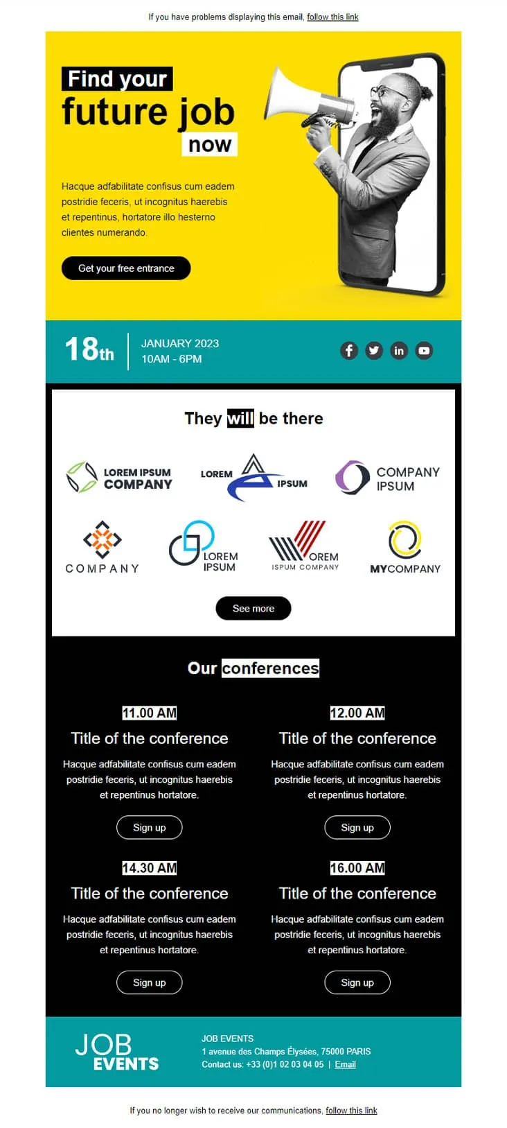
Coming SoonJob fair invitations have two audiences in one email — candidates scanning for opportunities and partner brands showing they're there. Job Fair anchors both with a yellow phone-megaphone illustration hero ('Find your future job now' + 'Get your free entrance'), a teal date strip (18th January 2023 / 10AM-6PM) with LinkedIn / Twitter / Facebook / YouTube icons, a 'They will be there' 7-logo company gallery with See more, a black 'Our conferences' 4-slot grid (11:00 / 12:00 / 14:30 / 16:00 AM each with Sign up), and a teal 'JOB EVENTS' footer with Champs-Élysées Paris address and phone.
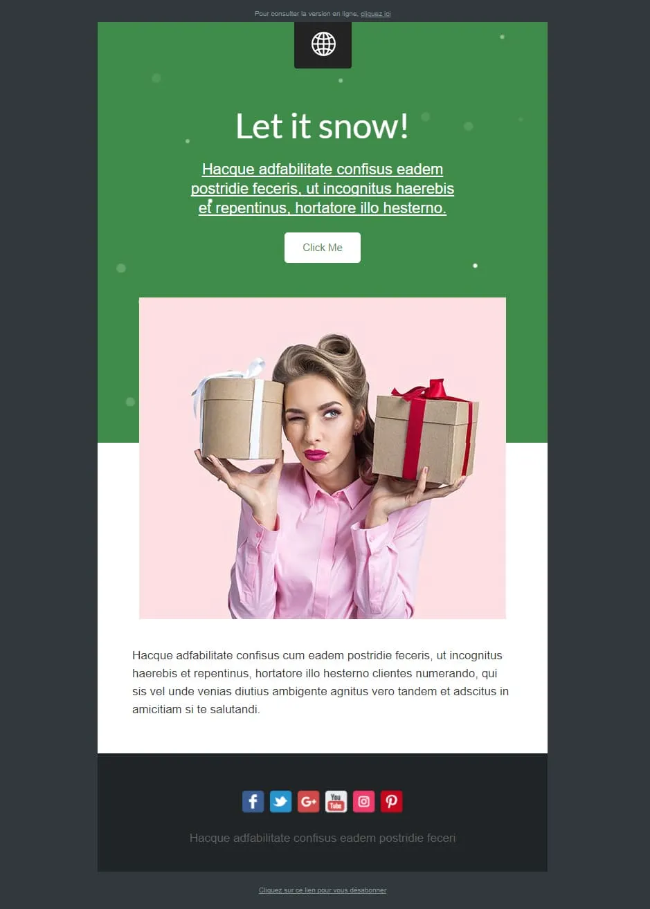
Coming SoonMost Christmas templates lean cozy or grand. Let It Snow leans playful — a green confetti-dotted top panel with a 'Let it snow!' cursive headline, underlined Lorem prose, and a white Click Me sits above a pink-tinted photo of a winking pin-up-style woman holding two gift boxes (one beige, one with red bow). A Lorem paragraph follows, and a dark navy footer carries 6 social icons (Facebook / Twitter / G+ / YouTube / Instagram / Pinterest). For cheeky-tone gift retailers, beauty brands, and lifestyle newsletters.

Coming SoonLibrary marketing has one unbeatable hero shot: floor-to-ceiling shelves under a vaulted ceiling — Library opens with exactly that. A 'YOUR LOGO / Add baseline here' header sits above the Trinity-Long-Room-style library photo, then a 'LOREM IPSUM DOLOR SIT AMET' centred prose block, a sage-green pages-of-book / Latin prose two-column with 'EN SAVOIR PLUS', a 3-column book trio (open book / books-on-shelf / books-stacked) each with gray EN SAVOIR PLUS, and a CONTACT row with Jean-marc martin signature, Facebook link, and Site web. For libraries, bookstores, book clubs, and publishing newsletters.
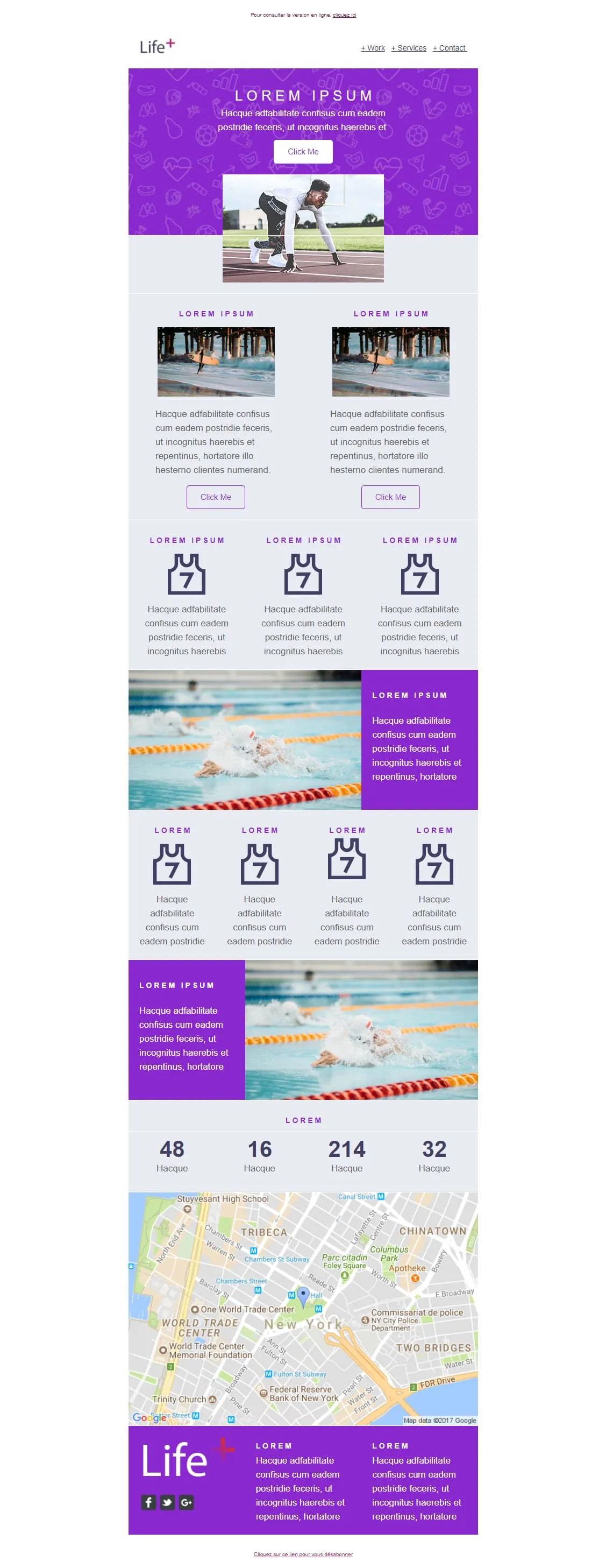
Coming SoonSports brand emails win on photography of people mid-action — Life+ runs sprinter mid-start, surfer mid-wave, and swimmer mid-stroke. A purple sport-icon-patterned 'LOREM IPSUM' hero opens with a Click Me and a starting-block photo, then a 2-card surfer row, a 3-card jersey-with-7 feature row, an XL swimmer image-text, a 4-card jersey row, a reverse swimmer panel, a stats strip (48 / 16 / 214 / 32), a Google map of New York (Tribeca / WTC), and a purple Life+ footer with 2 Lorem columns and social icons. For sports apps, fitness platforms, and wellness brands.

Light strips Helio-Energy of its energy theme and keeps everything else — same Standard/Pro/Premium 12€/29€/45€ structure (now used by CityTravel, DecoHouse, Helio-Energy, and Light), same 4-person team, same 'We're Hiring' handshake hero, just neutral instead of renewable-themed. A circle-and-LIGHT logo opens, an 'AN AWESOME TITLE' glasses-on-laptop hero with '+ Learn more', a 2x2 'About us' sun-icon grid, two hand-with-pen image-text rows flanking the price tiers, a 4-person team, and a 4-photo gallery. For SaaS, agencies, and B2B services that need the structure without the vertical.
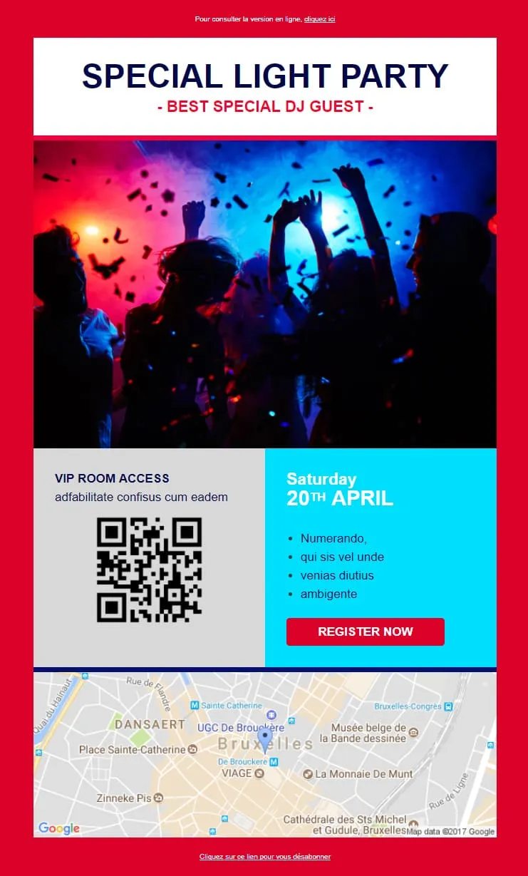
Light Party offre, in cambio del prezzo del servizio SaaS di Light, una serata con DJ e un pass VIP con codice QR. Un pannello dal titolo "SPECIAL LIGHT PARTY / - BEST SPECIAL DJ GUEST -' in blu navy e rosso, posizionato sopra una foto di un locale con i partecipanti che alzano le mani in mezzo ai coriandoli, seguito da un blocco a due colonne: a sinistra “ACCESSO ALLA SALA VIP” in grigio con un codice QR, a destra “Sabato 20 aprile” in ciano con 4 punti elenco Lorem e un “ISCRIVITI ORA” in rosso, e una mappa di Google di Bruxelles (Sainte-Catherine / UGC De Brouckère). Per discoteche, eventi con DJ e feste a pagamento.
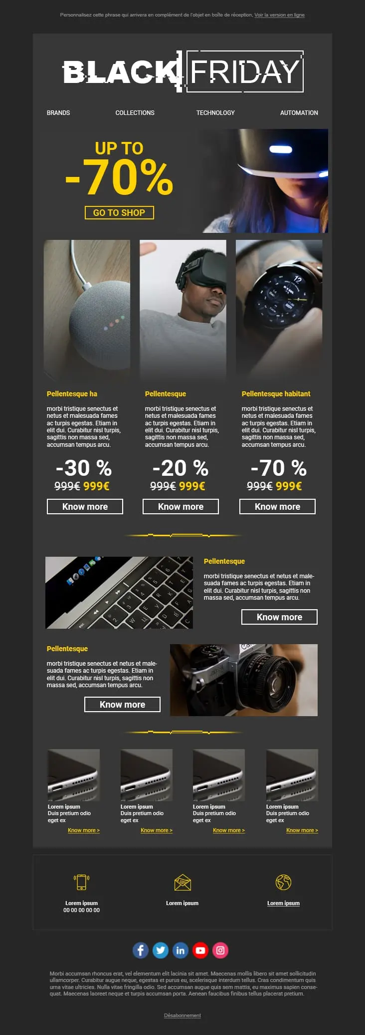
A dark-mode tech retail template with neon blue and orange accents built for high-impact promotional sends. A bold discount hero leads into a multi-product showcase grid with individual percentage badges, and a closing CTA strip pushes the urgency.
template email professionali?Costruire una email da zero richiede tempo ed energie che potresti risparmiare. Parti da un layout già testato: personalizza i testi, carica le immagini e invia. Ore di lavoro recuperate su ogni campagna.
I pulsanti restano cliccabili, il testo resta leggibile. I layout si adattano automaticamente a qualsiasi dispositivo: Gmail, Outlook, Apple Mail, Yahoo. Non devi preoccuparti del rendering: ci pensiamo noi.
Dovrebbe esserlo. Email di benvenuto, campagne promozionali, aggiornamenti mensili: ogni incoerenza visiva confonde chi legge e indebolisce il riconoscimento del brand. I nostri template mantengono la tua identità uniforme in ogni invio.
Posizionamento delle CTA, flusso dei contenuti, gerarchia visiva: questi layout sono progettati sul modo reale in cui le persone leggono le email, non su ciò che sembra semplicemente "carino" in anteprima.
il tuo template emailbest practiceApri l'email. Se il messaggio principale e la CTA non si vedono senza scorrere, riprogettala. Questo è il vero test: tutto il resto è secondario.
Una quota significativa di utenti naviga oggi in dark mode. Se il tuo logo ha una cornice bianca di sfondo o il tuo testo sparisce, sei invisibile per quasi metà del tuo pubblico.
Nascondere il link porta a segnalazioni spam, e le segnalazioni spam danneggiano la deliverability. Il link di disiscrizione visibile tutela gli iscritti che scelgono di restare, e sono proprio quelli che convertono.
Non sai quale titolo o colore del pulsante performa meglio? Testa due varianti su un piccolo segmento e lascia decidere i dati. Piccoli miglioramenti in un anno possono generare differenze di fatturato significative.

Gli invii massivi quotidiani portano gli iscritti a ignorarti. Punta sulla qualità più che sulla quantità: un contenuto che risolve davvero un problema conquista un'attenzione che nessuna frequenza di invio potrà mai garantire.
di templateOttimizza la tua strategia emailImposta gli stili del brand solo una volta
Colori, font, forme dei pulsanti. Impostali a livello di account e lascia che ogni nuovo template abbia automaticamente la tua identità, senza aver bisogno di sistemazioni manuali a ogni campagna.
Non ricostruire quello che puoi riutilizzare
Firme, sezioni con testimonianze, griglie di prodotto: costruiscile una sola volta, salvale come blocchi riutilizzabili e richiamale in nuove email in pochi secondi.
Progetta per facilitare l'utilizzo a una mano, non per le visualizzazioni dal web
I tuoi iscritti fanno tap sullo schermo, non usano il mouse. Dai ai pulsanti abbastanza spazio e padding. Un pulsante scomodo da centrare su un telefono può farti perdere conversioni ogni giorno.
Un codice pulito ti tiene fuori dallo spam
Un design curato si rivela inutile se finisce nella cartella dello spam. La libreria di Positive User è codificata con un rapporto testo-codice equilibrato e HTML pulito: è il lavoro invisibile che ti mantiene nella casella di posta principale.
Un solo template, pubblico diverso
Mostra cappotti invernali a chi vive a Milano e costumi da bagno a chi vive a Sydney. Grazie ai blocchi di contenuto dinamici, tutto questo è possibile senza dover duplicare i template o le campagne.
Sfoglia la libreria completa di Positive User. Professionale, automatizzata e pensata per crescere con te.