




Art
Newsletter
Lifestyle
E-commerce e offerte
Una buona newsletter crea un'abitudine. I tassi di apertura migliorano nel tempo perché gli iscritti imparano ad attenderla, a darle fiducia e a desiderarla con interesse. Questi template ti offrono layout professionali e coerenti per approfondimenti di settore, notizie aziendali e contenuti selezionati con cura. Scegli un design, aggiungi i tuoi articoli e inviali con l'editor drag&drop di Positive User.
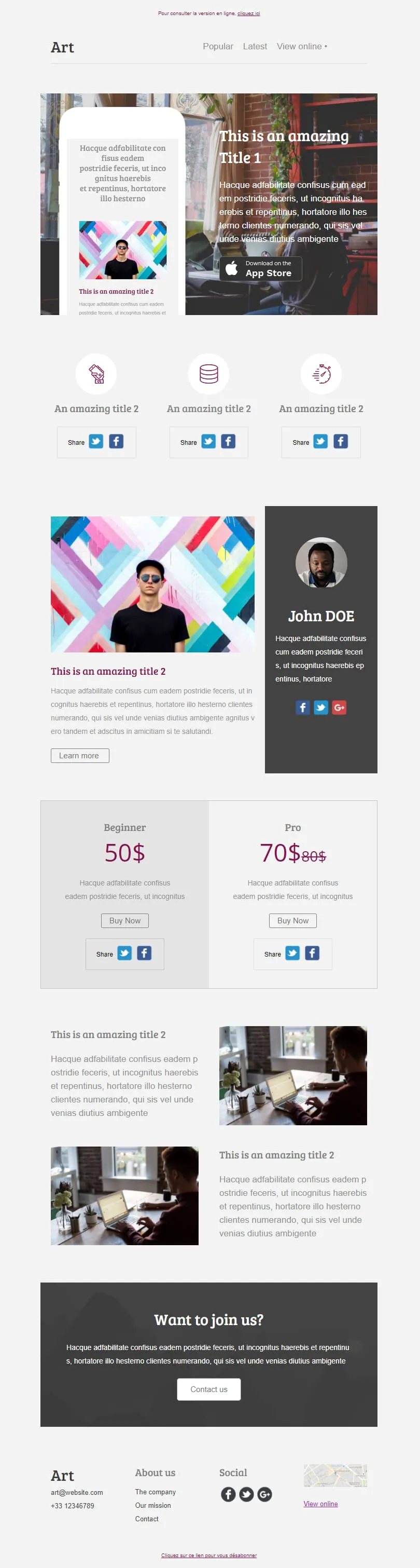
template email per newsletterComing SoonSei blocchi di contenuto distinti si combinano in un unico layout editoriale: un elemento di risalto dedicato all’App Store con un mockup di telefono, una riga con tre icone di condivisione, una colonna dedicata all’autore con il suo profilo, un piano tariffario “Principiante/Professionista” con il prezzo di riferimento barrato, due immagini in primo piano e un invito all’azione “Unisciti a noi”. Scegli quelli che ti servono: la struttura si adatta alle tue esigenze.


Le richieste rivolte ai donatori e ai volontari si contendono lo stesso spazio nella casella di posta; questa struttura suddivide il contenuto. Un'immagine principale dai toni caldi dell'arancione trasmette la missione, seguita da una sezione illustrativa in quattro parti intitolata “La nostra missione”, poi da file di immagini accoppiate, una striscia “Fai una donazione”, quattro profili del team con i profili social e un riquadro “Stiamo assumendo”: ogni richiesta ha il proprio spazio dedicato.
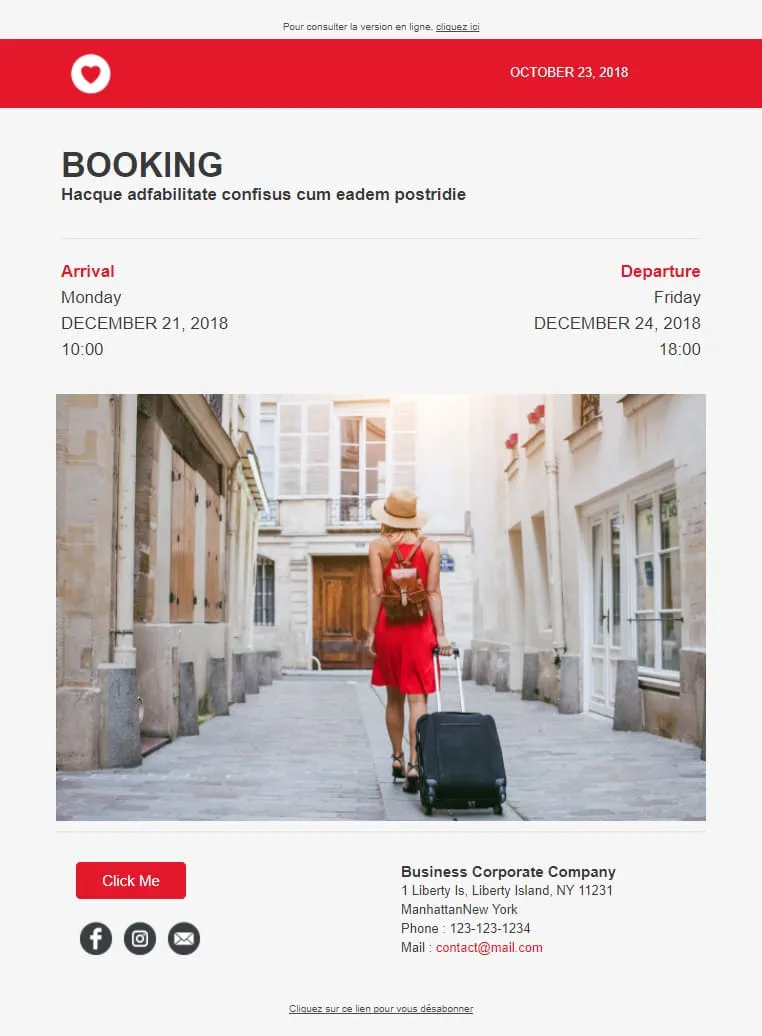
Le conferme di prenotazione fidelizzano i clienti quando i dettagli sono di facile lettura. L’arrivo e la partenza sono riportati in due colonne ben definite, con date e orari disposti verticalmente sotto ciascuna di esse; una foto della destinazione occupa la parte centrale per ricordare all’ospite il motivo della prenotazione, mentre un riquadro con i recapiti in fondo alla pagina consente di contattare la struttura con un solo clic.

Minimal non significa spoglio, ma intenzionale. Hero con messaggio principale, fila di icone dei servizi, blocco video con pulsante di riproduzione, widget con 4 barre delle competenze, team con 3 ritratti, mosaico di immagini dei progetti e fascia con i loghi dei clienti: ogni elemento è circondato dal giusto spazio bianco, così da risultare valorizzato e mai sovraccarico. Un portfolio completo del brand, raccontato con sobrietà.
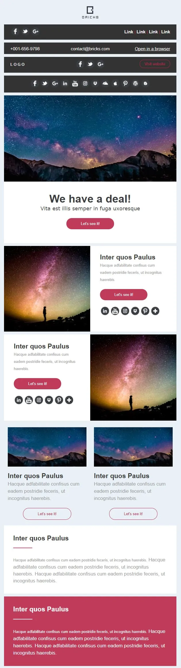
Alcune campagne richiedono un banner, altre una galleria, la maggior parte entrambe le cose. Questo template suddivide l'email in otto blocchi sovrapponibili: un banner promozionale con CTA “Scopriamolo”, coppie di righe con immagine e testo (a sinistra e a destra), due schede secondarie con miniature, una striscia larga in evidenza e una chiusura audace e contrastante. È possibile riordinare, trascinare o duplicare gli elementi: il layout rimane inalterato.
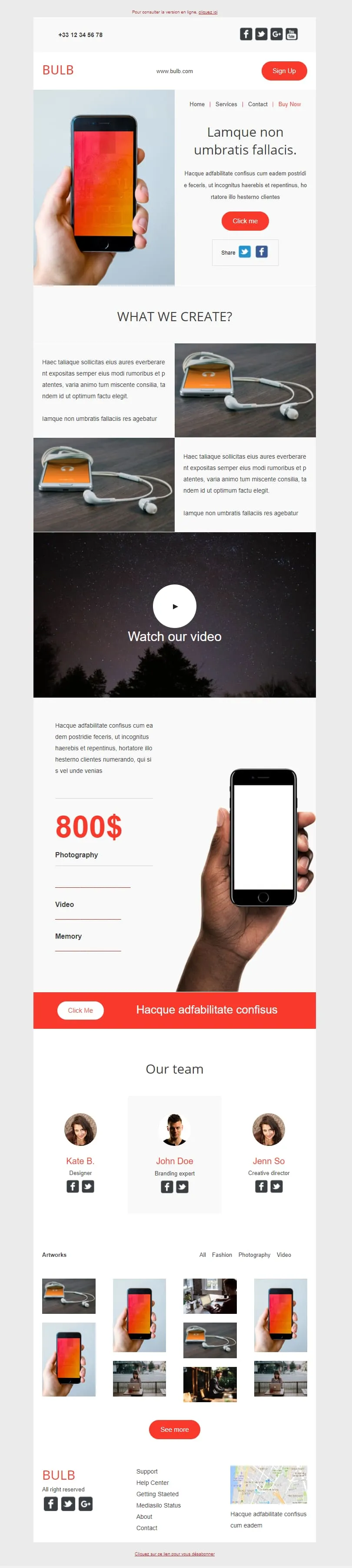
Questo template punta a fare tutto. Hero con smartphone in mano, due sezioni con immagine e testo dedicate al prodotto, un ampio blocco video, una colonna verticale con il prezzo (800 $) abbinata a un dettaglio dello smartphone, una barra arancione "Click Me", una sezione con il team composta da tre ritratti e un mosaico di quattordici miniature dei progetti. Tech brand di giorno, agenzia creativa di notte.
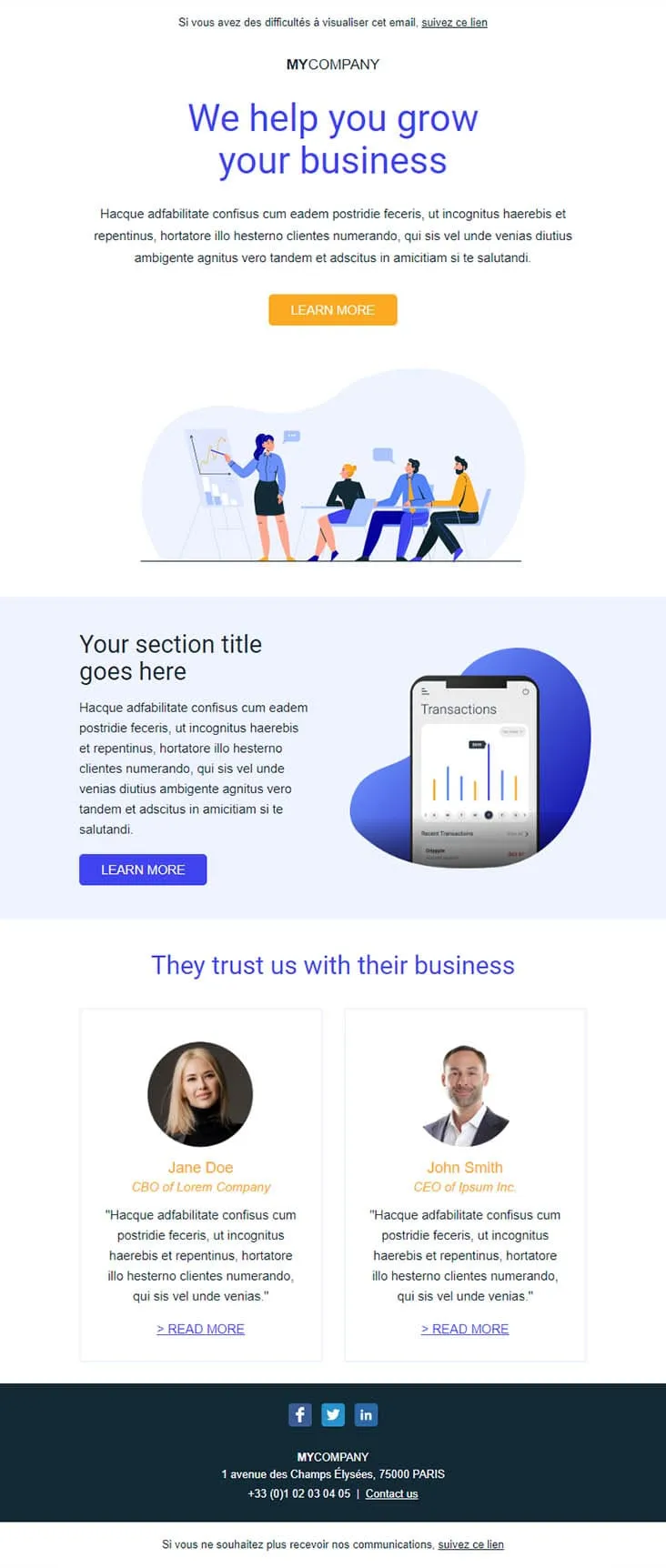
I potenziali clienti B2B scorrono velocemente le email e ignorano le presentazioni commerciali. Questo template contrasta questa tendenza con elementi concreti: un titolo in blu intenso che indica chiaramente il risultato (“Ti aiutiamo a far crescere la tua attività”), un’illustrazione di una riunione che attenuata l’impatto iniziale, lo schermo di un telefono che mostra transazioni reali e due testimonianze affiancate con i titoli di CBO e CEO. È il tipo di email che ottiene una risposta.
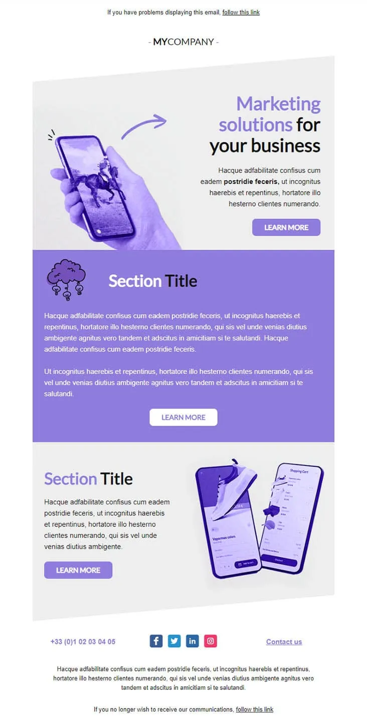
Coming SoonMarketing agencies don't sell features — they sell outcomes. This violet-toned template lines up three Learn More buttons across three distinct sections: a marketing-solutions hero with phone-in-hand artwork, a centred purple manifesto block, and an e-commerce case study showing shopping-cart screens. One email, three conversations, three pitches.
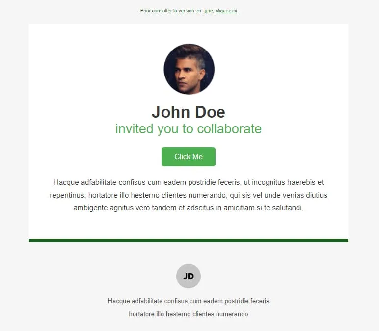
Coming SoonInvitations need a face, a name, and a button — nothing else. Collaborate stacks three things on white: a circular profile photo, a two-line headline ('John Doe / invited you to collaborate'), and a green Click Me button. A green horizontal divider separates the message from a small initials-avatar footer with the inviter's signature line. Read in two seconds, accepted in three.
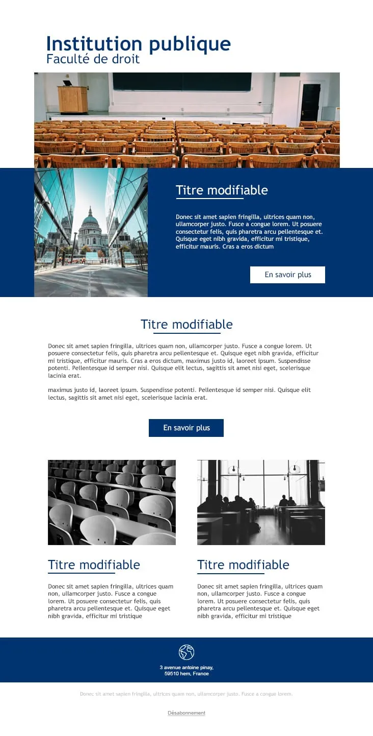
Coming SoonPublic institutions communicate in blue and serif, not gradient and emoji. College gives universities and faculties a layout that sounds credible from line one: a navy 'Institution publique / Faculté de droit' header, an auditorium photo, a deep-blue feature block with a cathedral side-photo and 'En savoir plus' CTA, a centred Titre modifiable section, and two black-and-white image-text rows for departmental news. Footer carries the address and unsubscribe link.
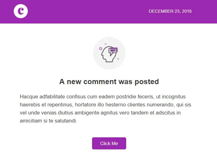
Coming SoonComment notifications race against the user's instinct to dismiss. Comments wins that race in under five seconds: a violet 'C' logo strip with the date stamped right ('December 23, 2018'), a centred head-with-bubble icon, a 'A new comment was posted' headline, two short paragraphs of context, and a single violet Click Me. No author preview, no thread preview — the platform handles the rest.
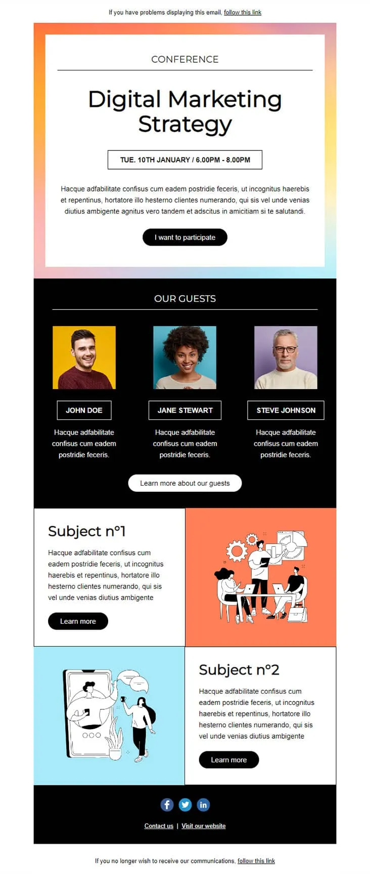
Coming SoonConference invites compete with three other invites in the same week. This template wins by putting the agenda in the email: a pastel-gradient hero with 'CONFERENCE — Digital Marketing Strategy' and a date/time strip ('TUE. 10TH JANUARY / 6.00PM - 8.00PM'), an 'I want to participate' CTA, a black 'OUR GUESTS' block with three speaker portraits on coloured backgrounds, then two Subject blocks with illustrations (Subject n°1 + Subject n°2) — each with its own Learn More.
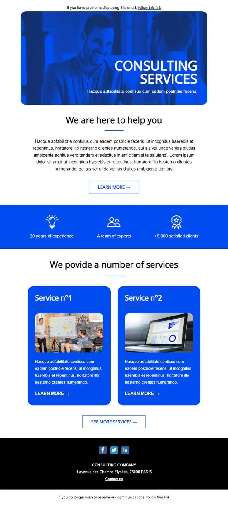
Coming SoonEstablished consultancies skip the persuasion and lead with stats. This template plays that card: a confident businessman hero in saturated blue, a 3-stat credibility strip ('20 years of experience / A team of experts / +5 000 satisfied clients'), then two numbered Service cards (Service n°1 + n°2) with photos and individual Learn More CTAs. Built for management consultants, accounting firms, and professional services that need to look established before they look smart.
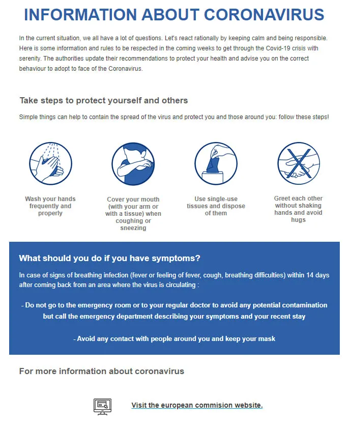
Coming SoonPublic health bulletins need to land calm — no gradients, no clever copy. Coronavirus Info (EN) is pre-set in English with an institutional headline ('INFORMATION ABOUT CORONAVIRUS'), four barrier-gesture icons in navy circles (wash hands, cover mouth, single-use tissues, no shaking hands), a deep-blue 'What should you do if you have symptoms?' panel, and a 'Visit the european commission website' link as the source of truth.
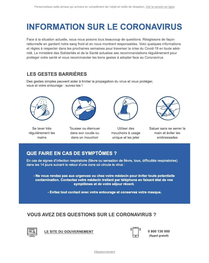
Coming SoonWhen the audience is exclusively French-speaking, every UI string already in the design saves a translation pass. Coronavirus Info (FR) ships with the entire body locked in French — an 'INFORMATION SUR LE CORONAVIRUS' headline, four 'Gestes Barrières' icons (se laver les mains, tousser dans le coude, mouchoirs jetables, pas de poignée de main), a 'Que faire en cas de symptômes ?' blue panel, and a 0 800 130 000 hotline next to a 'Le site du gouvernement' link. For French health authorities and French-speaking employers.

Coming SoonInterior brands need to do two jobs in one email: inspire and sell. DecoHouse handles both with a leaves-textured living-room hero and yellow-saturated body. Welcome statement, dining-room photo block with social share, four-person 'Powered by' team grid, then the offer: a 12€/29€/45€ Standard/Pro/Premium pricing card, four check-mark features, a reverse image-text row, a 3-thumbnail interior gallery, two oversized lifestyle shots (bed, pink sofa), a closing mosaic, and a Lille map. For interior designers, furniture retailers, and home-renovation studios.
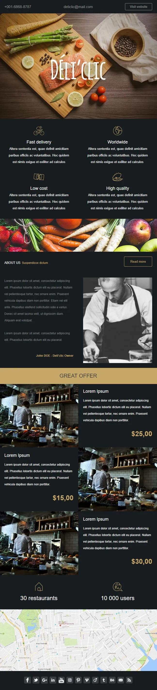
Coming SoonFood delivery emails need to make the user hungry before they think about logistics. Déli'clic plates the meal first: a wooden chopping-board hero with salmon, asparagus, lemon and tomatoes around a hand-lettered logo, then a four-quadrant feature icon grid (Fast delivery / Worldwide / Low cost / High quality), an About Us paragraph next to a black-and-white chef portrait, a 'GREAT OFFER' price strip with three café interior shots at $25/$15/$30, and a 30-restaurants / 10K-users stats bar before a NYC location map.
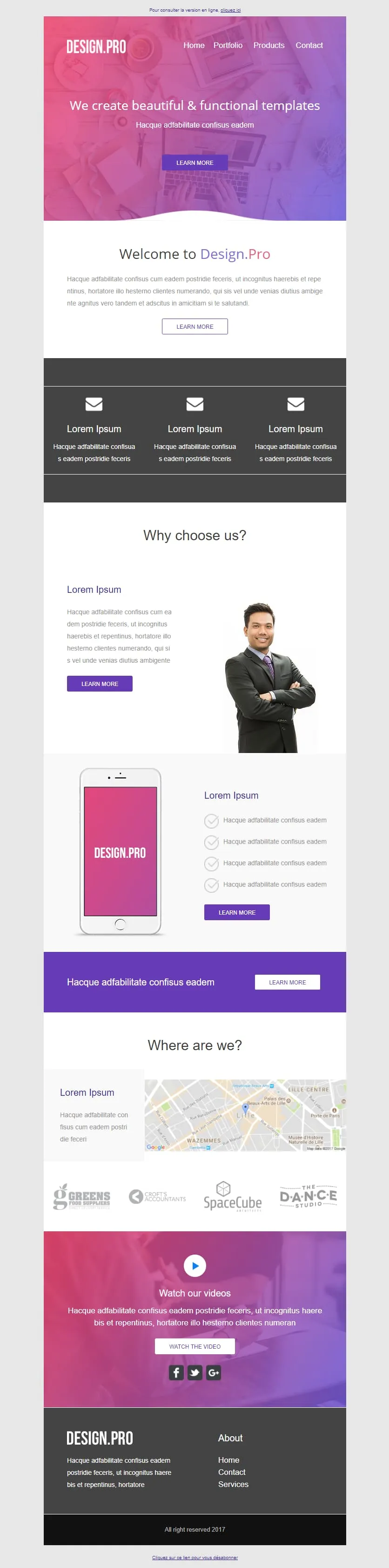
Coming SoonA design studio's email has to look like the work it sells. Design.Pro frames itself in a pink-to-purple gradient hero ('We create beautiful & functional templates'), runs a Welcome panel with prose-and-button, a 3-mailbox icon row, a 'Why choose us?' block with a businessman portrait, a pink phone mockup tied to four checkmark features, a violet CTA strip, a 'Where are we?' Lille map, a client logo strip (GREENS / CROFTS / SpaceCube / DANCE STUDIO), and a 'Watch our videos' video block over the gradient before the dark footer. For design agencies pitching their portfolio in one scroll.
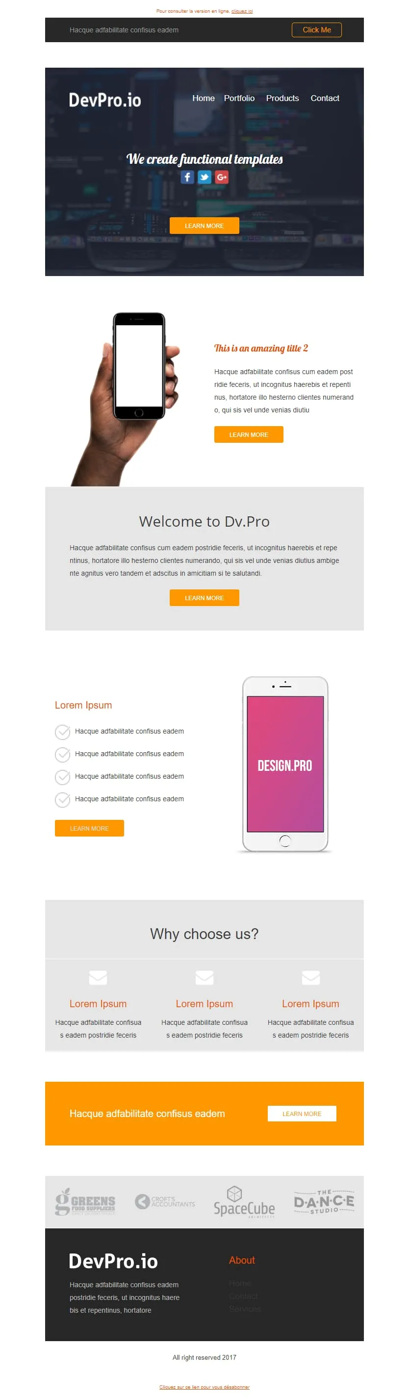
Coming SoonDev shops can't afford a pink gradient — they ship in dark mode with orange highlights. DevPro.io is the engineering-room sibling of Design.Pro: a code-blurred header bar with Click Me, a 'We create functional templates' dark hero with social icons, a phone-in-hand orange feature block, a 'Welcome to Dv.Pro' grey panel, a pink-screen phone tied to four checkmark features, a 3-mailbox feature row, an orange full-width CTA, the same client logo strip (GREENS / CROFTS / SpaceCube / DANCE STUDIO), and a dark footer.

Coming SoonAbandoned cart emails work better when they don't try. Don't Forget keeps everything in two colours and one purpose: a thin grey header with MYCOMPANY logo, a 'There's something in your cart' headline in heavy sans-serif, a three-row product table with image placeholders, ((product_name)) / ((product_description)) / ((product_quantity)) / ((product_price)) merge tags, and a single blue 'RETURN TO CART' button. No upsell, no discount, no excuse — just the receipt of what they almost bought.
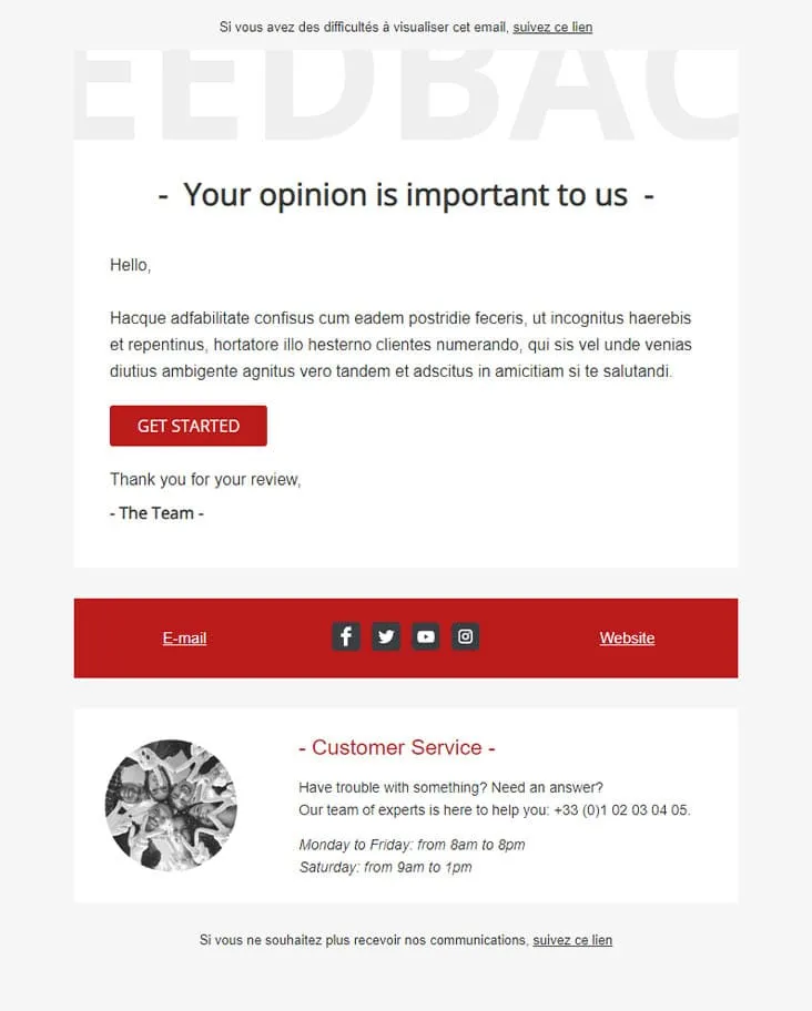
Coming SoonFeedback Matters keeps the ask honest: one button, no incentives. A watermark-style 'FEEDBAC...' supertext fades behind a dash-bracketed '- Your opinion is important to us -' headline, a short greeting and paragraph follow, a single red 'GET STARTED' button takes the action, and a 'Thank you for your review, - The Team' signature closes it. A red social-strip footer separates the message from a Customer Service block with photo, phone number, and weekday/Saturday hours.

Coming SoonFlat is the swiss-army knife of corporate templates. A camera-and-keyboard hero with cursive 'Flat' logo opens, then 'Our Features' 3-icon row (bulb/globe/trophy), a teal 'How we work' double-row with phone-notes photography, a 4-thumbnail 'Our Blog' grid, an 'Our Gallery' multi-tag filter (Photography / Digital marketing / Design / Video) over 6 photos, a 2x2 'Our Specialities' icon grid, an 'Our video' play-button hero, and an 'Our Pricing' 3-tier 399$ table with strike-through 350$ and feature checkmarks. Designed for agencies that need every section pre-built.
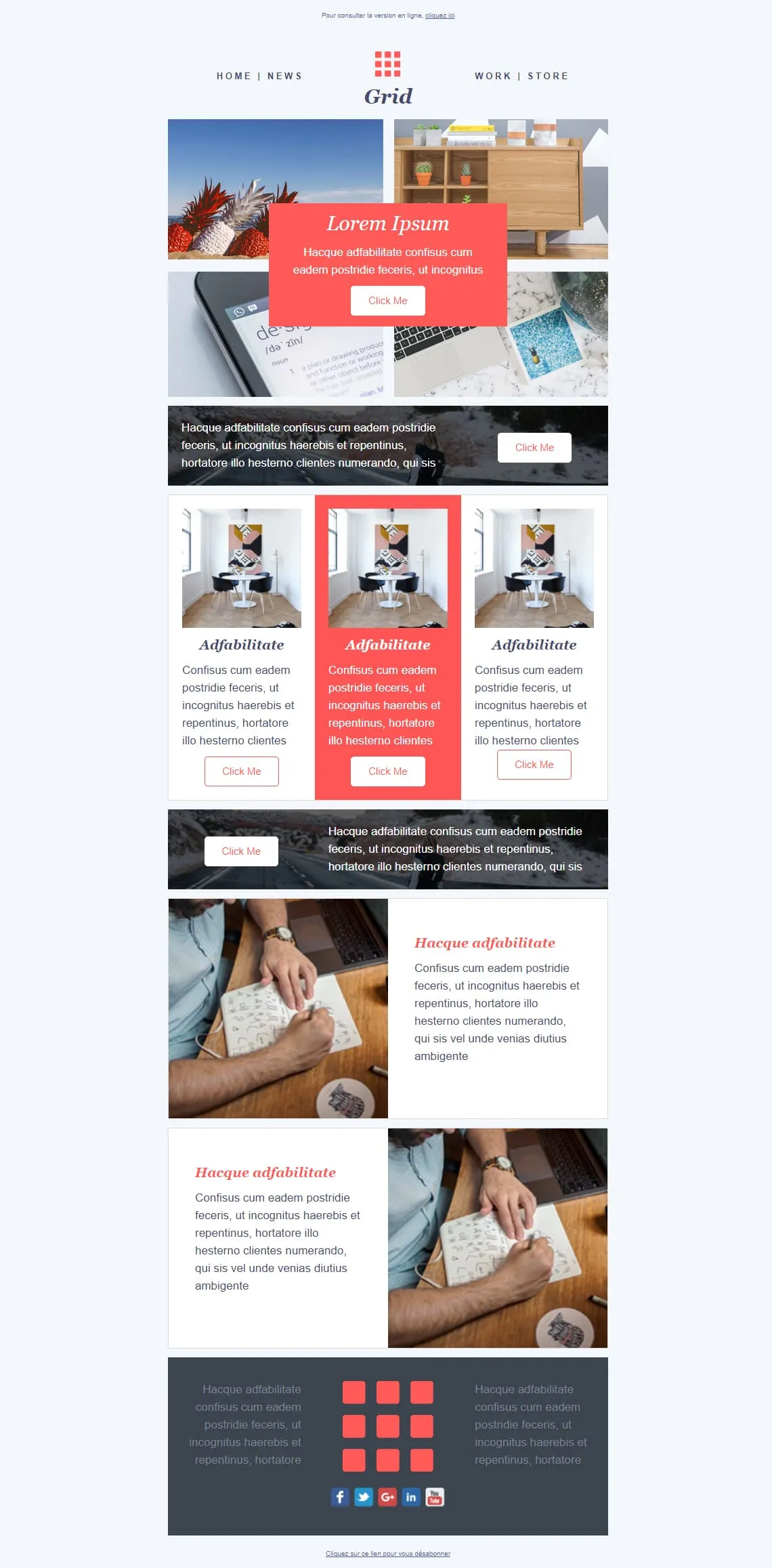
Coming SoonMosaic templates either fight for attention or get out of the way — Grid splits the difference. A 4-photo asymmetric mosaic at top carries a red 'Lorem Ipsum / Click Me' overlay card, a dark photo strip with a white-button CTA cuts through, a 3-card row spotlights the middle entry in red, a reverse dark image-strip CTA follows, then two image-text rows (handwriting-laptop / handwriting-laptop reversed) alternate before a dark gray footer with the 9-square red grid logo centred between social icons. For magazines, agencies, and creative shops that want photography to lead.
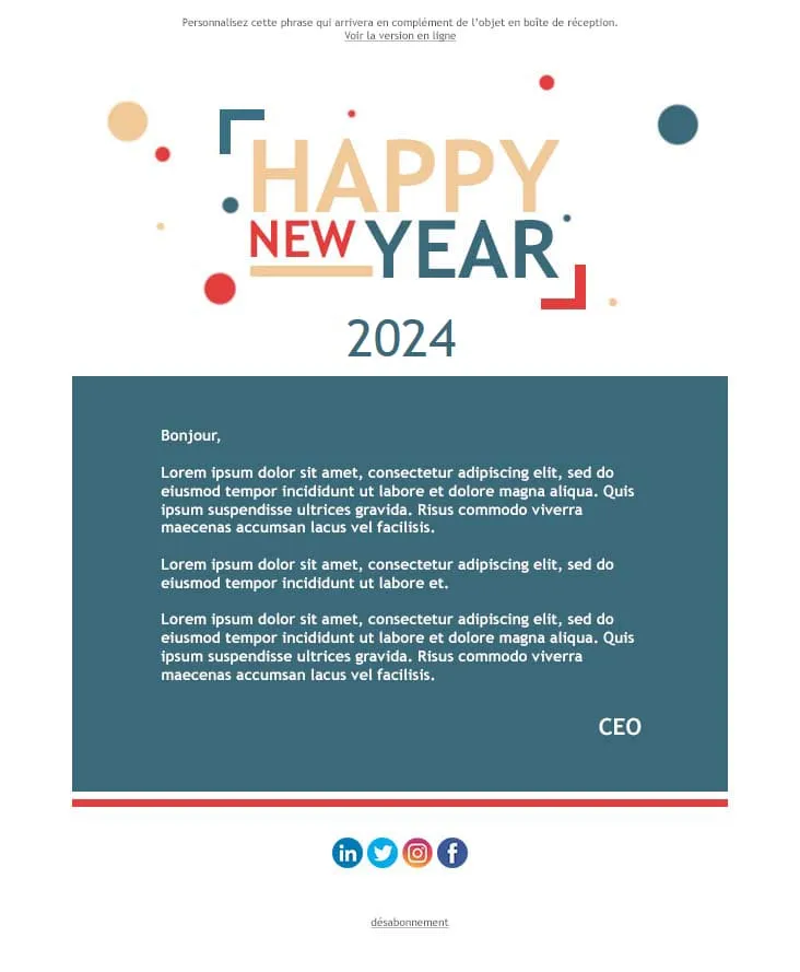
Coming SoonThe 'Happy New Year' letter is the simplest corporate email — and the easiest to overdo. Happy New Year stacks a confetti-dotted, multi-colour 'HAPPY NEW YEAR' typographic logo (yellow/red/blue/teal) over a giant teal '2024', then a single teal letter panel running three Lorem paragraphs and a CEO sign-off, a red separator, and a 4-icon social row (LinkedIn / Twitter / Instagram / Facebook) before the unsubscribe link. For company-wide year-end messages, B2B founder notes, and team-internal greetings.

Coming SoonThe first email after signup is the only one with a guaranteed open. HappyWelcome treats it like a party invitation: a royal-blue frame with cursive 'HappyWelcome' logo, a 'Welcome!' card with paragraph and pink Click Me, and a party flat-lay photo (confetti, candles, ribbons, gift box). Then a teal 'Holiday offer' image-text row paired with cake-and-candy photography, a reverse purple 'Holiday offer 2' row, and a dark navy footer with cursive brand and 3-icon social row. For onboarding sequences, birthday clubs, and 'thanks for joining' moments.
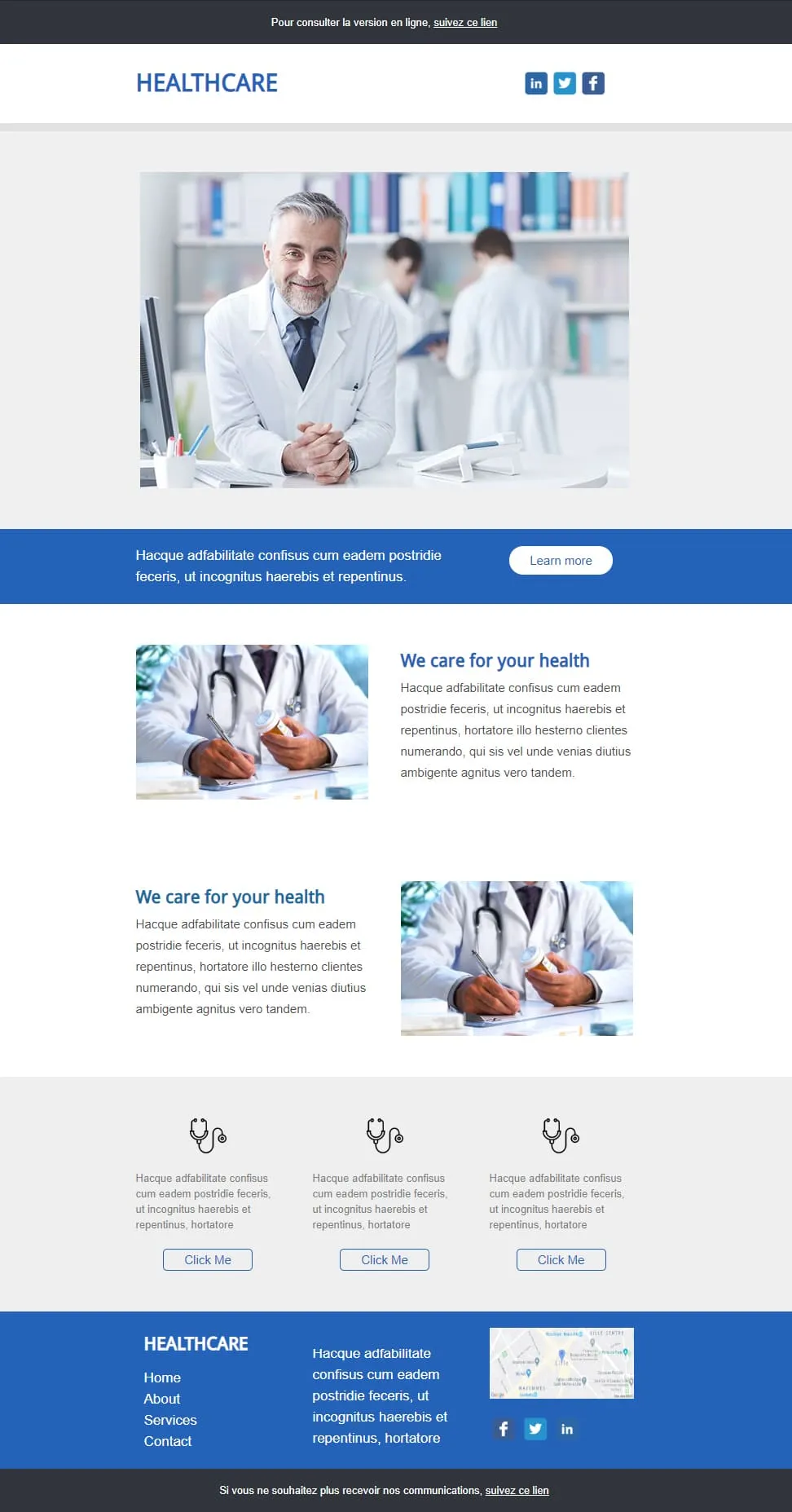
Coming SoonHealthcare emails should look trustworthy first and visually interesting second. Healthcare anchors on a smiling-doctor hero in a clinic library, drops a blue full-width 'Learn more' strip, then two image-text rows alternating (pill-bottle / prescription-writing) under a 'We care for your health' header, a 3-stethoscope-icon row with outlined Click Me buttons, and a blue footer with Home / About / Services / Contact, contact paragraph, Lille map, and LinkedIn/Twitter icons. For clinics, GP networks, pharmaceutical newsletters, and patient communications.
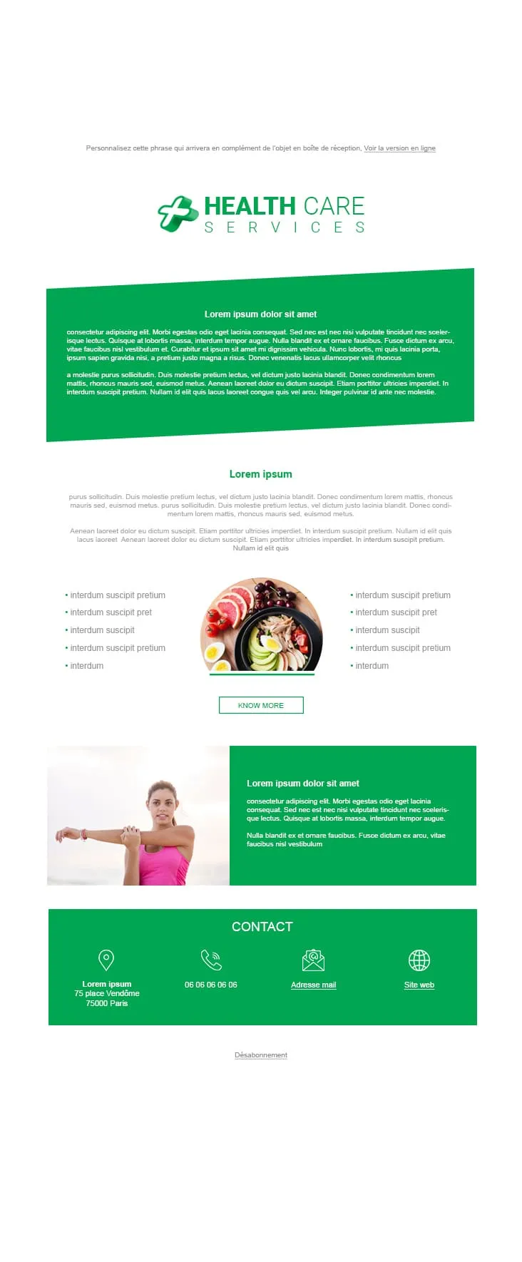
Coming SoonWellness clinics need a different palette than hospitals — green for prevention, blue for treatment. Health Care Services pairs a HEALTH CARE SERVICES green-cross logo with a tilted green prose panel, a 'Lorem ipsum' centred title and prose, a 2-column 5-bullet list flanking a round bowl-of-fruits-and-salad photo with a KNOW MORE outlined CTA, a green stretching-woman image-text row, and a green CONTACT footer with 4 icons (location 75 place Vendôme Paris / phone / mail / website). Companion to Healthcare, but built for nutrition, prevention, and wellness practices instead of clinical care.
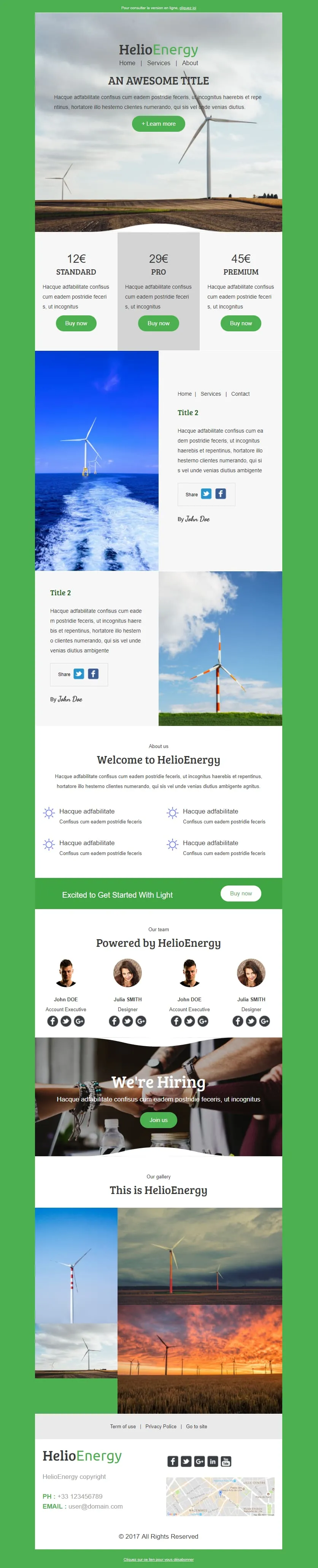
Coming SoonHelio-Energy takes the Standard/Pro/Premium 12€/29€/45€ subscription structure used by CityTravel and DecoHouse and ports it to renewable energy. A wind-turbine hero with HelioEnergy green logo opens, a 3-tier pricing row (gray-highlighted Pro), two image-text rows alternating with offshore-turbine and field-turbine photography, an 'About us' 2x2 sun-icon feature grid, a green 'Excited to Get Started With Light' Buy now strip, a 4-person 'Our team' row, a 'We're Hiring' handshake hero, a 3-photo gallery, and a Lille-mapped footer. For energy providers, solar installers, and green-tech newsletters.
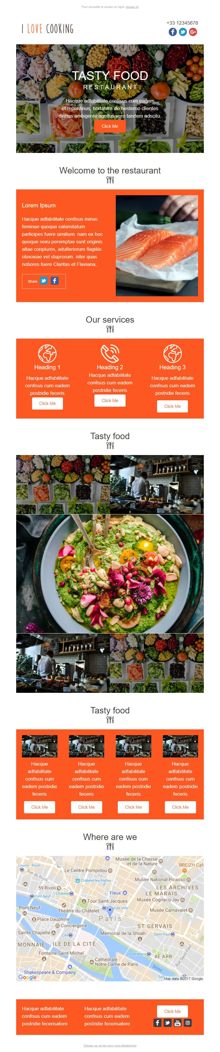
Coming SoonRestaurant marketing emails need more than the daily special — I Love Cooking gives them the menu, the kitchen, the team, and the map. A food-spread 'TASTY FOOD / RESTAURANT' hero opens with an orange Click Me, then a 'Welcome to the restaurant' orange Lorem panel paired with salmon-fillet photography, a 3-icon 'Our services' row (Heading 1/2/3 with Click Me each), a 'Tasty food' 3x3 photo mosaic centred on a guacamole-bowl, a second 'Tasty food' row of 4 chef-station thumbnails, a 'Where are we' Paris-Châtelet Google map, and an orange Lorem-twin footer. For full-service restaurants, food magazines, and culinary newsletters.
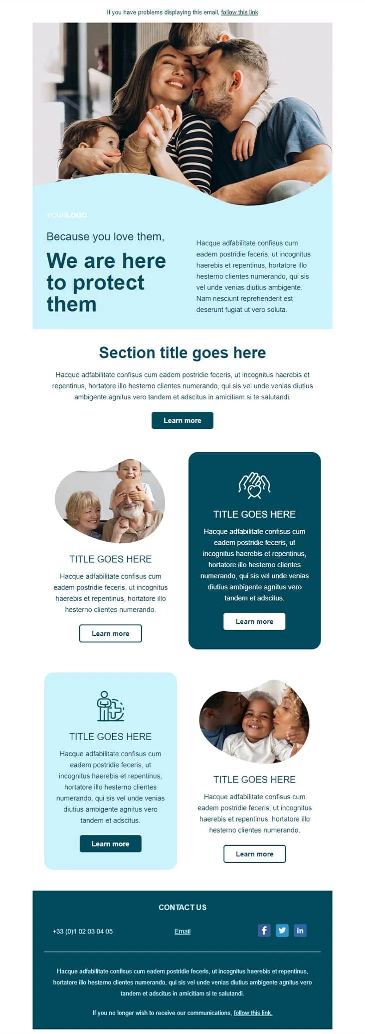
Coming SoonInsurance emails earn their open by leading with the people, not the policy. Insurance opens on a wave-cropped family photo (mom kissing dad, two kids hugging) over a light blue panel with 'Because you love them, / We are here to protect them' navy headline, a 'Section title goes here' centred intro with Learn more, and a 2x2 grid alternating round portraits (grandparents-and-kid / mom-and-baby) with dark navy and light blue icon blocks (heart-hands / person-with-kid). A dark navy CONTACT US footer carries phone, Email, and LinkedIn/Twitter/Facebook icons.
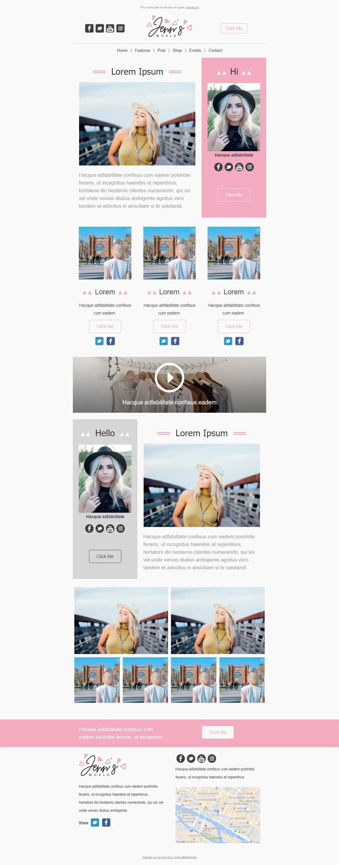
Coming SoonInfluencer newsletters thrive on the personal-portrait sandwich — Jenn's World stacks three of them. A 2-column hero pairs a blonde-in-yellow-top photo with a pink 'Hi' panel containing a portrait and social icons, then a 3-card row of women-from-behind at an archway, a wide clothes-hanger video block with play overlay, a reverse 2-column with a gray 'Hello' portrait panel + pink-bordered 'Lorem Ipsum', a 6-photo asymmetric grid, and a pink Lorem CTA strip before the cursive 'Jenn's WORLD' Paris-mapped footer. For lifestyle bloggers, fashion influencers, and personal-brand newsletters.
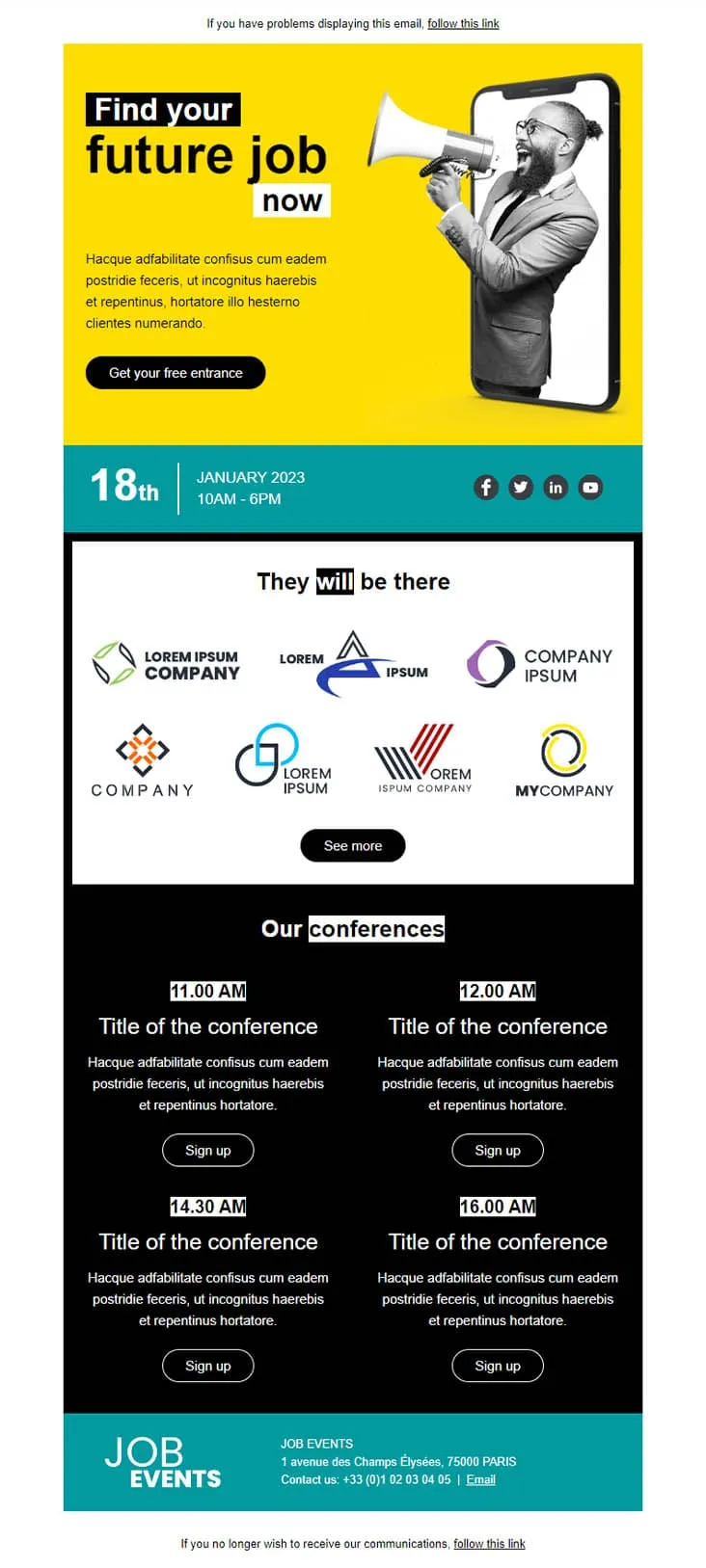
Coming SoonJob fair invitations have two audiences in one email — candidates scanning for opportunities and partner brands showing they're there. Job Fair anchors both with a yellow phone-megaphone illustration hero ('Find your future job now' + 'Get your free entrance'), a teal date strip (18th January 2023 / 10AM-6PM) with LinkedIn / Twitter / Facebook / YouTube icons, a 'They will be there' 7-logo company gallery with See more, a black 'Our conferences' 4-slot grid (11:00 / 12:00 / 14:30 / 16:00 AM each with Sign up), and a teal 'JOB EVENTS' footer with Champs-Élysées Paris address and phone.
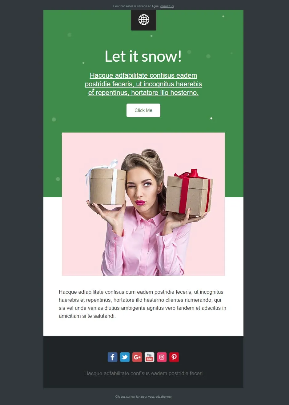
Coming SoonMost Christmas templates lean cozy or grand. Let It Snow leans playful — a green confetti-dotted top panel with a 'Let it snow!' cursive headline, underlined Lorem prose, and a white Click Me sits above a pink-tinted photo of a winking pin-up-style woman holding two gift boxes (one beige, one with red bow). A Lorem paragraph follows, and a dark navy footer carries 6 social icons (Facebook / Twitter / G+ / YouTube / Instagram / Pinterest). For cheeky-tone gift retailers, beauty brands, and lifestyle newsletters.

Coming SoonLibrary marketing has one unbeatable hero shot: floor-to-ceiling shelves under a vaulted ceiling — Library opens with exactly that. A 'YOUR LOGO / Add baseline here' header sits above the Trinity-Long-Room-style library photo, then a 'LOREM IPSUM DOLOR SIT AMET' centred prose block, a sage-green pages-of-book / Latin prose two-column with 'EN SAVOIR PLUS', a 3-column book trio (open book / books-on-shelf / books-stacked) each with gray EN SAVOIR PLUS, and a CONTACT row with Jean-marc martin signature, Facebook link, and Site web. For libraries, bookstores, book clubs, and publishing newsletters.
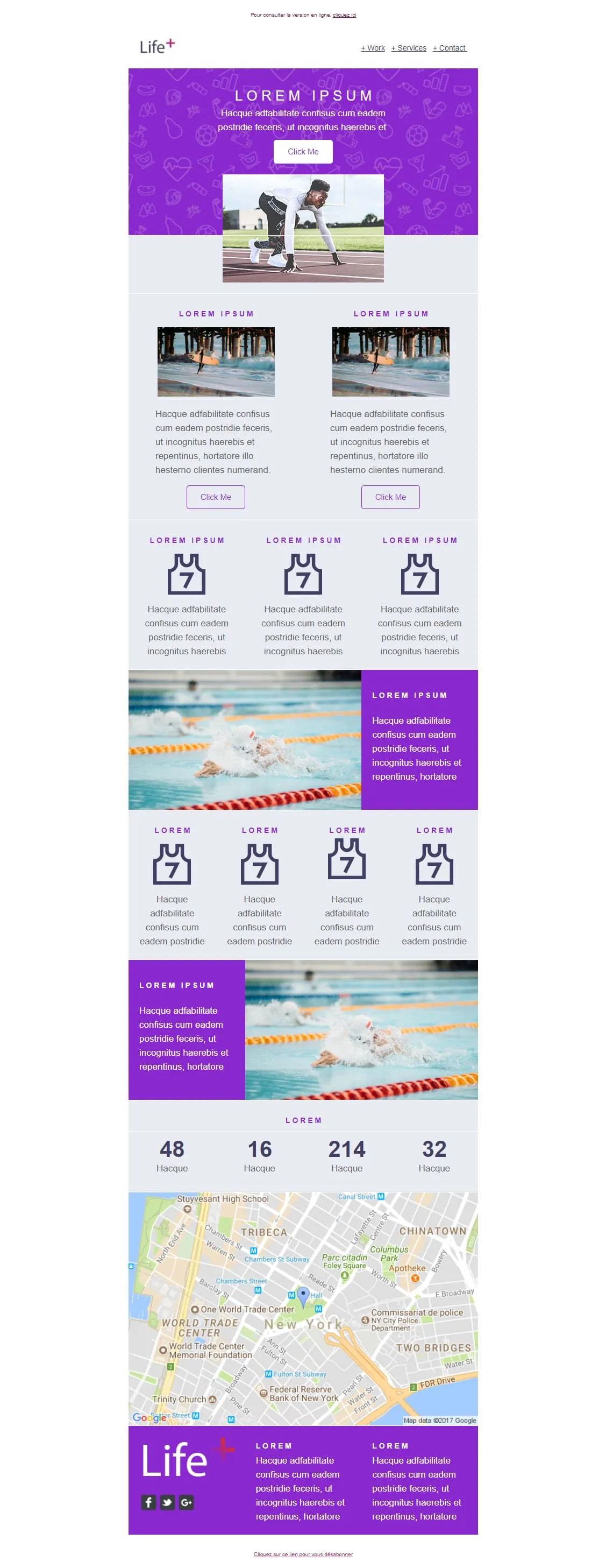
Coming SoonSports brand emails win on photography of people mid-action — Life+ runs sprinter mid-start, surfer mid-wave, and swimmer mid-stroke. A purple sport-icon-patterned 'LOREM IPSUM' hero opens with a Click Me and a starting-block photo, then a 2-card surfer row, a 3-card jersey-with-7 feature row, an XL swimmer image-text, a 4-card jersey row, a reverse swimmer panel, a stats strip (48 / 16 / 214 / 32), a Google map of New York (Tribeca / WTC), and a purple Life+ footer with 2 Lorem columns and social icons. For sports apps, fitness platforms, and wellness brands.

Light strips Helio-Energy of its energy theme and keeps everything else — same Standard/Pro/Premium 12€/29€/45€ structure (now used by CityTravel, DecoHouse, Helio-Energy, and Light), same 4-person team, same 'We're Hiring' handshake hero, just neutral instead of renewable-themed. A circle-and-LIGHT logo opens, an 'AN AWESOME TITLE' glasses-on-laptop hero with '+ Learn more', a 2x2 'About us' sun-icon grid, two hand-with-pen image-text rows flanking the price tiers, a 4-person team, and a 4-photo gallery. For SaaS, agencies, and B2B services that need the structure without the vertical.
template email per newsletter?Un singolo contenuto non basta a creare fiducia. Venti contenuti coerenti e ben progettati sì. È questo che posiziona il tuo brand come punto di riferimento nel tuo settore.
Ogni invio reindirizza gli iscritti al tuo blog, alla pagina dei prodotti o all’ultimo caso di studio. Non serve alcun budget. Non c’è alcun algoritmo da sfidare.
Scegli un layout. Salva gli stili del tuo brand. Inserisci nuovi contenuti ogni settimana. Il template rimane lo stesso. Il tuo tempo rimane tuo.
Probabilmente entrambe le cose. Una chiara gerarchia visiva fa sì che ottengano valore in entrambi i casi. Titoli per chi legge di sfuggita. Sezioni complete per chi legge in profondità.
template newsletter
Minimalista per aggiornamenti brevi. Griglia a più colonne per raccolte curate. Sfoglia e scegli.
Titoli, frammenti, immagini in evidenza. L'EmailBuilder ti permette di riorganizzare i blocchi per dare priorità a ciò che conta questa settimana.
Font, colori, stili dei pulsanti. Adattali al tuo sito. Aggiungi una firma personale e le icone dei social. Mantieni un tocco umano.
Pianifica l'invio nelle ore di picco. Poi osserva quali articoli ottengono il maggior numero di clic. Lascia che siano i dati a plasmare la tua prossima edizione.
Questo è il rapporto giusto. Prima di tutto approfondimenti, notizie e consigli. La promozione del prodotto viene dopo. Gli iscritti restano quando imparano qualcosa. Se ne vanno quando si sentono sottoposti a una vendita.
L’oggetto attira l’attenzione. Il preheader è ciò che convince. Usa quei 40-60 caratteri per dare un’anteprima della storia più interessante contenuta nell’email. La maggior parte dei brand lascia questo campo vuoto. Non farlo.
Titolo. Riepilogo di due righe. Pulsante “Leggi tutto”. Rendi l’email facile da scorrere e indirizza il contenuto completo al tuo sito. Questo genera traffico e mantiene l’email leggera.
Settimanale. Bisettimanale. Mensile. Scegli una cadenza e rispettala. Gli iscritti interagiscono di più quando sanno quando aspettarsi le tue email. L’inconsistenza, col tempo, fa crollare i tassi di apertura.

Pulsanti social o un link “Inoltra a un amico”. Se il contenuto è valido, saranno i tuoi lettori a far crescere la tua audience. Le newsletter di maggior successo crescono in modo organico proprio in questo modo.
I migliori articoli, strumenti e notizie dal tuo settore. Posiziona il tuo brand come il filtro di cui gli iscritti si fidano.
Momenti dietro le quinte. Traguardi raggiunti dal team. Note dalla dirigenza. Il lato umano del tuo brand.
I tuoi ultimi post, organizzati e riassunti. Coinvolgi nuovamente gli iscritti che si sono persi i contenuti sul tuo sito.
Nuove funzionalità. Miglioramenti. Correzioni di bug. I layout strutturati rendono gli aggiornamenti tecnici chiari e di facile consultazione.
Ottimizza le tue email newsletterStai progettando per chi legge di sfuggita?
La maggior parte dei lettori impiega meno di un minuto. Sottotitoli in grassetto, paragrafi brevi e spazi bianchi fanno sì che i punti principali vengano colti al volo.
Cosa succede quando le immagini non si caricano?
Un’email che è un’unica grande immagine rischia di finire nella cartella dello spam. Inoltre, molti client di posta elettronica per dispositivi mobile bloccano le immagini per impostazione predefinita. Alterna testo e immagini in modo che il messaggio rimanga leggibile.
Il contenuto può aggiornarsi da solo?
I blocchi dinamici inseriscono automaticamente le prime righe dei tuoi ultimi post. Meno lavoro manuale. Contenuti più pertinenti. In ogni edizione.
È leggibile in pieno sole?
Alto contrasto. Carattere minimo di 16px. Le newsletter vengono lette in tutte le condizioni. Verifica la leggibilità, non nel tuo ufficio buio alle 14:00.
Tutti gli iscritti ricevono la stessa versione?
Non dovrebbe essere così. Gli strumenti di analisi dei dati di Positive User ti consentono di inviare versioni personalizzate in base agli interessi di ciascun segmento.
Cosa c'è nell'oggetto?
“Questa settimana: 3 tendenze che stanno ridefinendo il marketing B2B” è meglio di “Aggiornamento mensile”. Sii specifico riguardo al contenuto. Prova diverse versioni.
Quanti articoli per ogni invio?
Da tre a cinque articoli di grande impatto danno risultati migliori rispetto a 15 link. Un’edizione mirata vince sempre.
Una newsletter che il tuo pubblico apprezza. I template e l'automazione integrata di Positive User. Coerente e professionale.