



Art
Newsletter
Estilo de vida
E-commerce y ofertas
Una buena newsletter construye un hábito. Las tasas de apertura mejoran con el tiempo porque los suscriptores aprenden a esperarla, a confiar en ella y a desearla. Estas plantillas te dan diseños profesionales y consistentes para insights de sector, novedades de empresa y contenido curado. Elige un diseño, añade tus historias y envía con el editor drag & drop de Positive User.
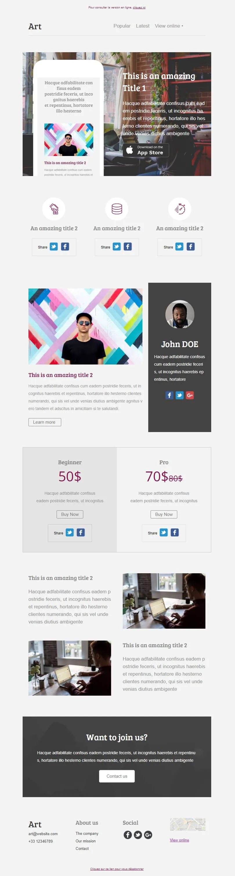
plantillas de email para newsletterSix modular content blocks stack cleanly into one editorial layout: an App Store hero with phone mockup, a share icon row, an author profile column, a Beginner/Pro pricing tier with crossed-out anchor price, two image feature rows and a join-us call to action. Use the blocks you need and drop the rest.


An NGO and nonprofit template that splits donor asks and volunteer recruitment into separate rooms. A warm orange mission hero feeds into a four-quadrant explainer, paired image rows, a donation strip, four team profiles with social links and a hiring callout at the close.
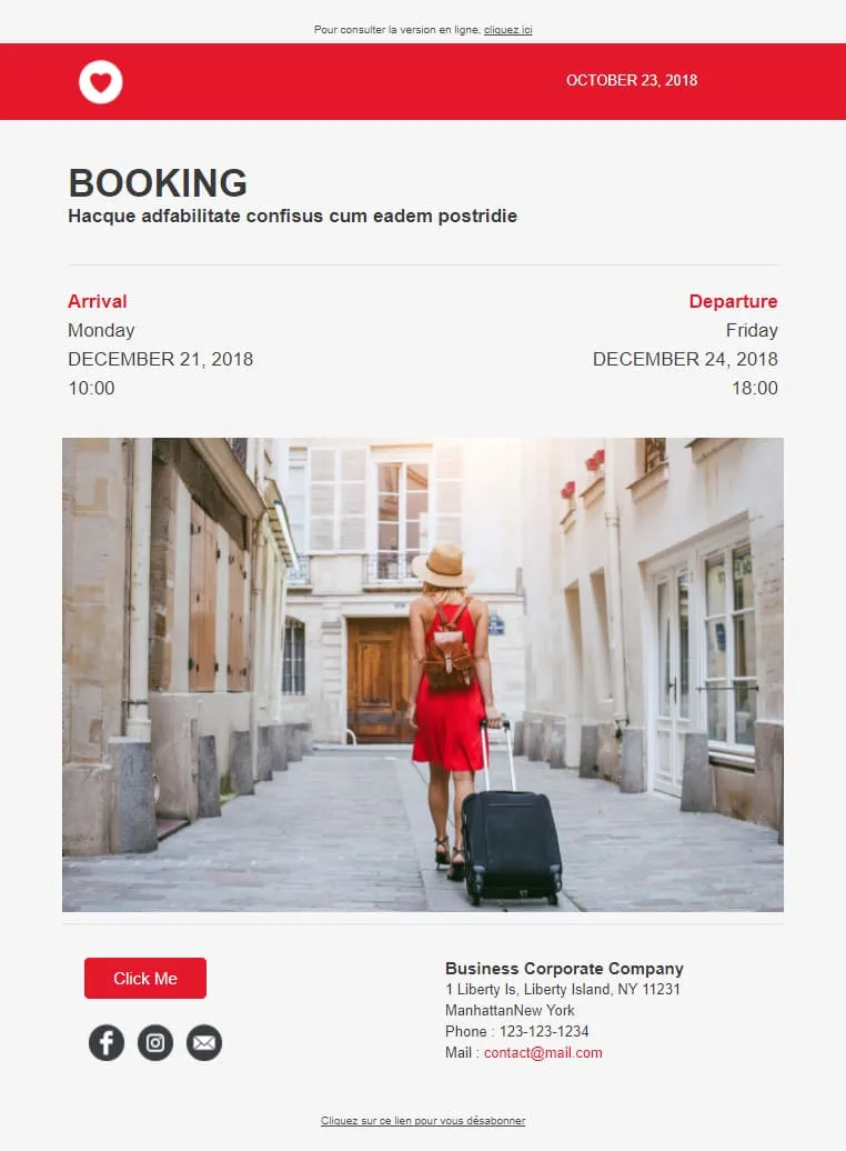
A clean booking confirmation template that earns loyalty through scannability. Arrival and departure details sit in two columns, dates and times stack neatly beneath each, a destination photograph reminds the recipient why they booked and a footer contact block keeps the property one click away.

A minimalist brand portfolio template where white space does the heavy lifting. A mission hero, a services icon row, a video block with play button, a four-skill progress bar widget, a three-portrait team section, an artwork mosaic and a client logo strip each feel chosen rather than crammed.
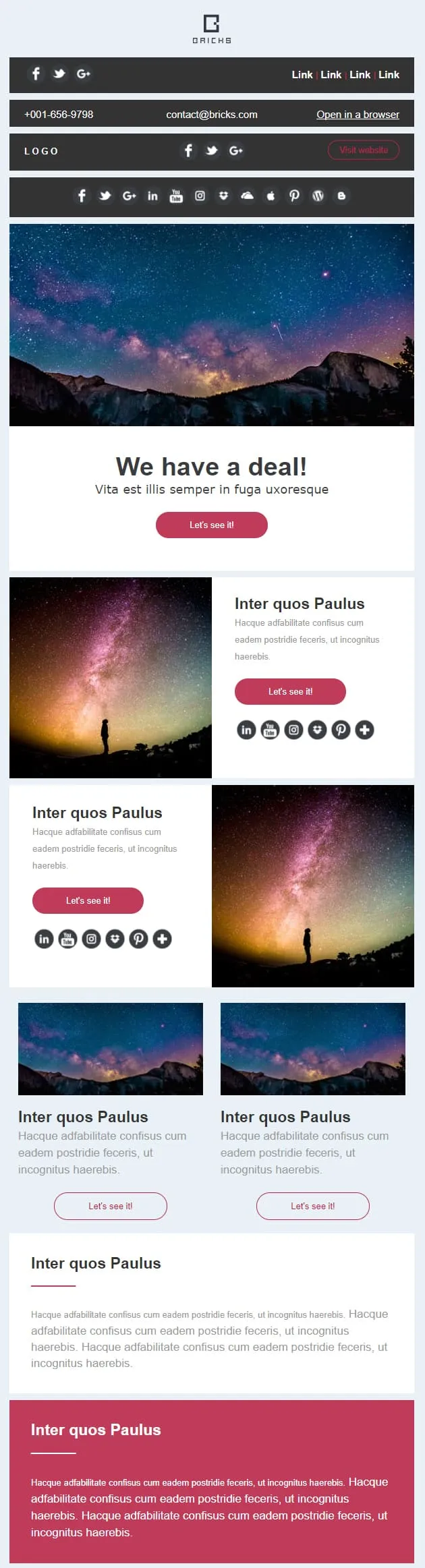
A campaign template made of eight stackable content blocks: a deal banner with a direct call to action, paired left and right image-text rows, two thumbnail sub-cards, a wide highlight strip and a high-contrast closing block. Reorder, drop or duplicate blocks to suit any brief.
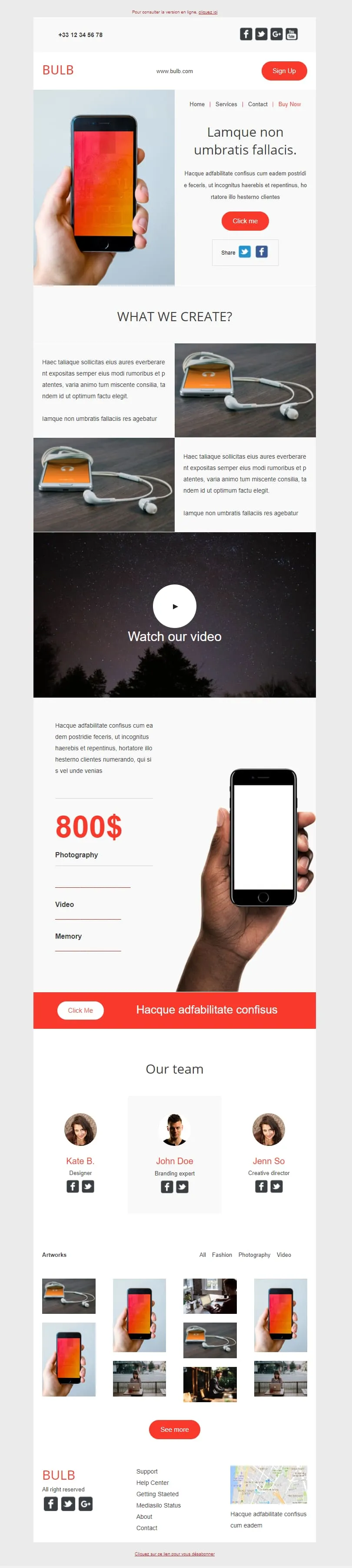
A tech brand template that earns its length. A phone-in-hand hero opens, two image-text rows detail the product, a wide video block follows, a vertical price column tied to a phone close-up, an orange call-to-action bar, a three-portrait team row and a fourteen-thumbnail artwork mosaic close it out.
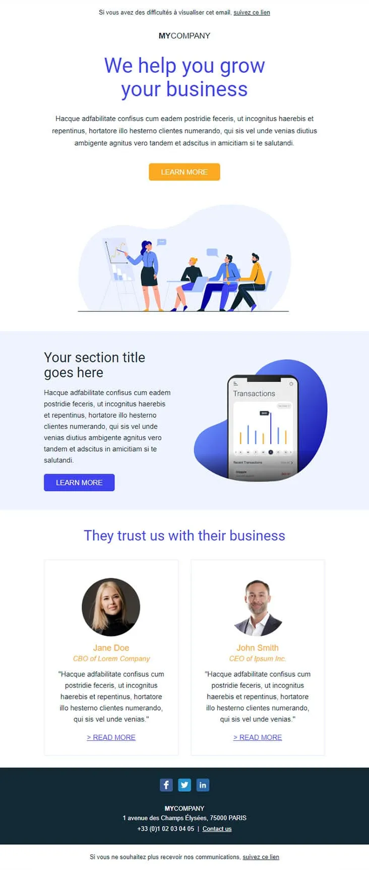
A B2B lead generation template built on social proof. A deep blue outcome-named headline opens, an illustrated meeting scene softens the approach, a phone screen showing real transactions demonstrates the product and two side-by-side testimonials with CBO and CEO titles seal the credibility.
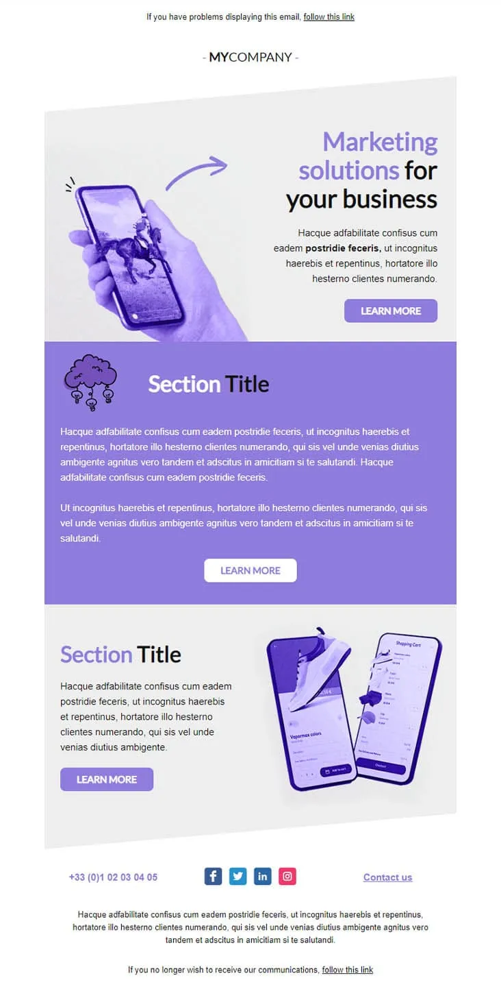
Coming SoonMarketing agencies don't sell features — they sell outcomes. This violet-toned template lines up three Learn More buttons across three distinct sections: a marketing-solutions hero with phone-in-hand artwork, a centred purple manifesto block, and an e-commerce case study showing shopping-cart screens. One email, three conversations, three pitches.
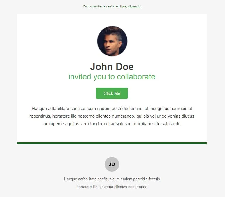
Coming SoonInvitations need a face, a name, and a button — nothing else. Collaborate stacks three things on white: a circular profile photo, a two-line headline ('John Doe / invited you to collaborate'), and a green Click Me button. A green horizontal divider separates the message from a small initials-avatar footer with the inviter's signature line. Read in two seconds, accepted in three.
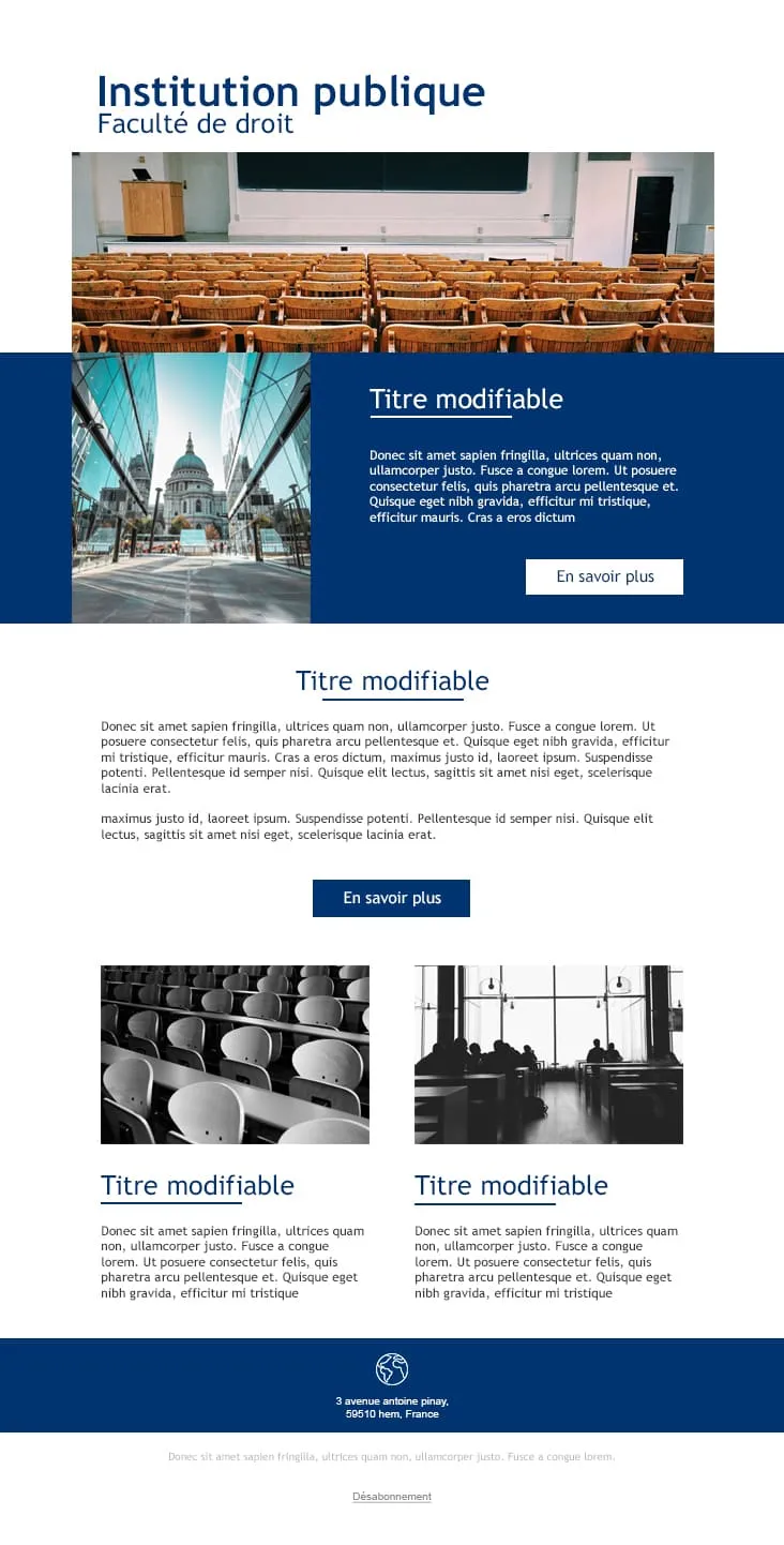
Coming SoonPublic institutions communicate in blue and serif, not gradient and emoji. College gives universities and faculties a layout that sounds credible from line one: a navy 'Institution publique / Faculté de droit' header, an auditorium photo, a deep-blue feature block with a cathedral side-photo and 'En savoir plus' CTA, a centred Titre modifiable section, and two black-and-white image-text rows for departmental news. Footer carries the address and unsubscribe link.
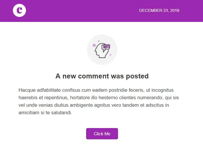
Coming SoonComment notifications race against the user's instinct to dismiss. Comments wins that race in under five seconds: a violet 'C' logo strip with the date stamped right ('December 23, 2018'), a centred head-with-bubble icon, a 'A new comment was posted' headline, two short paragraphs of context, and a single violet Click Me. No author preview, no thread preview — the platform handles the rest.
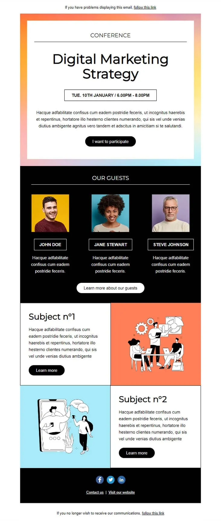
Coming SoonConference invites compete with three other invites in the same week. This template wins by putting the agenda in the email: a pastel-gradient hero with 'CONFERENCE — Digital Marketing Strategy' and a date/time strip ('TUE. 10TH JANUARY / 6.00PM - 8.00PM'), an 'I want to participate' CTA, a black 'OUR GUESTS' block with three speaker portraits on coloured backgrounds, then two Subject blocks with illustrations (Subject n°1 + Subject n°2) — each with its own Learn More.
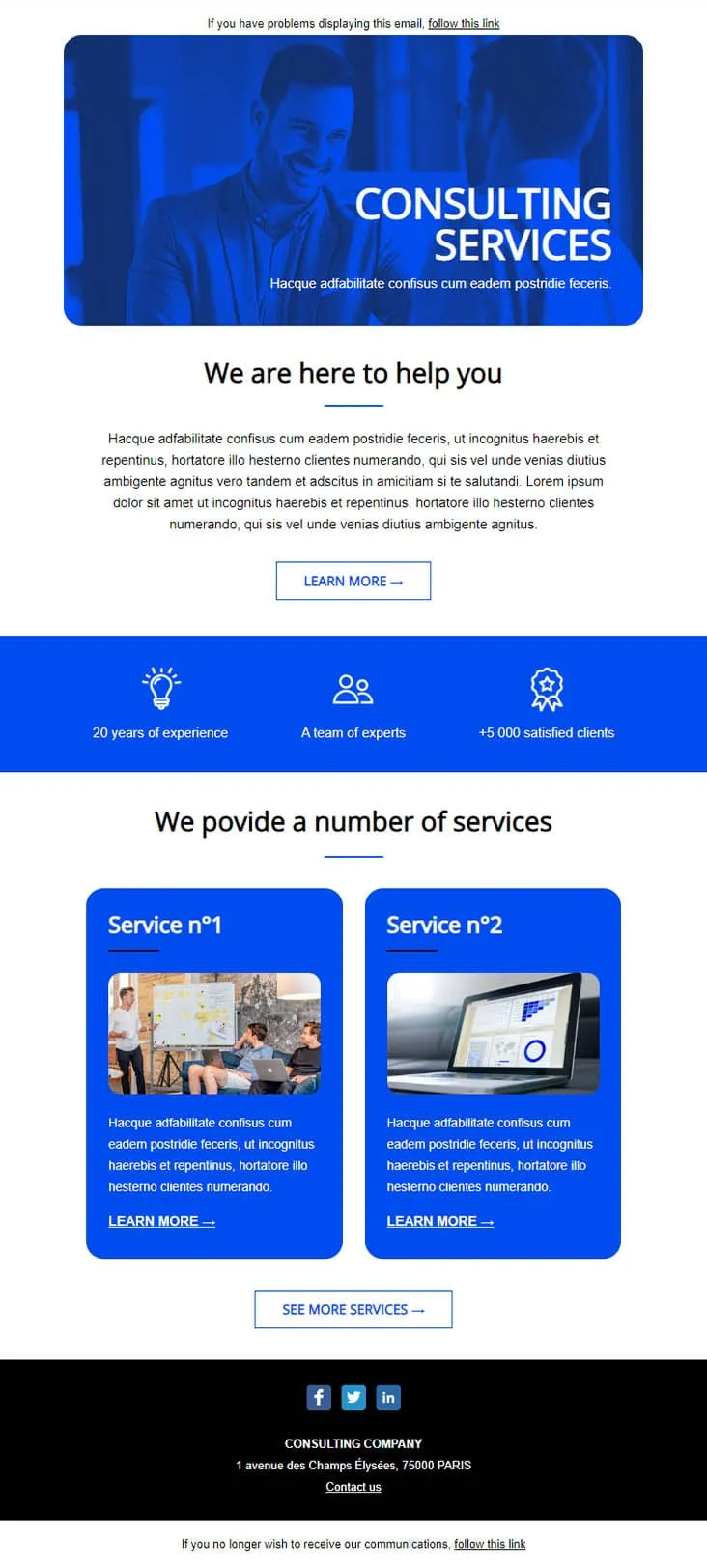
Coming SoonEstablished consultancies skip the persuasion and lead with stats. This template plays that card: a confident businessman hero in saturated blue, a 3-stat credibility strip ('20 years of experience / A team of experts / +5 000 satisfied clients'), then two numbered Service cards (Service n°1 + n°2) with photos and individual Learn More CTAs. Built for management consultants, accounting firms, and professional services that need to look established before they look smart.
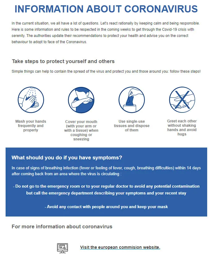
Coming SoonPublic health bulletins need to land calm — no gradients, no clever copy. Coronavirus Info (EN) is pre-set in English with an institutional headline ('INFORMATION ABOUT CORONAVIRUS'), four barrier-gesture icons in navy circles (wash hands, cover mouth, single-use tissues, no shaking hands), a deep-blue 'What should you do if you have symptoms?' panel, and a 'Visit the european commission website' link as the source of truth.
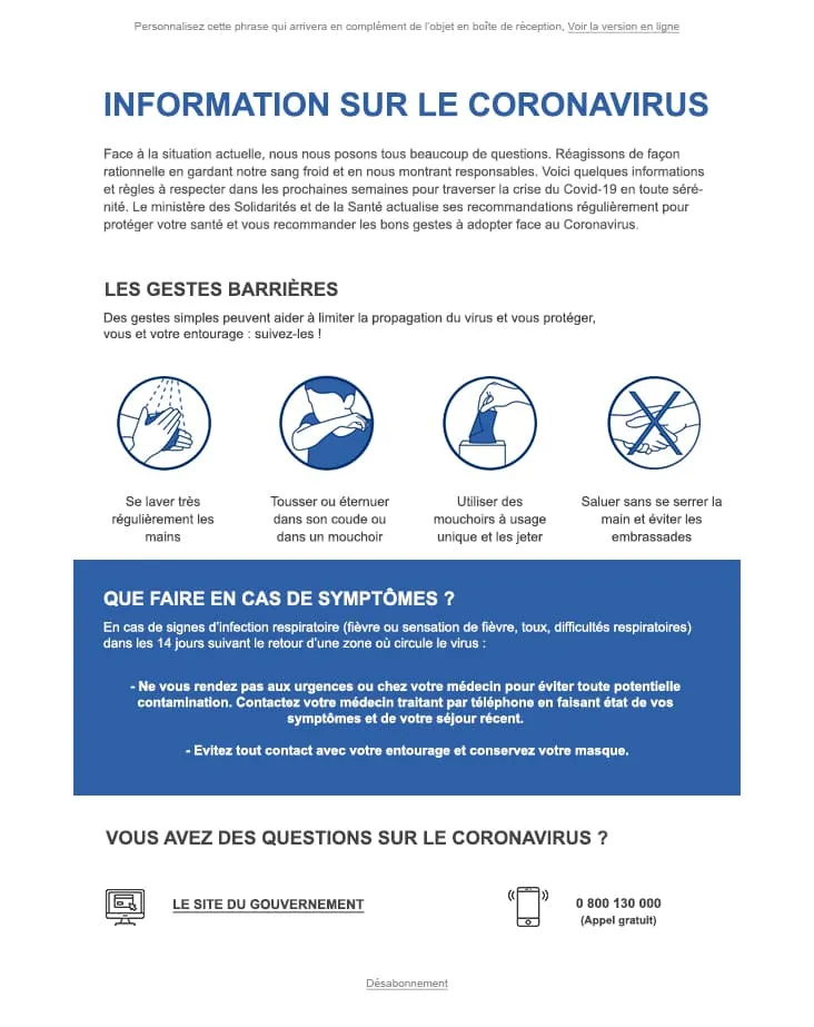
Coming SoonWhen the audience is exclusively French-speaking, every UI string already in the design saves a translation pass. Coronavirus Info (FR) ships with the entire body locked in French — an 'INFORMATION SUR LE CORONAVIRUS' headline, four 'Gestes Barrières' icons (se laver les mains, tousser dans le coude, mouchoirs jetables, pas de poignée de main), a 'Que faire en cas de symptômes ?' blue panel, and a 0 800 130 000 hotline next to a 'Le site du gouvernement' link. For French health authorities and French-speaking employers.

Coming SoonInterior brands need to do two jobs in one email: inspire and sell. DecoHouse handles both with a leaves-textured living-room hero and yellow-saturated body. Welcome statement, dining-room photo block with social share, four-person 'Powered by' team grid, then the offer: a 12€/29€/45€ Standard/Pro/Premium pricing card, four check-mark features, a reverse image-text row, a 3-thumbnail interior gallery, two oversized lifestyle shots (bed, pink sofa), a closing mosaic, and a Lille map. For interior designers, furniture retailers, and home-renovation studios.
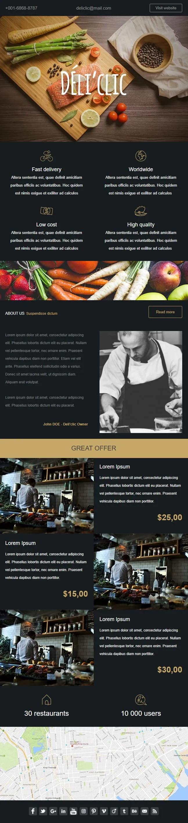
Coming SoonFood delivery emails need to make the user hungry before they think about logistics. Déli'clic plates the meal first: a wooden chopping-board hero with salmon, asparagus, lemon and tomatoes around a hand-lettered logo, then a four-quadrant feature icon grid (Fast delivery / Worldwide / Low cost / High quality), an About Us paragraph next to a black-and-white chef portrait, a 'GREAT OFFER' price strip with three café interior shots at $25/$15/$30, and a 30-restaurants / 10K-users stats bar before a NYC location map.
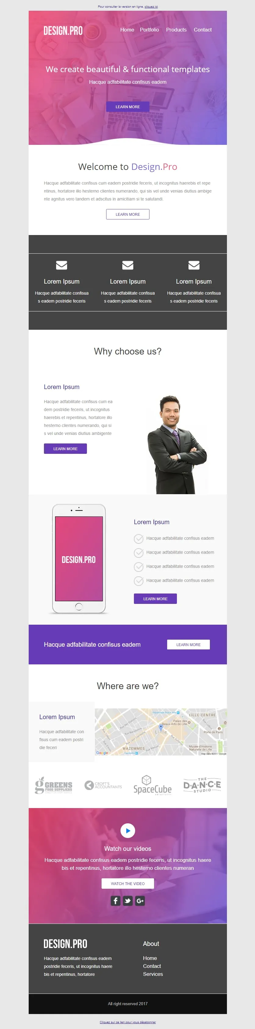
Coming SoonA design studio's email has to look like the work it sells. Design.Pro frames itself in a pink-to-purple gradient hero ('We create beautiful & functional templates'), runs a Welcome panel with prose-and-button, a 3-mailbox icon row, a 'Why choose us?' block with a businessman portrait, a pink phone mockup tied to four checkmark features, a violet CTA strip, a 'Where are we?' Lille map, a client logo strip (GREENS / CROFTS / SpaceCube / DANCE STUDIO), and a 'Watch our videos' video block over the gradient before the dark footer. For design agencies pitching their portfolio in one scroll.
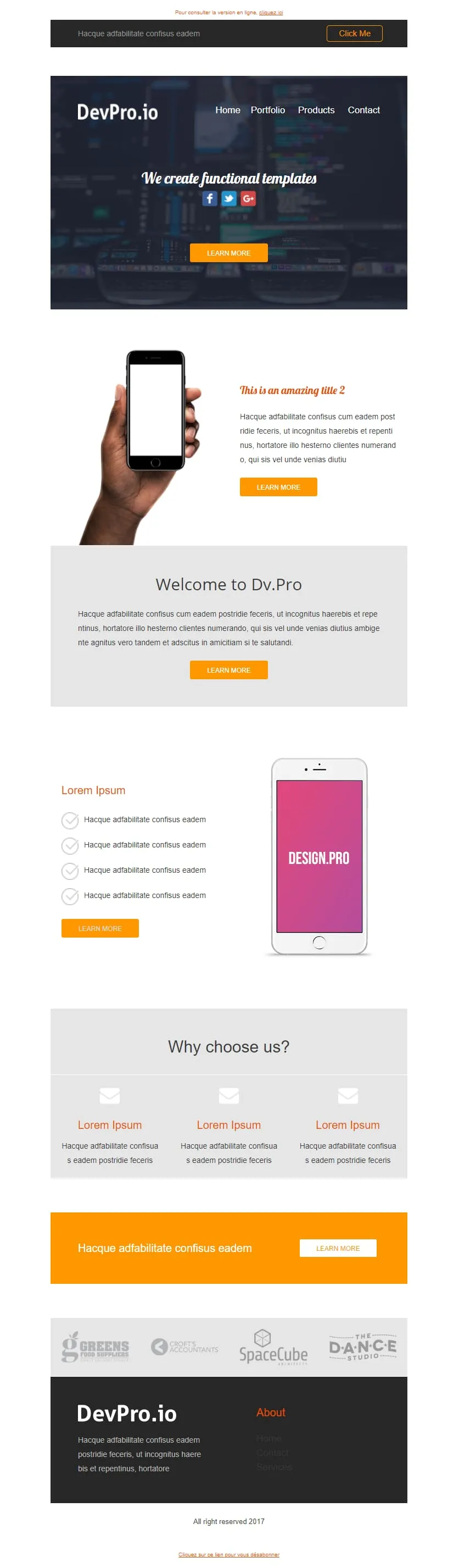
Coming SoonDev shops can't afford a pink gradient — they ship in dark mode with orange highlights. DevPro.io is the engineering-room sibling of Design.Pro: a code-blurred header bar with Click Me, a 'We create functional templates' dark hero with social icons, a phone-in-hand orange feature block, a 'Welcome to Dv.Pro' grey panel, a pink-screen phone tied to four checkmark features, a 3-mailbox feature row, an orange full-width CTA, the same client logo strip (GREENS / CROFTS / SpaceCube / DANCE STUDIO), and a dark footer.

Coming SoonAbandoned cart emails work better when they don't try. Don't Forget keeps everything in two colours and one purpose: a thin grey header with MYCOMPANY logo, a 'There's something in your cart' headline in heavy sans-serif, a three-row product table with image placeholders, ((product_name)) / ((product_description)) / ((product_quantity)) / ((product_price)) merge tags, and a single blue 'RETURN TO CART' button. No upsell, no discount, no excuse — just the receipt of what they almost bought.
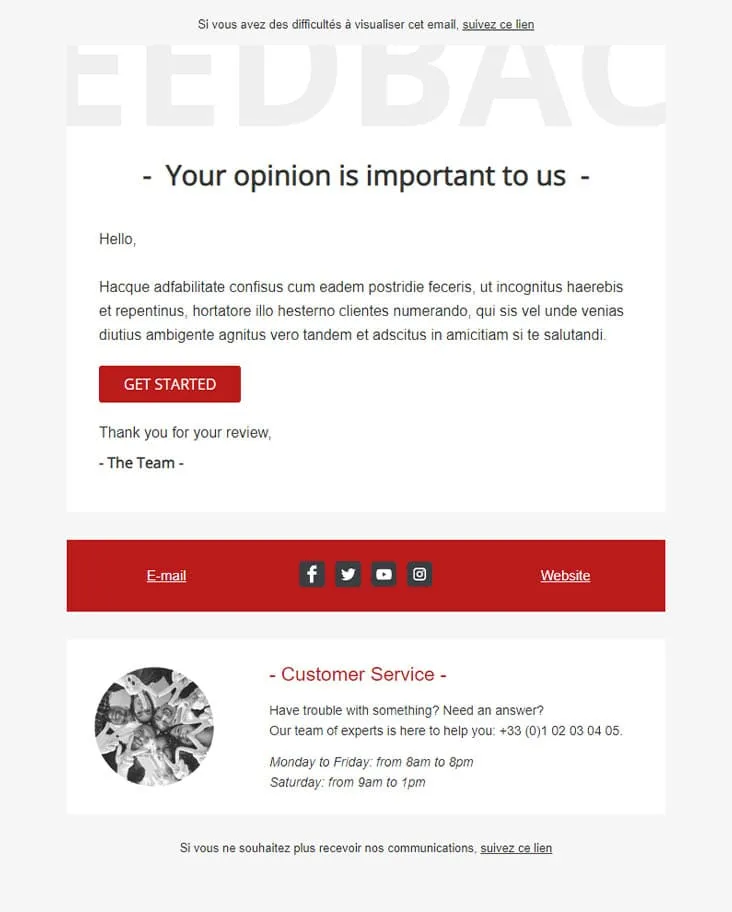
Coming SoonFeedback Matters keeps the ask honest: one button, no incentives. A watermark-style 'FEEDBAC...' supertext fades behind a dash-bracketed '- Your opinion is important to us -' headline, a short greeting and paragraph follow, a single red 'GET STARTED' button takes the action, and a 'Thank you for your review, - The Team' signature closes it. A red social-strip footer separates the message from a Customer Service block with photo, phone number, and weekday/Saturday hours.

Coming SoonFlat is the swiss-army knife of corporate templates. A camera-and-keyboard hero with cursive 'Flat' logo opens, then 'Our Features' 3-icon row (bulb/globe/trophy), a teal 'How we work' double-row with phone-notes photography, a 4-thumbnail 'Our Blog' grid, an 'Our Gallery' multi-tag filter (Photography / Digital marketing / Design / Video) over 6 photos, a 2x2 'Our Specialities' icon grid, an 'Our video' play-button hero, and an 'Our Pricing' 3-tier 399$ table with strike-through 350$ and feature checkmarks. Designed for agencies that need every section pre-built.
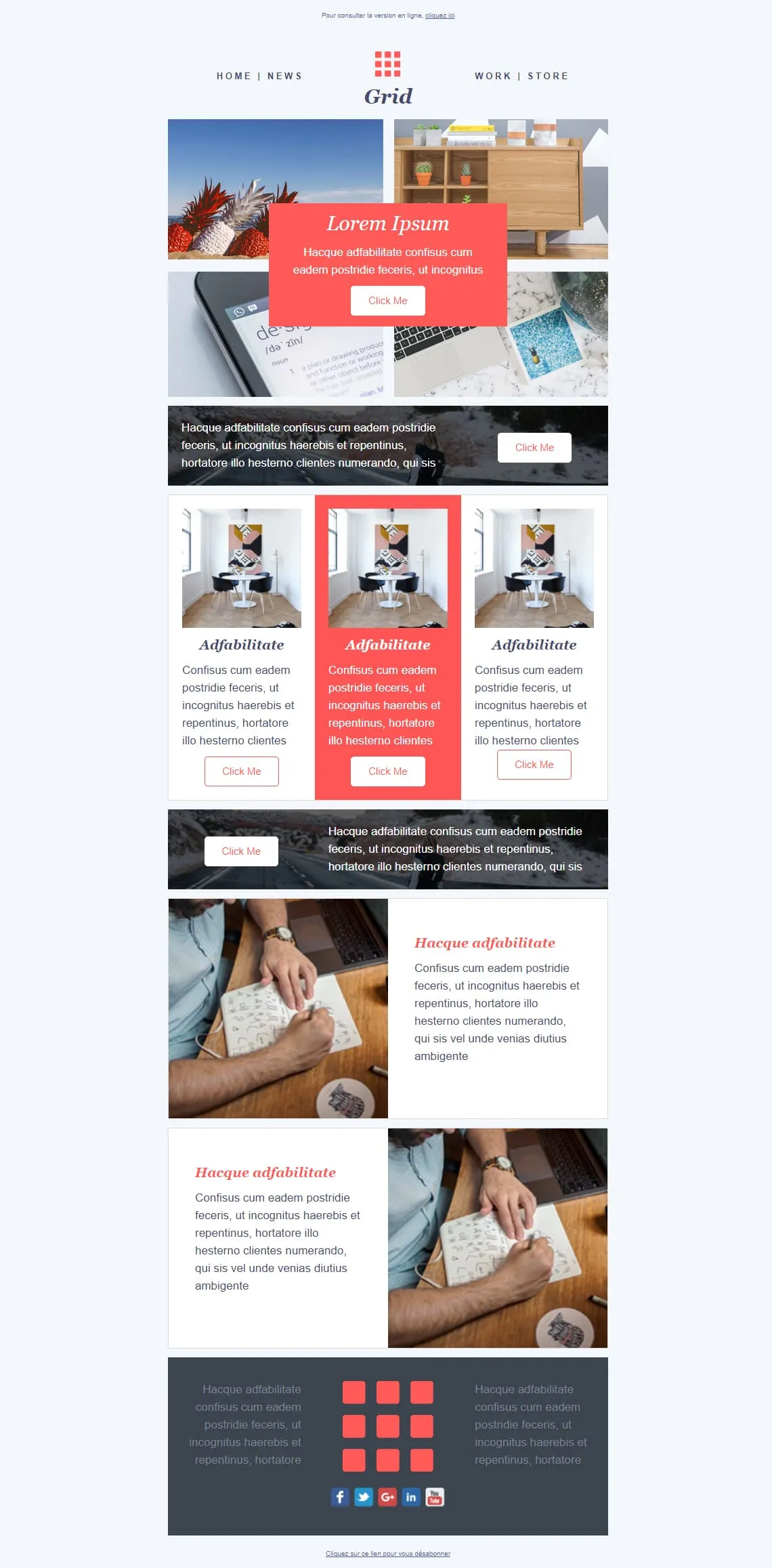
Coming SoonMosaic templates either fight for attention or get out of the way — Grid splits the difference. A 4-photo asymmetric mosaic at top carries a red 'Lorem Ipsum / Click Me' overlay card, a dark photo strip with a white-button CTA cuts through, a 3-card row spotlights the middle entry in red, a reverse dark image-strip CTA follows, then two image-text rows (handwriting-laptop / handwriting-laptop reversed) alternate before a dark gray footer with the 9-square red grid logo centred between social icons. For magazines, agencies, and creative shops that want photography to lead.
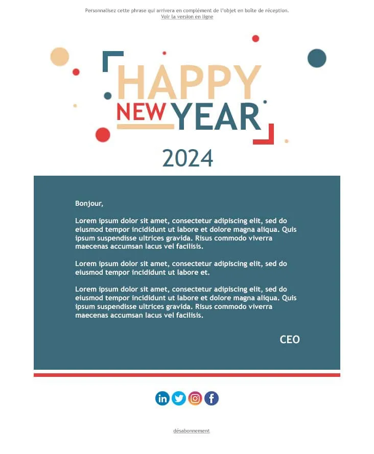
Coming SoonThe 'Happy New Year' letter is the simplest corporate email — and the easiest to overdo. Happy New Year stacks a confetti-dotted, multi-colour 'HAPPY NEW YEAR' typographic logo (yellow/red/blue/teal) over a giant teal '2024', then a single teal letter panel running three Lorem paragraphs and a CEO sign-off, a red separator, and a 4-icon social row (LinkedIn / Twitter / Instagram / Facebook) before the unsubscribe link. For company-wide year-end messages, B2B founder notes, and team-internal greetings.

Coming SoonThe first email after signup is the only one with a guaranteed open. HappyWelcome treats it like a party invitation: a royal-blue frame with cursive 'HappyWelcome' logo, a 'Welcome!' card with paragraph and pink Click Me, and a party flat-lay photo (confetti, candles, ribbons, gift box). Then a teal 'Holiday offer' image-text row paired with cake-and-candy photography, a reverse purple 'Holiday offer 2' row, and a dark navy footer with cursive brand and 3-icon social row. For onboarding sequences, birthday clubs, and 'thanks for joining' moments.
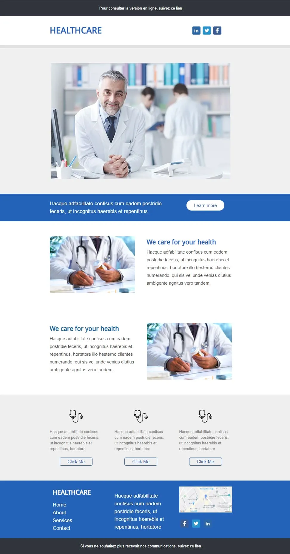
Coming SoonHealthcare emails should look trustworthy first and visually interesting second. Healthcare anchors on a smiling-doctor hero in a clinic library, drops a blue full-width 'Learn more' strip, then two image-text rows alternating (pill-bottle / prescription-writing) under a 'We care for your health' header, a 3-stethoscope-icon row with outlined Click Me buttons, and a blue footer with Home / About / Services / Contact, contact paragraph, Lille map, and LinkedIn/Twitter icons. For clinics, GP networks, pharmaceutical newsletters, and patient communications.
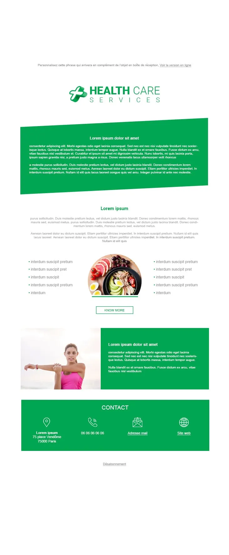
Coming SoonWellness clinics need a different palette than hospitals — green for prevention, blue for treatment. Health Care Services pairs a HEALTH CARE SERVICES green-cross logo with a tilted green prose panel, a 'Lorem ipsum' centred title and prose, a 2-column 5-bullet list flanking a round bowl-of-fruits-and-salad photo with a KNOW MORE outlined CTA, a green stretching-woman image-text row, and a green CONTACT footer with 4 icons (location 75 place Vendôme Paris / phone / mail / website). Companion to Healthcare, but built for nutrition, prevention, and wellness practices instead of clinical care.
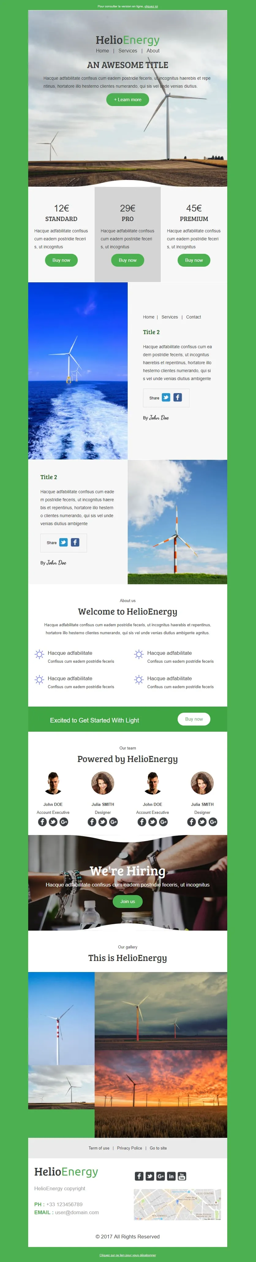
Coming SoonHelio-Energy takes the Standard/Pro/Premium 12€/29€/45€ subscription structure used by CityTravel and DecoHouse and ports it to renewable energy. A wind-turbine hero with HelioEnergy green logo opens, a 3-tier pricing row (gray-highlighted Pro), two image-text rows alternating with offshore-turbine and field-turbine photography, an 'About us' 2x2 sun-icon feature grid, a green 'Excited to Get Started With Light' Buy now strip, a 4-person 'Our team' row, a 'We're Hiring' handshake hero, a 3-photo gallery, and a Lille-mapped footer. For energy providers, solar installers, and green-tech newsletters.
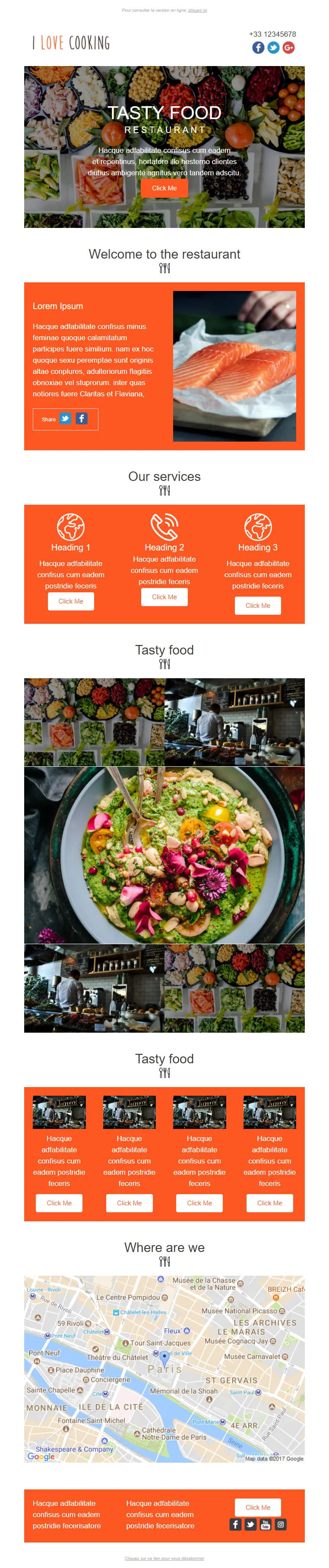
Coming SoonRestaurant marketing emails need more than the daily special — I Love Cooking gives them the menu, the kitchen, the team, and the map. A food-spread 'TASTY FOOD / RESTAURANT' hero opens with an orange Click Me, then a 'Welcome to the restaurant' orange Lorem panel paired with salmon-fillet photography, a 3-icon 'Our services' row (Heading 1/2/3 with Click Me each), a 'Tasty food' 3x3 photo mosaic centred on a guacamole-bowl, a second 'Tasty food' row of 4 chef-station thumbnails, a 'Where are we' Paris-Châtelet Google map, and an orange Lorem-twin footer. For full-service restaurants, food magazines, and culinary newsletters.
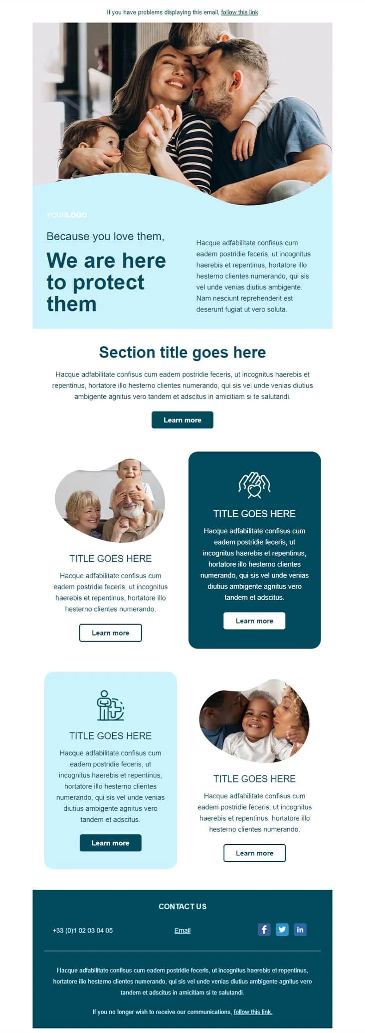
Coming SoonInsurance emails earn their open by leading with the people, not the policy. Insurance opens on a wave-cropped family photo (mom kissing dad, two kids hugging) over a light blue panel with 'Because you love them, / We are here to protect them' navy headline, a 'Section title goes here' centred intro with Learn more, and a 2x2 grid alternating round portraits (grandparents-and-kid / mom-and-baby) with dark navy and light blue icon blocks (heart-hands / person-with-kid). A dark navy CONTACT US footer carries phone, Email, and LinkedIn/Twitter/Facebook icons.
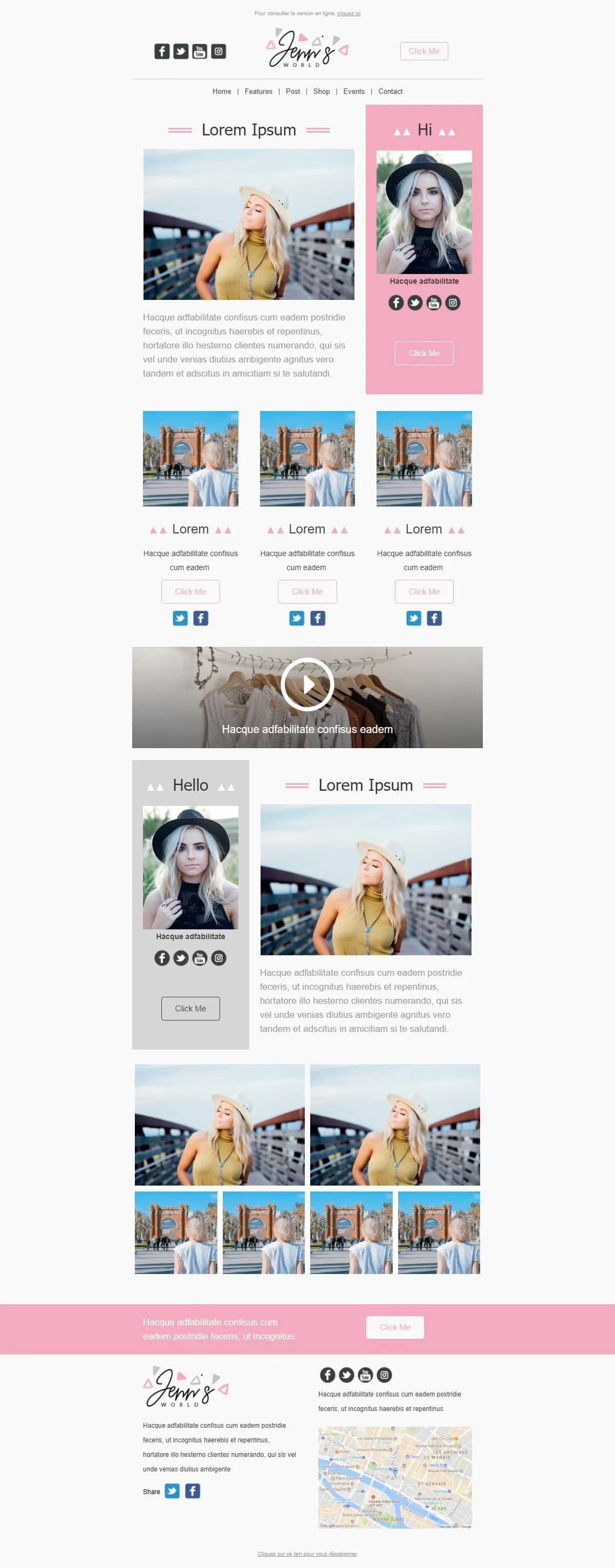
Coming SoonInfluencer newsletters thrive on the personal-portrait sandwich — Jenn's World stacks three of them. A 2-column hero pairs a blonde-in-yellow-top photo with a pink 'Hi' panel containing a portrait and social icons, then a 3-card row of women-from-behind at an archway, a wide clothes-hanger video block with play overlay, a reverse 2-column with a gray 'Hello' portrait panel + pink-bordered 'Lorem Ipsum', a 6-photo asymmetric grid, and a pink Lorem CTA strip before the cursive 'Jenn's WORLD' Paris-mapped footer. For lifestyle bloggers, fashion influencers, and personal-brand newsletters.
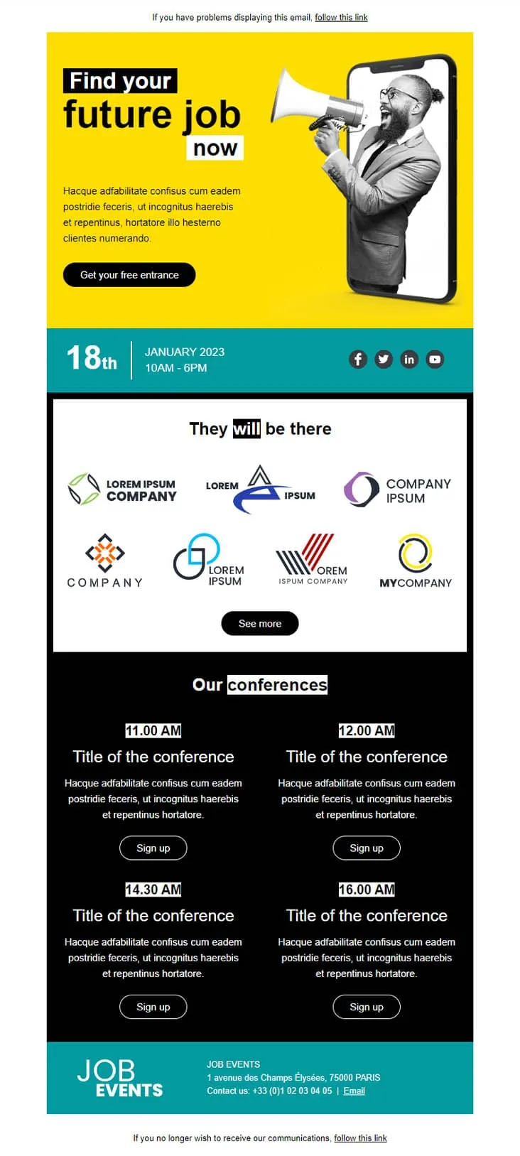
Coming SoonJob fair invitations have two audiences in one email — candidates scanning for opportunities and partner brands showing they're there. Job Fair anchors both with a yellow phone-megaphone illustration hero ('Find your future job now' + 'Get your free entrance'), a teal date strip (18th January 2023 / 10AM-6PM) with LinkedIn / Twitter / Facebook / YouTube icons, a 'They will be there' 7-logo company gallery with See more, a black 'Our conferences' 4-slot grid (11:00 / 12:00 / 14:30 / 16:00 AM each with Sign up), and a teal 'JOB EVENTS' footer with Champs-Élysées Paris address and phone.
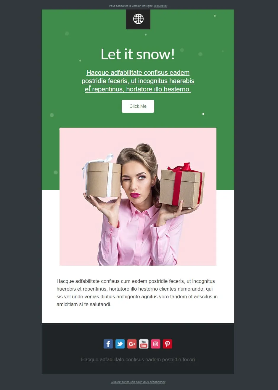
Coming SoonMost Christmas templates lean cozy or grand. Let It Snow leans playful — a green confetti-dotted top panel with a 'Let it snow!' cursive headline, underlined Lorem prose, and a white Click Me sits above a pink-tinted photo of a winking pin-up-style woman holding two gift boxes (one beige, one with red bow). A Lorem paragraph follows, and a dark navy footer carries 6 social icons (Facebook / Twitter / G+ / YouTube / Instagram / Pinterest). For cheeky-tone gift retailers, beauty brands, and lifestyle newsletters.

Coming SoonLibrary marketing has one unbeatable hero shot: floor-to-ceiling shelves under a vaulted ceiling — Library opens with exactly that. A 'YOUR LOGO / Add baseline here' header sits above the Trinity-Long-Room-style library photo, then a 'LOREM IPSUM DOLOR SIT AMET' centred prose block, a sage-green pages-of-book / Latin prose two-column with 'EN SAVOIR PLUS', a 3-column book trio (open book / books-on-shelf / books-stacked) each with gray EN SAVOIR PLUS, and a CONTACT row with Jean-marc martin signature, Facebook link, and Site web. For libraries, bookstores, book clubs, and publishing newsletters.
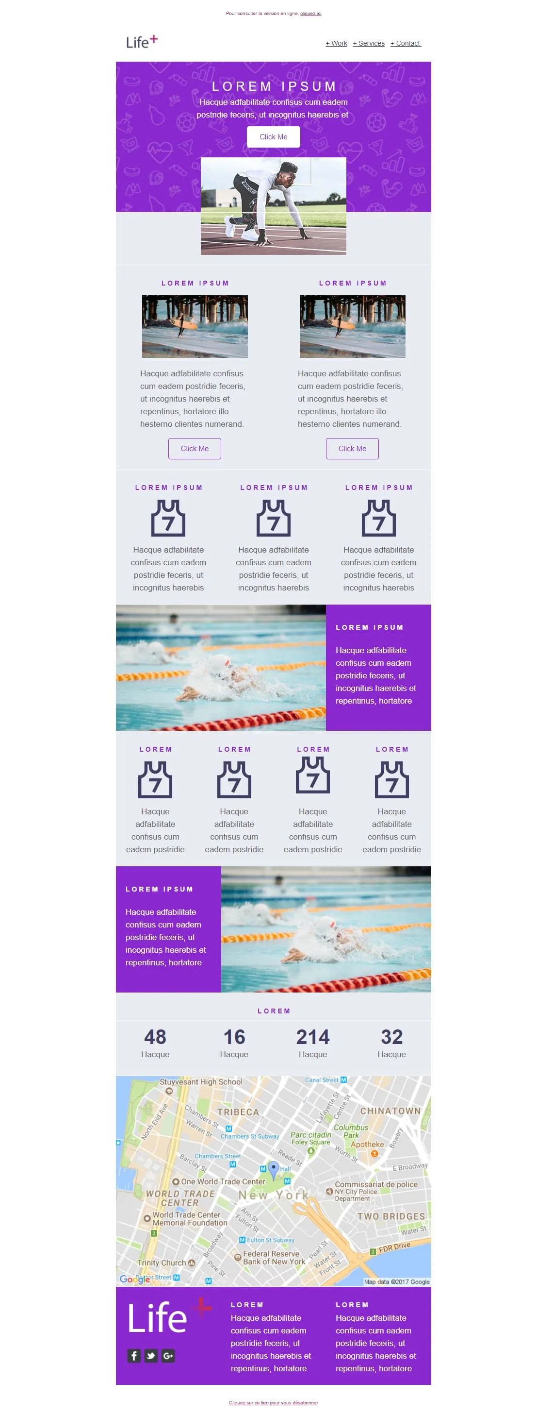
Coming SoonSports brand emails win on photography of people mid-action — Life+ runs sprinter mid-start, surfer mid-wave, and swimmer mid-stroke. A purple sport-icon-patterned 'LOREM IPSUM' hero opens with a Click Me and a starting-block photo, then a 2-card surfer row, a 3-card jersey-with-7 feature row, an XL swimmer image-text, a 4-card jersey row, a reverse swimmer panel, a stats strip (48 / 16 / 214 / 32), a Google map of New York (Tribeca / WTC), and a purple Life+ footer with 2 Lorem columns and social icons. For sports apps, fitness platforms, and wellness brands.

Coming SoonLight strips Helio-Energy of its energy theme and keeps everything else — same Standard/Pro/Premium 12€/29€/45€ structure (now used by CityTravel, DecoHouse, Helio-Energy, and Light), same 4-person team, same 'We're Hiring' handshake hero, just neutral instead of renewable-themed. A circle-and-LIGHT logo opens, an 'AN AWESOME TITLE' glasses-on-laptop hero with '+ Learn more', a 2x2 'About us' sun-icon grid, two hand-with-pen image-text rows flanking the price tiers, a 4-person team, and a 4-photo gallery. For SaaS, agencies, and B2B services that need the structure without the vertical.
plantillas de email para newsletter?Un solo número no construye confianza. Veinte números consistentes y bien diseñados, sí. Eso es lo que posiciona a tu marca como la referencia de tu sector.
Cada envío dirige a los suscriptores de vuelta a tu blog, página de producto o último caso de éxito. Sin presupuesto. Sin algoritmo contra el que luchar.
Elige un diseño. Guarda los estilos de marca. Cambia el contenido cada semana. La plantilla se queda. Tu tiempo sigue siendo tuyo.
Las dos cosas, probablemente. Una jerarquía visual clara hace que ambos saquen valor. Titulares para los que escanean. Secciones completas para los lectores profundos.
plantilla de newsletter
Minimalista para actualizaciones cortas. Cuadrícula multicolumna para roundups curados. Explora y elige.
Titulares, snippets, imágenes destacadas. El EmailBuilder te deja reordenar los bloques para priorizar lo que importa esta semana.
Tipografías, colores, estilos de botón. Que casen con tu sitio. Añade una firma personal e iconos sociales. Mantenlo humano.
Programa en horas pico. Después mira qué artículos consiguen más clics. Deja que los datos den forma a la próxima edición.
Esa es la proporción. Insights, novedades, consejos primero. Pitch de producto después. Los suscriptores se quedan cuando aprenden algo. Se van cuando sienten que se les vende.
El asunto se nota. El preheader cierra el trato. Aprovecha esos 40-60 caracteres para anticipar la mejor historia de dentro. La mayoría de las marcas lo deja en blanco. Tú no.
Titular. Resumen de dos líneas. Botón «Leer más». Mantén el email escaneable y empuja el contenido completo a tu sitio. Genera tráfico y mantiene el email ligero.
Semanal. Quincenal. Mensual. Elige una cadencia y respétala. Los suscriptores se involucran más cuando saben cuándo esperarte. La inconsistencia mata las tasas de apertura con el tiempo.

Botones sociales o un enlace «Reenviar a un amigo». Si el contenido es bueno, los lectores hacen el crecimiento por ti. Las newsletters más exitosas crecen orgánicamente así.
Mejores artículos, herramientas y noticias de tu sector. Posiciona tu marca como el filtro en el que los suscriptores confían.
Momentos behind-the-scenes. Hitos del equipo. Notas del liderazgo. El lado humano de tu marca.
Tus últimos posts, organizados y resumidos. Vuelve a enganchar a los suscriptores que se perdieron contenido en tu sitio.
Lanzamientos de funcionalidades. Mejoras. Corrección de bugs. Diseños estructurados hacen que las actualizaciones técnicas sean claras y escaneables.
Optimiza tus emails de newsletter¿Estás diseñando para los que escanean?
La mayoría de los lectores pasa menos de un minuto. Subtítulos en negrita, párrafos cortos y espacio en blanco hacen que los puntos clave aterricen rápido.
¿Qué pasa cuando las imágenes no cargan?
Un email que es una sola imagen grande arriesga la carpeta de spam. Y muchos clientes de email móvil bloquean imágenes por defecto. Mezcla texto vivo con visuales para que el mensaje sobreviva.
¿El contenido puede actualizarse solo?
Los bloques dinámicos importan las primeras líneas de tus últimos posts. Menos trabajo manual. Más contenido relevante. En cada edición.
¿Es legible bajo el sol fuerte?
Alto contraste. Fuente mínima de 16 px. Las newsletters se leen en todas las condiciones. Testea la legibilidad, no solo en tu oficina oscura a las 14:00.
¿Cada suscriptor recibe la misma edición?
No tendrían por qué. Las herramientas de Data de Positive User te dejan enviar versiones a medida según lo que le importa a cada segmento.
¿Qué hay en el asunto?
«Esta semana: 3 tendencias que están reescribiendo el marketing B2B» supera a «Actualización mensual». Sé concreto con el contenido. Prueba varias versiones.
¿Cuántas historias por envío?
De tres a cinco piezas fuertes superan a 15 enlaces. Una edición enfocada gana siempre.
Una newsletter que tu audiencia valore. Las plantillas y la automatización integrada de Positive User. Consistente y profesional.